About the Film:
Inspired by true events, Cargo examines the world’s refugee crisis from a very local perspective. Cargo is the story of a sensitive fisherman who becomes a prolific human smuggler to pay off a gambling debt. Written, developed, funded and produced entirely in The Bahamas, Cargo is the largest and best performing award winning Bahamian feature film project to date. Written and directed by acclaimed Bahamian filmmaker Kareem J. Mortimer.
How it came together:
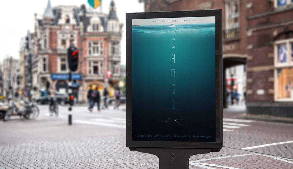
In 2016 Alexander Younis, Austrian Entrepreneur and Producer of Cargo, with whom already I had collaborated with on several projects in my early days as an Art Director at Austrian agencies, offered me a design job for his film production ‘Cargo’. At the time the work required was limited to print; to design the official movie poster, but was later on extended to the design and execution of Cargo’s official webpage:
Hidden underneath the beautiful surface you enter a darker side of The Bahamas: human smuggling...”
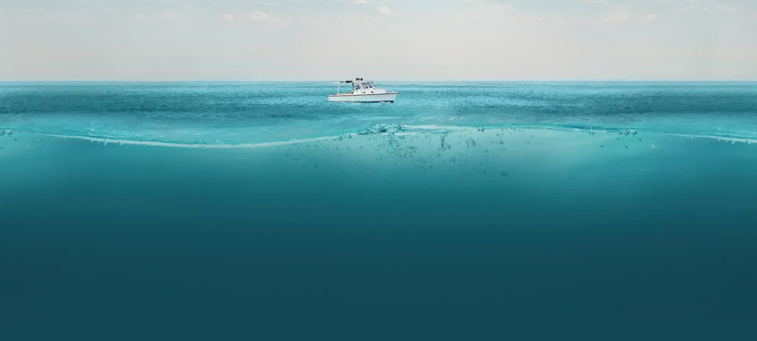
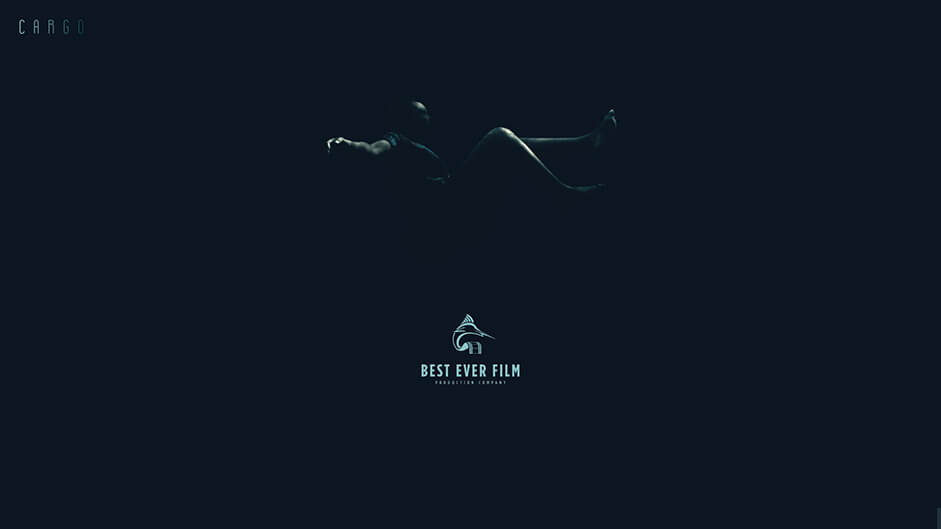
The poster is an abstract visualization of social problems in The Bahamas. The upper part represents what most people visualize when they think of The Bahamas. Paradise islands with beautiful beaches and wild nature. But the deeper you follow the poster, the darker it becomes. Hidden underneath the beautiful surface you enter a darker side of The Bahamas: human smuggling, a growing issue that calls for our attention. Separated by a large empty area of continuously darkening water, one can barely recognize a woman floating lifeless in the darkness of the deep blue.
Website concept:
From the very beginning, when Alexander approached me to additionally design their website, I instantly had a clear concept in mind. The very layout of the poster was perfect for the transition into the digital world:
Although using the same conceptual design as in the poster, I had to enhance via a scroll-only navigation to unfold better on digital devices and thus taking full advantage of the limited viewport on a digital screen. This allows for the user to be lead and directed step by step through all the levels of the experience without spoiling the darkness that lurks below the surface.
From a storytelling point of view, my approach was to separate the website into 4 main parts:
The Landing impression: as mentioned, everything starts with a really beautiful impression of the island.
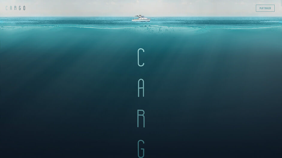
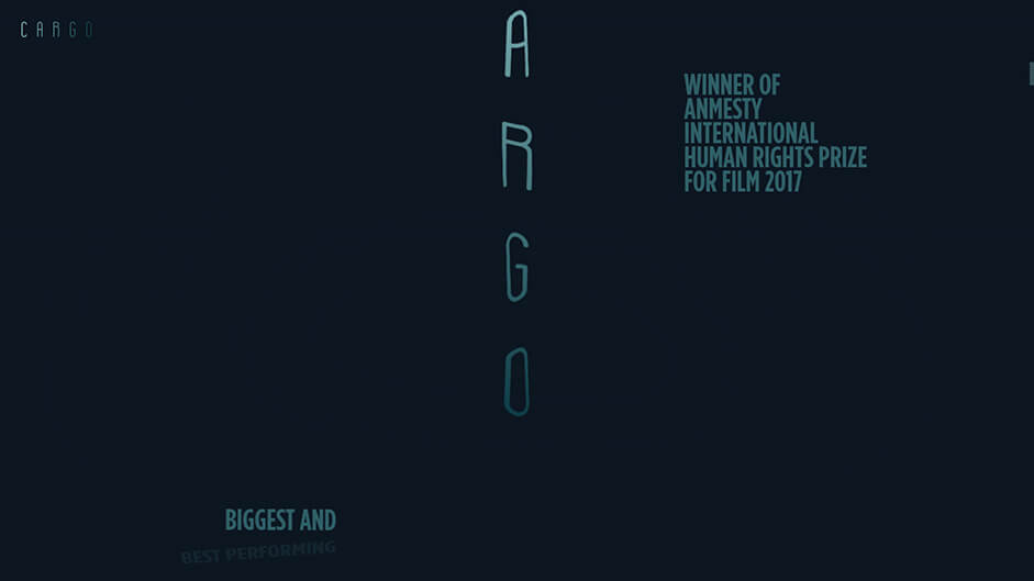
The Highlights: While the Cargo (logo) is sinking, the background becomes darker. It's a slow dive down while highlights about the film rise from the depths.
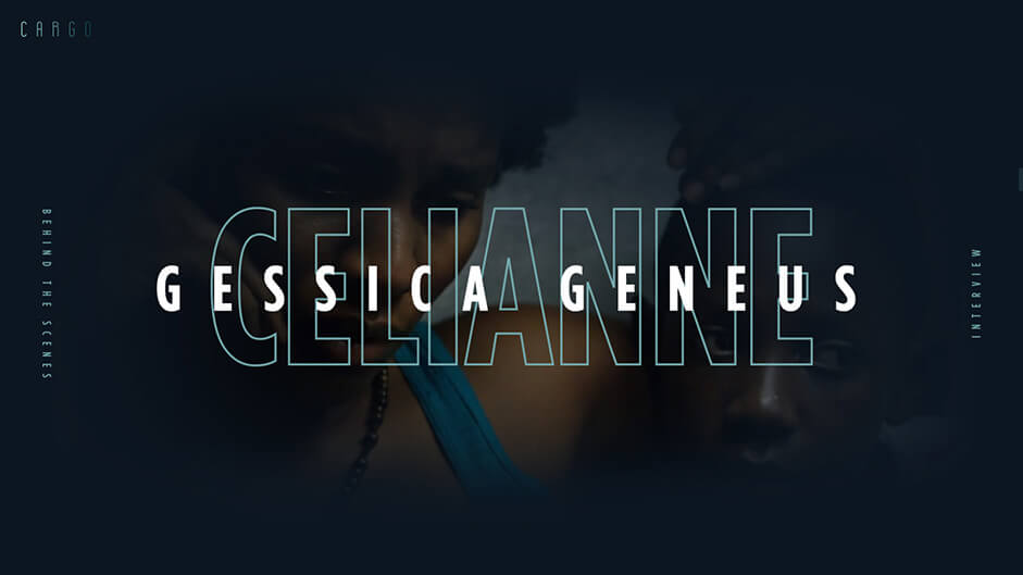
The main part: the actors. A stand alone introduction of every actor and their film-characters. Enhanced by a short interview-clip of the Actor featuring behind the scene footage. An additional photo slider leads the user slightly out of the narrative, behind the scenes on set.
Reflecting the movie’s storyline all parts lead to a final impression: A woman floating motionless in the empty darkness.
After a trouble-free designing phase the draft was ready for development. At this point, Creative Developer Mario Sommer, joined the task force.
Realization:
As everyone knows, a good first impression is crucial for every website. In order to catch the users' attention we enhanced the original poster design, with some dynamic effects. First, we did the obvious and used WebGL to animate the waves in the image. Additionally we added some lighting effects in the form of god rays in order to achieve a more realistic underwater experience. Since the user spends most of the time virtually underwater we tried to mimic that environment as much as possible. Resulting in a lot of wobbly text animations and transitions.
Now, with all the moving parts the vertical Cargo logo felt a little bit too static. Therefore we added a subtle floating effect which gets more intense when you start scrolling - just as if you were underwater.
Now, with all the moving parts the vertical Cargo logo felt a little bit too static. Therefore we added a subtle floating effect which gets more intense when you start scrolling - just as if you were underwater.
Although we are not a big fan of scroll hijacking we decided that in this particular case adapting the scroll behaviour would definitely enhance the overall experience. We kept the navigational structure as simple and streamlined as possible so to enable an experience that encourages users to go through all the main parts of the page.
Challenges:
While developing, we faced numerous challenges such as the following:
The animation timing:
It had to be tailored to various scroll speeds of users without harming the aesthetics. The elastic text animations actually needs a lot of time to finish: ~6 seconds. Therefore, we put efforts into making sure that users scrolling faster than 6 seconds per actor don't break the animations and still have a relatively good experience.
Performance issues:
While scrolling the site a lot is happening which could possibly harm a smooth experience. There are numerous WebGL effects, scrolling animations and fullscreen background videos to name the worst offenders to performance. We had to be really careful to hide and stop everything which was not present in the current viewport. And even that was not enough to scroll smoothly on mid-class and especially mobile devices, so we had to drastically simplify the experience on such. This was particularly important due to the fact that a part of the targeted audience is based in The Bahamas/Caribbean where fewer users view pages on high-end desktop devices. In order to decide which version is shipped we adopted our own super basic cuts-the-mustard definition based on a combination of screen size, viewport width and device-pixel-ratio.
We wanted the site to load instantly (well, at least the loading screen) so we inlined the critical CSS for that into the HTML. For the ripple loading indicator, we first used CSS-animations but ultimately opted for an animated SVG as it performed way better.
We wanted the site to load instantly (well, at least the loading screen) so we inlined the critical CSS for that into the HTML. For the ripple loading indicator, we first used CSS-animations but ultimately opted for an animated SVG as it performed way better.
The initial page setup involves a lot of JavaScript operations. One of these was particularly resource-intensive at first: resizing the text to fit certain bounds as we did for the actor and role names. We had to come up with a solution that performed better in our case. Our final solution helped us cut down the JavaScript start-up performance significantly.
Also lazy loading the behind the scenes material cut down the loading time of the site. The images of each actor are only loaded if you hover over the respective "Behind the Scenes"-button. Initially, we loaded all the images when the user clicks on the button. Due to the setup cost associated with the WebGL effect on the images, this resulted in a sluggish experience. That's why we ultimately decided to load the images on hover. Increasing the invisible area of the button to trigger the loading event earlier also helped to improve the perceived performance.
All in all, we and our client were very satisfied with all the performance improvements we made. Fun-Fact: In order to see all the laurels on the loading screen on high-end devices with fast internet we had to set a two-second timeout.
Technologies:
Due to the fact that it is a single page and we were completely in charge of the content of the website, we got away with having no content management system at all. The site is built on top of a plain HTML file. For performance reasons, we even hardcoded the output of the GSAP-SplitText operation, which was needed for all the text animations.
All the animations are powered by a combination of GSAP and ScrollMagic.
We used PixiJS for all the WebGL operations and webpack to bundle it all together. The Webpack Bundle Analyzer Plugin was used to keep an eye on the final bundle size.
The Outcome:
We are very grateful to see our goals accomplished including winning major design-awards: The site won Site of the Day on Awwwards, fwa, cssda and it got selected by commarts as webpick and featured by muzli which boosted the views significantly. Our client’s response was exceptionally positive highlighting to us that their production company received an unusual recognition about the page from film industry partners and distributors at various international film markets such as Cannes and Berlinale.
Credits
Daniel Spatzek
www.danielspatzek.com
www.twitter.com/dnlsptzk
Mario Sommer
www.mariosommer.at
www.twitter.com/mario_sommer