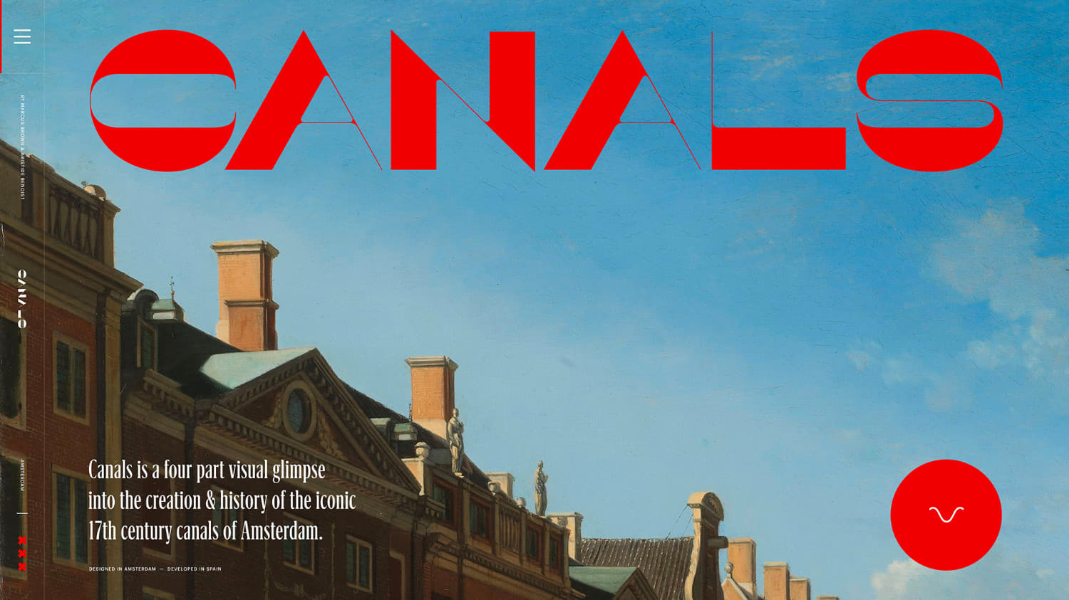
Wrapping up the year in style, we're delighted to announce CANALS a personal passion project, celebrating the iconic Amsterdam canals by Marcus Brown & Aristide Benoist wins SOTM December, thanks for all your votes, find the winner of the Pro Plan at the end of the article.
As an expat from New Zealand who had been living amongst the Amsterdam canals for five years, I had always been fascinated by the history. I was intrigued by how the city was built on water, how it’s circular shape came about and that incredible homes remain from the 17th century. Being very inspired by my surroundings, I decided to create a personal project which combined storytelling with a strong typographic art direction, wrapped in a smooth editorial-style experience. Teaming up with Aristide Benoist early in 2019 to develop the website, we both set the goal of releasing CANALS before the end of the year.
Layouts
Inspired by magazines and their attention to typography, the layouts were designed much like a double page spread. A ‘page’ was designed to fit within a standard viewport ratio with each of them sitting one after another forming a long looping scroll from left to right.
Inspired by magazines and their attention to typography, the layouts were designed much like a double page spread.
The intention from the beginning was always to do a horizontal navigation, the most fluid way to move through the magazine-like designs. The smooth sideways motion heightened the editorial feeling and was a point of difference to encourage users to engage with the content.
Content
In parallel to design explorations for the page layouts, writing the copy and sourcing related images became a considerable task and a key focus. As the typography was such a core part of the site, it was important that the copy was written early in the process.
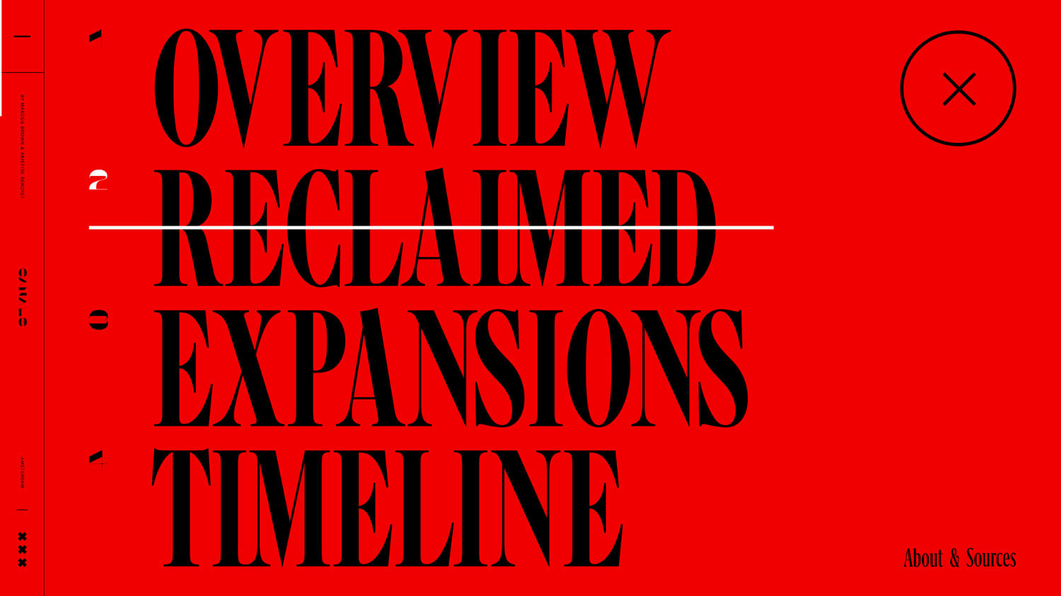
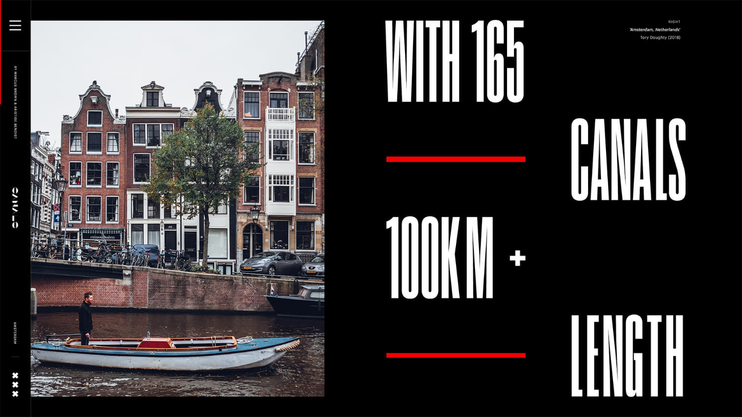
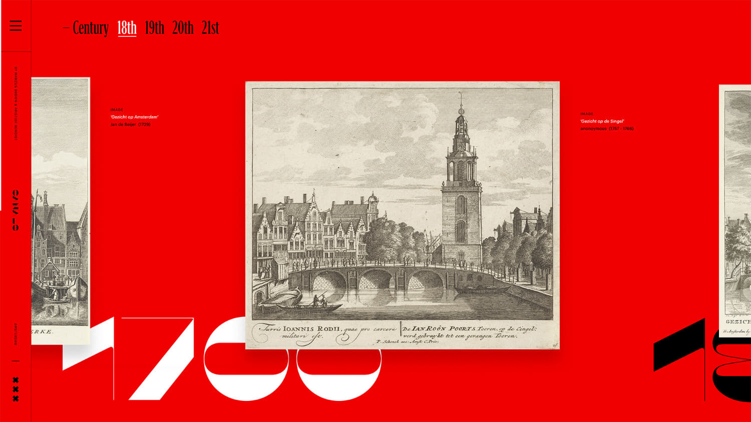
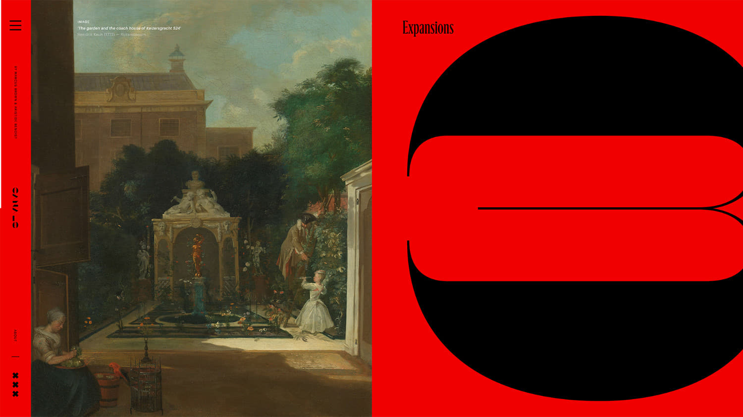
After months of research from book sources and online, the content was narrowed to three main sections. They take the user through a top level overview of the canals, to information about the construction on reclaimed land and to the city’s expansions. The fourth section showcases a number of historical images laid out in a horizontal timeline.
Art Direction
Amsterdam is a beautiful city with a rich Dutch history, a strong identity and one that revolves around water. I wanted to represent the iconic nature of the canals with an art direction to match. One of the primary means was the use of a striking colour palette of red, black and white drawn from the Amsterdam flag.
Inspired by 1800s typographic poster designs, CANALS features a variety of different typefaces, something not commonly seen in web design but popular many years ago.
Inspired by 1800s typographic poster designs, CANALS features a variety of different typefaces, something not commonly seen in web design but popular many years ago. Each typeface in the website serves a different purpose such as Maelstrom Sans mimicking the shape of canals and flow of water, Graphik for copy readability or Grifinito to give an old historical feel.
Motion
Very special attention was paid to the motion and overall feeling of the website. We wanted to elevate the designs through movement but not distract from the visual design and editorial approach. Careful decisions were made on how the imagery was treated during scrolling such as added parallax and scaling, which typography had transitions and where we added interaction.
Technical
➭ Server architecture
To deliver the website, we use an OVH web hosting based on an Apache HTTP server (version 2.4).
➭ Technologies
The languages we exploit on CANALS are HTML, CSS, JS and PHP version 7.2 on the server side. The entire website is built from scratch, which means that no libraries or frameworks are used. This allowed us for example to only have 74 Ko of scripts before gzipping on the whole project.
➭ Technical features
Because of the horizontal scroll, we had to render pictures in WebGL to prevent any janks on scroll when an image comes into view. The WebGL also permitted us to use parallaxes and scales on full screen pictures without impact on performance.
The main difficulties were to manage the horizontal scroll with the significant content (DOM), and also to deal with the different layers: html elements behind the WebGL canvas, elements over it and WebGL layers between themselves. We did a dedicated version for the mobile devices with a classic vertical scroll. In this way, we didn't need to use WebGL, so neither a preloader which makes the website really more reactive, which is the most important thing for us on a mobile experience.
Thanks to everyone in the web design community who took the time to vote and tweet: @marioecg, you've won a free year's Pro Plan in our directory for designers, DM us on Twitter to receive your prize!