Massive congratulations to Louis Paquet, Ingamana, Kim Levan, KOKI-KIKO and Thomas Aufresne for winning Site of the Month May for C2 Montréal. Thanks to everyone who voted, the winner of the Pro Plan is at the end of the article
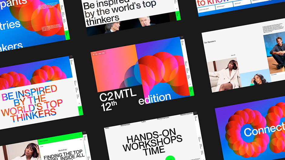
Imagine a world where cultures intertwine, diverse thinkers collide, and creativity knows no bounds. That's the essence at the heart of C2MTL, Canada's premiere creative-business event. Each year, C2MTL gathers some of the world’s most disruptive, innovative and creative minds from around the world to our vibrant city of Montreal. This year’s theme? Combined Perspectives.
Breathing New Life into C2MTL
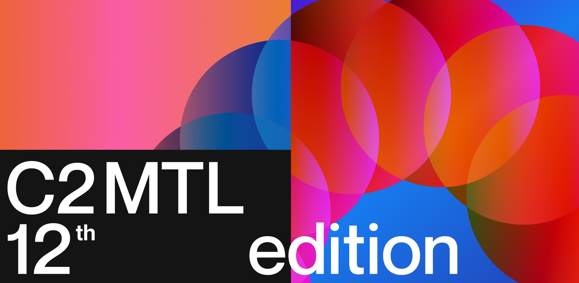
With the goal of infusing C2MTL with a renewed energy, we set out to completely revamp its brand for this year's edition. Through an exploratory phase, we uncovered the brand's essence by identifying key identity pillars (Curiosity x Human x Connection) and visual concepts (Plurality x Imperfection x Festivity) that capture the core spirit of C2MTL.
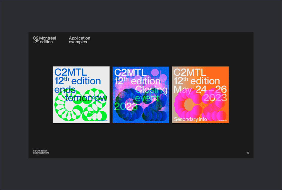
We then developed a comprehensive brand toolbox to champion the creation of a very large number of assets, including printed materials, digital ads, animated visuals, event scenography, and, of course, the website. Our approach focused on creating core brand elements that can easily adapt and transform within their environment, reflecting the transformative nature of the event and the humans that make it.
Our Iterative Approach to Creativity
Inspired by C2MTL’s theme, we approached this project with a holistic mindset, ensuring that every aspect of the brand experience is carefully considered. Rather than adhering to a strict linear process, we embraced an iterative and circular approach. For example, we actively engaged our web designer and developers from the early stages of branding, which ended up influencing some brand elements, including the logo. By fostering a creative culture where all disciplines intertwine, we were able to achieve seamless collaboration and witness the heightened creativity that emerged from the interplay of our very own Combined Perspectives.
Agility, collaboration, curiosity, creativity and respect were the essential ingredients that made this project so seamless, unique, and enjoyable. And that’s despite operating in three different time zones, from Buenos Aires 🇦🇷 to Amsterdam 🇳🇱, with a layover in Montreal 🇨🇦.
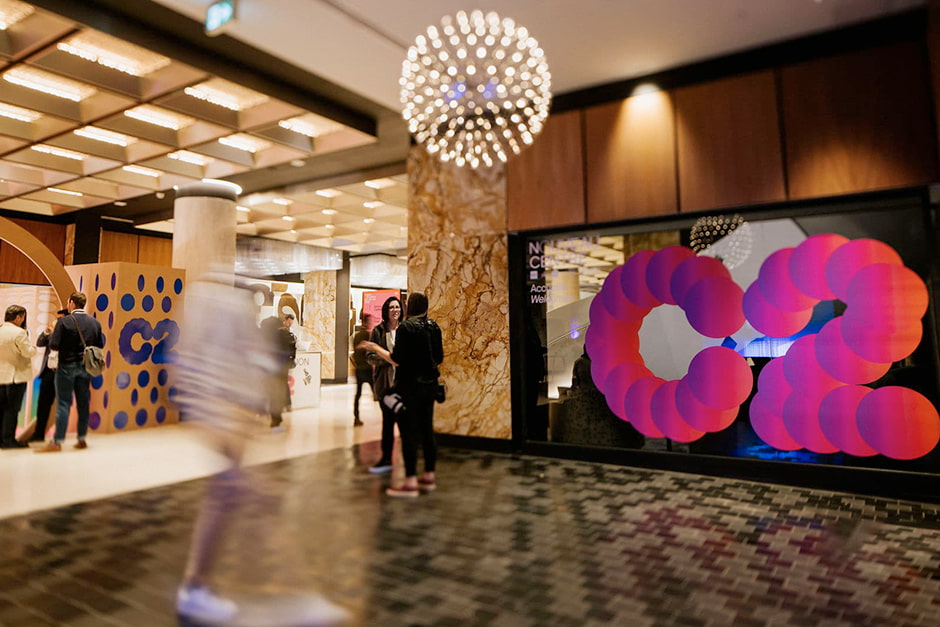
A Festive Welcome
C2MTL is far from (just) a business event; it's a vibrant celebration of diversity and creativity. So it was important to us that users feel this festive energy right from the get-go. As soon as they land on the Homepage, they’re greeted with a dynamic and impactful visual experience full of vibrant colors. The C2 logo, composed of interconnected spheres representing the unique individuals contributing to the C2 experience, initially appears as an abstract pattern. However, as users scroll down, the spheres zoom out, revealing the clear letters of the logo and reinforcing the idea of multiple humans coming together.
These C2 spheres were crafted using WebGL and Blend Modes, providing users with a captivating 2D experience. Additionally, 3D spheres were also introduced in the event countdown located in the footer of every page. These spheres rotate on their X-axis and display a parallax effect on scroll, enhancing the visual depth and perspective. In order to save time (and unnecessary meetings), we put together a handy interface using a tool called dat.GUI to enable our designer to easily and quickly test out the spheres' aesthetics. By using Blend Modes on the spheres and overlapping content, we knew this could potentially impact the site’s performances. To mitigate this, we implemented measures such as avoiding rendering of the WebGL canvas when the spheres are actually not visible to the user, which ensured smooth navigation.
Layers in Motion
Exploring the concepts of superpositions and layering to bring Combined Perspectives to life was super fun! It led us to incorporate various shapes and cutouts that elegantly unveil hidden content as users scroll. And while we're all about playful design elements, we also had to make sure to keep the website professional and user-friendly. Striking this delicate balance was a top priority as the website has two main objectives: providing the important event details - like dates, locations, and speakers - while also getting users all hyped up and excited to snag some tickets.
To create the text cutouts, we harnessed the power of CSS lighten blend mode as well as layering techniques. To ensure optimal legibility and highlight the copy content, we also implemented a backdrop filter. This not only improved text clarity but also subtly toned down the asset behind the mask, allowing the copy to shine bright.
Striking the Perfect Balance
In terms of movement, we incorporated vibrant user-centric animations, but without compromising on loading speed and information accessibility. Each page of the website is meticulously crafted to meet its unique requirements, striking the perfect balance between captivating visuals and seamless functionality. For instance, the Homepage and "About Us" pages come alive with engaging animations and storytelling elements, while the "Speakers" and "Schedule" pages focus on efficient information delivery with minimal distractions.
Throughout the website, purposeful micro-animations breathe life into the UI, offering immediate feedback to users, conveying the brand identity, and capturing attention with carefully timed stagger delays that establish a hierarchy of importance. We leveraged overlays on key pages such as Home, “Speakers”, “Programming”, and “Blog” to streamline content access, while seamless transitions facilitated by shared elements like the WebGL canvas in the background ensure a smooth and fluid navigation experience.
To end on a cheesy (but heartfelt) note, we could go on and on about the countless intricacies and details of this project. However, its true essence lies in the passionate humans involved and their remarkable collaborative efforts. It really all boils down to that. 🫶
Tech Stack
- Frontend Framework: Vue.js/Nuxt.js
- Styles: Sass preprocessor + BEM naming convention
- WebGL: Threejs
- Motion: GSAP + CSS
- Smooth-scrolling: Lenis
- CMS: Contentful
- Events and Artists data-fetching: Fanslab API
- Hosting:Netlify
- Marketing and Subscribers: Active Campaign
About KOKI-KIKO
KOKI-KIKO is the smallest of agencies, run by two, powered by hundreds. We believe in the magic of tailored teams, curating the perfect blend of talent for each unique project. As a strategic creative studio, our power lies in defining, building, and expanding brands that not only catch the eye but also connect to the real world. Fueled by projects that put humans at their core, we value curiosity, collaboration, respect, and pleasure in our work and relationships. Our secret weapon? Next-level agility with a laser-focus on the essential, without any fluff or BS. ✌️
Credits
Brand Strategy: Kim Levan, Khoa Lê
Creative Direction: Khoa Lê
Brand Artistic Direction: Maude Turgeonn
Digital Strategy: Kim Levan
Web Artistic Direction: Louis Paquet
Web Development: Thomas Aufresne, Ingamana, Vincent Weyh
Thank you for your vote and tweets @OlehMostipan, please DM us to collect your prize!