Introduction
Readymag is a no-code design tool for creating websites of any kind, be it a landing page, a presentation, or a multimedia editorial. However, portfolios occupy a special place among Readymag’s use cases—especially creative, nonstandard portfolios, since they fit our “blank canvas” and free-layout approach. It was part of our DNA from the very beginning, so we wanted the new landing page showcasing Readymag’s portfolio use case to instantly show the tool’s potential while still feeling light and inspiring. At the same time, this page had to differ in tone and visuals from the main site, which speaks to everyone at once. Here we focused instead on a narrower audience—designers and creatives looking for a way to build an expressive online presence.
Balancing information and engagement
The site is built on a rhythm of clean, digestible info alternating with visual fireworks. This alternating sets a visual, semantic, and emotional beat: each bit of information lands quickly, then sinks in or overlays with the examples.
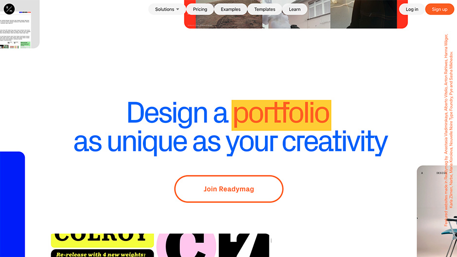
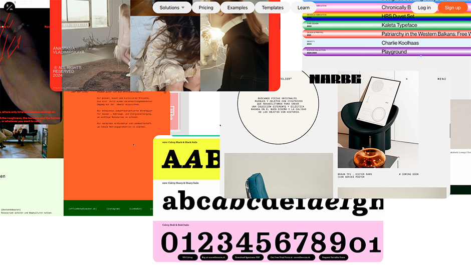
The page starts with a white background and a minimalist headline to set the tone, but once you scroll, looped video frames of the outstanding portfolios made with Readymag glide in from the edges toward the center—moving at different speeds and directions, yet creating controlled richness, not chaos.
The idea was to immerse users in visuals immediately after a short intro, instead of the usual “what and how” pitch. Our audience is mostly visual, and images hook them faster than words.
“I came to this solution because I wanted the title to be readable at first glance, but then quickly highlight the examples. This way it creates a kind of curtain that also helps connect to the following sections”—Francisco Pires, project designer
Inspiration from the community
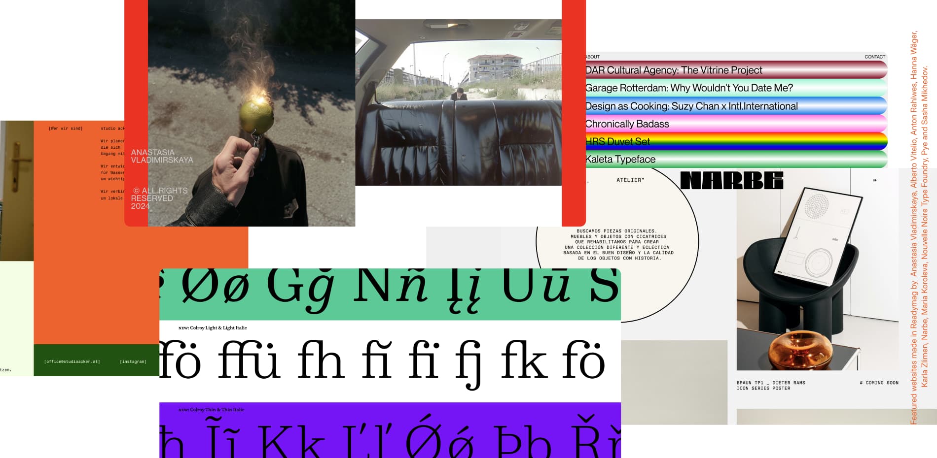
We care deeply about the community around us and highlight great user work whenever possible. That’s why the first, inspirational section of the social proof block features selected portfolios—each with a demo video and a link to explore in detail. The navigation here is horizontal, adding variety and providing relief from the long vertical scroll.
Show, don't just tell
Next comes the core: showcasing features and capabilities. We use two approaches: demonstration and interactivity.
The section begins with a full-screen demo of tools inside the Readymag Editor. As you scroll, this demo shrinks into a window, with feature descriptions on one side and, on the other, our inspired invention: a tiny TikTok video explaining the same feature. It’s more like a preview, but it nudges interested users to check out the short, easy format. TikTok is our secret weapon and a major source of new users.
“Because the page was long, if it was always designed with the same structure, it could easily become boring. At the same time, we needed to highlight the Editor’s advantages, so I arrived at this solution using Readymag’s animation features,”—Francisco Pires, project designer
This part highlights the essentials: the WYSIWYG editor, a huge font library, video embedding and customization, device adaptation, Shots (our widget that allows you to turn video or image sequences into stills, shown one by one when users scroll or hover over it), plus pre-built widget and animation combos called presets for faster workflows.
Then comes interactivity—smaller features you can literally play with on the landing page. In the draggable objects section, you can drag squares beyond the frame, mischievously breaking block boundaries. Hovering over the Custom cursor block changes your cursor, and the Hover me text sprouts shadows. This lightweight interactivity, easily built in Readymag, keeps engagement fresh beyond default scrolling.
Wrapping up with proof
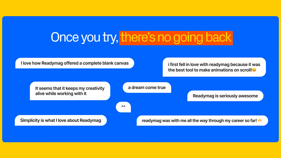
Then comes the second, convincing wave of social proof: user reviews. Word of mouth has always been important to our growth, so we carefully collect and anonymize feedback for exactly this purpose.
After that, things are straightforward: a functional CTA screen plus a selection of training and educational resources. Even though we’re describing the desktop layout, all elements here are designed large and high-contrast—for accessibility and smoother onboarding.
Technologies and team
Here we can proudly say that not a single web developer was harmed in the making of this site. Aside from a bit of code for variable fonts, everything was built directly in the Readymag editor by designers’ hands. The main tools were Video widgets with trigger-based animations, and Shots.
Thanks to the simplicity of creation, the core team included just three people: a designer, who was responsible for both the creative and the site’s implementation; a marketing manager, who shaped the concept and coordinated the process; and an editor, who wrote the texts. The final outcome was the result of many iterations, with different ideas and directions eventually reaching consensus. The process was fast too. “Excluding strategy, concept, and design, implementation took about a week,” says Francisco Pires.
About Readymag
Readymag is a design tool for creating anything on the web—websites, landing pages, presentations, multimedia editorials, or portfolios. Built by designers for designers, it has stayed true for over 10 years to the principles of maximum creative freedom and intuitive accessibility.