Warning designers, we are facing an invasion. A “Brutal” invasion of gigantic cursors, crazy hovers and unusable galleries! Brutalism in web design laughs in the face of rationalism and functionality, in the world of design it can be defined as Freestyle UGLY irreverent RAW and superficially decorative etc. Check out some articles and examples of brutalist websites that will blow your mind with interesting digressions like THIS ONE or THAT ONE.
How do you spot a Brutalist website?
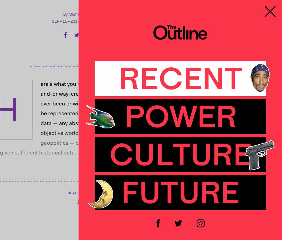
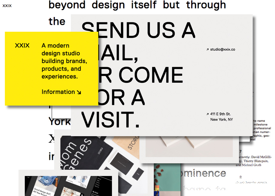
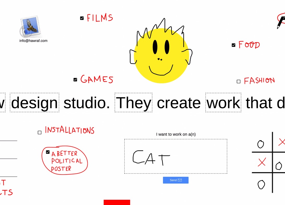
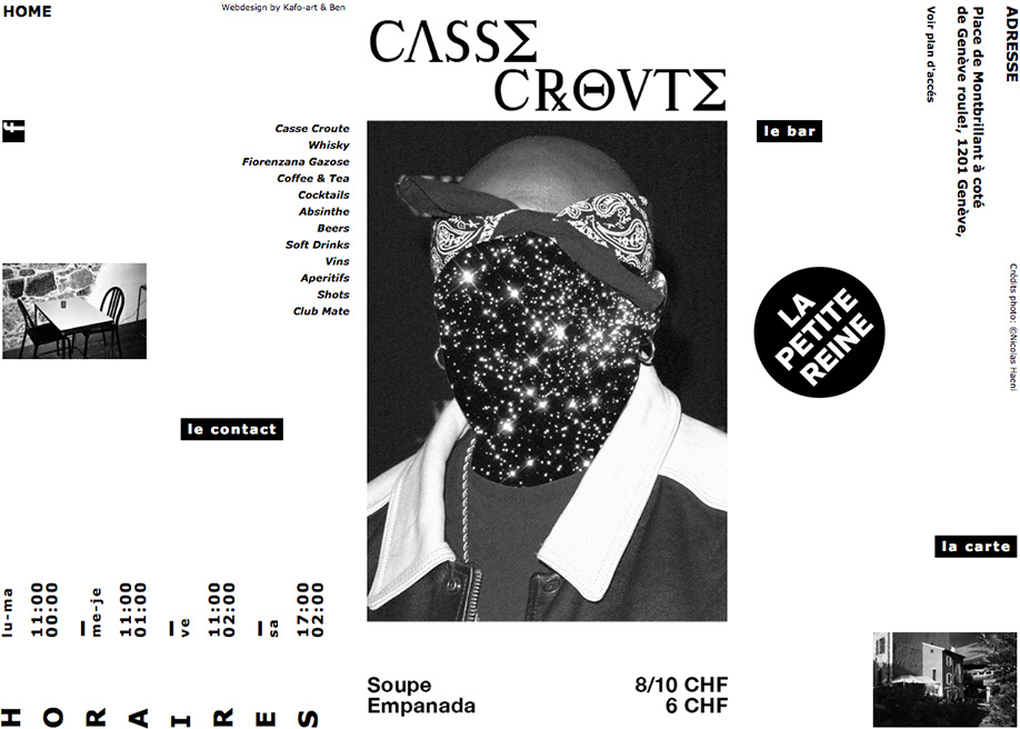
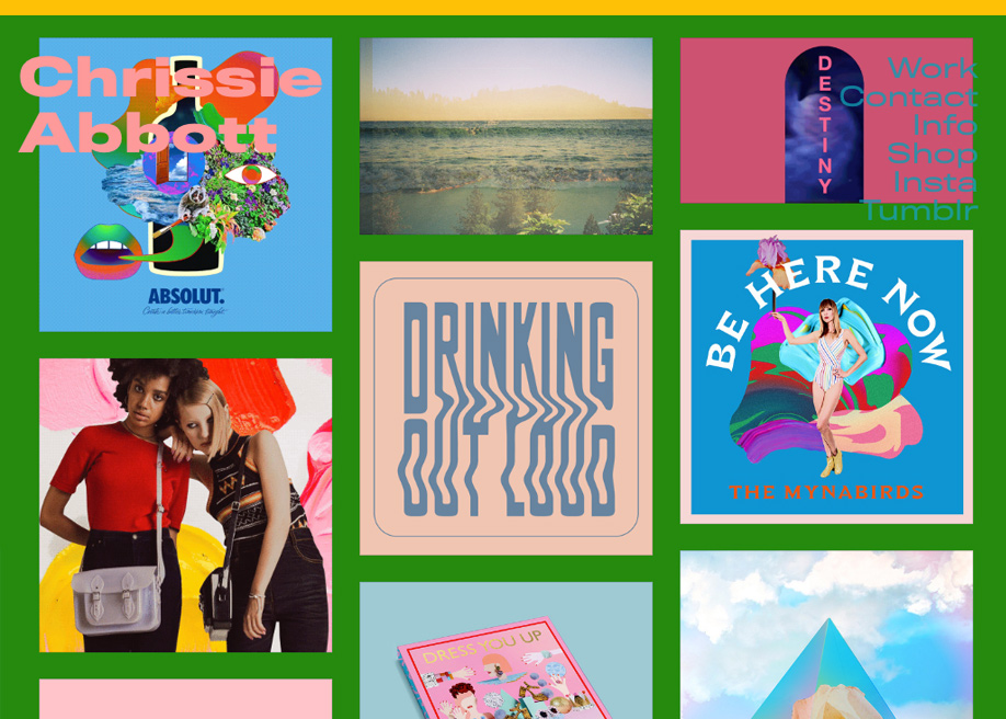
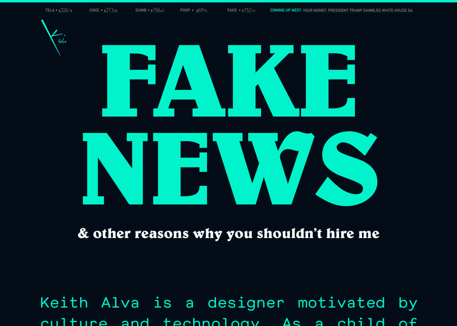
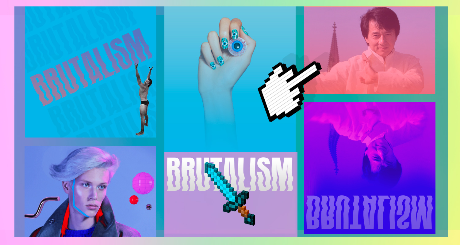
Coming from the universe of UX & Interaction Designers, (previously known as web designers or even further back webmasters) We can find an excessive abundance of Hover effects, System Fonts, Web Safe Colors, Hero Typography, Micro-Interactions, Pop Culture Icons and Images in the weirdest and most uncomfortable of places. Photos that appear and disappear as if they came with no opacity transition and a long series of user UNfriendly practices, presented here in this article or found in our collection “Brutalism in Web design”
(Note: This article is optimized for Internet Explorer 6.5 with lots of inline styles)