When Cartier reached out to collaborate on their 2024 Yearbook website, we were excited. It’s not every day you get to work with a jewellery brand with over a century of history.
From the very first meeting with their digital brand team, the collaboration felt natural and creative. It set the tone for one of the most rewarding website experiences we’ve had the chance to create.
Here’s a bit of the story behind how we designed and built it — what went well, what we learned, and what challenged us along the way.
The Project
365 — A Year of Cartier is the digital version of Cartier's annual print publication, capturing the brand’s highlights from the past year. This year’s goal was to create a website that people enjoy browsing. Like flipping through a magazine and picking out the stories that catch your eye.
While the project’s main goal was to create a timeless and intuitive browsing experience, both Cartier’s team and ours were eager to add creative twists, bringing more fluidity and small moments of surprise to craft a site that reflects the brand’s creative ambition.
Designing the Yearbook
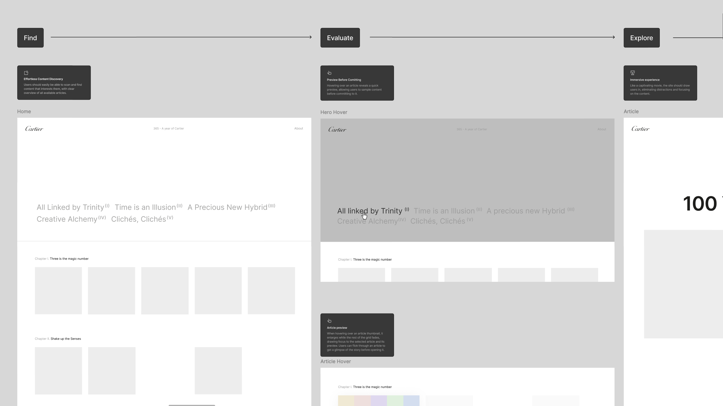
This year’s focus was on offering users a glimpse of the full year in just a few interactions. Inspired by Netflix-style browsing, but with the editorial feeling of reading magazines. We wanted people to get a clear overview of the content, with previews and short descriptions, that made it easy to pick what they were most curious about.
That’s why we designed the homepage almost like a menu: a custom grid, divided by chapters.
We also added a few UX touches to make the reading experience smoother:
- A “read” state that marks thumbnails with a small red triangle, like a folded corner, once an article has been read.
- Endless scroll articles that automatically load the next piece when you reach the bottom of a page.
- A sidebar navigation on article pages, so you can easily jump to another article within the same chapter.
Scaling Elegantly
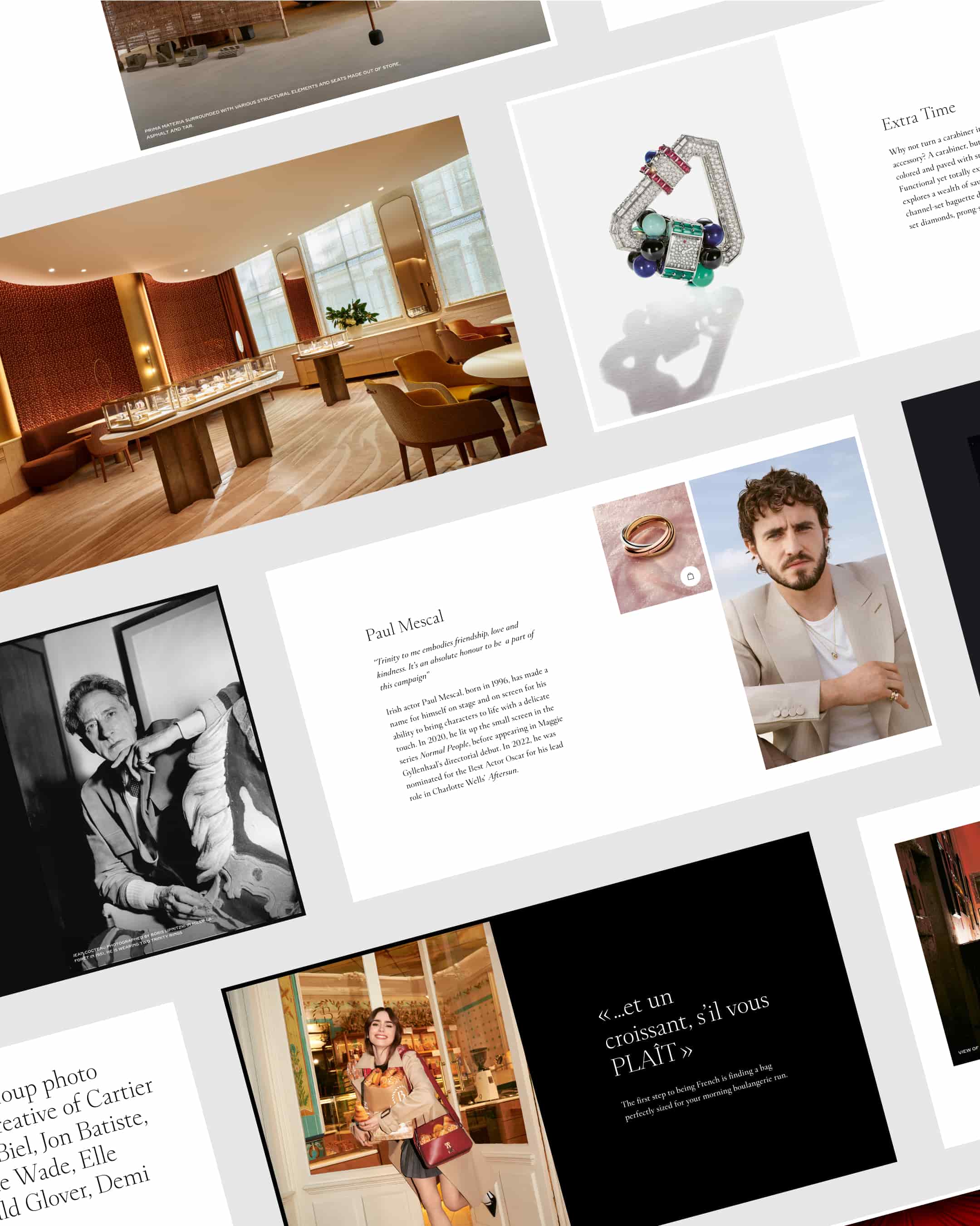
All 32 articles are built with just 15 reusable components, assembled in different ways like modular building blocks to create variety without unnecessary complexity.
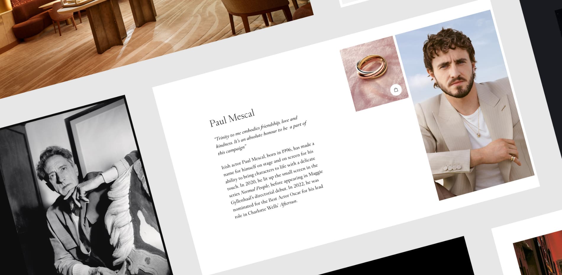
Some articles - the ones with bigger thumbnails, are “highlighted” pieces. These are special: each one features a unique creative component that reacts on scroll and adds to the storytelling.
Form Meets Function
To achieve a seamless user experience, we implemented smooth page transitions and elegant scroll animations. The site integrates both traditional HTML/CSS elements and a progressive WebGL layer, enabling advanced visual effects such as image distortions and interactive 3D jewellery elements. This hybrid approach ensures accessibility as all the content is in the HTML, while also delivering high-end interactive motion.
We put a lot of effort into making the performance as good as possible. Cartier has a global audience and the site had to load as fast as possible, even on slower connections, without compromising visual quality.
One major problem with WebGL images is that they can lock-up the website while they are uploaded to the graphics card — and this site has a lot of high quality images on the landing page which makes it quite challenging. We decided to convert WebGL images to the KTX2 format which is streamlined for use on GPUs. The downside is a bit larger file sizes but the end result was an overall faster and smoother page load.
During the Quality Assurance phase, we integrated comments from Vercel directly into our Slack workspace, which turned out to be a huge time-saver. It made it super easy for everyone to leave comments on specific pages and components on the website, without breaking the natural flow of the team’s communication.
Tech stack
- React & Next.js
- (Framer) Motion
- R3F (React Three Fiber) and three.js
- 14islands r3f-scroll-rig
- SASS & CSS Modules
- Vercel hosting (for development and testing)
- AWS S3 static hosting for production
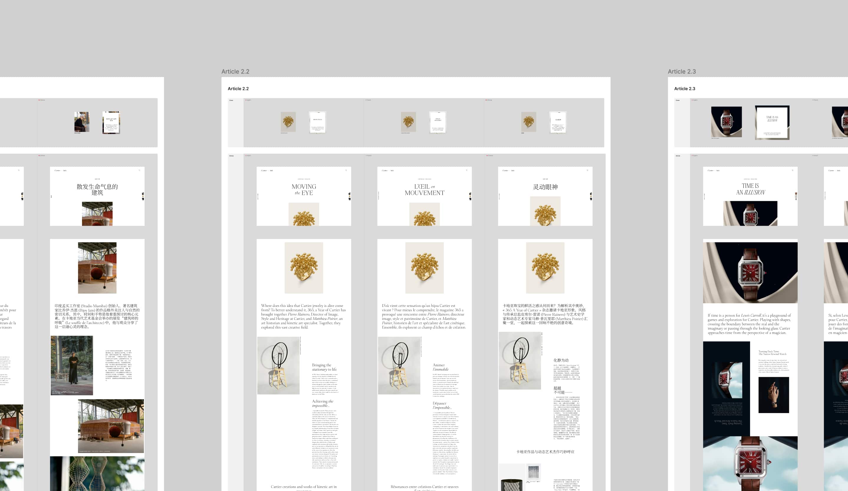
The Multi-Language Challenge
The site had to work across three languages: English, French, and Chinese. Since the layouts used a lot of different typography styles and carefully designed title compositions, we couldn’t just translate the site using spreadsheets. Instead, we duplicated all 32 articles in Figma and manually adapted the line breaks and compositions to fit all three languages — which added up to 105 pages. From there, we placed the copy manually into the codebase and proofread everything carefully. Proofreading Chinese without speaking it definitely kept us on our toes!
On the technical side, a key challenge was supporting three languages while managing a large volume of content across different layouts. We implemented Next.js internationalisation (i18n) routing and structured the content to make translation management more efficient. This also meant handling typographic differences carefully, making sure the visual balance stayed consistent across languages with different text lengths and character sets.
It was a real team effort together with our client’s editorial team, and it was all worth it in the end!
A Project to Remember
This project was special for a lot of reasons. It was our first time working with Cartier, and the collaboration was genuinely smooth from start to finish. There was a lot of trust as Cartier gave us space to bring ideas to the table and shape the digital experience as a team.
Overall, we’re proud of how the site turned out: a creative yet timeless space that captures the spirit of the original print yearbook, and in a way that feels right for the digital world.
14islands
We’re a Creative Studio with offices in Sweden and Iceland. We design and build lovable digital products, websites and branded experiences.