Conveying the scale of a system without overwhelming the user. Highlighting advanced technology while making it feel warm and human.
These were the challenges our team at Zajno faced when designing the website for OPTIKKA — a creative orchestration platform that transforms traditional design workflows into intelligent, scalable systems.
While we were searching for the right visual metaphors based on the client’s target audience, values, and product essence, the development process itself created new puzzles — and opened up unexpected creative possibilities. Here’s how we tackled them.
Finding the Right Visual Metaphors
We started with OPTIKKA’s core idea: it's a tool that helps teams generate and customize marketing materials across formats using AI. Simple inputs become complex structures, all at lightning speed.
The platform’s target audience includes marketers, creative directors, producers, franchise owners—anyone looking to produce marketing assets quickly and efficiently. We focused on what unites them: solving complex challenges, working with systems, and embracing innovation. These insights helped us shape a visual language that speaks directly to them.
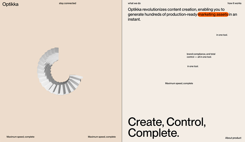
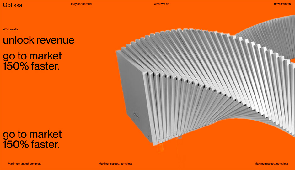
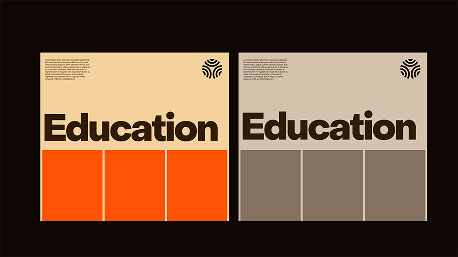
To capture the layered complexity of the platform, we used the metaphor of stacked layers merging into a cohesive system.
We also introduced another visual device: a bird’s-eye view of creation. This perspective helps communicate OPTIKKA’s scale and power while reinforcing a sense of structure and clarity.
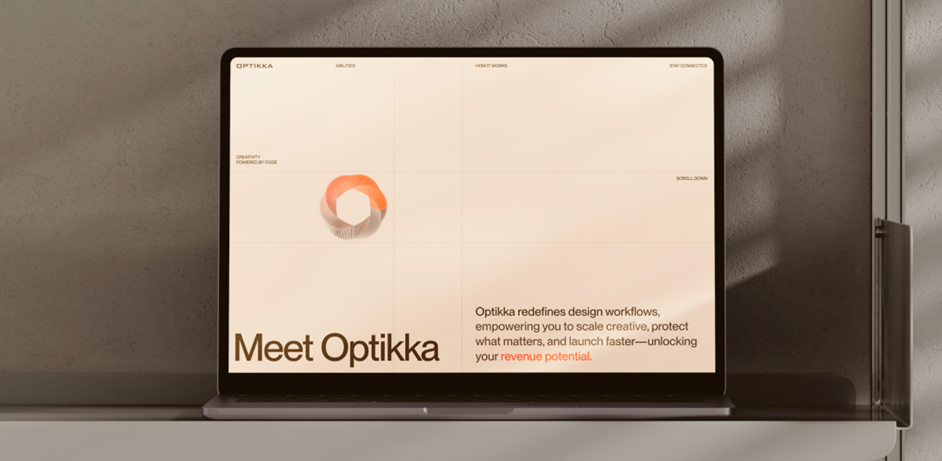
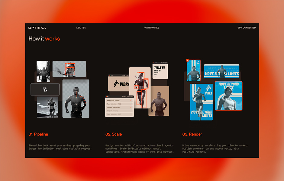
On the hero section, a rotating circle displays uploaded files—a small element that, as the user scrolls, expands into a vast ecosystem of marketing assets. The animation shifts to a bird’s-eye view to show the magnitude of this system, with each tile symbolizing an individual file. Then, as the scroll continues, the user “dives” into the system, as if entering a tunnel—a gesture that underscores accessibility. The next section shows a visual collection of assets in various formats—a recap of a file’s journey from upload to output.
A Warm Approach to Technology
One key challenge we faced was that technology, especially when shown at scale, often comes across as cold and impersonal. When visuals emphasize the grandeur of a system, the human presence can feel diminished.
But OPTIKKA exists to serve people—to simplify workflows and save time and effort. So, we needed to visually communicate that the system works for the user, not the other way around.
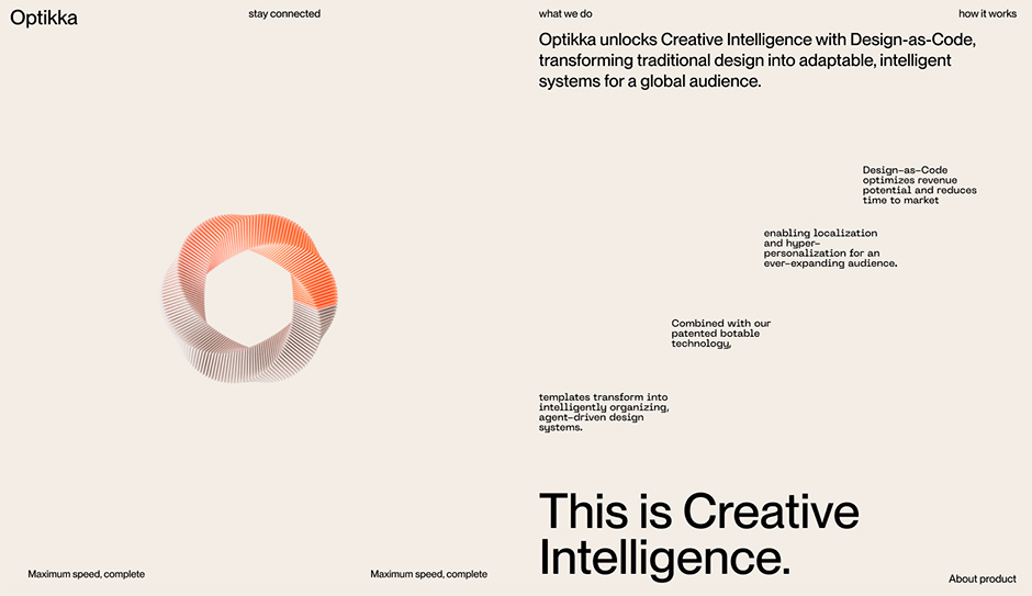
Our solution: use a warm, human-centered color palette. Sand tones as a base, coral accents for contrast—this softens the “coldness” of digital aesthetics and creates a sense of approachability. The result? A system that feels structured, yet welcoming.
Developing the Tunnel Animation
During the development of the Optikka website, Zajno's team encountered an interesting technical challenge: creating a smooth tunnel animation synchronized with the page scrolling. Initially, the solution was based on using video, but during the optimization process, a decision was made to switch to frame sequencing. In this article, we would like to take a closer look at the reasons for this decision and present both approaches.
Initial approach: HTML5 video
Initially, to create the scroll animation, we used a standard approach with HTML5 video and to track the scroll progress using the GSAP ScrollTrigger:
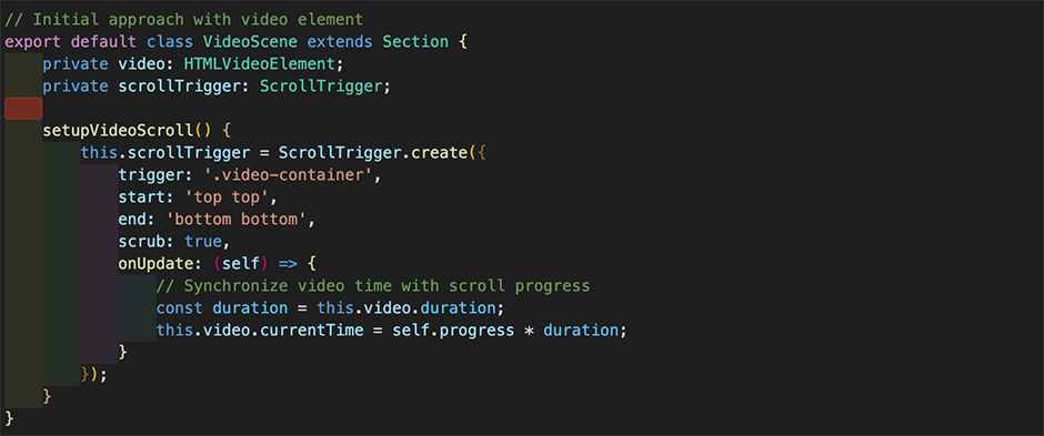
We liked this method for its simplicity and compression efficiency. But soon we hit a wall:
- Jittery playback, especially on mobile;
- Inconsistent behavior across browsers;
- Auto-play restrictions in many browsers;
- Loss of quality due to video compression — a big issue when showcasing design.
So, we pivoted: instead of embedding a video, we used a frame sequence—individual images played in quick succession to simulate motion (just like traditional animation or film).
Frame Sequence: The Better Way
We used FFmpeg to convert our video into individual frames, outputting them in the WebP format. To set up rendering on mobile and desktop, we need to create two sets of sequences:
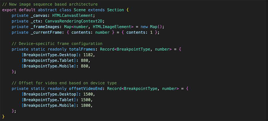
We also needed Dynamic Path Definition, where the path to the shape image is based on the current device type:
- Desktop: /desktop/frame_001.webp
- Tablet: /tablet/frame_001.webp
- Mobile: /mobile/frame_001.webp
However, this raised new questions: How do you load over 1000 images without bogging down the experience? Our solution: smart staged loading.
We developed a multi-stage loading strategy:
- Instant start: The first 10 frames load immediately
- First frame display: Gives the impression of instant animation
- Background loading: Remaining frames load quietly in parallel
We used a ParallelQueue to enable concurrent loading and avoided reloading preloaded frames by defining a smart preload range.
All rendering happened in an HTML "canvas" element, which enabled ultra-smooth animation and even allowed us to loop a seamless animation on the homepage—that pulsating file-circle on the hero section.
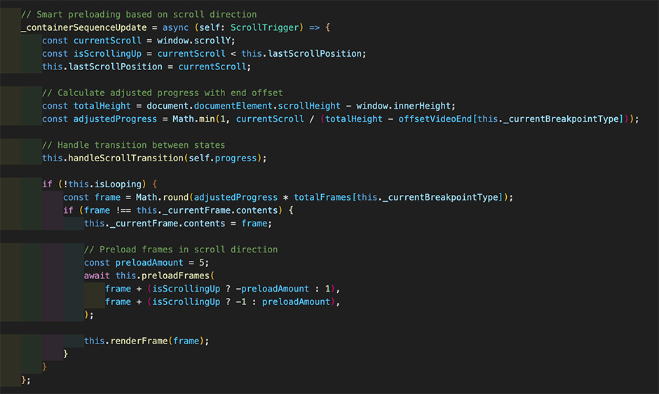
And here’s the clever part: scroll-direction-based preloading. If the user scrolls down, the system preloads 5 frames ahead. Scroll up—it loads 5 frames behind. Simple, but powerful.
Outcome: Why It Was Worth It
Switching from video to frame sequences came with clear benefits:
- ✅ Rock-solid performance on all devices;
- ✅ Perfect image quality, no compression artifacts;
- ✅ Full control over animation behavior;
- ✅ No browser restrictions;
- ✅ Optimized output for every screen size.
Of course, there were trade-offs:
- ❌ Over 1000 server requests instead of one;
- ❌ More complex development process;
- ❌ Separate sequences needed for each device type.
Final Thoughts
Working on OPTIKKA’s website was a journey of both creative clarity and technical complexity—from defining the project’s core concept to rethinking how scroll-based animation should work.
Ultimately, choosing a more technically demanding path paid off. When the goal is to deliver an exceptional user experience, the extra effort is always worthwhile.
Technologies
Frontend Frameworks and Libraries: Astro, Rescript, Lottie, Lenis, SVG animation.
Backend Technologies: FFmpeg, ParallelQueue.
Tools: HTML5, CSS3, SCSS/SASS.
Company Info
Zajno is a digital design studio that’s all about breaking the mold! We don’t do boring websites or ordinary apps—we specialize in crafting the wildest, most unconventional digital experiences out there.