Jul 14, 2021
Aristide Benoist — Portfolio 2021 wins Site of the Month June 2021
We are very happy to announce Aristide Benoist and Jon Way have won Site of the Month June for Aristide – Portfolio 202. Thanks to everyone who voted and tweeted, find the winner of a free year in our Design Directory at the end of the article.
Having not renewed my portfolio for almost two years, it was important for me to work on a new version. My approach and my code have evolved a lot since then, and I felt it was important that my portfolio reflect those changes.
Going into the project, I had a very clear idea of what I wanted for this new version, both in typography and general motion. However, despite my love for design and the daily time I devote to it, what I’m capable of creating in this field for me is sorely lacking in sensitivity. So I contacted Jon Way, a freelance creative based in Los Angeles (CA). His work stands out a lot from what is currently being done in the web industry, and that is a major priority for me. I shared my initial thoughts, he liked the concept, and shortly after we began work.
Initial idea
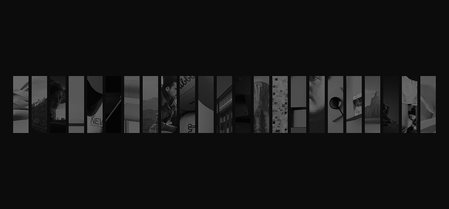
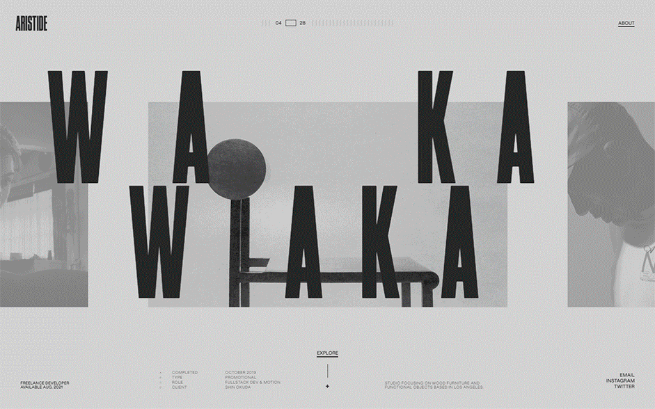
In this new portfolio, I wanted to present a large number of projects through a simple, visual, and unique navigation. With that in mind, I started to explore different directions until I landed on something I was happy with.
Here is what I took away:
Home opening animation
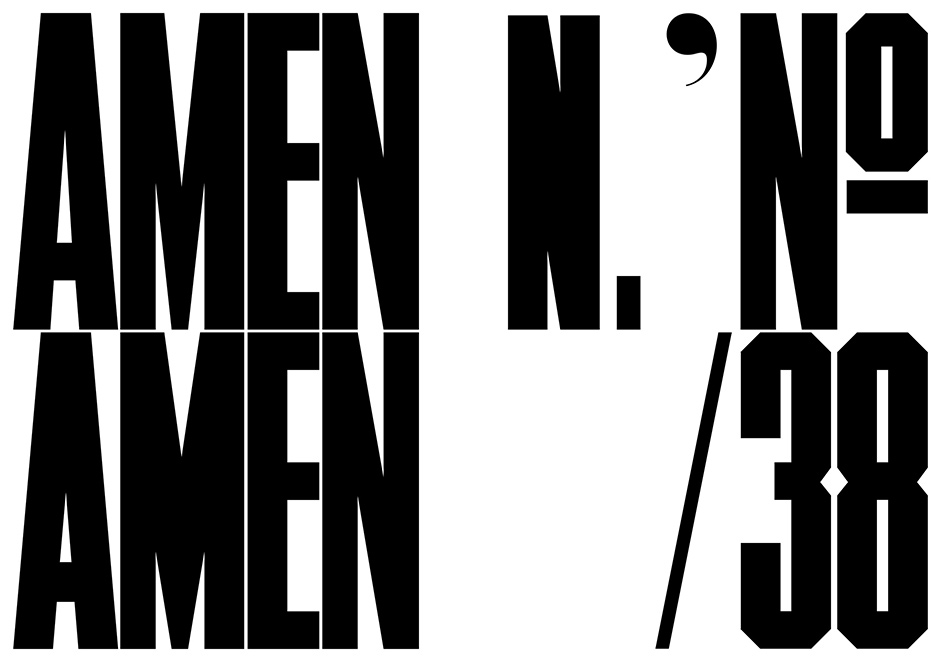
Timmons NY
Being a fervent admirer of the work of Matt Willey, a graphic designer based in Brooklyn (NY), I wanted to use one of his original fonts as a way to pay tribute to him. Timmons was the one I chose: a bold, compressed condensed display face. As a lovely side-note, all proceeds of Timmons go to support cancer charities, which can be found here:
→ https://mattwilley.co.uk/Timmons
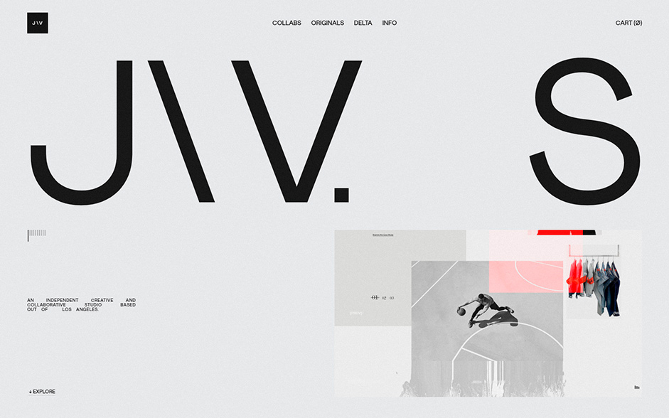
Main experience
That's when Jon stepped in. I shared with him the navigation I had chosen, as well as my interest to use Timmons as the main font. He started to explore a multitude of ideas, and after a lot of back and forth, we landed on something we were both happy with.
We wanted to see if and how we could take the experience a little further by exploring new possibilities, such as a grid view
Home opening detail animation
Once this base was established, we wanted to see if and how we could take the experience a little further by exploring new possibilities, such as a grid view. We designed and created an additional grid experience we really liked, but I made the decision to remove it in favor of a simpler experience. Despite removing it from my site, Jon and I are working together on a new project where this grid will be part of the experience.
Home grid option
Home grid and project detail navigation
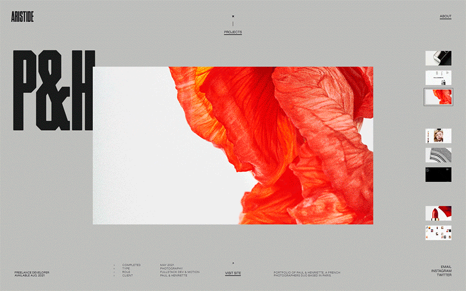
Also, we have explored various ways to navigate through the content of case studies, such as a simple scroll:
Project info navigation
After a lot of exploration, we chose to go with a version using thumbnails, being more interesting and original. I have more recently attached greater importance to user experience by ensuring that navigation and animations never paralyze user interactions. With that in mind, we opted to stay away from any form of scroll jacking– whether that was traditional scroll jacking or more subtle variations we explored that resolved content to a center position via directional easing. All variations came with their own cost/benefit, and we felt a click navigation, augmented with keyboard commands, was the smoothest and most uninhibited approach. There were some benefits of other approaches, but they came at other costs, such as the ability to jump from one image to another at any moment.
Project detail navigation
About page
Regarding the page, I gave Jon some guidelines and the content I wanted to present, and he explored numerous ideas and directions until we unanimously agreed on a direction. He then proposed to me this grid which I found really interesting:
With this page being accessible from anywhere, I worked on a few details to make each transition to this one interesting and different.
About page transition
Content
Once the site was developed, we worked on the content: a total of 28 projects that I wanted to present. Between the color combination specific to each case study, the different letter positions for each title, and also all the screens to be designed... It was a ton of work.
Technical aspects
- development from scratch: no libraries and frameworks used
- languages used: HTML, CSS, PHP and Javascript
- bundler: custom bundler I built using rollup, postcss and csso
- 67 Ko of javascript for the whole site before gzipping
- homepage pictures are rendered via the WebGL JavaScript API
- to minimize the size of the assets, the WebP format is used when the browser supports it
- JSON files are used to manage the content of the site
Credits
Jon Way
- Portfolio → https://www.jonway.studio
- Instagram → https://www.instagram.com/jonvway
- Twitter → https://twitter.com/jonway_
Aristide Benoist
- Portfolio → https://www.aristidebenoist.com
- Instagram → https://www.instagram.com/aristidebenoist
- Twitter → https://twitter.com/AriBenoist
Thanks for getting involved with the votes and sharing it on social media, @fant0mette you have won the pro plan, please DM us on Twitter to collect your prize.