Accessibility is a much-needed component in today's digital world. Having this fact in mind while creating can be tricky for both web designers and writers. Yet, more people need the ability to navigate through a website-or the web as a whole.
One in 4 adults in the US alone has a type of disability. This fact is enough to show the importance of accessibility through the digital experience. From eCommerce stores to email marketing, and web design that makes sense, here's how you can achieve it.
Accessibility in Web Design
Your website's visitors are a diverse crowd. Each visitor has their wants but a specific set of needs as well.
Designing for accessibility doesn't equal creating a website, that is void of the elements you find attractive. On the contrary, it will help you come up with fresh, more straightforward ideas.
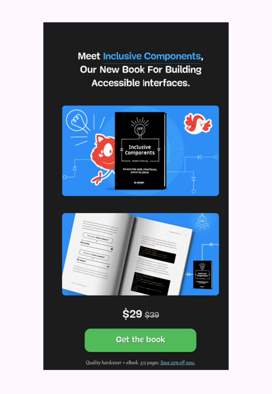
Here’s an example:
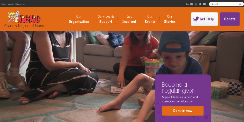
This website is by no means boring. It is also meant to be used by people-specifically, children-with disabilities.
Let’s see a tip or two on how to make it work.
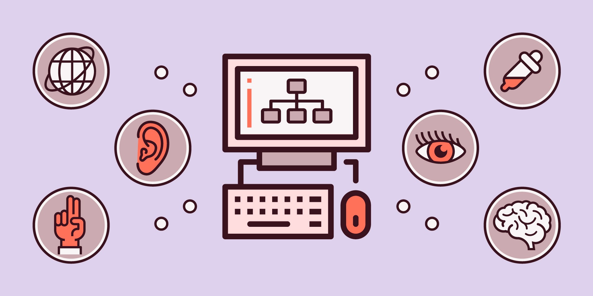
Create Buyer Personas That Will Reflect Accessibility
Your teams should examine the User Experience (UX) of your website in terms of accessibility when it comes to buyer personas.
Research your users and determine the percentage of those that need accessibility. Next in order of business would be to pinpoint their exact needs.
Your users are not perfect, which means that your user personas shouldn't be either.
If you’re unsure, you can take to your social media platforms and consult your users and their opinion on the content you write and the types of posts they’d love to see. Ask questions and come up with new ways to assist and engage your buyer personas.
This observation will allow you and your team to create under a different perspective when it comes to web design as a whole and accessible web design in particular.
Avoid Color-Coding
When you’re communicating something important, showing an action, or prompting a response, don’t use color as the only visual cue. People with low visual acuity or color blindness will have a hard time understanding your content.
Most of us have come across a website that likes to color-code things. For example, PayPal does exactly that, but with a twist:
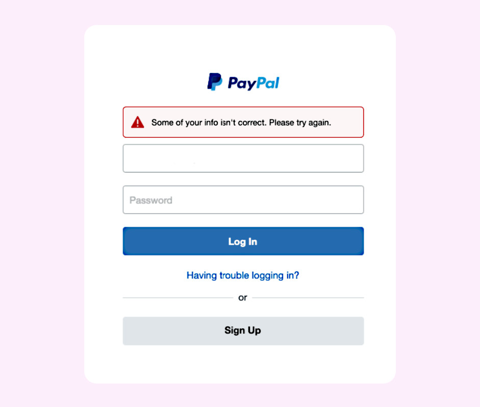
A color-blind person will be able to read the message as well as a person with no vision problems. Colored text is not reliable, especially when it comes to showing an error on the website. You can try other methods, like making the text bold or underlined, or even using a small symbol like the one above.
The same practice should be applied to other aspects of your website and marketing efforts. Keep it in mind while making graphs, charts, or analytics.
If you want to create an inclusive website, you can try to use labels, for example. A great idea would be to use different sized shapes to highlight something important and downplay something that could be secondary information.
If you’re unsure, you can either run color blindness tests on your website or just print the page you’re unsure of, or the graph, in black and white.
That way, you’ll be able to see for yourself and make sure everything you need stands out.
At this point, I should make a small reference to contrast again.
Contrast is very important for every visual marketing action that has a direct influence on UX, as it's important for people with vision impairment.
WCAG’s guidelines state that the contrast ratio between text and background needs to start at 4.5 to 1. You can go with a 3 to 1 ratio for a bolder font.
Check the contrast for any of the following:
- Buttons and menu items
- Placeholder text
- Logos
Using high contrast often creates an image many marketers or businesspeople had not envisioned for their website; for some, it can be too "bold" or "loud."
However, making a website accessible is much preferred.
Use Icons and Simple Navigation
Simplified navigation can go a long way and make a website accessible to everyone.
Sometimes, things that we may think of as “common sense” are not that common, which means that you’ll need usability testing first to make sure that everything goes according to plan. Trust your big data analytics to find out what could be missing from your website.
You may find that you need a sitemap, for example. Sitemaps are meant to help with the website’s navigation and would be especially useful not just for people with disabilities.
It can be of great use for people that aren’t so familiar with websites as a whole, the elderly that need to use the internet, and so forth.
Keeping your pages short and your headings informative and on a logical place on the website, would help people with reading disabilities, such as dyslexia.
People with dyslexia find it hard to run through long paragraphs. In this case, accessibility means content and design short, informative, and in a logical order.
Also, use autocomplete but with a twist. Since autocomplete function requires almost perfect spelling, people with dyslexia, especially those with severe dyslexia, might find great benefit in icons used next to words.
That way, when looking for a podcast that may have the same or similar name with a movie, they’ll be able to distinguish which icon they need to click. The same principle can be applied to almost any list, of course.
You can use it for your menus or even take it a step further and allow a pencil and a trash icon next to one of the fields your user has filled.
Go Keyboard
A pretty large number of people-myself included-prefer using keyboard shortcuts, instead of their mouse.
Add to that, the people that need people accessibility as a means to enjoy the experience you offer on your website. Keyboard accessibility needs to be one of the main things you’ll consider, as it can ruin UX for more people than you could think.
If you’ve decided to create a website with an element of gamification, like an interactive quiz page, for example, enable your users to do everything with their keyboard rather than their mouse.
For example, I use the tab key often, especially when I’m filling out forms because I don’t very much like using my mouse and clicking here and there. When I have a focus indicator, I know what will be selected if I use my enter button. Like this:
The order of the page is of high importance in that case. You need logical order, left-to-right, and top-to-bottom, to allow the user to know where to look intuitively, not by looking for that little green square on the screen.
Accessibility in Email Marketing
Email marketing is a staple for all sorts of businesses, making the need for accessibility even more significant.
Choosing one of the best email marketing platforms may be crucial to any industry. Picking out a newsletter design that will be inclusive is just as important. Here are a few necessary steps on how to make email marketing work in terms of accessibility.
Create an Email That Makes Sense
Email templates and email newsletters need tables to help create an email layout that will work across devices and email clients.
Most readers read text and emails from left to right and from top to bottom. Therefore, you could preserve the logical reading order of your email newsletter if you created it in a single-column and two-row format:
As you can see above, we've got a single-column layout. That way, reading the email's content in the wrong order is not a possibility.
To create a logical order for your email's content, you can create an HTML email that will have specific qualities:
- Use headings: The H1 tag, the H2 tag, and so on, will not only help your email's content stand out. Those elements will create a logical reading order for users that may not be able to see your content and need an assistive device to read it.
- Use contrasting colors: People with vision impairment or color blindness won't distinguish easily between the letters of your email and the background image. Choosing the colors of your emails for accessibility is a detrimental step. Just consider that 300 million people suffer from color blindness globally. Make sure to use more micro-copy and fewer color cues when it comes to your email newsletters' content.
- Use alt-text for your images: Make sure that it perfectly describes what your image is. That way, a screen reader will be able to describe the image itself.
Consult ADA
If you’re still unsure, you can always consult the Americans with Disabilities Act (ADA) and use their guidance to create a checklist.
By considering the above, you'll create a website that can be accessible for users with disabilities first and foremost, as well as both power and novice users.
In Conclusion
There are even more steps to take if we’re to talk about full accessibility and inclusion in UX, but there are some basics to be covered.
If you go for actual, relateable buyer personas, you’ll see for yourself that in reality, there are more people struggling to use any website on the web right now, than you thought.
The key is to consult your data and, of course, A/B test each and every version to make sure that everything goes according to plan!
Author Bio:
Téa Liarokapi is a content writer working for email marketing software company Moosend and an obsessive writer in general. In her free time, she tries to find new ways to stuff more books in her bookcase and content ideas-and cats-to play with.