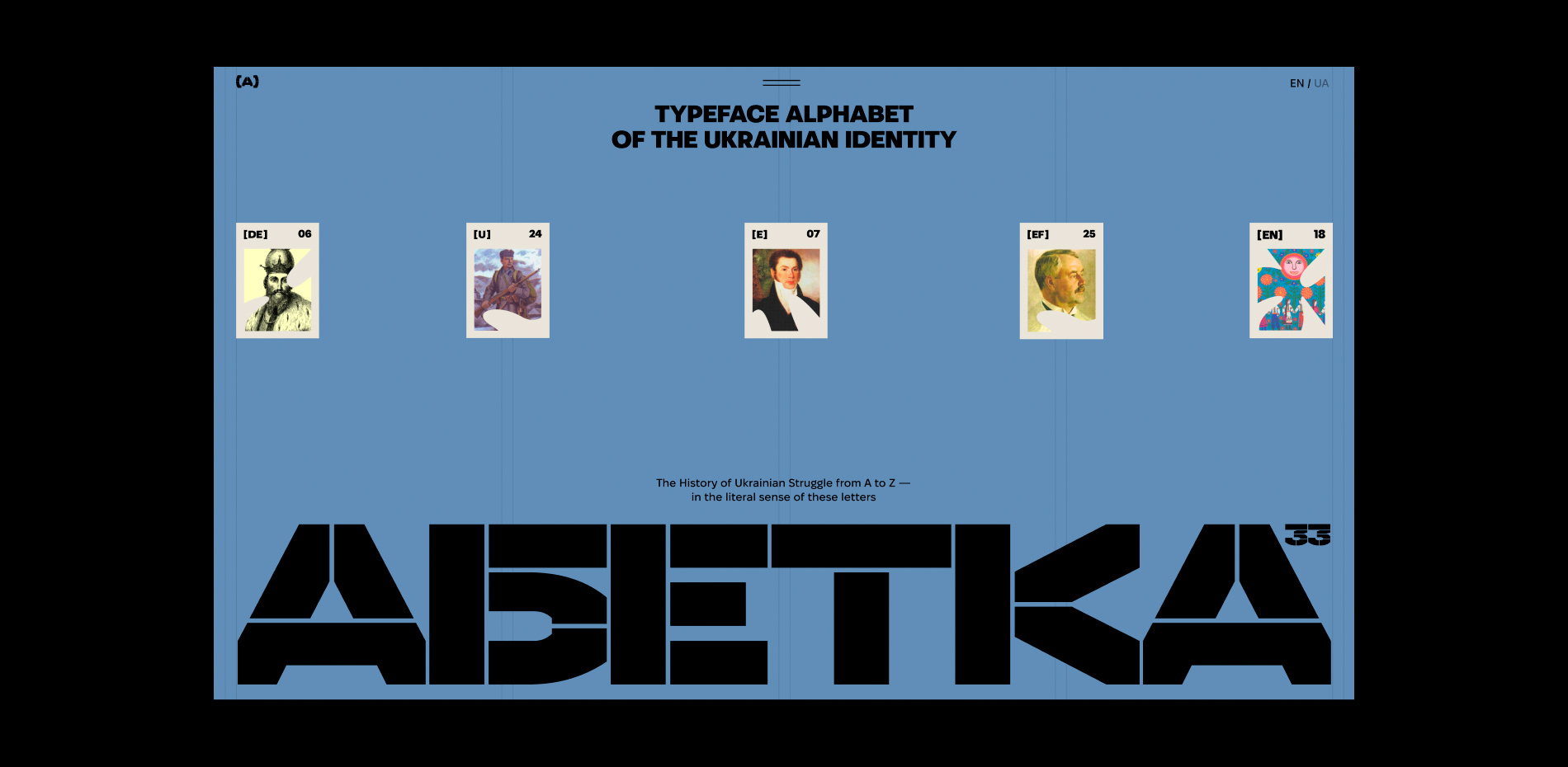
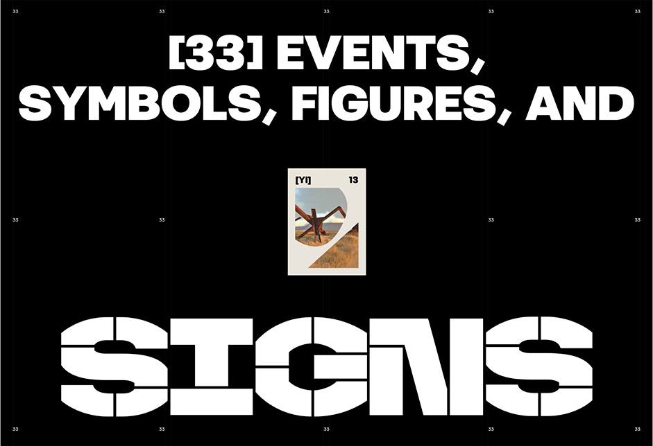
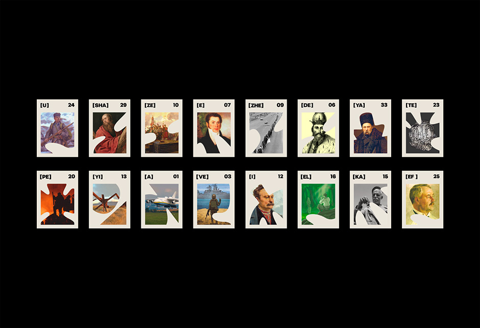
Typeface Abetka (Alphabet) of the Ukrainian Identity was presented on Ukraine’s Independence Day. The project aims to promote modern fonts by Ukrainian designers and educate them about symbols of Ukrainian statehood. The history of the Ukrainian fight in 33 letters.
The idea for the Abetka website is the brainchild of the Projector Foundation, a non-profit organization that offers independent digital education for careers in information technology and creative economy. Obys Agency is honored to be able to contribute to this incredible initiative through our design and development expertise. Right from the first email, we were enamored with the idea and started brainstorming on the visuals.
The Main Idea of the Site
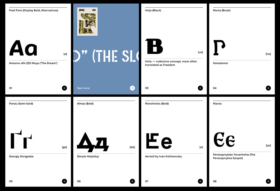
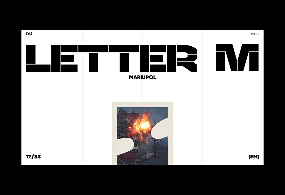
The Typeface Alphabet project showcases 33 contemporary Ukrainian typefaces. Abetka is an interactive project where each letter represents a unique symbol. For each letter, the team created a dedicated page showcasing one of the newest Ukrainian typefaces. Users can explore profiles of the typeface creators and access licensed use links. The Projector Foundation team launched a cultural project aimed at providing Ukrainians with alternatives to Russian typefaces. Moreover, this project will introduce the world to the vibrant Ukrainian typeface industry. It is noteworthy that many Ukrainian fonts include both the Cyrillic and Latin versions, which is significant because designers worldwide can use Ukrainian fonts instead of Russian fonts.
Storytelling Technique on the Website
In all our projects, we try to add a little storytelling for the user. And Abetka is no exception. Often people like to simply scan information rather than read every line of a website. And if, after scrolling through the page, there is nothing for the eye to catch on, people leave it. That's why we love to create interactive storytelling that intrigues the user with an unusual animation or idea from the first seconds and then helps guide him from the beginning to the end of the site because the user likes to study each block. The site is just starting to load, and something is already happening on the screen that goes to the main screen of the site, and then moves on through the rest of the blocks.
“We love to create interactive storytelling that intrigues the user with an unusual animation or idea from the first seconds and then helps guide him from the beginning to the end of the site because the user likes to study each block"
The Preloader of the Site
A preloader is a mandatory part of every project of our association. We always devote a significant amount of time to thinking through this functionality. The preloader helps to create intrigue and capture the user’s attention from the first seconds, to create ideas about what the site will be about. Then, by scrolling the site, the user has the opportunity to confirm or refute his first ideas. As soon as visitors land on the project's page, we engage them with a compelling story. The preloader displays cards with letters that flip over to reveal captivating stories and events through photographs. These cards take visitors on a journey through the alphabet, showcasing each character and event in a unique way. By doing this, we aim to immerse visitors in the project and leave them wanting to explore more.
The Visual Ideas
The main challenge we face is how to combine two central themes: Ukrainian identity and typography. We aim to do this in an original way without resorting to national identity, flags, or clichéd phrases like "The quick brown fox...". To achieve this, we drew inspiration from Ukrainian primitive art and early modernism to create unique colors, textures, and shapes.
In order to create a visually appealing and unique display of our content, we carefully selected specific fonts to showcase our work. However, we also wanted to capture the essence of creating a typeface - the intricate details of dots, curves, and baselines that give each font its own character. By incorporating these elements into our design, we were able to add an additional layer of depth and nuance that sets our work apart from the rest.
Work with the Content
It was very interesting for us to work with the content, read, and learn what we did not know about our history. This only increased the desire to make the project even cooler. Now is a very difficult time in Ukraine and Ukrainians are obliged to know the history of their country, to know all the key events, all the heroes, artists, and writers who glorified and defended the very existence of the Ukrainian language, culture, art, etc.
“It was very interesting for us to work with the content, read, and learn what we did not know about our history. This only increased the desire to make the project even cooler"
The Challenges During the Project
We had a very tight deadline. It was necessary to design and develop a website that would include 35 pages. The site also has 2 language versions. Many authors worked to write these articles and translate them into 2 languages. It seemed that it was impossible to accomplish this in such a short time. However, we were inspired by the theme of the project and were able to quickly come up with and implement all our ideas. The main difficulty was not to make the project a boring site like Wikipedia, where articles and scientific facts would be collected.
The Main Lesson We Have Here
It's important to remember that there's always something new to discover, even if you've worked on many projects in the same field. For instance, some time ago, we created "The Message to Ukraine" and we managed to showcase the essence of the Ukrainian people in a unique and innovative way. Throughout the process of working on this project, we discovered even more original ways to portray Ukraine.
It's all about collaboration! This project wouldn't have been possible without the hard work of the team of foundations, managers, type designers, editors, article authors, designers, developers, historical consultants, and partners. This is just a small part of the team involved. So, don't hesitate to step out of your usual circle and collaborate with new professionals from different fields.
Technologies
Front-end development:
PUG, 11ty static site generator, GSAP, Lenis, modern JS – hosted as the static website on Netlify.
CMS:
Strapi CMS hosted on Render.com.
Company Info
Obys is a creative design and development agency based in Ukraine, specializing in creating unique graphic and web experiences globally.
More about us is here.