This piece sets forth a bunch of UX principles that stand behind the interface of Readymag, a design tool that helps create websites without coding. Intertwining with each other they build up a universal system of criteria: it helps make product decisions, maintain design consistency and build user trust. Apply them with a careful attention to the specific of your product, and you’ve got yourself a reliable user interface.
This is an abstract from a longread called Guiding Principles Behind the Readymag User Interface, which was originally written and published by Readymag product Designer Stas Aki.
An interface is communication
User interface is a sum of possible experiences, rather than visual elements. The way you accomplish tasks with a product —that’s the interface. Thus, its primary goal is to communicate clearly what functionality it offers: the structure and appearance of an interface must serve this task.
Once we accept that there is a meaning to be conveyed, it is useful to perceive interface design as a communication process. Aside from the message itself, there is someone who sends the message—as well as someone that receives it. There has to be a common code that both of them understand; and if they don’t, then the communication fails.
An interface should be intelligible
Every feature in an interface should be easily discoverable and must provide a recognizable function. Along with this, an interface should keep users informed about their actions and any committed changes. For instance, when the user uploads an image or processes a payment for more than a second, the interface should communicate that. Similarly, when the project is published or a font parameter is adjusted, the user needs to know that and perceive changes quickly.
Minimize additional layers between the interface and user. The result of the user actions should be shown right away; without shifting between panels, windows and preview modes.
An interface should be habitual
A well-designed interface should not be split into beginner and expert modes. Think of an interface as a beginner-to-expert journey. Simplicity, clarity of function, and the visibility of a user interface helps beginners learn. The expert phase is characterized by unconscious use.
According to human–computer interface pioneer and Mac co-inventor Jef Raskin, qualities like suitedness to the task and modelessness lead the way for UI to be habitual. Users shouldn’t have to get lost among multiple elements. There should be only one way to perform a task. Raskin wrote, the more ‘monotonous’ an interface, the more quickly it becomes habitual.
An interface must be reliable
Reliability is often thought of as purely technical. But a fairly reliable interface can still be designed on top of a system that isn’t 100% reliable. The system should never lose any work a user has done or any information they have entered. All actions must be auto-saved. It should be possible to restore large chunks of content, like pages or projects.
Entropy is the main enemy of an interface
As a product grows, new features always appear and the interface naturally tends to get messier. But complexity harms everyone. For developers, it leads to incidents and bugs. For users, it becomes time-consuming to learn and work with. The creative process slows down.
So: keep things simple. Don’t hesitate to trade off other values for simplicity. Simplicity comes from a thorough understanding. The point here is to know the ins and outs of the process. If you do not, the result of your efforts will be ‘simplistic’ rather than simple. Add multiple functions to a single element, look for universal solutions to solve general problems.
A design tool interface should be as useful as aesthetically pleasing
A design tool should inspire its users to create. Otherwise, it is not a design tool. Design has always been about invention and design software should provide an enjoyable environment for creative work. A beautiful, well-crafted interface earns the trust of its users. It reassures them that the product is reliable and could be in use for a long time.
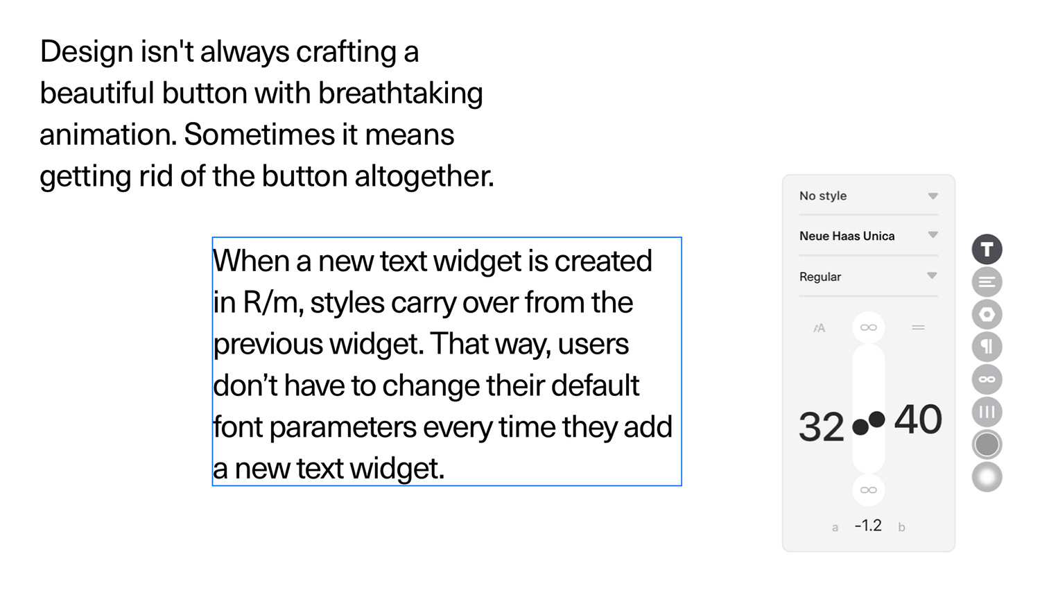
The best interface is no interface
Design isn't always crafting a beautiful button with breathtaking animation. Sometimes it means getting rid of the button altogether. When a new text widget is created in R/m, styles carry over from the previous widget. That way, users don’t have to change their default font parameters every time they add a new text widget.
To see how these principles come to life—register an account with Readymag.
Check out the original longread Guiding Principles Behind the Readymag User Interface and vote for it on awwwards.