
In today’s world we often take for granted the abundance of beautiful and responsive website designs, carefully crafted by expert UX designers to provide us with effortless and enjoyable browsing experiences.
However, it wasn’t always this way, and twenty years ago (or more) the Internet was a very different place. With super-slow dial-up modems a given, and no need to make websites work on the pocket-sized screens of smartphones - the requirements of website design were very different (not to mention the sensibilities).
Many of the everyday features of web pages seen throughout the 90s and early 2000s have now gone entirely by the wayside, thank goodness - but if we were to peer through the mists of time, we might see some of the following…
1. Hit counters
Remember these?

“You are visitor number: 12345” was a common proclamation of the majority of 90s-era websites, and we’re still wondering why - what was the user supposed to do with this information?
Sometimes, counters were deployed as a crude data-collection tool for the webmaster so that they might be able to maintain some metrics about the popularity of their pages. Often they didn’t function very well though, and particularly in their early days would track hits rather than visits - meaning that anybody could simply refresh the page a number of times and artificially inflate their own statistics.
The public nature and general availability of this basic visitor data meant that the Internet of the late 90s was a strangely competitive place, with even hobby websites and personal pages enviously regarding each other’s hit counters and fretting about their relative popularity. However, in today’s world of Google Analytics, AWStats and other privately kept metrics, these concerns have to some degree melted away.
There is one place, at least, where the old-school hit counter survives, doggedly unassailed by the winds of change - and that’s eBay listings.
2. Best viewed in Netscape 4.0
Quite bizarrely, a large number of websites throughout the late 90s and early 2000s would carry small-print advisories at the bottom of the page as to which browser, screen resolution, or Shockwave version (remember that?) the visitor should best use in order to enjoy the content.

"Best viewed in 1024x768", a page might say, or "this site is best viewed with Netscape Navigator" - as if the user were genuinely expected to be constantly adjusting their computer’s screen resolution and flicking from one browser to another in order to surf the web in the approved manner.
The very idea that the onus would be on the user to visit the site in the correct fashion, and not on the designer to ensure that the website actually worked properly on every computer, seems somewhat eccentric by today’s standards of interface design.
3. Under construction
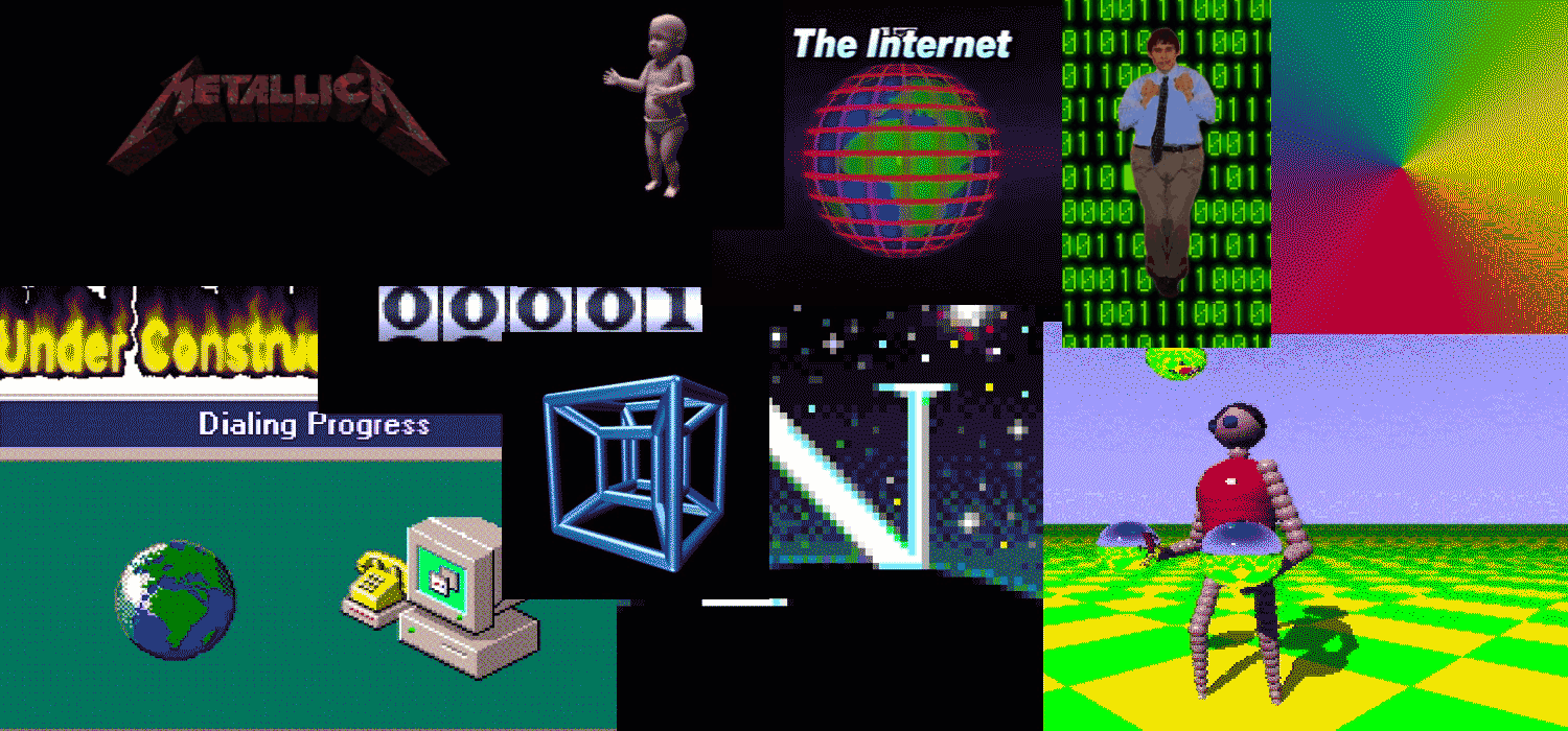
For some reason, it used to be of paramount importance to notify the public that a website was currently in production. After all, you couldn’t have people turning up to an empty page, could you? Better stick a logo on it.
“Under construction” and “coming soon” pages are largely a thing of the past, for the simple reason that they are completely pointless wastes of time. If a user clicks a link, they expect to be taken to something related to that link - not to a completely content-free page with construction clipart.
If the content isn’t ready, then, why even have the link? The whole arrangement almost seemed to be engineered to annoy visitors and waste their time - thankfully, today’s websites are generally a lot smarter about providing links that actually go somewhere.
4. Flash
With the advent of HTML5 and other modern advances, the Flash Player websites of yesterday have become a relic of a bygone era.
At the time, Flash seemed to open up a world of web design opportunities. No longer limited to dull text markup and microscopic animated GIFs, webmasters could now make sites full of animation, sound, and interactivity!
Flash sites began to lose some of their lustre around the mid-2000s, when users began to get annoyed with constantly needing to update their plugins and routinely having audio played at them in the course of browsing - not to mention the well-documented security problems with the technology.
At the time, Flash seemed to open up a world of web design opportunities. No longer limited to dull text markup and microscopic animated GIFs, webmasters could now make sites full of animation, sound, and interactivity!
Industry insiders (Steve Jobs, for example) began to reach the conclusion that it was time for Flash to be retired, and Apple’s first iPhone conspicuously lacked support for the standard.
Today, it’s difficult to find surviving websites that still use Flash for navigation, and many of our modern browsers and devices treat it with seeming disdain (Chrome, for example, has blocked Flash content by default since 2016).
5. Frames
Ugly as they were, frames for navigation made a kind of sense at the time. Before pages could be assembled from pieces for the user via server-side includes, frames were a pretty good way of being able to re-use one navigation bar for all of the content on the site (and not have to edit every single page if you decided to add something to the menu).
They also allowed some bandwidth optimisation for the days of dial-up, as the user wouldn’t need to re-download elements of a page that hadn’t changed from the ones viewed previously.
However, frames did cause a number of usability errors. For one, they would frequently break the usefulness of the browser’s “Back” button, not to mention make pages difficult to print - and they would also hamper the user’s ability to bookmark specific URLs for framed content.
Frames also represented major problems for SEO (as a website incorporating frames would be very difficult for a search crawler to index, in addition to the problem of “inner frame” pages turning up by themselves in search engines that were intended to be presented in the context of other frames).
As a result, layouts constructed out of frames are essentially a thing of the past, although the “iframe” element does survive for use in modern HTML5 projects.
In summary, web design as a medium has undoubtedly reached an unprecedented level of maturity in today’s world - the technological constraints and unrefined thinking of a nascent platform have given way to a well-established world of elegantly designed, effortlessly usable websites.
Within a relatively short time span of around twenty years, web design and UX principles have progressed almost beyond all recognition - to the point that the websites of 1999 might as well be cave paintings. We can only wait and hope to be delighted by the advances of the next twenty years!
Play the Midi here!

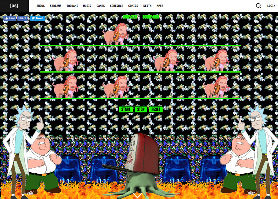
☆彡Awwwards Selection, 90s Inspired Projects
Want to see more web projects based on 90s Internet aesthetics? Take a trip down memory lane and check out Internet Archive's: Wayback Machine, Cameronsworld.net, Internet Archaeology and the following collection full of sites inspired by the early days of the internet!


This post was contributed by Angle Studios - Kent UX consultants and web designers with over 15 years of experience offering high-quality site design, UX and branding services for a broad range of businesses across Kent and London.