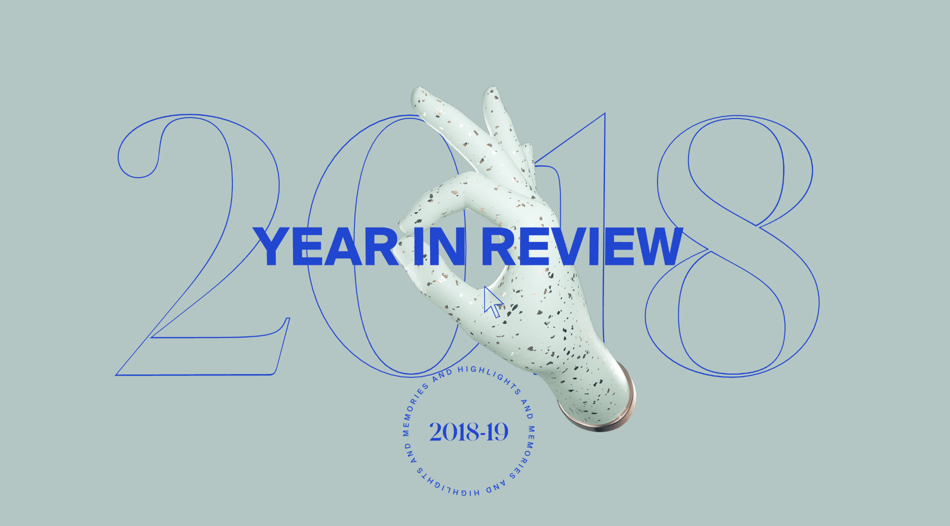
Round of applause to Green Chameleon for winning Site of the Month March with Our 2018: Year in Review, here they share the processes of creating their developer driven 3D time capsule. Thanks for all the votes and tweets, find the winner of the Pro Plan at the end of the article.
Our 2018: Year in Review site was created as a place to document and showcase the year gone by. The agency has evolved, we’ve produced our best work to date and picked up a number of accolades along the way; the Year in Review site was created to give us somewhere to house all of this content in a fun and unique way.

The process for creating the site was a new one for us. The whole concept was driven by dev, meaning our usual way of doing things was flipped; our developer, Ash, first showcased the technology and concept of travelling through a 3D space, which we then designed over the top of, adding layers of detail and additional features as we progressed.
The project was an excuse to make something ‘just for fun’ in a short time frame, but it also taught us a lot; the process of starting in code is something we’ll definitely take forward and incorporate into more projects.
Performance
Three.js has some pretty handy frustum culling stuff built in which helped a great deal when it comes to only rendering what is visible, but we needed to extend this functionality to handle when videos should be played and paused as you travel through the timeline. We wanted the user to be able to travel through the timeline as fast as they wanted whilst keeping it as smooth as possible, and constantly playing and pausing videos restricted this. So, we only updated video states when moving at a slow enough speed to keep things as lightweight as possible.
Device Video Limits
HTML Video element limits wasn’t something we knew about until we stress tested with a few dozen videos. At first we saw a hard limit of 16 videos when testing on an iPad so we tested on a number of other mobile devices and lower spec machines where we came to the conclusion it must be a hardware limitation. We overcame this on these devices by only loading the metadata which includes the video dimensions and the first frame that was required to build the timeline, then clearing the video element and moving onto the next one. The video would then only play once the item had been opened.
Chroma Key Video
There are two gesturing hands in the timeline that we intentionally kept as 2D assets after discovering the faux-3D effect they take on when changing camera perspective. This illusion broke when trying to animate the object so we rendered a video of the end hand waving in a real 3D space to get the lighting and shadows correct. This meant having a solid background in the video which covered elements behind it but this didn’t match the design, nor could we reliably match the compressed video colours with a WebGL colour. So we used solid green and made multiple passes in a shader to discard it, rendering it transparent. It’s not perfect but it’s the first time we’ve tried this and we think it came out pretty well!
Technologies
Our hosting provider is Digital Ocean, the server is running Nginx on the HTTP2 protocol with brotli/gzip compression. This along with optimising assets as much as possible means we can serve the site in ~20Mb.
Aside from HTML and CSS which was used to create the UI around the edge of the screen and the entrance and loading screen, WebGL was at the core of the site – specifically the Three.js library. There were two main challenges that quickly became apparent in the development process: keeping up performance with so many objects in the 3D space, and getting past the device’s limits when it comes to videos.
Thanks for getting involved and voting, the winner of the year's Pro Plan is @DannaTrujillo, please DM us to get your upgrade