Wireframing is one of the most effective and valuable exercises during the project lifecycle. Whether you’re building a mobile application, a landing page or high end user interfaces, wireframing acts as your skeleton assisting in building better products and, more importantly, products people can actually use.
In a product design environment for example, where various stakeholders are involved, wireframing becomes an effective communication tool which involves and engages all. Whether drawing screens on a whiteboard or sketching on butcher’s paper, it allows a UX designer to communicate their ideas and logic with an engineer, business analyst, marketing manager etc. and on the flipside, the stakeholders can communicate their own ideas with designers.
Benefits of wireframes
Without wireframes, designing an app or website becomes a guessing game. Providing guidance is one benefit of a wireframe, and here are a few more:
- Collaboration is key when it comes to design. Everyone involved from the developer and engineer to the client and stakeholders need to have a clear idea of requirements, goals and expectations.
A wireframe is a great basis of communication and source of clarification when it comes to developing the features and interactions of an app or website. It establishes what works and what doesn’t when it comes to your design and when everyone is clear on this, you’ll see results sooner and faster. - An intuitive navigation design is essential in providing an effective user experience as this ultimately leads to conversion. Wireframes are used as a test run when designing a comprehensive site or app. It provides designers and developers with the opportunity to utilize the navigation design first-hand therefore they can establish the usability of drop down menus, the relevance of breadcrumbs and the ease of navigation between pages.
- Wireframes do not need to depict visual designs. Rather, they create clear paths between the content of your site or app by creating a flow of information and how the end user will be accessing this information, a hard task to complete without some sort of draft or blueprint.
Once you’ve got an idea of how and where your design elements appear on the page, you’ll be able to make informed and strategic decisions based on what you see in the wireframe rather than at a more expensive stage of the process. - Wireframes are all about trying before you buy. Conducting efficient click or usability tests through interactive wireframes takes it that step further saving you time, effort and money in the design process. Through a platform as simple as a clickable or interactive prototype, this method puts you, the client or designer in the driver’s seat, testing the logical flow of your site or app first hand.
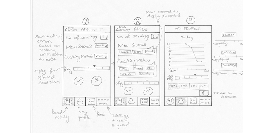
Lo-fidelity wireframes
We can all sketch. We’ve been doing it since we were kids. Lo-fidelity wireframes may be as simple as a series of paper sketches which can be easily edited and amended.
Lo-fidelity wireframes also allow clients themselves to communicate their ideas with a web team whilst feeling a sense of ownership. These wireframes don’t need to look a million dollars as they are usually drafts or quick overviews.
These particular wireframes are also achievable with software. Lo-fidelity wireframes usually include placeholder content consisting of black and white boxes, suggested copy and annotations. The purpose of these wireframes is to suggest the layout and structure, not the visual styling or colours.
Have we designed a product completely based off paper sketches? Yes. Was it effective? Yes.
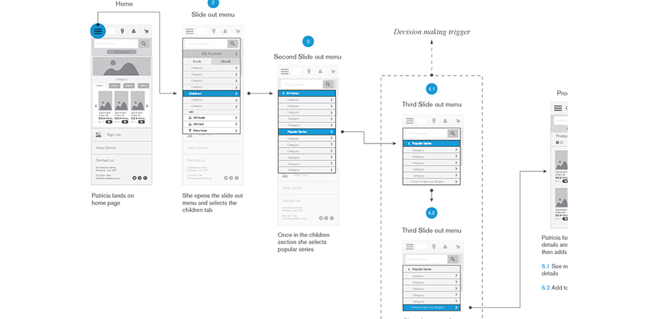
Mid-fidelity wireframes
The next step up usually involves a tidier or cleaner version of the Lo-fidelity wireframe. However, it doesn’t require the bells and whistles that come with Hi-fidelity version.
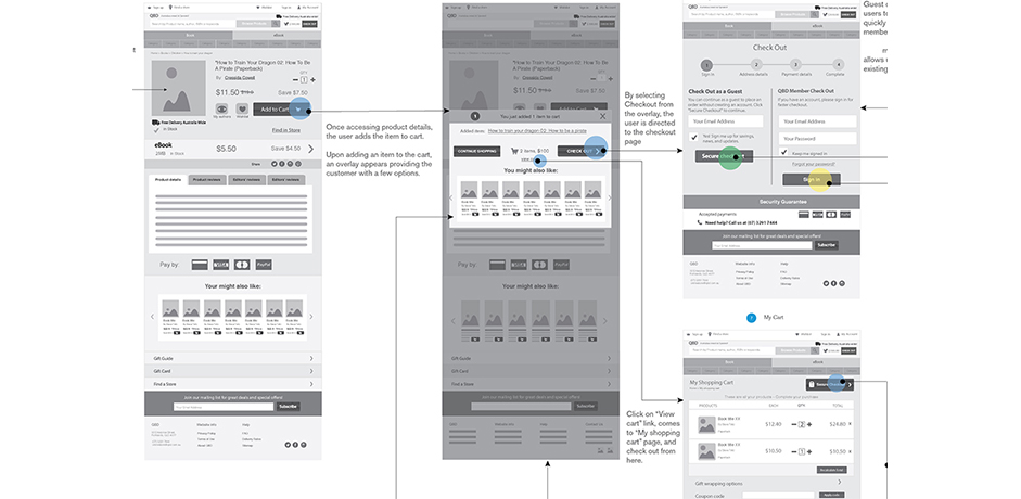
Mid-fidelity wireframes take it one step further demonstrating how the site or app is going to feel to use typically through prototyping. This approach maintains the professionalism of hi-fidelity wireframes but the simplistic detail of lo-fidelity making it easier to communicate and interact with users and stakeholders.
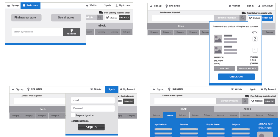
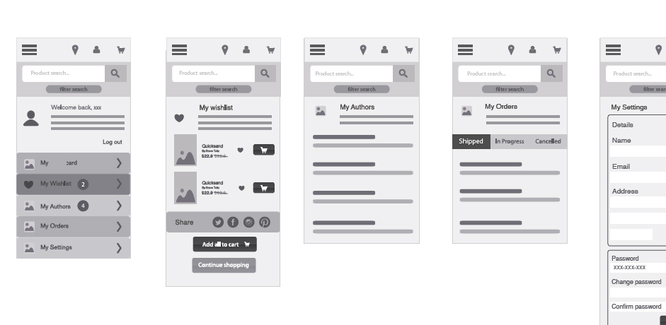
Hi-fidelity wireframes
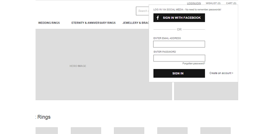
This is a more detailed version of the wireframing stage which usually displays actual styling, complete menus and real text or images. Each item on the page usually includes detailed information regarding their action, measurements and movements. These wireframes generally look like a finished version of the concept minus the finer details.
Implementing Interactive elements are usually even more detailed as they involve navigational and usability testing. Word of warning: hi-fidelity wireframes require intricacy and detail so it is easy to make this task your scope. Remember: it’s only the blueprint for your site or app, not the final product.
We’ve dressed up wireframes for particular projects because we just had to. We needed to communicate specific interactions and flows to clients in a non-technical manner while ensuring the client didn’t take the visuals literally. Finding a balance in this scenario is key.
Paper prototypes
A type of wireframe which is usually overlooked is the paper prototype. Interactions can still be achieved using paper prototypes by using individual UI cut-outs which can be placed on top of other elements. This type of wireframe is perfect when presenting to less technically adept stakeholders. It’s also an effective tool when conducting a scenario or task based test.
We’ve allowed clients to sit with us during a kick-off meeting and sketch out their ideas on paper because they simply weren’t able to explain them in a brief given the nature of their requirements and we really needed to find out more about the project. Apart from the obvious advantage of receiving early, rough feedback, the client is invested in the project at an early stage and feels a greater sense of ownership.
Remember, early rough data is better than no data at all.
Time and budget constraints
We are all aware that time is money. So how do you decide which wireframe is best suited to your timeframe and project? Wireframes can be as speedy or as longwinded as you make it, it all just depends on how much effort and detail you put in and what you are trying to communicate. If you’re short on time, start lean.
We’ve found the Design Studio method works well because within a few hours, teams can sketch out the main features and solutions to solve a particular problem and develop some type of minimum viable product.
Our advice: spend less time on detail and aim to validate ideas and concepts sooner. The sooner you receive feedback, the less waste there is. Keep it lean.
Designer preferred tools
We’ve definitely been spoilt for choice when it comes to wireframe tools and applications. The extent and availability of these tools means designers can be as picky as they please. Furthermore they can choose to utilize tools that complement their style.
For example, if you prefer the classic wireframe, then you can’t go past Balsamiq Mockups. Conversely, if you’re looking for a more extensive, detailed program, then take a look at Axure which has been an industry standard for years.
Justinmind and UXpin are lightweight yet feature rich applications. InVision on the other hand offers a screen sharing feature, comments and the ability to create hotspots and interactions which may be suitable for certain clients.
Mac users swear by Sketch which allows you to export UI elements in different formats easily which is handy when designing for different screen resolutions and especially for mobile.
Bottom line, there is no ‘right’ or ‘wrong’ tool to use. It all depends on personal preference and comfort.
There’s no denying a wireframe is essential in the design process. Think of it as your projects skeletal structure. It fortifies the body from inception through to old age. Without it, the body is not supported and therefore cannot stand strong. If we provide our projects with a strong skeleton, than we will be better able to create an effective UX and navigable website or app. The flow on effects will be evident in a strong, healthy end product.