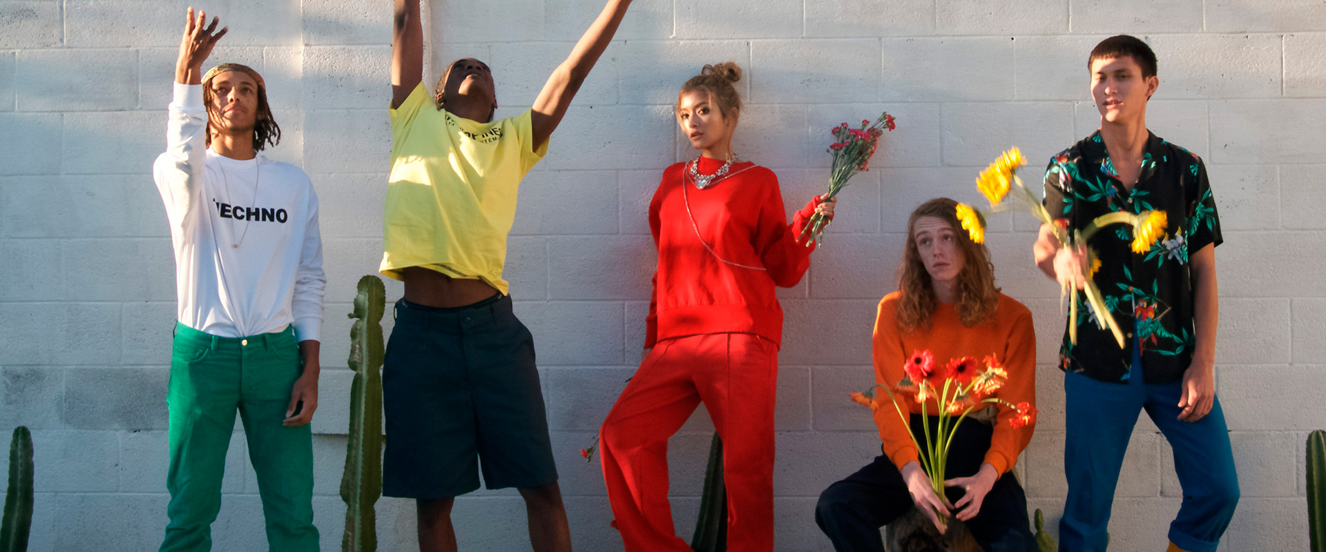
THE BRIEF
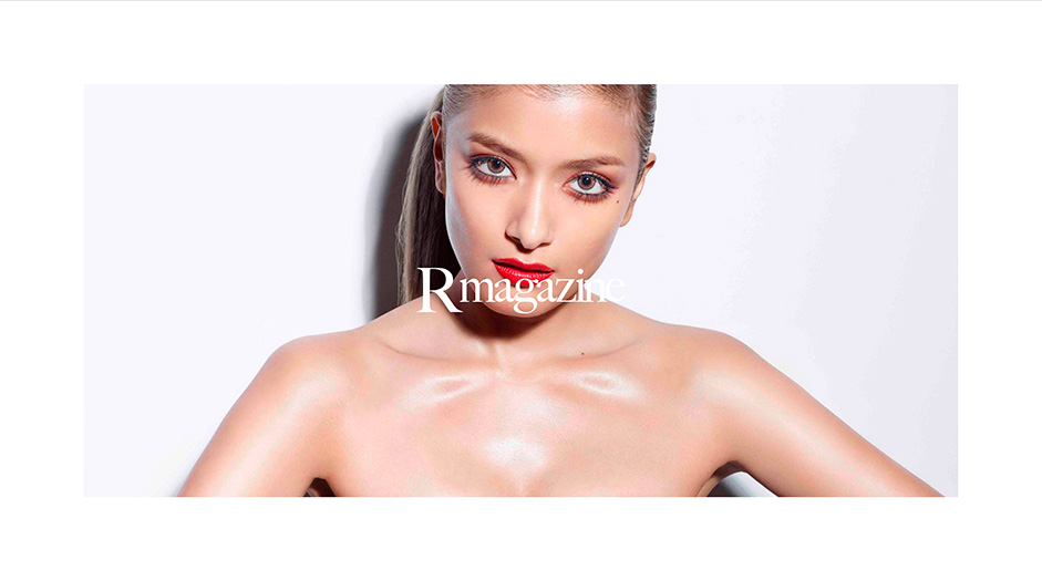
Rmagazine is a fashion and lifestyle magazine entirely directed by ROLA, one of Japan’s biggest celebrities. Rmagazine used to be a print magazine issued twice a year but since the demand for brand-collaborated content has increased, they decided to move their business to a digital platform. monopo was invited to make the new digital version of Rmagazine.
CHALLENGE
One particularity of the print version of Rmagazine is that every issue had a different style and even a different logo. In a print magazine, everything is controlled by a designer and there are no technical restrictions. The designer has total freedom to play with different typographies and layouts on every page if they want. However for a digital magazine, we had to come up with one consistent style through templates, and we had to keep in mind that the person who uploads the articles won’t be a designer. The challenge was to find the balance between being stylish and fashionable but also functional and easy to use, while having no control over the content. However, we have a big advantage in digital to make things interesting: interactivity and animations.
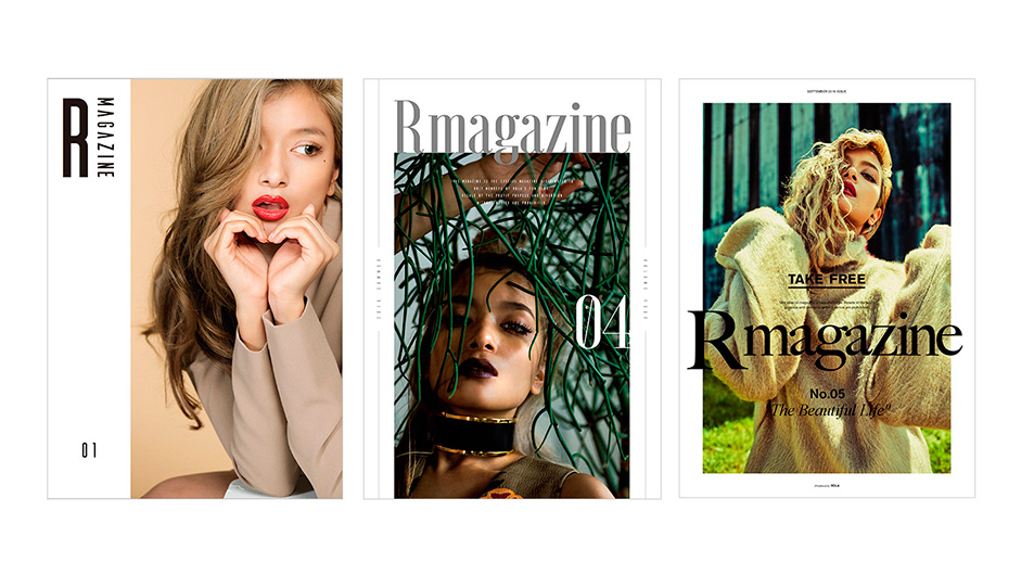
OUR APPROACH IN ART DIRECTION AND TECHNOLOGY
We really wanted to give an editorial and fashion feeling to the design and navigation. We took our inspiration directly from fashion magazines: giving a lot of place to visuals, playing with the layout and white spaces and having big typographies as graphic elements. We wanted the aesthetic to be minimalist, elegant, feminine, stylish and fashionable.
We also sought to give this fashion feeling through crafted animations and transitions. The website uses a javascript framework called biggie as a base, which is a factorisation of bigwheel originally developed by Jam3, but refined to our needs by Baptiste Briel. It’s particular advantage is its easy handling of page transitions. Everything is written in plain javascript to get the best out of the performance of the browser. The two additional libraries used for UI interaction are GSAP, that comes almost automatically with biggie, and Swiper.js on the homepage.
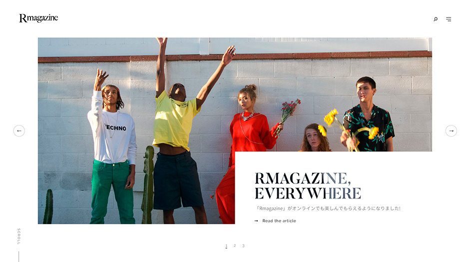
01. AN UNCONVENTIONAL HOMEPAGE USING SWIPER.JS
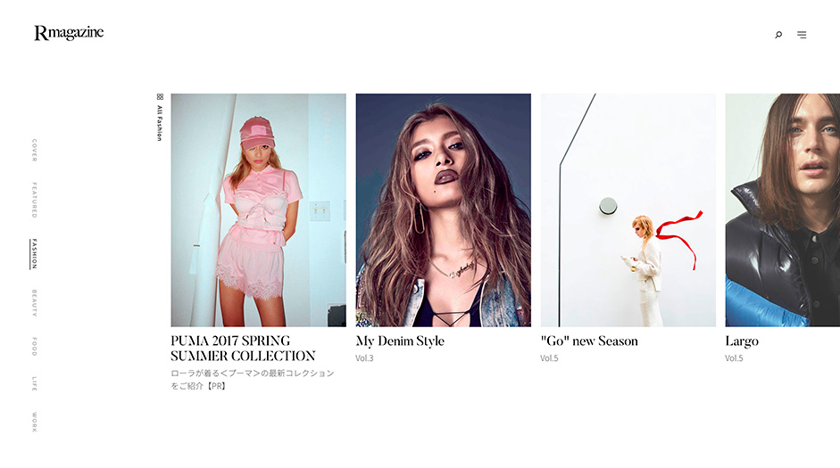
There are so many great print magazines, but not so many digital magazines are as interesting as they often follow a standard interface. We wanted to challenge this by having an unconventional homepage that works like an inspiring cover of a print magazine. Our homepage works in 2 ways: vertical scrolling and horizontal sliders.
We consider that we have three types of carousel:
- The homepage acts as a big carousel that covers all the vertical slides. Each slide corresponds to one category.
- The first slide is a cover carousel with the top-3 featured articles.
- Each following slide is a carousel with the 10 latest articles by category.
It was not so easy to make it user-friendly. We tried to add more UI but it was looking too complicated. We tried to remove the slider idea and keep only 4 featured articles per category but it was getting boring. Then we tried to make something more intuitive by playing with an evolving cursor and we were on the right track.
Technically, it was quite unconventional to build a digital magazine based on this home forced-scroll layout, but it was very interesting to play around with this library and discover hidden features such as mobile breakpoints management or shipper inception. Swiper.js was used to initialise all our carousels on the homepage and GSAP was used to smoothen the evolving cursor.
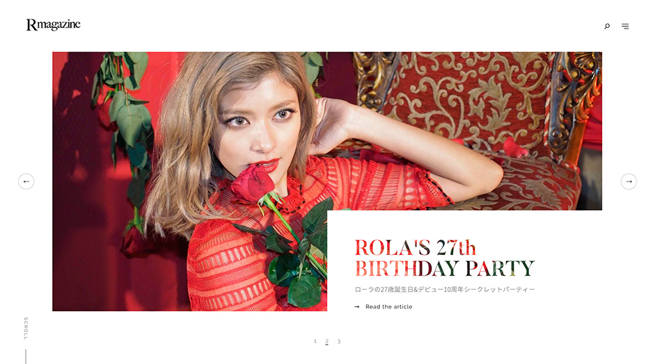
02. STYLE AND FASHION DETAILS
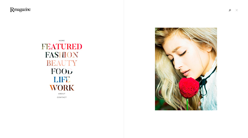
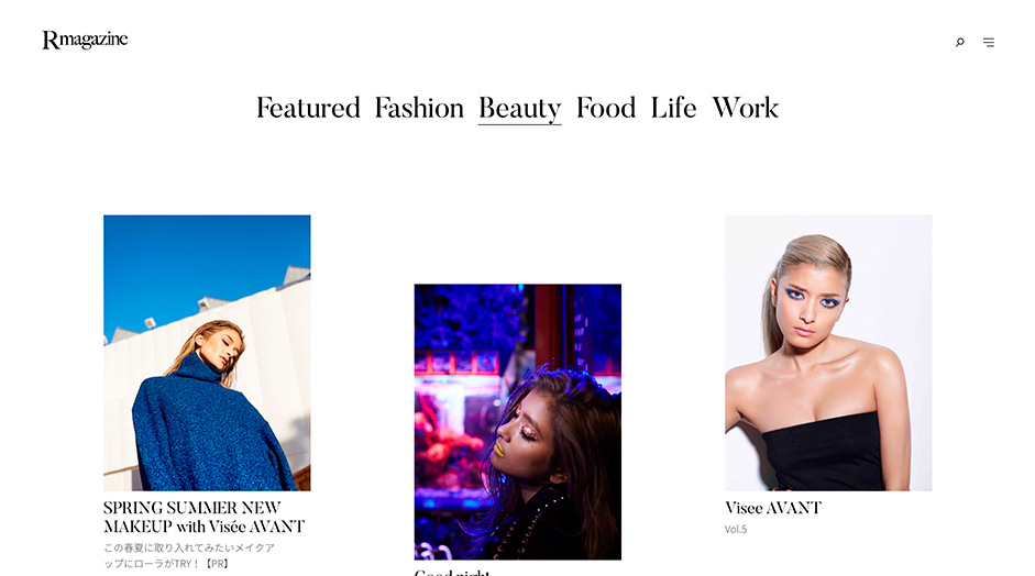
We wanted to make the magazine as stylish and elegant as possible by turning the fixed UI elements into design pieces. The main titles became a big part of our identity by using the picture texture. This was done through the propriety “background-clip” of CSS3 that makes a mask into the font. We made the category filters a real design element by highlighting the nice serif typography (Butler). We also made the choice to use English words for the main titles and use Japanese language only for the paragraph of text, to keep the fashion look. We added some interactive details such as smooth scrolling, creative hover effects and a fashionable menu with nice interactions using the library GSAP.
03. EDITORIAL ARTICLE MODULES USING CRAFT CMS
Finding the right layout that is interesting yet easy to use, and works with whatever the client uploads was a big challenge. Whatever our client uploads, it has to look great. Our template works with some fixed elements: a cover, a description, a title. Then, we designed a series of modules that each play with different margins, which gives freedom to diversify the page and can work for any type of content. It’s easy to use, so any order of module would work.
The back-end is built with Craft CMS which is a really handy tool that enables a lot of freedom of creation in terms of coding, compared to a Wordpress for example.
We outputted 3 sizes of assets regarding the devices you are browsing the site from. As Rmagazine is a Japan-based project and most users in Japan browse the web through their smartphone, the core requirement of the website was that it needed to be the fastest possible on mobile given the number of entries estimated, and also the number of potential connections at the same time (more than 9 million inhabitants for Tokyo alone) so we needed a very powerful server.
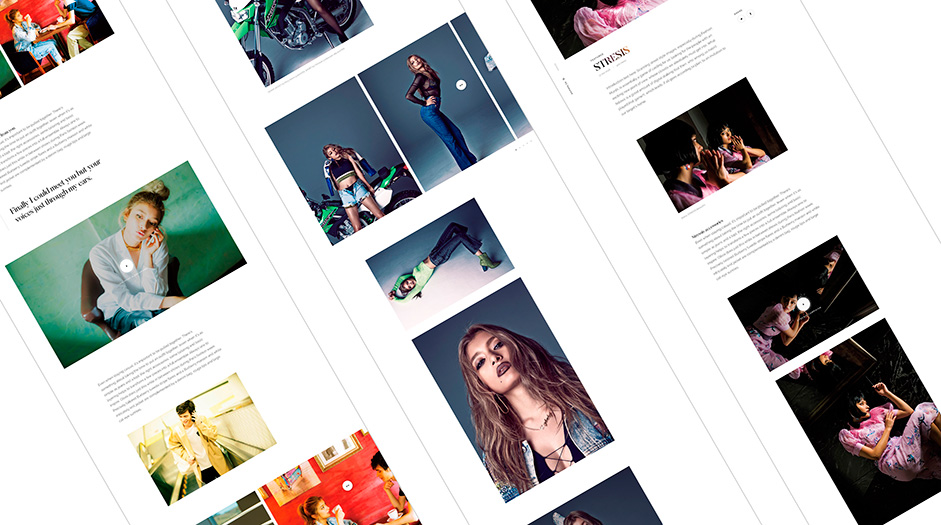
04. CRAFTED EXPERIENCE THROUGH TRANSITIONS
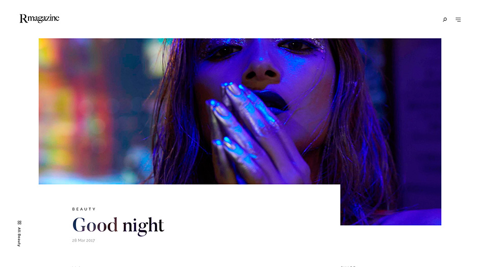
We used big covers and loading sequences to show off the nice fashion visuals. The transitions were an important part of the project. The main challenge with transitions was to be able to understand which part of the site the user lands on to trigger the right animation and get the right assets on the loading. Basically what we really wanted to achieve as developer on the front-end was to provide a smooth and fluid experience of navigation through the whole website.
There are four landing cases possible:
- Landing on the homepage: we need to load the image of the first entry of the top carousel
- Landing on an article: we need to load the cover image of an article
- Clicking on any entry: we need to load the cover image of the article that’s going to be loaded
- Clicking on a category: we need to trigger the category name animation and remove the image
The reason why all of this was tricky is because the way biggie.js framework works doesn’t allow you to, from one view, know what is appended in the next one. However, thanks to twig templating and a couple of javascript / css tweaks / conditional classes we managed to handle it.
HOW WE DID IT: Empowered collaboration
We managed to achieve this result through true creative collaboration. At monopo each member has full freedom and trust, so everyone can put their own personality in the work. On this project we were also lucky to have a very trusting client that gave us free rein to make something creative, so we gave ourselves fun challenges to solve and we explored a lot of things to go beyond the ordinary.
TECHNOLOGIES USED:
- FrontEnd:Biggie.js framework, Swiper.js, LESS, Node.js, Ajax,GSAP
- Backend: Craft CMS, PHP, Twig, MySQL, Imager
- Server: Amazon EC2 & S3
- Tools: Gulp, Docker, Yarn, Sublime Text, PhpStorm
MONOPO
Tokyo-based digital communications agency, monopo, is a catalyst for innovative, design-driven solutions that connect, motivate, and inspire. Our collective of globally-minded people mobilizes creative communities, breaking down barriers of language and culture. Collaborative by nature, we exercise our spirit of curiosity by engaging with partners internationally. We believe in invention with integrity and are proud to share our work with the world. The poweredby.tokyo project is the vehicle to realize this ambitious objective of being recognized as a global, world-class creative community.
