Responsive & Adaptive Web Design by UXPin explains how to design consistently across devices with examples and best practices.
New devices come and go. The only future-proof strategy is designing fluid web experiences that adapt to any device. And since Mdot sites are dying out, the two best techniques for designers today are responsive and adaptive web design.
Timeless UX Trends: Responsive & Adaptive Web Design offers useful techniques for mobile-first design based on examples from some of today’s most successful companies. The book is insightful but reads quickly since it draws from real-world application.
You won’t find any dry theory in this free guide. It focuses only on what you need to know for everyday web design.
The free e-book includes:
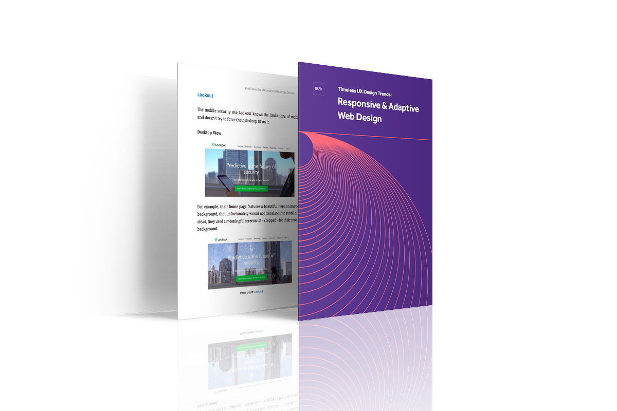
- Thorough analysis of the mobile, tablet, and desktop views for 10 companies doing it right (like Hulu, Lookout, and Change.org)
- Step-by-step explanation of mobile-first design (with tutorial): creating content inventories, prioritizing content, and designing visual hierarchies.
- Explanation of all the elements required for device-consistent UX design
- Pros & cons of responsive & adaptive web design
- Best practices for responsive & adaptive web design
Take a look, and feel free to share if you find it helpful. You can download it here.