Some trends are popular for a reason: they just work.
They’re easy to build, users are accustomed to them, they’re flexible across many viewports, and they present information in a meaningful, aesthetically-pleasing way.
Take this Awwwards-winning site, for example:
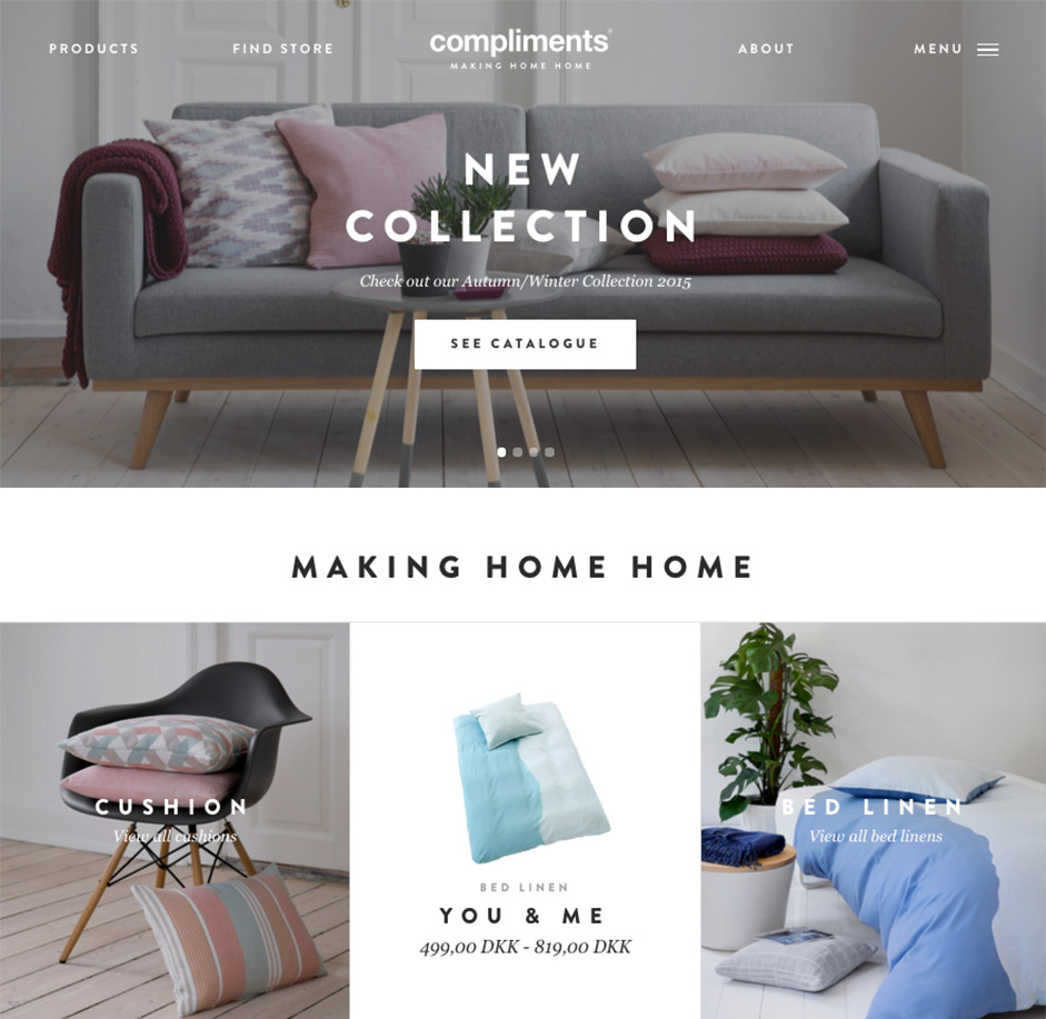
It looks great and works well. But why, and how can we replicate its success?
In this tutorial we’ll show you how to build a similar site that incorporates flat design, minimalism, cards, and HD images.
How the Site Design Works
What makes this site appealing and functional? We notice several design decisions at first glance:
- Imagery is content
- Pages load with a fade effect
- The flat-inspired aesthetic creates visual maturity that matches the brand
- The home page is arranged in a card-based interface
- There’s both a navigation bar and a nav menu to support a full responsive experience
Minimalism & High-Definition Images
In a site whose goal is to sell products, showing the wares is essential. A single photo gives people an easy-to-read first impression. But it has to be the right photo, though: one that represents the product’s qualities, not just what it is. Images tell a sort of story.
As described in the ebook Web Design Trends 2015 & 2016, large photos are trendy today because they’re easy to read. At the same time, mobile-savvy websites use fewer, smaller photos because mobile bandwidth is limited and can get expensive, depending on users’ data plans.
How do we reconcile bandwidth with quality? Minimalism.
In web design, minimalism doesn’t just mean “do more with less” — it communicates the same amount with less clutter. Use of muted colors that coordinate well across all imagery and visual design elements (header, footer background and typography).
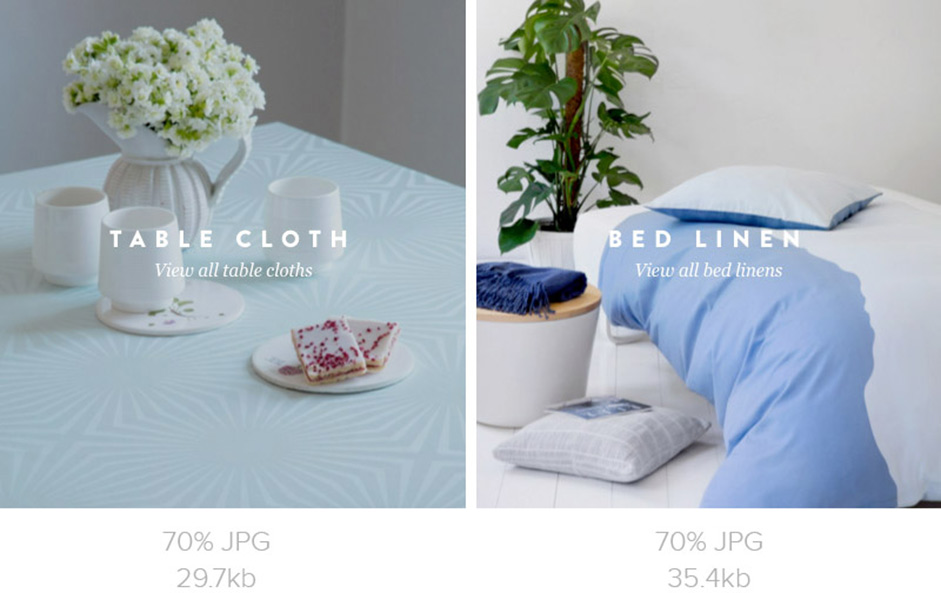
There’s another benefit. Photos with coordinated color schemes (on the left, in the above comparison) download faster because JPG photos with less contrast compress better than high-contrast photos. That means we can use larger, higher quality images for about the same number of bytes.
Flat Design Stands Out
Design elements with single, simple colors appear to sit flat against the background. It’s great at eliminating distractions to focus users’ attention on content — in this case, products — but it also complements the site’s elegant look and feel.
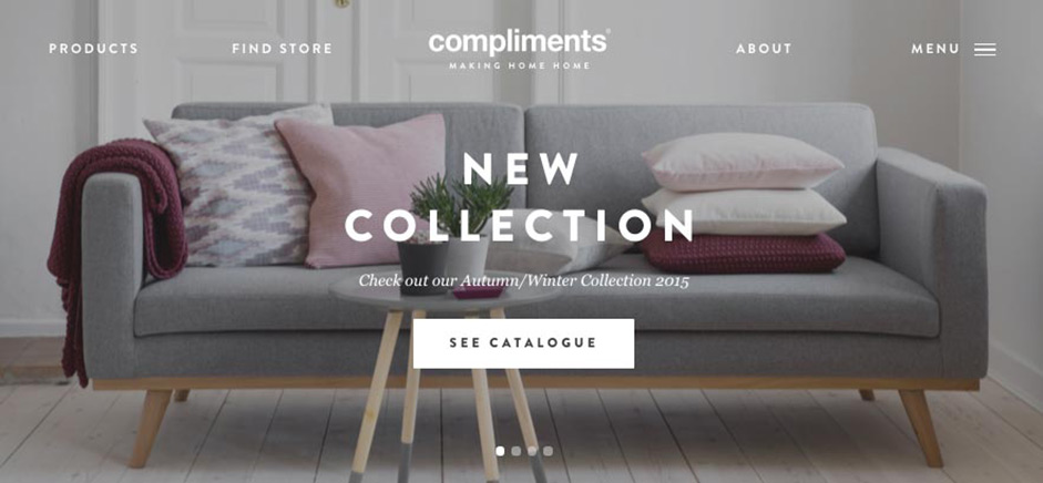
Consider the hero carousel. Its relatively bold, pure white text stands out from the photos upon which it sits. Users can’t not notice it, yet it doesn’t detract from the overall look.
In the cards below, generous white space — a flat color — does the opposite, making the products pop out in sharp relief. And where photos do have backgrounds, those backgrounds are clutter-free and evenly lit. You might even say, flat.
Cards Organize Content & Improve Flow
Card-based designs begin with a grid, but understanding why helps us use them effectively.
Adaptive design: The blocky, no-frills layout compresses well on small screens while expanding well on large ones.
Bite-sized chunks: Small dollops of information are easy to digest. That means the less information per card, the better. Notice also that each card uses the same types of information, which both helps users compare the items and learn the interface at the glance.
Best practices for card design:
- Each card communicates only one cohesive idea.
- Plan for cards to stack and sit side-by-side.
- Make the entire card area tappable.
- Space between cards helps them stand apart, but too much space creates distracting gaps. Mind your gutters.
Prototyping a Trendy & Usable Website
We can apply these rules of minimalism, flat colors, cards and HD imagery to our own work.
Here’s what we’ll build as we start in Photoshop and end in UXPin:
1. Get the materials
Start by gathering the images you need. Make sure they use similar colors or tints — in this case, we even added a dash of color to a few grayscale images to make them match.
You’ll also want a site outline: specific pages, or at least the broad sections, the site will contain.
2. Decide on priorities
Thinking mobile-first forces us to set priorities.
What do people need to get out of the home page? What image(s) will inspire them to act? Decide what content is vital to users from all devices, and what you can afford to only show for users with larger screens.
For the homepage, we’ve created the visual hierarchy as follows:
- Primary: Hero image encouraging users to browse product collection
- Secondary: Establish credibility with clear tagline highlighting 25 years in business
- Tertiary: Show additional products with 3 side-by-side cards
By designing your content first for smaller devices, you progressively enhance your experience as the viewport increases. The opposite approach risks creating a mobile experience that feels like an afterthought.
3. Lay out the pages
We start with the mobile-optimized view to make sure that the visuals for our priorities actually fit the canvas. From there it’s a matter of setting the cards adjacent to each other on wider canvases.
That’s part of cards’ convenience: they flow from left to right, top to bottom, to fill users’ screens as best they can.
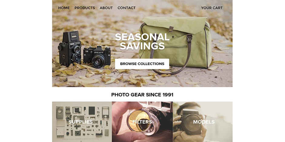
Homepage
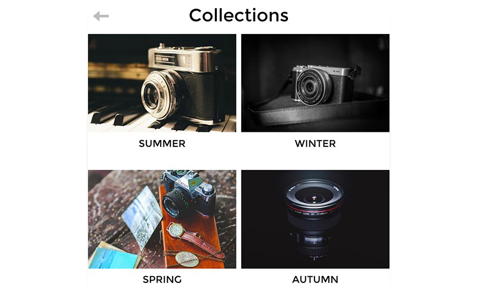
Collections Page
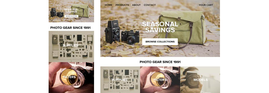
As seen above, the next step is to assemble the parts in Sketch or, in this example, Photoshop. We create both mobile (left side) and widescreen (right side) versions to visually confirm that our priorities do, in fact, work.
Card-based layouts are simple and flexible: stacked components simply flow right-to-left as traditional web pages are wont to do.
4. Design & test the interactions
A static mockup shows how a site looks, but a prototype represents how the site actually works.
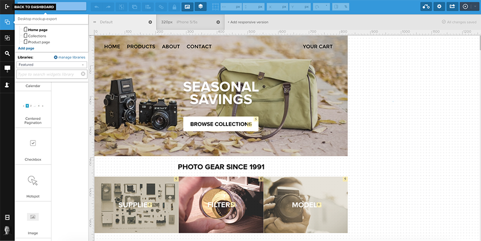
Using the handy plugin, next we’ll import the layered Photoshop file into the collaborative prototyping app UXPin. By adding interactions and linking pages together, we can refine our user flows and overall site usability.
The PSD import preserves all layers, making each its own object to which we can assign actions — like tapping to different pages.
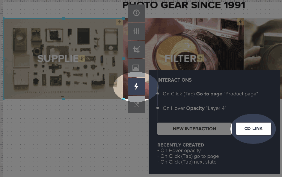
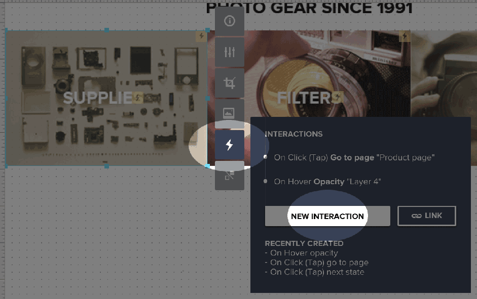
5. Add links
Static mockups are misleading. They don’t show a website’s user flow — in this case, how we plan to get users from their first impression to browsing the collections.
Tap on a photo to reveal its options. Then tap the lightning bolt icon and its “link” button. Choose an appropriate page and you’re good to go.
6. Add a little extra
Although it’s tappable, this prototype is still a little … bland. We can spice it up with a few simple hover effects.
First, set the photos’ opacity to about 85% by tapping on their “info” palettes.
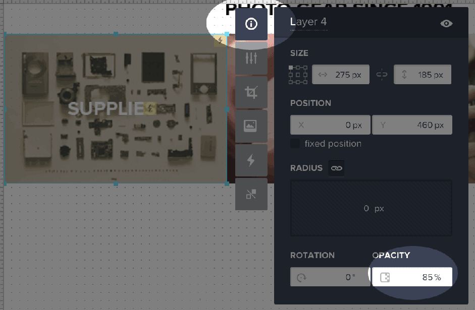
Then add a hover action that changes its opacity back to 100%.
You can see the result by hovering over the photos in this live prototype.
From here, the next step would be to run a usability test with at least 5 users. We can use UXPin’s built-in tool to run our own test, or you could use a service like UserTesting to recruit and run the test.
Once you’ve analyzed the test results, it’s time to iterate the design and test again. User validation is the key step that helps transform acceptable websites into exceptional websites.
Conclusion
Some trends are popular because designers like them.
Others are popular because they’re proven, usable, and easy to build. By themselves, cards, HD images and minimalism are great techniques. But when used together for the right user-focused reasons, they can make a site loved by users and win Awwwards.
If you found this lesson helpful, feel free to try it yourself with either Photoshop or Sketch for the static design and UXPin for the interactive design. UXPin offers everyone a free trial.