Sep 12, 2018
Creativity and Mobile Performance: One World, One Face by Adoratorio
Presenting a new series of case studies on Creativity and Mobile Performance which delve into Mobile Excellence Award winning projects. This badge, born from a collaboration between Google and Awwwards, aims to improve performance, accessibility and other important aspects such as semantics and best practice on the mobile web.
These case studies will unveil the challenges winning sites have overcome to achieve quality projects which fuse design and usability. We hope you find them useful for understanding how to manage the performance and accessibility of your mobile websites. To make sure your site achieves the Google seal of approval, follow the items in the Mobile Excellence Guidelines.
The subtle line between Mobile and Desktop
Which came first? The chicken or the egg? Or in our case, One World One Face's Desktop or Mobile?
(tl;dr: both/none. That’s what a paradox is).
Let’s start from the beginning:
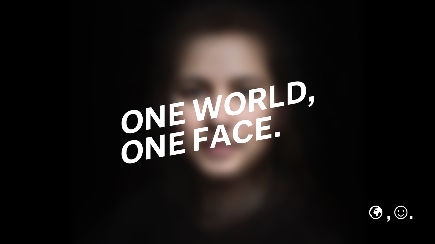
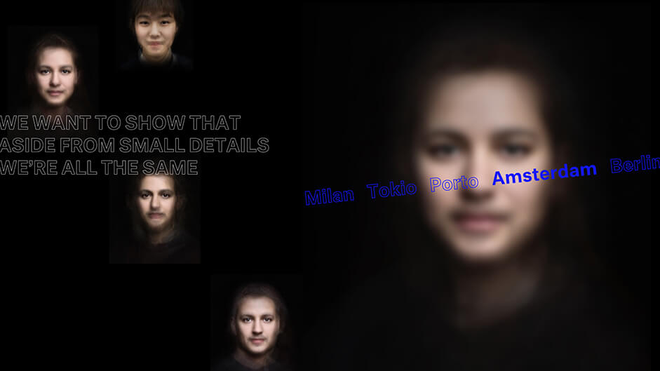
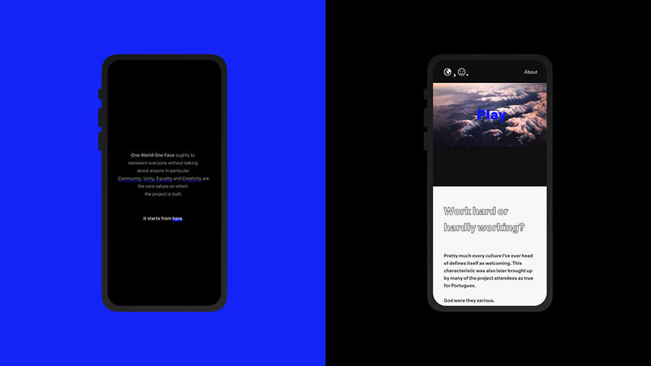
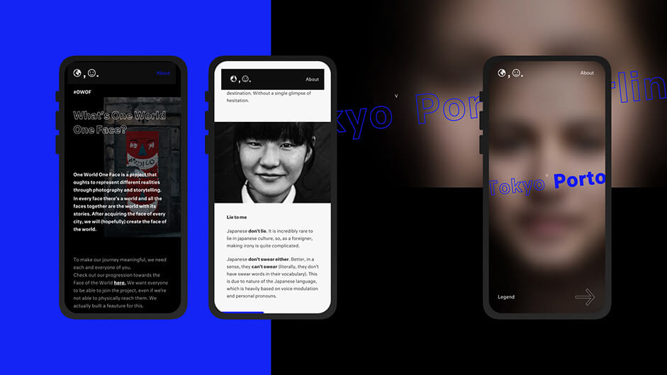
Adoratorio’s One World One Face is a project that ought to represent different realities through photography and storytelling.
Our team’s mantra is to travel to different places, meet new people, take as many portraits, film as many interviews and hear as many stories as possible. One World One Face is born on the streets, where it has also grown up.
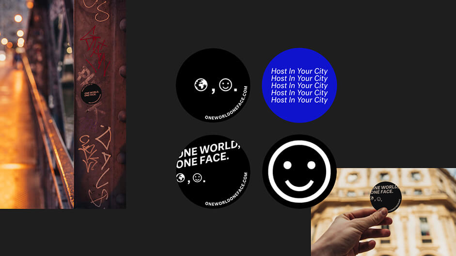
We’re used to guerrilla marketing our way through the cities we visit, leaving our stickers around to be found by every wanderer who may stumble upon them, therefore spreading our message. This given, mobile fruition was an imperative. People had to be able to come across our stickers and instantly discover, in the best way possible, the project and website we envisioned.
Mobile-First
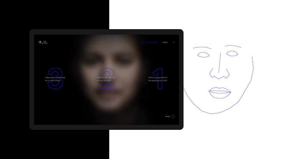
So, was Owof “Mobile-First”? Yes and no. Design-wise, we made our first sketches on desktop frames, only to soon transfer them to mobile. The same was done with transitions and effects, born from the idea that they had to give their best on both platforms. Desktop gave us the chance to test and focus on new technologies which brought us to a face recognition feature in the form of “Add your face”, while mobile allowed us to put the most importance on the articles themselves and therefore to the work of our photographer, video maker and copywriter.
Different platforms call for different experiences.
On all our projects we’re captivated by matters of mobile, responsive and progressive web apps. This means that even if a website is conceived for desktop fruition, this won’t mean we’ll spend less time on mobile, as the project would be, otherwise, incomplete.
Spot the differences
Talking about differences from mobile to desktop, the big change is to be found in “Add your face”, which couldn’t be implemented on mobile (Ios may put a spoke in your wheel from time to time). We could, in the future, fix this by implementing it in a Web App.
There are a multitude of small differences that are hard to notice on the first visit, mainly focusing on layout, animations, entry effects and such. As an example, the rotation of the faces found throughout the site are triggered by mouse movement on desktop, while through the gyroscope on mobile or that many elements that are animated with a magnet effect on desktop, are instead static on mobile.
Desktop gives more room to “play” as a user, while we prioritized solidity and ease of use on mobile.
Even though we have no specific strategy for PWA development, we initially performed in-depth studies on them, only to in the end choose a PWA optimized Vue boiler which we customized to better suit our project and needs. This customization mainly concerned service workers as, even if they are automatically generated, they had to be tweaked here and there to be used at their fullest.
Technical Stuff
Now to the elephant(s) in the room and probably the most interesting yet technical topics: optimization, performances and best practices.
It may sound like a catchphrase, but performance optimization plays a huge role in our development flow.
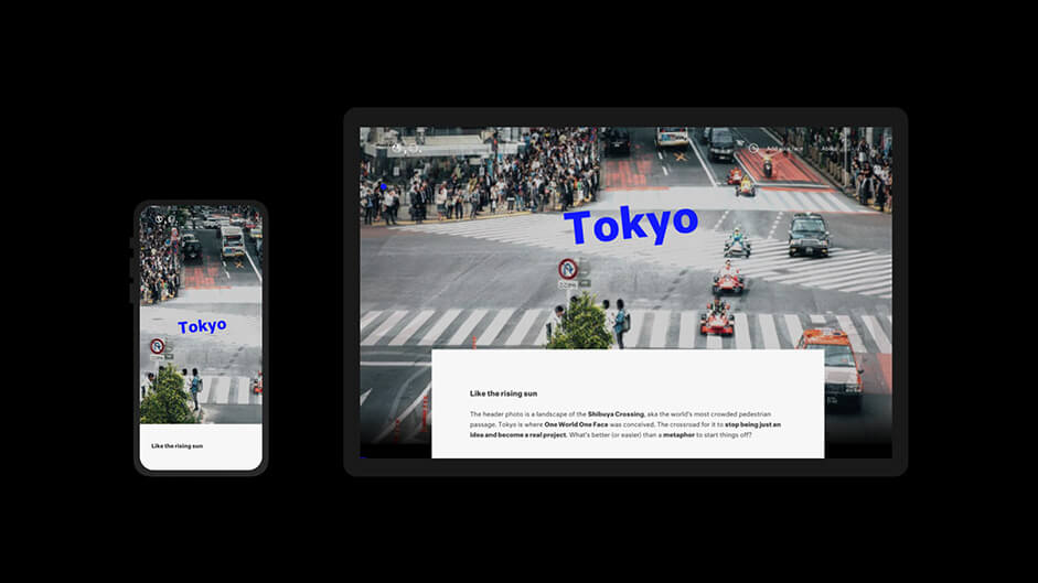
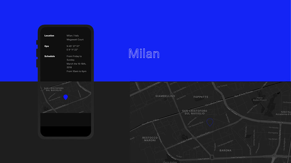
Which, in common words, means it takes a long ass time and dedication. Let’s proceed with order and focus on how we handled images. To optimize performances we introduced Webp images (through webp converter, quality level 80% as advised by Google themselves) which are already set for Chrome visualization, while, for other browsers, we prepared a fallback to .png format (optimized through TinyPng) and streamlined the vector files via SvgOMG. Another detail we took care of was not to implement the Google Maps Iframe but rather link a static image linked to maps itself (as we had no need to actively navigate), this way further improving the experience.
To further improve performances we implemented a lazy load for images not currently on display, that coupled with a transition effect, improves both actual and perceived loading times. This is also true for the website’s introduction (which may be called a loader, even though not technically one), which works as a hiding effect for background loading on one hand, and as an overview of the project on the other, since we wanted the user to have an idea of what they were about to experience. To deal with image and text entry animations we employed GSAP, while for videos and header of each article we used Pixi,js.
For the WebGL components, namely all the different faces and the distortion effect found in all the article’s header, we used three.js, the most complete library to manage a 3D ambience setup and camera.
Aside from image compression and the reduction of js and css files which are nowadays standard, due to the high size of the js bundle we decided to implement dynamic imports to integrate the website WebGL libraries, improving performance and resulting in a clearer code structure as a nice side effect.
To lay on a bench(mark)
This is what we did to improve our website’s performance, but how did we test the actual results? An awesome benchmark was represented by the Google and Awwwards Mobile Excellence Guidelines used alongside the Development Award Guidelines which allowed us to test ourselves out and see how close we were to the goal.
Parallel to this incredible checklist (leaving the standard cross-device/browser checks out) we tested on many platforms such as Google Lighthouse, Page Speed, TestMySite and GTmetrix.
Legibility is key
In terms of UX, in the last phases of the project, we realized it was better to modify the menu when switching from index to single article, which now appears as a band when scrolling upwards and added an horizontal scrolling bar to accompany the user while browsing the articles themselves. Talking about browsing articles, we paid extra attention to font dimensions, color and background in order to achieve the better degree of legibility possible.
We paid extra attention to font dimensions, colour and background
For the hosting provider we went with Google Firebase, with the direct consequence that the application itself and all its files are hosted and served through Google’s CDN in a geographically distributed system.
We love a challenge
An issue we faced during mobile development, aside from the ordinary worries about animations and WebGL, was related to the interaction between Chrome and our index slider. Chrome allows some actions that are activated when scrolling over the maximum ranges of a page (i.e. page refresh). To fix this we proceeded with Hammer.js by binding all the elements onto the slider container which prevented this issue from occurring and eventually disabling the option to scroll the cities list altogether in favor of sliding alone.
Aside from this we didn’t face any major issue cross-browser and our internal cross-device tests went smoothly (we perform them internally without the use of 3rd party tools as we own a decent array of devices).
We want you
We wanted to place the biggest challenge at the end of the article: our “Add your face” feature. We knew from the get-go we would have to face this challenge as enabling everyone to participate, even those who couldn’t physically reach us during our travels, was an imperative. The major issue was to integrate the face detect library needed to obtain the coordinates (in our case clmtrakr) with Pixi to process the image (cutting, post-production, scaling and rotating) to match the pattern structured for the Face of the World.
The help of our photographer Erminando Aliaj (co-creator of the project), given the needed know-how, was fundamental to say the least.
Goodbye
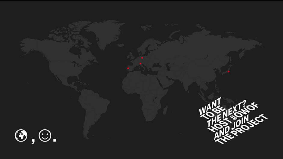
One World One Face was born to spread a message of community, unity, equality and collaboration all over the world. Releasing the project’s website has been a great milestone for this dream, but we’re not done yet.
Hopefully, next time, you too will join us.
Company Info
Adoratorio is a multi-disciplinary digital agency located in Brescia, Italy. We identify the essential around new visual perspectives.