Trends in web design, like fashion trends, come and go. Sometimes trends are dictated by necessity (like responsive design). Other trends are industry shifts, such as the change from skeuomorphism to flat design.
The decision to follow a trend must depend on the needs of your users and your business. The decision should never be based solely on “it’s what the cool sites are doing”. Fads fade. A site built only on trends quickly becomes out of date.
With that in mind, let’s look at the design trends that you might want to think twice about using.
Hiding Everything Under a Hamburger Menu
As mobile devices became commonplace, designers started simplifying navigation and hiding it under a hamburger menu. It’s a trend that’s also crept into the desktop version of websites.
For example, the Squarespace site uses a navigational drawer across its site, regardless of device.
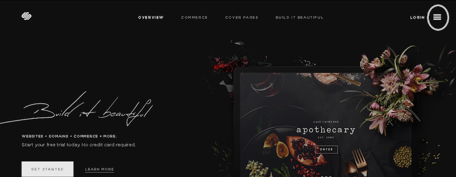
As you can see in the image above and below, the global navigation is hidden in the ubiquitous hamburger menu.
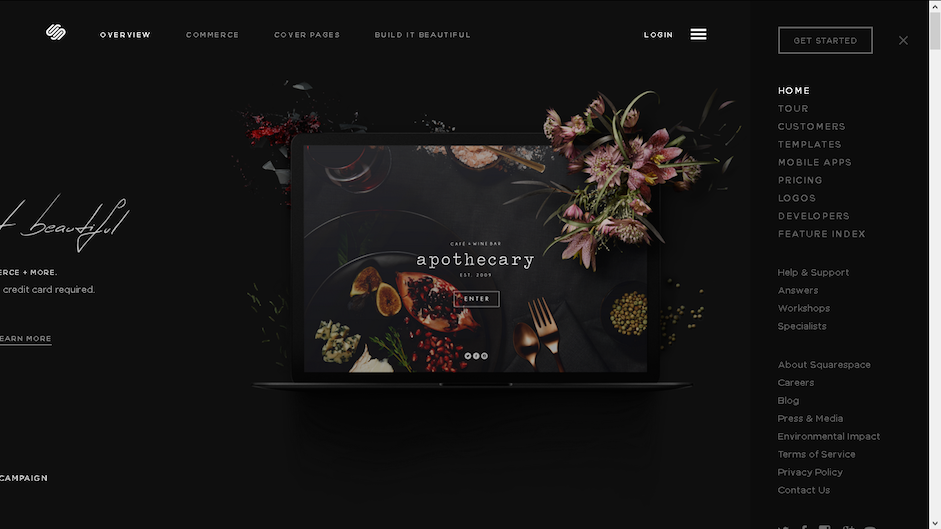
It’s understandable why this is appealing. Placing navigation under a hamburger menu makes a site cleaner, sleeker. And most people are familiar enough with the pattern. But this isn’t something that works for every site and can reduce discoverability.
The consequences can be harmful for e-commerce sites and news sites, where discoverability of topics and items is critical to the experience. As explained in Web Design Trends 2015 & 2016, forcing users to open the navigation menu in this situation may create unnecessary friction.

On Time’s website, you’ll find a variety of news topics hidden in the hamburger menu. However, Time combats the discoverability issue with a ticker on the side of recent news stories. There’s also a search feature prominently atop the ticker.
As pointed out in an excellent Nielsen Norman Group article, “Killing Off the Global Navigation: One Trend to Avoid,” hidden navigation could still alienate users.
As writers Jennifer Cardello and Kathryn Whitenton point out:
“Even if the global navigation is difficult to design and hard to maintain, most sites will still be better off showing top-level categories to users right away. It's simply one of the most effective ways of helping users quickly understand what the site is about.”
As they point out, here’s a couple ways to tell if hiding global navigation is for you:
- Skyrocketing bounce rates on landing pages. Users won’t stick around if global navigation isn’t obvious, making it hard for them to browse the site.
- Where users are clicking. Are they actually clicking the hamburger menu? If not and combined with high bounce rate, then you know something is amiss. You can check the clicks with heatmapping tools from CrazyEgg and Usability Tools.
User behavior determines whether you should use a hidden navigation drawer on a full-desktop site. Don’t sacrifice usability and discoverability for pure aesthetics.
2. Front-page Carousels
These days, carousels seem to be everywhere. They can add visual interest and reduce clutter. But with their overwhelming use, they’ve made a lot of sites feel cookie cutter.
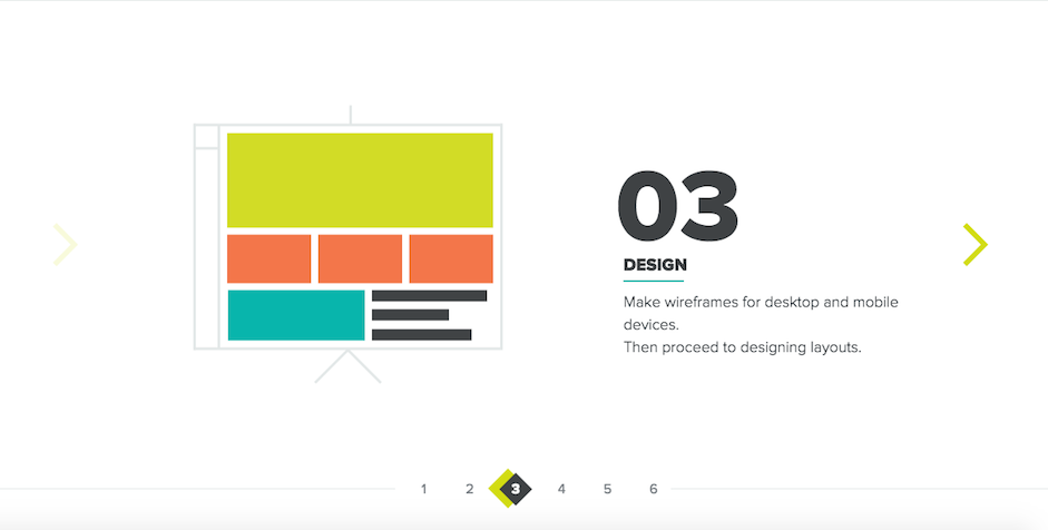
Not to mention, there’s an argument that this is one trend we should put to rest.
A few things to consider:
- Carousels are bad for SEO. The lack of content means that it’s difficult to get meta information into a page. This is especially true as Google no longer crawls meta keywords (although Bing does) and so will take keyword information from the page. Of course, you can have the word count below the carousel, in the body of the page. Most sliders though contain headers that are wrapped in H1, and these change when the slider does and as such, devalue keywords within them.
- Adversely affect performance. Often carousels contain high-res images that are under-optimized and as such, slow down the load time of the front page – which as the most important page on the site should load as quickly as possible. Sliders also make use of JavaScript or jQuery, which can also add to performance headaches.
- Pushes Content down below the fold. While above the fold content is perhaps not as important as it once was (we all know how to scroll these days), it’s still not recommended by Google that you push content lower down the page. While the search giant’s recommendations are based on ad content above the fold, a carousel really doesn’t offer much in the way of value to the user – it’s just pretty.
- Tends to be inaccessible. Even the best frameworks out there can’t fully solve the issues of accessibility that surround carousels as there are so many to address.
Further to this, just a 2013 study showed that just 1% of people click on carousels. And many simply ignore them and don’t note the content, thanks to the phenomenon known as banner blindness.
All of this is not to say that you shouldn’t use carousels at all in your designs, but you should have a good reason for their inclusion aside from that the client likes it. Carousels can work, but they should be carefully crafted and optimized to ensure that they don’t compromise UX and accessibility.
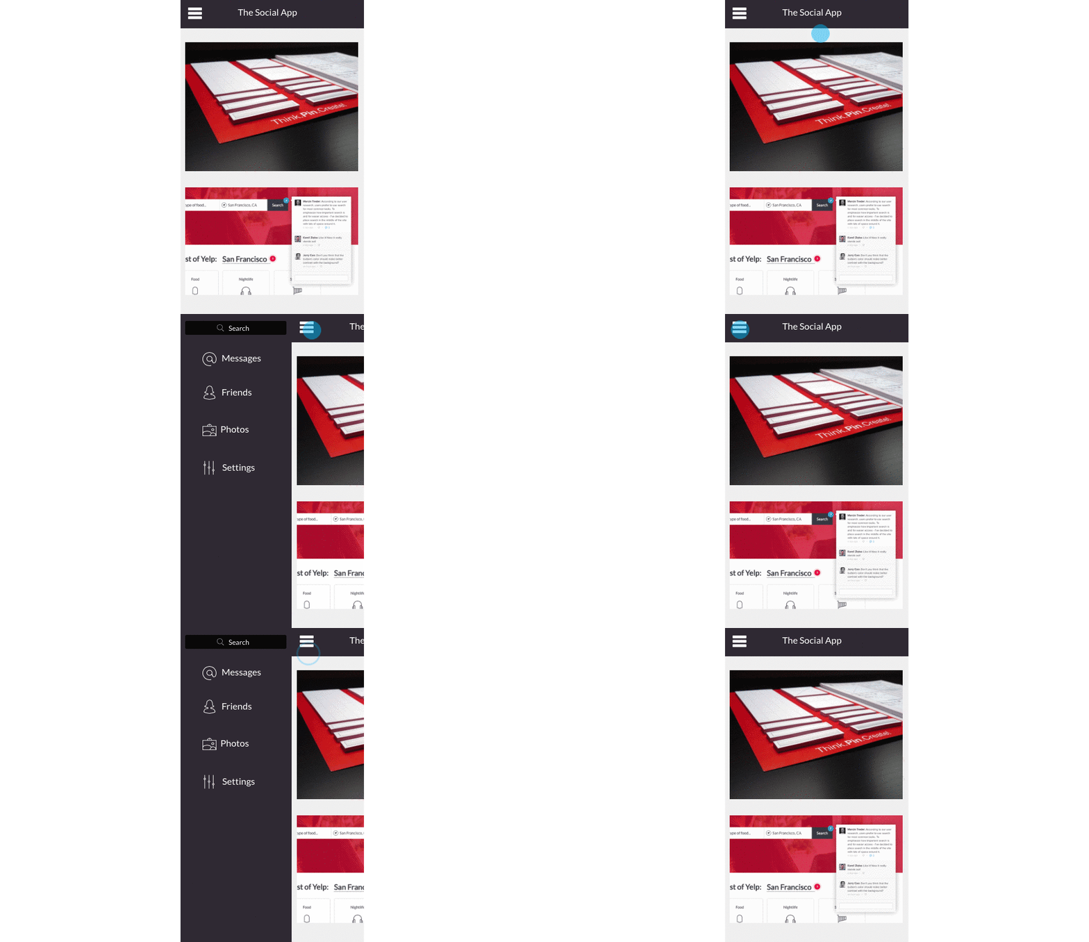
The sliding animation powering carousels, for instance, is certainly a useful tool for other design elements. For instance, you can try a sliding navigation drawer for your mobile viewport. As shown in the below prototype created in UXPin with the no-code animations editor, the sliding animation allows the user to “shelve” and reveal content as needed.
Unlike a carousel, a sliding animation doesn’t require a user to scroll through multiple frames. The content simply pops in and out of view as required.
3. Parallax Scrolling
In recent years we’ve seen more sites appear that make use of parallax scrolling.
The parallax technique allows the foreground and background content to scroll at different speeds, creating an illusion of depth. It can be used to very good effect, but it’s debatable if it can be described as having good UX.
Parallax has a few potential issues:
- Bad for SEO. As sites that utilize parallax scrolling tend to be made up of one page, there’s usually little in the way of content that can be crawled by the search engines. This is especially true as text tends to be embedded in graphics.
- Can reduce performance. Due to the heavy use of graphics and JavaScript, a page can get clogged up on load. And it’s certainly a headache for mobile users. Load times on mobile tends to be very poor when parallax is used, due to the heavy use of JavaScript.
- Can affect users negatively. The Journal of Usability Studies carried out research on parallax which found that whilst the parallax site was considered to be more fun than non-parallax sites, some users experienced “motion sickness and experienced significant usability issues when interacting with the parallax website.”
However, parallax scrolling can add another dimension to a site and allow it to stand out. But as we listed, there are trade-offs if you want to create a site that works on both desktop and mobile, then parallax really isn’t for you.
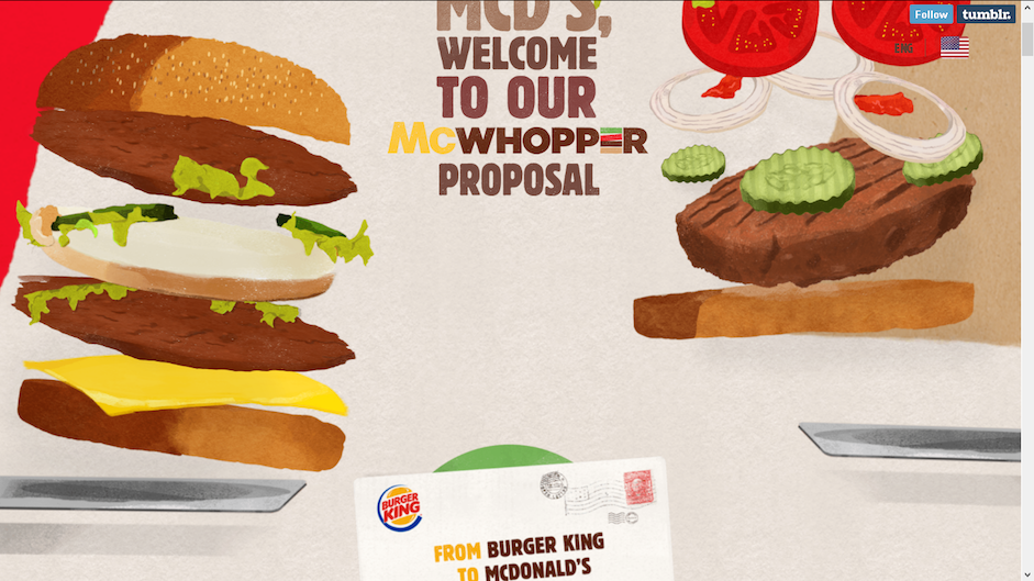
And it is, even if it’s a little cartoon-like, it’s quite well done and tells a story as you move down the page. This is the strength of parallax scrolling; it allows you to effectively tell a story using mostly graphical elements. The page above has imagery, text and video embedded into it, so we put it into GT Metrix to see how it stood up to scrutiny when it came to speed.
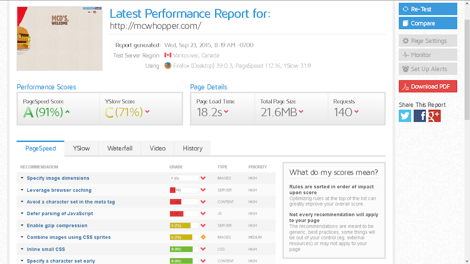
As you can see, the page has a score of A from PageSpeed and C from YSlow. That’s not terrible, but take a look at the page load time … it’s 18.2 seconds, which is hugely slower than most commercial sites that you’ll come across (according the GT Metrix, the average is 6.6s).
According to GTMetrix, the site should also - amongst other things - avoid character sets in the meta tag,
“The following resources have a character set specified in a meta tag. Specifying a character set in a meta tag disables the lookahead downloader in IE8. To improve resource download parallelization, move the character set to the HTTP Content-Type response header.”
Other tips include:
- Defer parsing of JavaScript as in this instance, 313.6kb of JavaScript is parsed during the initial loading of the page and deferring this can help to reduce “blocking of page rendering.
- YSlow recommends that the site should minify CSS and JavaScript where possible.
- The site should use a CDN
So if you’re considering creating a parallax site, ask yourself if the story you want to tell is worth losing visitors due to a reduction in performance. Parallax has to be done well and it has to be a little different in order to capture and hold the attention of the user.
4. Complex Load Screens
Remember back in the day when you might hit a website only to be greeted with a Flash animated load screen that you were forced to sit through before you could enter a site? Users will bolt from a site that takes more than 10 seconds, and that could affect your bottom line.

In the example above, you have to sit through a flash video that lasts 41 seconds. There’s no clue as to what the site is even about. And there’s no navigation, leaving users perplexed.
We can assume the site has something to do with filmmaking, but there’s nothing really to confirm our assumptions. The Apple icon allows you to open the video in iTunes, but the URL when entered on iPad just says server can’t be found.The second example above is somewhat tedious and you find yourself watching the counter slowly climbing to 100%. As the image and percentage counter is right in the center bottom of the screen, it’s also quite dull.

The second example above is somewhat tedious and you find yourself watching the counter slowly climbing to 100%. As the image and percentage counter is right in the center bottom of the screen, it’s also quite dull.
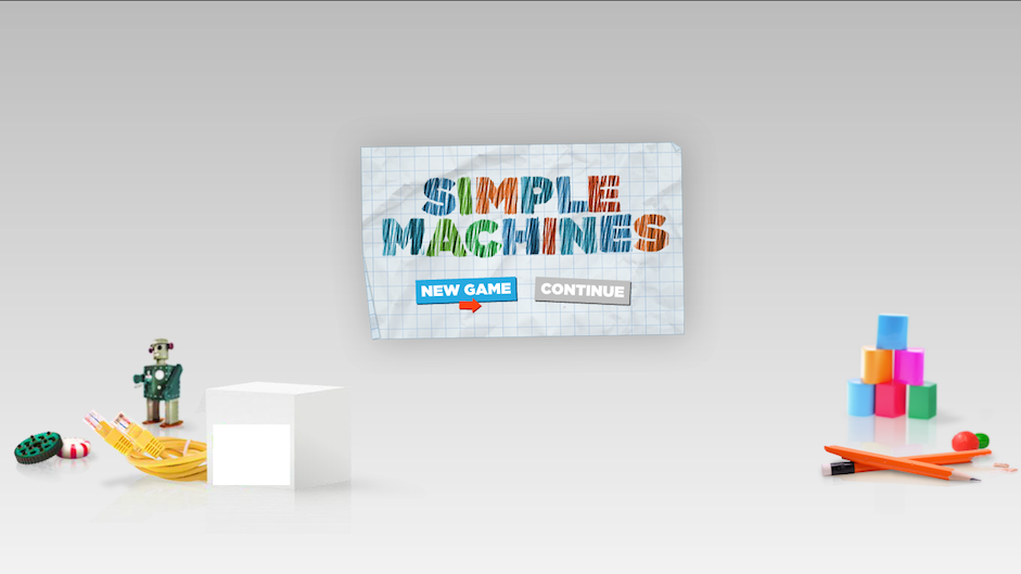
However, when the page does finally load, it’s clear what the site is all about. And that could leave you wondering why all the build up.
In this example, the load screen could be created using the below only, which wobbles when you hover over certain elements. It’s just enough to hold your attention. The interaction is fairly simple, it’s clear that when you hover over certain elements that they can be used and this also means it doesn’t affect performance too much.

Here’s a good example of a fun, interactive screen load that makes good use of graphics and sounds. Initially, it loads the graphics by bouncing them in one at a time, with a rocket at the beginning. It fully loads in around four seconds and uses simple music to keep things interesting.
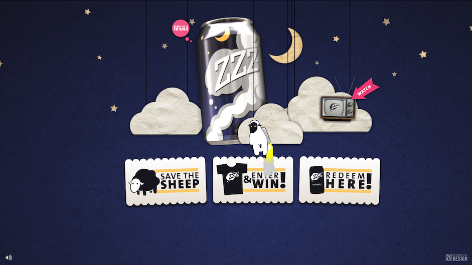
Once the screen is fully loaded, there’s plenty of interactive options. Elements bounce in quickly and the navigation options are clear. Moving the mouse around also moves the stars in the background. This creates consistency with the load screen and also pays off for the user waiting.
5. Too Much JavaScript
It seems that JavaScript is everywhere these days. Social plugins use them. So do a good proportion of WordPress plugins. rom a UX perspective, however, JavaScript can slow down a good site. And like we said earlier, users won’t stick around if a site is too slow.
JavaScript can be highly functional in that it can be used for many things that other languages can’t. It can help you create great load screens, for example, and other styling elements such as sliders, adding functionality.
JavaScript can be found in many of the modern libraries and frameworks such as Angular.js, Backbone.js, and Knockout.js. The latter is an MVVM (Model-View-View) framework which is written entirely in JavaScript.
There are plenty of reasons that overusing JavaScript can hurt your site and these include:
- Load times. This is due to plugins and sliders that create lots of different JavaScript files and CSS. It’s much more efficient to ensure that they all load from one file (of each type) by minifying.
- Mobile browsing is adversely affected. This is due to load speeds.
- Easily affects functionality and ‘breaks’ parts of a site due to a bug. You can learn more about bugs and how to avoid and fix them using web resources such as PluralSight.
- Security. JavaScript, like many web languages/scripts, can be exploited if it’s improperly implemented. This is often because it calls to other sites in order to make it work properly (think social plugins). Malicious code injections can also be carried out, usually in order to steal information
- SEO, JavaScript isn’t crawled by search engines and so if your site has a lot then you may miss out on some keyword rankings.
Be judicious with your use of JavaScript.
If you use it with your responsive site, you’ll only want to load the script you’ll actually need on a mobile device. JavaScript doesn’t always render well on mobile devices, which can clog up the speed of your page load. You should also use web fonts for social follow icons on your site in order to reduce JavaScript and check out how much is used in any other plugins that you use.
Now don’t get us wrong — there’s nothing wrong with JavaScript in general. It has a lot of great uses and allows us to do some nifty things on the web. However, you should reduce the amount of JavaScript you use so that it doesn’t make your site painful to view on a mobile device.
6. Complex Typography
While you can use multiple typefaces, I generally wouldn’t recommend more than two.
Too many typefaces creates a confusing and cluttered looking site, which reduces legibility and readability.

However, rules are made to be broken and there’s nothing to say that you can’t use more than two typefaces to good effect.
The example below from the UXPin site uses fonts from the same family (Proxima Nova), a tactic that works quite well for clarity. However, spacing is important too and it’s not essential that they should be from the same family, just that they work well together.
Here’s a few tips:
- Experiment with fonts. Aim for clean and clear presentation that also reflects the brand’s visual style.
- Stick to fonts and typefaces that complement each other or are different enough to provide interesting contrast. Consider too what the font/typeface says to the user on a psychological level. People have similar responses to certain fonts as they do to colors. Believe it or not, emotions and feelings are also tied to typography. A serif has an air of formality. A sans-serif feels reliable. A script can be haughty.
- If you want your business to be seen as traditional, go with a serif. If you want it to be seen as stable, a sans-serif is your best choice.
Good Designers Are Good Skeptics
Some fantastic trends have emerged as best practices in recent years.
Minimalism inspired a raft of sites that are clean, fast and easy-to-use. Meanwhile responsive web design helps many businesses worry less about designing for a constant stream of new devices. Good trends come along and tend to stick, but there will always be some that are ill thought out.
Above all else, user needs must inform your design the most. When a new trend pops up, always consider it from every angle before following the crowd.
For advice on the 10 most useful web design trends, check out the free e-book Web Design Trends 2015 and 2016. The book includes 100 resources and analysis of 166 examples from companies like Google, Apple, Reebok, Intercom, Adidas, Dropbox, and others.
