It doesn’t matter how good your website is if users can’t find their way around it.
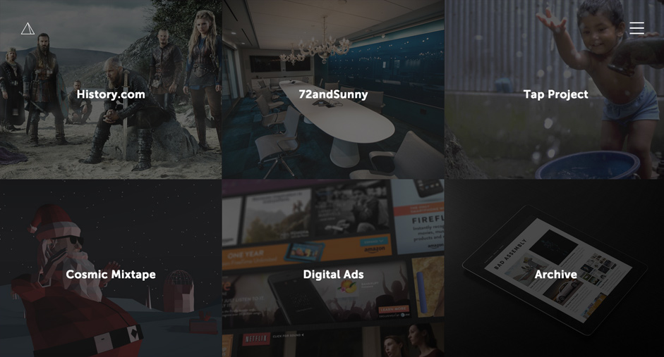
Photo credit: Pattern Tap
In this post, we’ll help you better understand the principles of good navigation, then show you how it’s done with some of our favourite patterns. For more advice, feel free to check out the free e-books Designing Better UX With UI Patterns and Web UI Patterns.
Luckily, navigation UI patterns are a shortcut for good website usability.
UI patterns do wonders for learnability, since there’s less your user has to figure out on your site. Just think of the top navigation bar: if you see words spaced out on the top of the screen, they instinctively know they’re internal links.
The problem with patterns is that it’s hard to stand out when you’re doing the same thing everyone else is doing. But you don’t want to deviate too far from functionality with something as important as navigation. You need to find that sweet spot right between familiarity and creativity.
The Principles of Web Navigation
While thinking outside the box is usually a good idea, there are some rules that you just can’t break. These are the navigation principles we first described in Web Design Best Practices.
First, and most important, a navigation system must be simple. Without exception, every site should have the simplest structure possible. Just as your site should only include as little pages as possible, make sure your navigation is as unintrusive as possible. Good navigation should feel like an invisible hand that guides the user along their journey.
Next, a navigation system should be clear. The function must be self-evident. No explanation or learning curve should be required. Your user should know how to go from point A to point B based on their first glance.

Photo credit: White Frontier Brewery via awwwards
Another non-negotiable rule is providing orientation – in other words, letting the user know where their current page is in relation to other pages, and how to return to any previous pages if necessary. For example, a few helpful patterns include breadcrumbs and tabs.
Last, consistency is required. The navigation system for the home page should be the same on every page. You can choose which type of navigation system will work best for your site, but once you make a decision, stick with it.
These principles apply to all site navigations, no matter which of the following four patterns below that you choose.
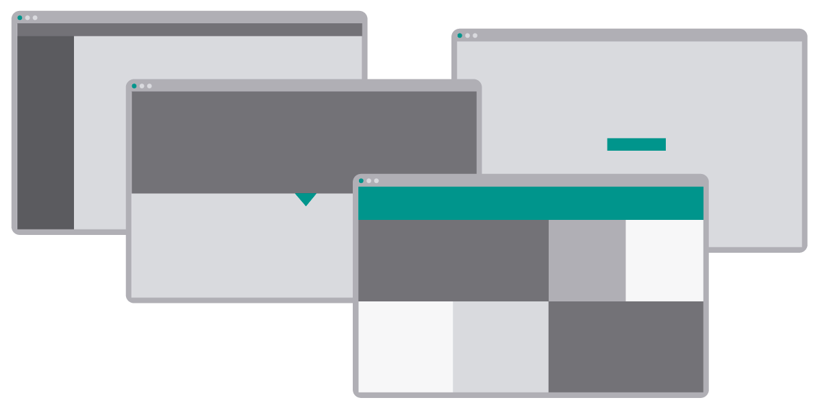
#1: Vertical Navigation Menu
It’s so simple and easy, and yet most sites don’t even consider it: if you want all the usability of a horizontal menu bar but with a unique spin, simply turn it vertical.
The vertical navigation menu is just as effective as its horizontal counterpart, with clear distinctions between pages and easily recognisable functionality.
Although placing the vertical column on the left side is slightly familiar (Facebook), the right-side vertical navigation menu is still uncommon enough to feel distinct.
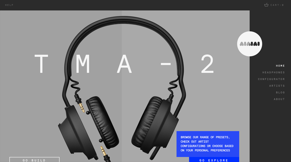
Let’s take a look at headphone makers AIAIAI. Without sacrificing any usability, this site goes against the norm in two ways: not going horizontal and not going down the left-side.
There is some debate over the merits of a left-sided vertical menu, not the least of which is that it takes up value screen real estate. For a more thorough analysis of the left-sided vertical menu and how to use it properly, read this Smashing Magazine article.
Pattern #2: Long Scrolling
With the increased popularity of scrolling, sites with most of their content on a single page are appearing more and more – though not nearly as much as the traditional separate-page format. That makes this a good time to try the one-page long scrolling pattern, as it still feels new, but is familiar enough that users understand how it works.
With a quick prompt like “scroll down,” users start on a journey in which each new screen presents a page. This pattern works best for progressions, such as displaying different phases in a process, but can likewise be applied to any content, from samples in a portfolio to different product lines for an online store.
If you want to tell a rich visual narrative, the long-scroll is your best friend.
This pattern also opens up the potential for exceptional visuals, especially with parallax scrolling. Like we described in Web UI Design for the Human Eye, the single-page long scroll and parallax scrolling go hand-in-hand.
The downside is the restrictions on user freedom, as they have little control over the order they view the pages. The workaround for this is to simultaneously include a persistent navigation, so that users can experiment with the scroll or simply jump to the page they want.
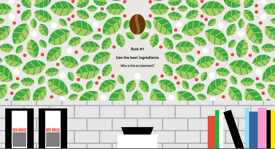
Source: For Better Coffee via awwwards
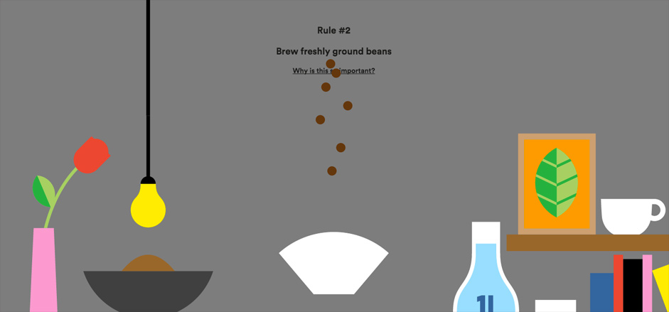
Source: For Better Coffee via awwwards
Let’s take a look at For Better Coffee.
As the user scrolls down, they follow the coffee bean (in a fixed position on the screen) through the different phases of coffee production, changing the graphic as it goes. Along the way at each phase, the site lists an underlined rule for how to make better coffee, with a link for me information. In a way, the underlined links accessible through long scroll is nothing more than an elaborate navigation menu.
At the bottom, you’ll also find a call-to-action to sign up for the newsletter. Conversion optimisation is where single-page sites really shine, according to a study done by Basecamp on their own site. The linear experience takes advantage of our affinity for storytelling so that we see the conversion point as a natural “end” to the experience.
Pattern #3: Single Option Home Page
The single option home page pattern gives you the most control over your user’s first move because there’s only one option.
This pattern works perfectly with the long scroll mentioned above, as the only option is to scroll down. The single option home page can also act as an entry point to the rest of a multi-page site.
The appeal of this pattern is that you lead your user where you want while eliminating any clutter. Usually, this pattern is seen in the home page with:
- the title
- tagline/slogan (optional)
- descriptive but succinct introductory paragraph/value proposition
- meaningful imagery (usually hero)
- single, attention-grabbing call-to-action
Like the long scroll, the obvious downside is the restriction on user freedom. Often, this pattern is used with a hamburger menu, to give the user more freedom without upsetting the minimalist style. Even so, this pattern is a gamble, and should only be used by certain sites that inherently have a narrow range of use.
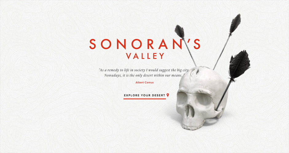
Source: Sonoran’s Valley via awwwards
The experimental site Sonoran’s Valley starts off the user’s journey with a single option. Once clicked, the user has more freedom.
So why not just start the experience on page 2? The single-option home page makes a stronger first impression with its skull graphic and philosophical quote. It creates an air of mystery that makes you want to learn more.
After all, a single option is the easiest choice to make, according to Hick’s Law (discussed in Interaction Design Best Practices). Once your user makes that easy first click, they’ll already be invested in the site, and more likely to continue.
Pattern #4: Full-Screen Navigation
For simplicity and ease-of-use, bigger is sometimes better.
Displaying your options over the entire screen ensures that your user will see how to navigate, and allows for some creative visuals. While you’ll be unable to showcase other content with this pattern, the upside is that the navigation menu is the content, so the accompanying images or icons take on greater meaning.
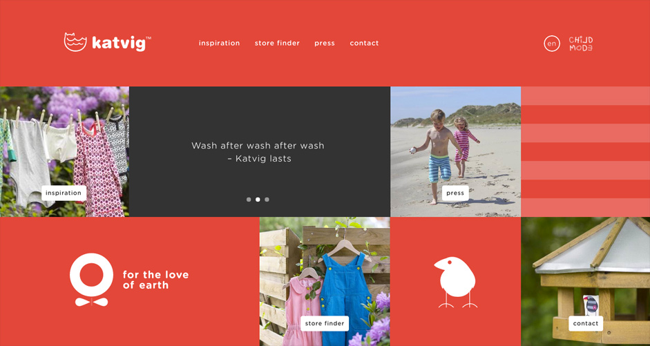
The environmentally conscious clothing line KATVIG expands its navigation menu across the entire screen, with each page represented by a sentimental photograph, and each option interspersed with attractive imagery. The site also circumvents any confusion by placing the same options in the horizontal menu bar across the top.
Mixing the Patterns
These patterns are not exclusive, and can be used in conjunction with each other to create better effects. For example, a horizontal menu bar can be added to any of the patterns just for safety (like the KATVIG example), or the long scroll can forego other options beside scrolling, making it a single-option home page.
In fact, one site, Bad Assembly, takes advantage of all four of these creative navigation patterns.
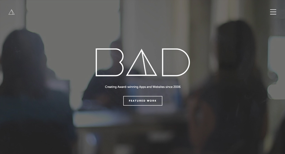
Source: Bad Assembly via awwwards
Users start on the home page, with one central call-to-action. However, the hamburger menu in the upper-right pulls down to a vertical, right-side navigation menu for more user freedom.
(Notice, also, the clickable Bad Assembly logo in the upper left corner – this upholds the navigation principle of orientation, as a user can also return to the home page if they ever get lost.)
Source: Bad Assembly
The user can either click the central call-to-action, or else scroll down. In fact, the user can navigate the site entirely by scrolling (if they wish). The next screen features a full-screen menu of the different choices.
All four of our creative navigation patterns are applied, but instead of competing, they actually complement each other. Working together, they create a safer and more comprehensive system for users to move from page-to-page – and if that’s not the point of a navigation system, then what is?
For more advice on finding and choosing the perfect UI patterns, check out the free e-book Designing Better UX With UI Patterns. You’ll learn a 4-step approach for getting the best UI patterns, along with examples from Dribbble, Jawbone, Duolingo, Dropbox, MailChimp, Medium, and more.