


https://www.betterknown.com.au/en-au/branding-the-family-office
Cuthbert’s came to us with a clear goal. They wanted to disrupt the Family Office category by helping first-generation wealth owners start a Family Office.
We knew that the business landscape has become far more complex in recent times, especially in the regulatory, tax and wealth management space. These days, investment strategies have to be more flexible and informed to keep pace with accelerating change and shifting market dynamics.
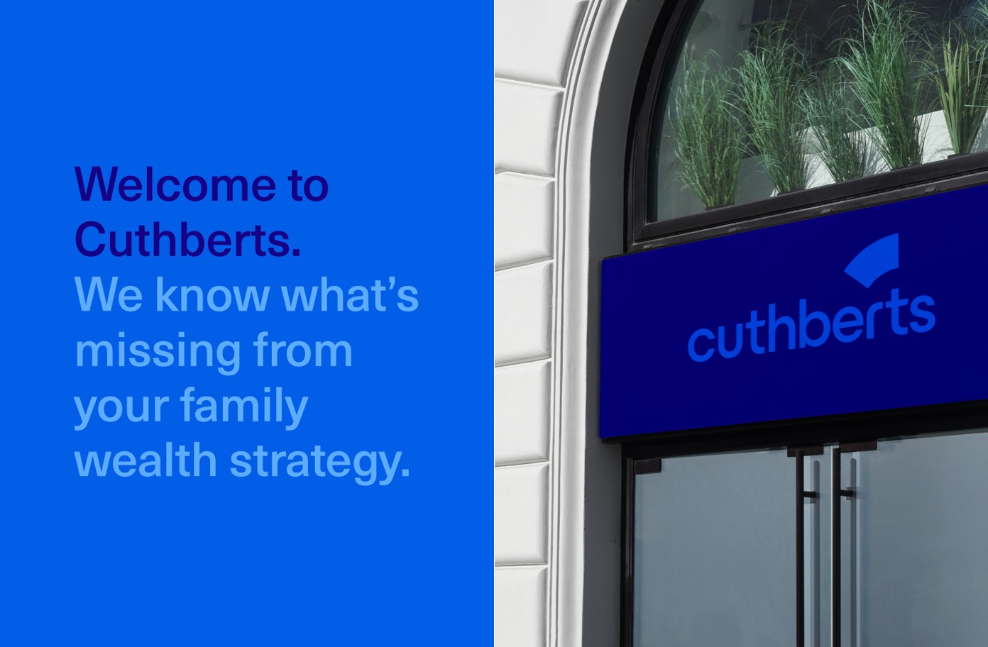
Understanding the complexities that wealthy families face, Cuthberts needed a distinct brand identity to attract like-minded people. Our aim was to empower them, through a unified brand experience and through a consistent personality, tone of voice and visual identity.
Research and insights
Our insights told us that the sheer pace of change when it comes to wealth and regulation, digital transformation and risk had led to a huge shakeup in the way the Family Office could now be approached. We also knew that the biggest consideration for a Family Office is succession. Preparing the next generation and the fear of letting go of control by the incumbent generation (often the wealth creator) is a key challenge in many high net worth families.
Together through client interviews and collaboration, we developed a guiding strategy to unlock the value of Cuthberts as: “The missing piece in your success story.”
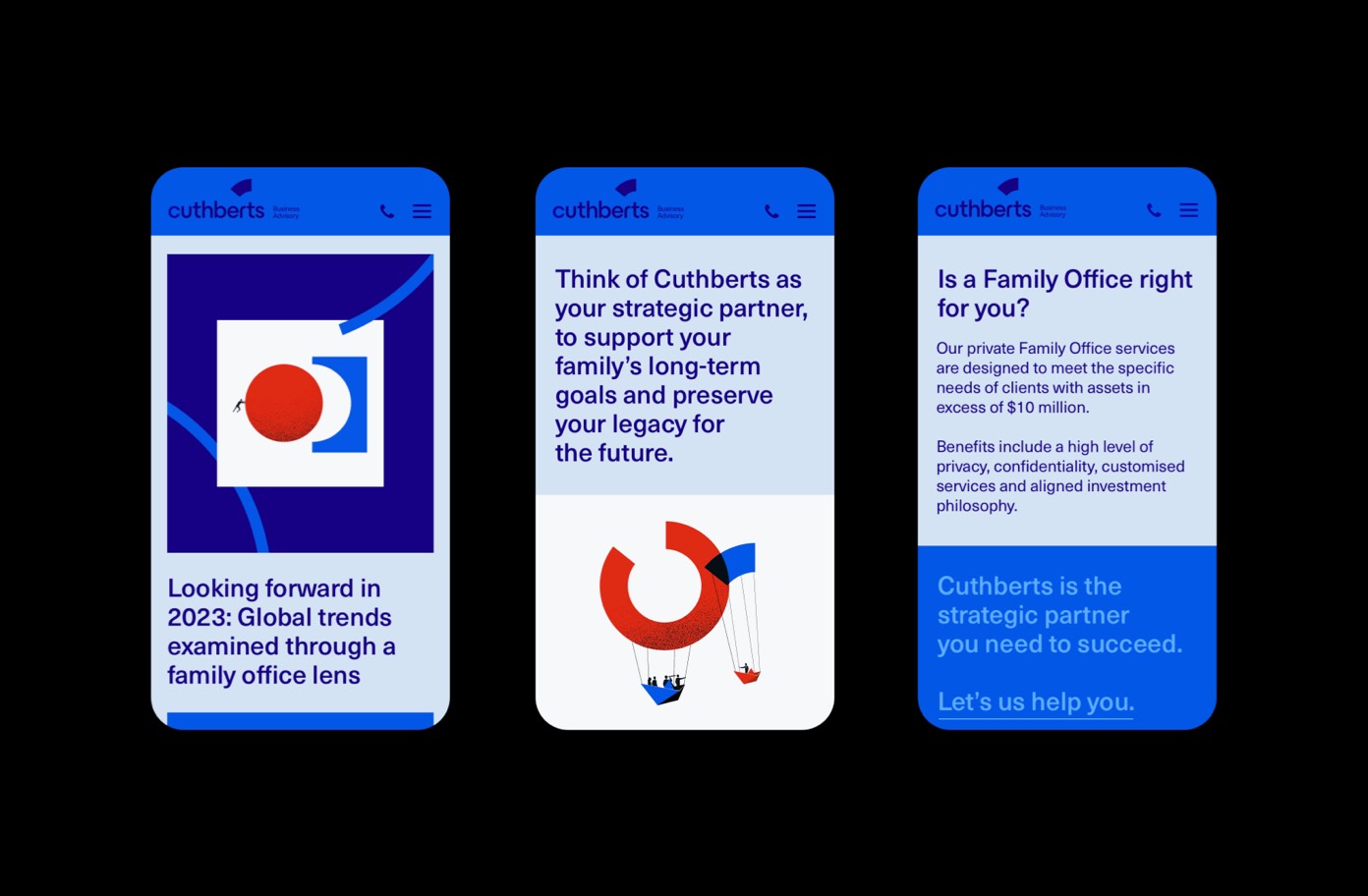
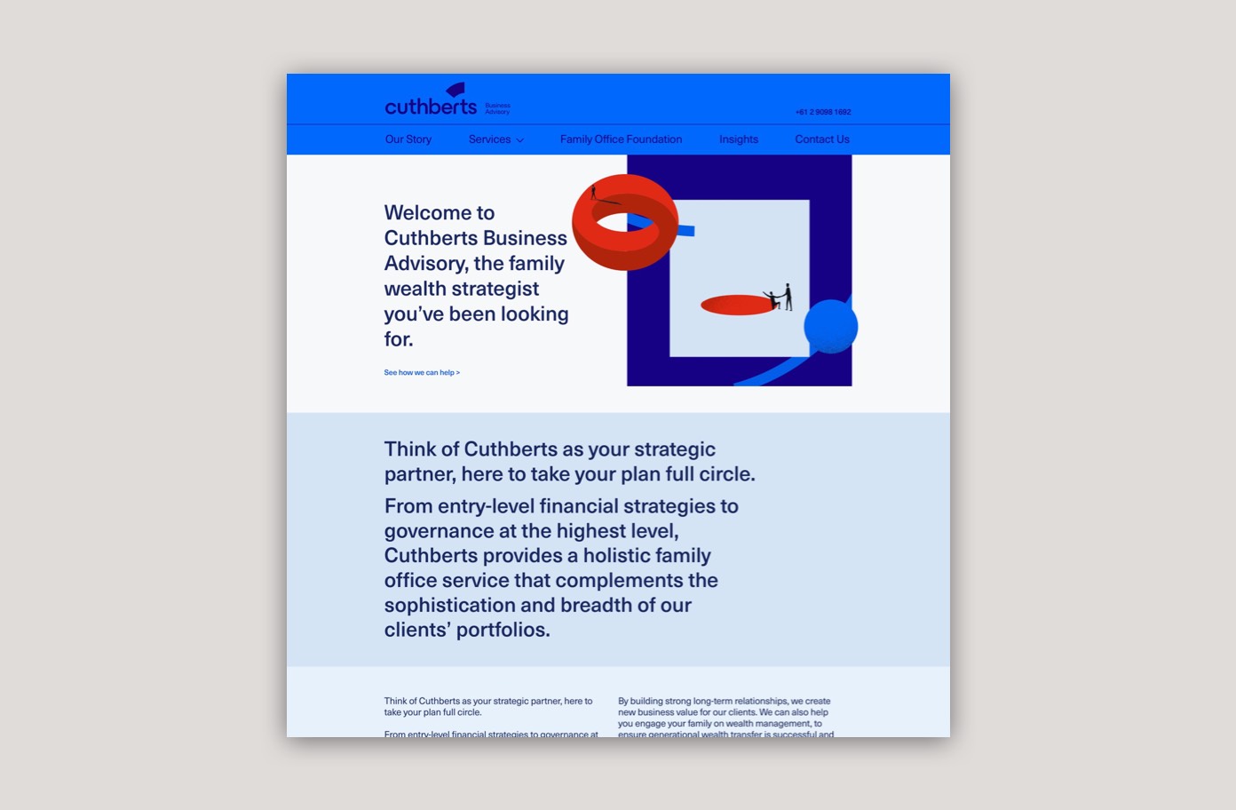
We positioned Cuthberts as a strategic partner, here to take your plan full circle. From entry-level financial strategies to governance at the highest level, Cuthberts provides holistic family office services that complement the sophistication and breadth of their clients’ portfolios.
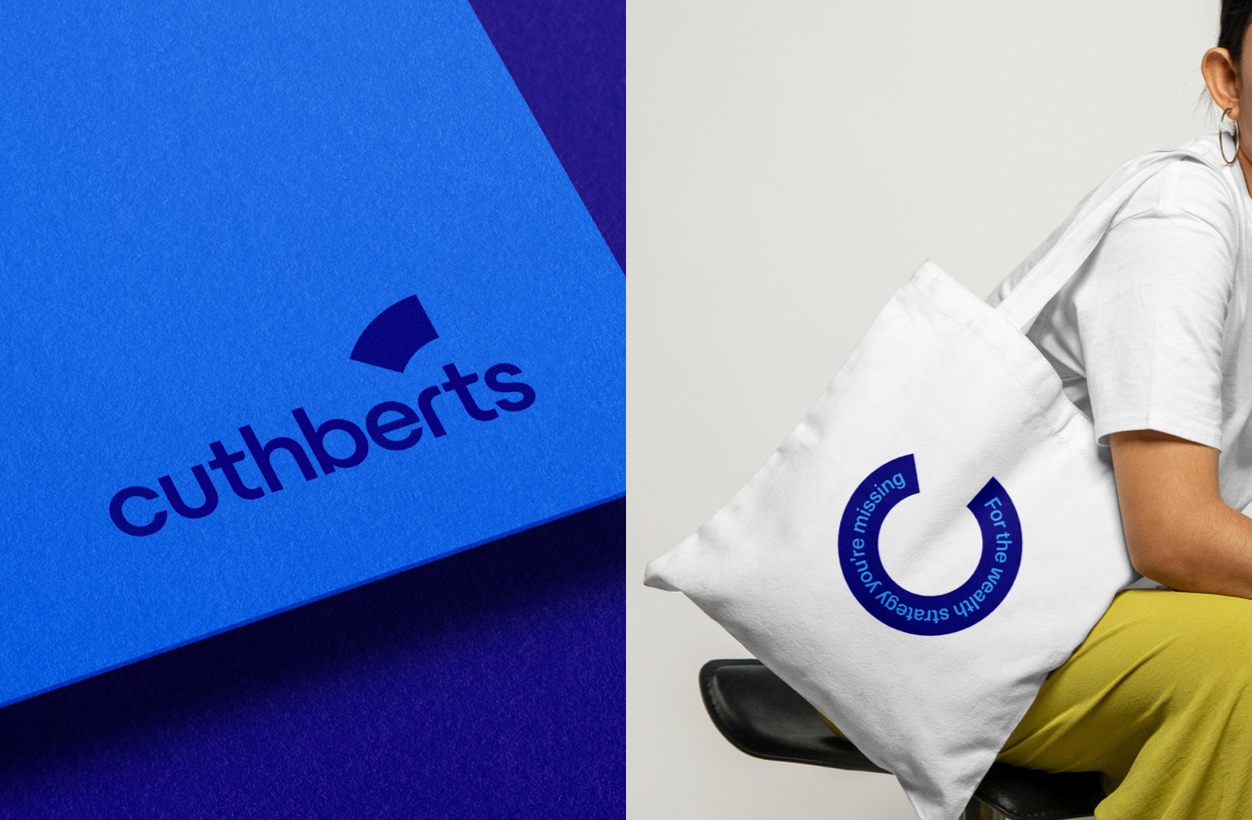
The tagline, ‘For the wealth strategy your missing’ connects visually to the logo which was inspired by taking the full circle approach.
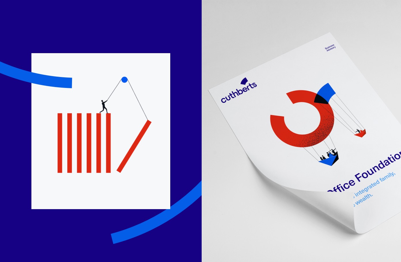
The brand story was told through well-crafted copy and a series of illustrations to help support the messaging such as family governance and philanthropic services.
Brand design
We created a new library of imagery to capture the key concepts of the Family Office in a metaphorical and delightful way.
The blue colour palette symbolises loyalty, honesty, trust and responsibility. Colours are paired back and complementary to signify support and working collectively. Bright red is used to give importance to illustrations and captures the energy of a brighter future.
The brand story was told through well-crafted copy an illustrations to help support the messaging such as family governance and philanthropic services.
Business enquiries and more information: Better Known
Project Details