

There’s no denying that visuals are important to interaction design, but exactly how important may surprise you.
 Source: Bushrenz
While visual representation is often listed as the second dimension of interaction design (the others being words, space, time, and behavior), in many ways it is the first.
As visual mediums, sites and apps communicate primarily in visuals, and even written language must be presented carefully through typography choices, sizing, alignment etc. Perhaps even more important, as sight-based creatures, humans are accustomed to making split-second decisions on appearance alone. These instantaneous responses are deeply linked with emotions, and so your interface’s look immediately affects how your user feels about the site.
More than Meets the Eye
We can easily notice when we see something we like (and something we don’t), but on a subconscious level, there’s so much more at play. When scientists say humans are sight-based creatures, it’s not just a casual comment – there’s a surprising amount of data showing that a large portion of the human brain is devoted to sight alone, especially in comparison to the other senses.
But, because you’re a sight-based human, we’ll make our point better showing rather than telling. Read the word below:
BLUE
For most people, the brain comprehends only the color red, even though the word represents a different color. The word itself is basic enough that any first-grader can recognize, yet still the sight of the color red dominates the communication of the color blue.
In an eye-opening TED Talk, data journalist and infographic expert David McCandless points out the sheer depth visuals have on our brains, most of which is subconscious. He conveys his point with an analogy to computer processing, using the graphic below:
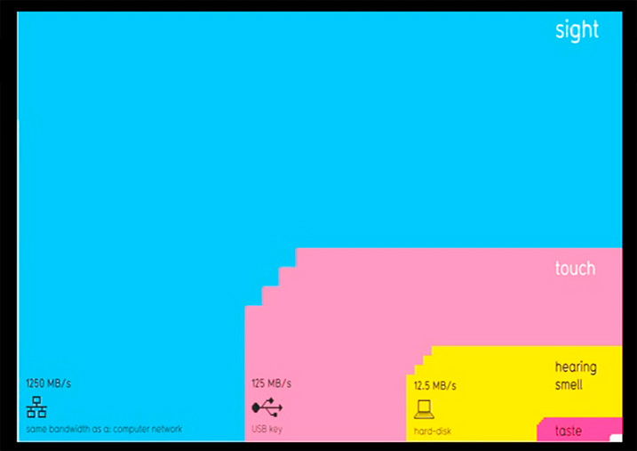
“Your sense of sight is the fastest. It has the same bandwidth as a computer network. Then you have touch, which is about the speed of a USB key. And then you have hearing and smell, which has the throughput of a hard disk. And then you have poor old taste, which is like barely the throughput of a pocket calculator. And that little square in the corner, a naught .7 percent, that's the amount we're actually aware of. So a lot of your vision — the bulk of it is visual, and it's pouring in — it's unconscious.”
Think of the impact this will have on interaction design. Your users notice the eye-catching elements of course, but every choice of color, font, icon symbol, layout location – every pixel on the screen – is a subconscious mental interaction.
As we described in our free e-book Web Design for the Human Eye, appearance even goes as far as to affect the user’s perception of how well a product functions.
When it comes to entering our credit card information on the web, trust always becomes a factor. A fascinating Stanford study on how users access website credibility revealed that almost half of all users determined if a site was trustworthy based on looks alone. Such visual minutiae as layout, typography, font size, and even color scheme were all pivotal factors.
Other studies provide similar evidence on the power of aesthetics on a product’s perceived value. An experiment by Masaaki Kurosu and Kaori Kashimura tested two ATMs in which the only difference was the aesthetic placement of the screen and buttons. Users reported that the more visually attractive one worked better, even though the functionality was identical.
The role of aesthetics goes far beyond “looking nice.” Form affects the user’s perception of function, which is more important than the functionality itself.
Not Just Physical: The Emotional Connection of Visuals
Writing for UX Mag, Morgan Brown and Chuck Longanecker describe what they call “designing for the gut.” This refers to the emotional connection formed between a user and the product, built upon their continued satisfaction, enough to keep them using the product.
It’s this “gut” reaction that is at the core of a good user experience, moreso than even a logical appreciation of functionality.
What does this gut reaction have to do with visuals?
As Don Norman explains in Emotion & Design: Attractive Things Work Better, millions of years of evolution have created in humans (and most of the animal kingdom) split-second decision-making instincts formed largely from immediate emotional responses. In the life-or-death situations of our prehistory, we and our animal brethren didn’t have time to logically deduce the pros and cons or different tactics – we simply acted to save our lives.
Years later, the life-or-death situations have mostly vanished, but the gut instincts remain. And these, you might have guess, are greatly influenced by sight.
Take, for example, that feeling of fear and exhilaration that comes from staring down from a great height. That sight alone induces an adrenaline spike, a rush that sparked our fascination with extreme sports. Another example is the joy that comes from the sight of delicious food, the reason behind the food television trend. We know the food on TV is not available to be eaten, that it’s just an image – but this image is enough to evoke an emotional response in us.
In interaction design, we can categorize the attractive influence of visuals into 5 primary categories: first impressions, creating trust, creating identity, encouraging user forgiveness, and improving usability through relaxation.
1. First impressions are lasting impressions
In the beginning, we mentioned how certain usability studies determined that appearance both (A.) was the main factor most users considered when deciding trustability, and (B.) that users perceived more aesthetic products as more functional. These are the results of how a product’s appearance forms its first impression.
Because our instincts have evolved such that we make quick decisions based on what we see, first impressions can make or break a site or app.
Studies show that users will judge the value of the site most critically within the first 10 seconds. This, alone, proves the importance of a first impression. In order to hold your user’s attention and prove your worth, you must visually establish an emotional connection that appeals to their gut responses.
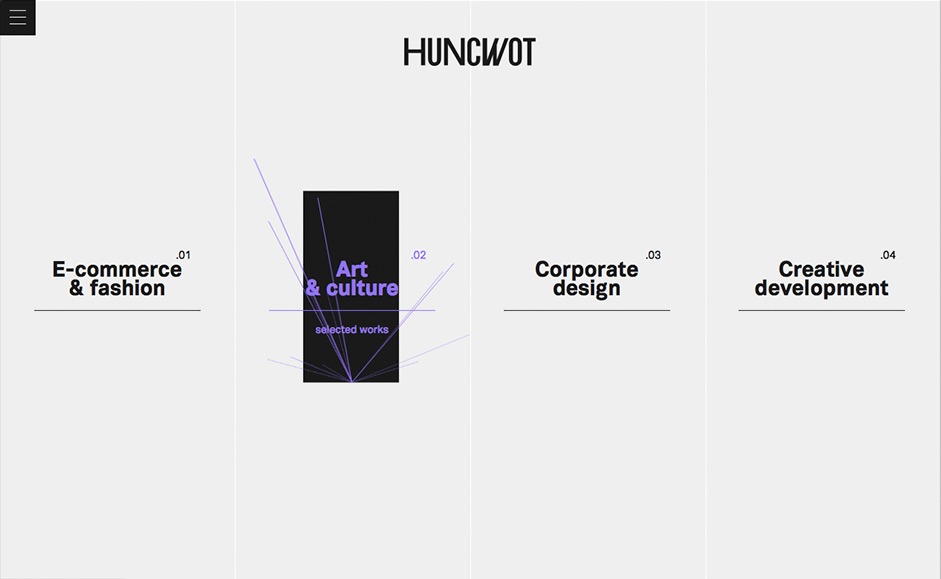
Let’s take a look at the how the visual design enhances the interaction design for the Polish design agency Huncwot.
 Source: Huncwot.
The four navigational choices are displayed simply enough, but when each one is hovered over, the text changes color and a vibrant graphic appears behind. First, this signals to the user that they’re input was registered, but on a deeper level, the rich animation adds an unexpected element of delight. The effect feels more like a magic trick and less like a piece of technology telling us that it understands our selection (even though that’s still communicated).
When it comes to first impressions, you always want to strike the right balance between usability and eye candy. Usability instills confidence in the user, while aesthetic delight actually makes them want to use your interface.
2. Clean designs create trust
On the related note of first impressions, visually attractive interfaces feel more trustworthy. This principle is most applicable to ecommerce, in which trustworthiness either makes or breaks the sale.
Let’s compare the appearance of two checkout forms below.
Checkout Form A
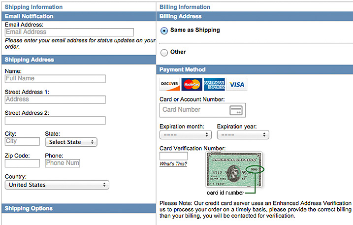
Source: LA Police Gear
In the first form, you can see that the layout feels cluttered and the design looks outdated by today’s standards. Also, notice how the only indication of secure payment is the “Please Note” text in the microcopy.
Checkout Form B
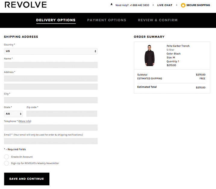
Source: Revolve Clothing
On the other hand, this form already exudes a feeling of trustworthiness with its clean layout and breathing room between input lines. Instead of a message explaining how the site protects data, the simple lock icon and “Secure Shopping” text is enough to get the point across to people who just want to finish their purchase.
Both form designs share the same functionality, yet the latter seems to work better because it’s presented with more thought. It’s the same principle as meeting a person wearing a tailored suit for an interview and someone wearing sweatpants and a t-shirt – you can’t really quantify the feeling, but somehow you just know one of them seems more qualified.
3. Design personality creates identity
Know your user – their background, their profession, their ambitions and fears.
Once you’ve created your personas, make sure that your visual personality mirrors the user’s personality. After all, your interface’s visual representation attracts, and will feel attractive to, those with the same personality type.
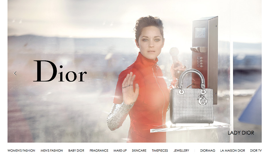 Source: Dior
Take the website for the fashion brand Source: Dior. The most prominent visual is the large-spread fashion photograph, with all the luxury, celebrity association (Marion Cotillard), and sex appeal you’d expect from a fashion brand. The crisp white background and photocentric design creates a feeling of aspirational elegance, which is part of the reason why people buy Dior products.
The interactions on the page are actually quite simple: the navigation items become underlined upon hover, images of seasonal collections overlay with text upon hover, and a some images of products change gradient upon hover to acknowledge selection.
Unlike Huncwot’s site which needs to reflect cutting edge animations (since it is a design agency, after all), we don’t need such complex interactions for Dior’s fashion audience – cleanly frame the product, present a well-executed traditional navigation, then get out of the way.
Execute your design fundamentals flawlessly, exude the right personality with your aesthetics, and your UI design will always feel more impressive than it technically is.
4. Users forgive pretty things
Because people emotionally connect with items they find attractive, they’re more prone to forgive when an interaction goes wrong with the design. We actually describe this phenomenon in quite a bit of detail in Interaction Design Best Practices, but let’s quickly dive into the implications.
You shouldn’t lean on this as a crutch for bad usability, but think of it as a fallback benefit in case something disrupts the experience – and knowing Murphy’s Laws of Technology, it’s more a question of when rather than if.
The design of clever 404 error pages exemplifies this principle. When you hit an error page, the design has effectively failed. You might experience any range of emotions from confusion to frustration, or maybe even slight anger if it disrupts a time-intensive process.
The design challenge, then, is to transform the unfortunate interaction into a positive one (not just neutral). Let’s take a look at two opposite ends of the spectrum below.
Macy's
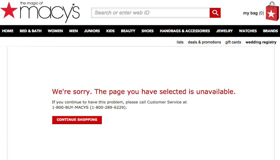
This 404 page doesn’t do much to alleviate the frustration or point the user in the right direction (aside from clicking the “Continue Shopping” page to return to the homepage, which might actually disrupt the user path). It’s also highly unlikely that someone will call customer service over a website issue – they’ll probably just go find the product from a competitor.
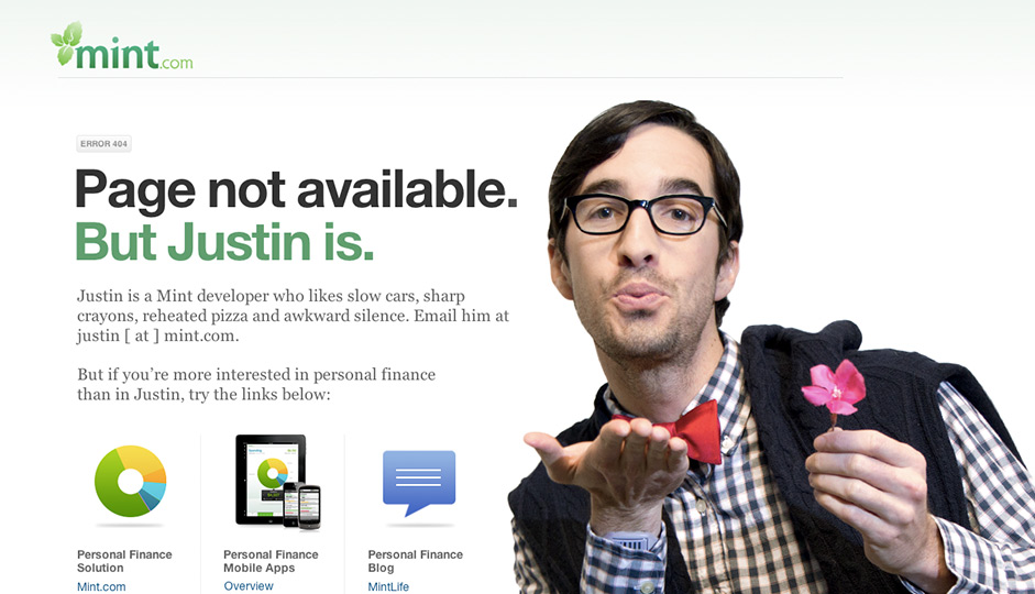
Mint
 Source: Mint via Pattern Tap
On the other hand, smart websites like to have fun with their 404 pages, as you can see by the above. When done right, even error messages can delight users.
The interaction design for this 404 page is perfectly executed. The humor deflects the frustration of the moment, while the fun employee information instantly creates a human connection. All this isn’t done at the cost of usability, of course, since suggested links are still provided to help the user access the content.
This example perhaps epitomizes the power of attractive interaction design. When we play to to emotions like humor or fun, our interaction design can even transform negative experiences into positive ones.
If you’re interested in other clever 404 pages, we recommend this piece by CreativeBloq highlighting 33 of the best examples on the web.
5. Relaxation Improves Usability
As Norman continues to explain in his article, products that we find visually appealing put us at ease biologically. This relaxation impacts how our brains and bodies function themselves, which could possibly explain why, in the Japanese ATM study, users had less difficulties with the attractive ATMs. The theory holds that, because the users were more “taken” by the attractive ATMs, they were more relaxed and thus were able to use the interface with less stress.
If this theory holds true, then establishing an emotional connection through visuals not only increases the perceived usability, but the actual usability. Designers, then, should dedicate equal time and energy to optimizing their interface’s appearance as they do it’s functionality – the two are inseparable.
Conclusion: It’s What’s Outside that Counts
We’ve grown up thinking that passing judgements based on looks was superficial.
Snippets of wisdom like, “it’s what’s inside that counts,” and “don’t judge a book by it’s cover,” while well-intentioned, may have lead us astray. Modern science is painting quite a different picture – visuals are what counts. They are what formulates our opinions and our emotions, whether we like it or not.
In that case, we must throw out conventional wisdom and replace it with another, overlooked piece of traditional wisdom: “what you see is what you get.”
For additional tips on designing smooth experiences, download the free e-books Interaction Design Best Practices: Mastering the Tangibles & Mastering the Intangibles. Case studies are analyzed from 50+ companies including Google, MailChimp, Mint, AirBnB, Facebook, Yahoo, Kickstarter, and many others.