


Your design lives within a finite screen. There is only so much that can be said, done, and offered within that tiny box, and so every last pixel is valuable real estate.
Of course even amateur designers know not to overload a single page, but when it comes to exactly how much white space to include, sometimes even seasoned designers might draw a blank.
White space, or "negative space" as it's also known – the two terms are used interchangeably – refers to any screen space between existing elements. It doesn't need to to be white, or even blank (if, for example, you're using a patterned, colored, or textured background). Negative space creates a vacuum of content, which then draws more attention to the existing content.
In this article, we'll discuss the how to apply one the most powerful tools in a designer's toolbox: nothing at all.
Empty Causes
As we described in the free e-book The Zen of White Space in Web Design, negative space has been a part of aesthetic theory from the very beginning.
In digital design, though, this emptiness holds more weight, so to speak. Negative space isn't just visually appealing, it must fulfill the more practical roles of balancing the visual hierarchy and leading the users' eyes to strategic points of interaction. Moreover, if there is text present, white space must also create the most legible and readable environment on top of its other duties.
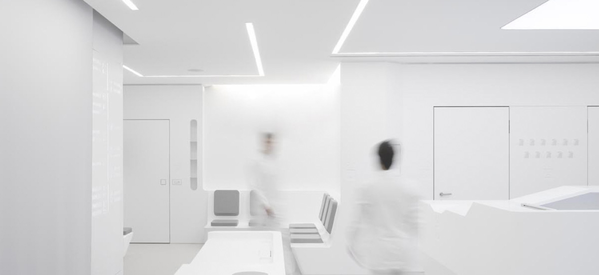
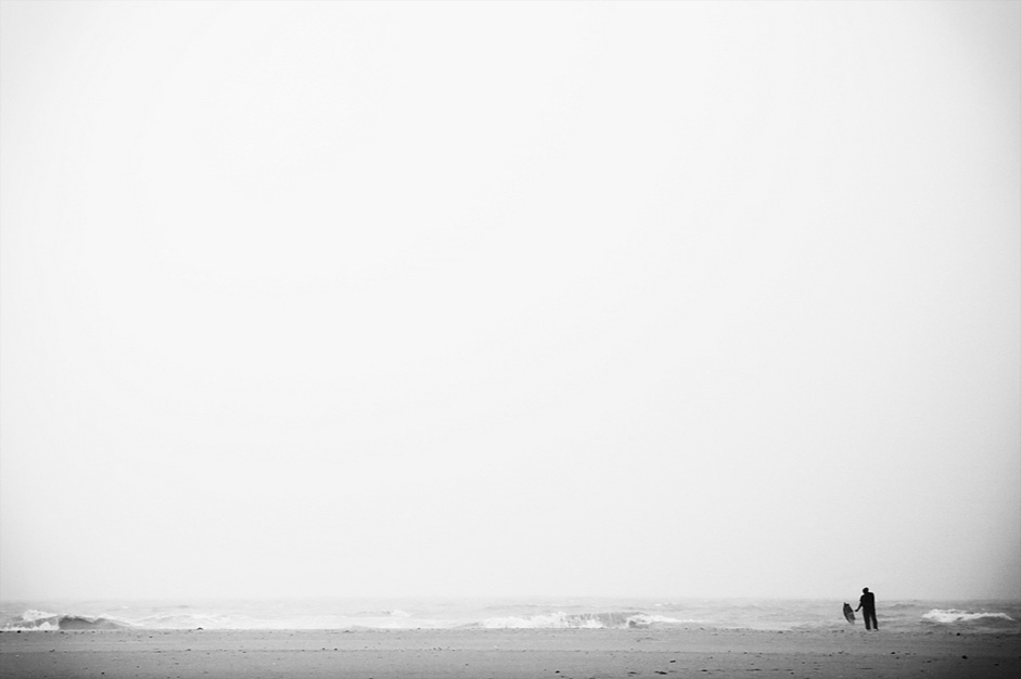 Source: "I'm alone/Explored." Vinoth Chandar. Creative Commons.
In general, white space directly affects the following areas:
-
Eye-scanning
The space between bigger elements (macro white space) affects how the user scans the page, and when used properly can guide the user's sight to notice whichever elements you want. This is helpful for creating a brand identity and increasing user interactions.
-
Legibility
The space between smaller elements (micro) like letters, lines of texts, list items, and sometimes icons will affect how clearly and quickly each can be read and possibly selected.
-
Aesthetics
When looking at the big picture, white space plays a big part in the visual organization (and therefore aesthetics) of the interface. For example, random clustering of content rarely looks good.
-
Luxury
Generous white space infuses your page with an air of elegance and sophistication.
To better understand how to apply it, we can categorize the different types of white space (macro and micro), as well as the different ways to use them (passive and active).
Macro and Micro
Where and how white space is used on a page will affect its role. To simplify this, we can break these types up into macro and micro.
Macro White Space
Macro white space refers to the spacing between large elements. This is the spacing used for:
- General composition
- Separating different elements
- Text columns
- Margins
- Padding
- Space within actual graphics/images
Macro white space heavily affects the user's visual flow, either gently nudging or forcefully push their attention where you want. The rule here is that larger distances push harder. You want to strike a balance, however, because too much white space violates Gestalt Principles and weakens the relationships between objects.
Let's look at art director Tomasz Wysocki's site for an example of how white space entices user interaction.
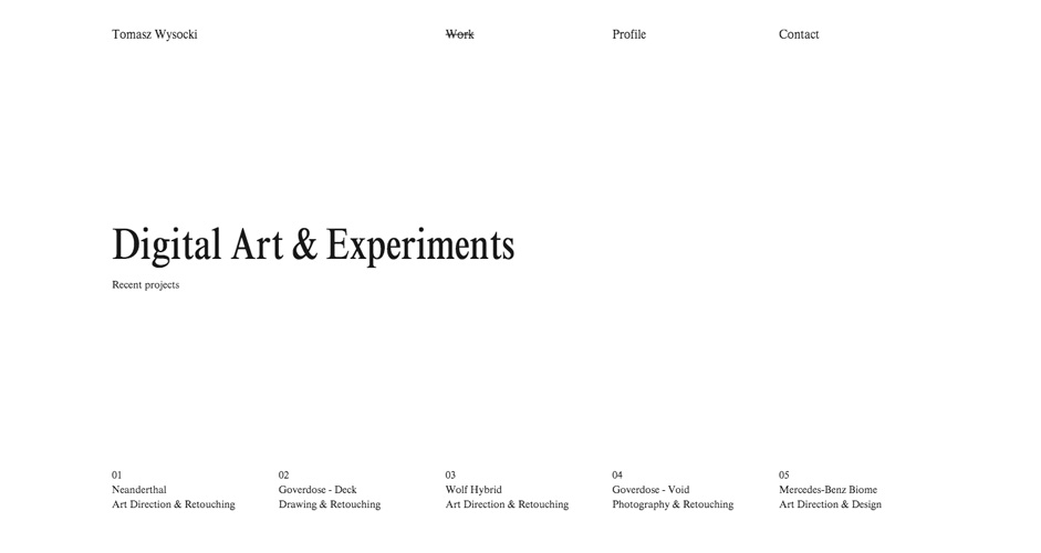 Source: Tomasz Wysocki
The first thing most users will notice is the page's title, 'Digital Art & Experiments' in an atypical sans-serif typeface. In conjunction with the text's size, the white space surrounding the title funnels the users' attention there from both sides. The top and bottom menus, too, also attract attention, though not as much since they only have space on one side. Overall, the white space does its job of drawing attention, but the design is actually deceptively simple.
Wysocki actually uses the white space as a blank canvas for surprising us with the richness of his work. Upon hovering over any of the bottom navigation, we are treated to a full-page background image of the work. The effect creates an almost childlike joy of discovery: we stumble into a blank space, only to find that each drawer is filled with visual delight.
You can see below how dramatically the screen transforms upon hover:
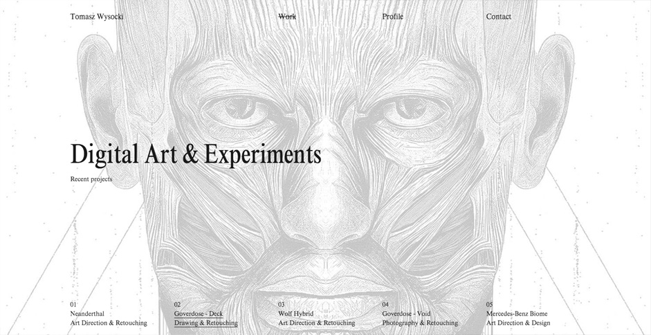 Source: Tomasz Wysocki
By using white space as a tool for luring users into his work, Wysocki creates an experience that is strangely addictive. After the first work appears, we want to see what else he's hidden from us – it feels counterintuitive from a discoverability standpoint (since you'd want to reveal the most important content), but it works because it's executed with the perfect level of intrigue.
2. Micro White Space
On the other hand, when designers mention micro white space, they are referring to the space between smaller elements, or the elements within greater elements. These include:
- Letters
- Lines of Text
- Paragraphs
- List Items
- Buttons & Icons
Micro white space is used mostly for the overall clarity of the site, specifically legibility of typography (how clearly you can distinguish each letter). When adding space in and around text, you'll want to strike the balance between just enough to aid clarity, but not so much that it distracts from more important elements. It's usually a good idea to set the line height (vertical space between lines) to around 1.5x your type size.
As we mentioned when discussing the Gestalt principles in our Web UI Design for the Human Eye, putting elements in close proximity also suggests they function similarly. Micro white space can help suggest a relationship between buttons or links, and mimicking this spacing elsewhere reinforces a pattern, which increases recognition (and learnability) with use.
While macro and micro are the types of white space, each can be used either passively or actively, which we'll explain now.
Passive and Active Space
The application of white space all depends upon context.
As we said above, the more space used, the stronger the pull. But you don't always want the strongest pull possible for every element on a page, not to mention how much screen real estate that would consume.
Let's look at how passive and active space help create balance in negative space.
1. Passive Space
Think of passive white space as the bare minimum.
Without enough white space, a site becomes illegible and frustrating to navigate, as effort is required to make sense of the jumble. Passive white space is however much white space is required to make the site comprehensible.
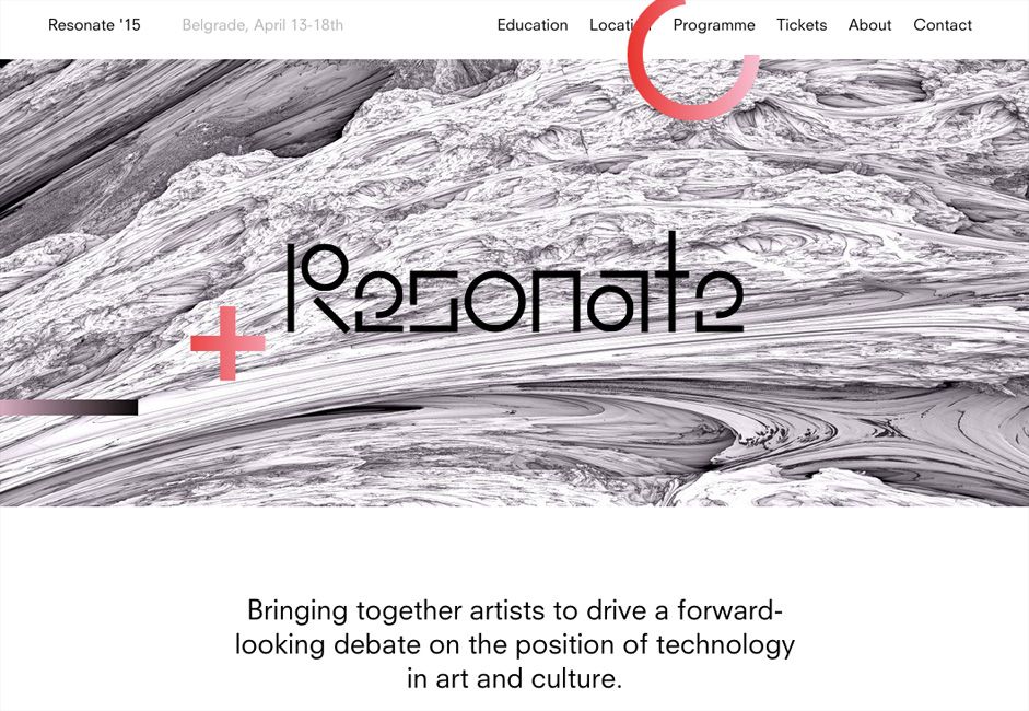 Source: Resonate '15
In the above example, take a look at the spacing between the words/links at the top navigation bar. Also, look at the text at the bottom and the spacing between the letters, words, and lines. Do you notice anything out of the ordinary? You shouldn't, they're all spaced so as not to draw attention. That's passive spacing.
For macro white space, passive spacing means adding enough borders and margins to clarify the distinctions between elements and avoid confusion. For example, putting enough space between a login navigation bar and a site navigation bar at the top of the screen.
For micro white space, this means spacing out letters, lines of text, and paragraphs to maximize readability, and spacing items in a list or menu to make them individually easy to spot when scanning (in other words, removing clutter).
Passive applications should feel organic and natural. In fact, the main purpose of passive white space is that it goes unnoticed. What makes it passive is that it doesn't draw attention to itself. It simply looks "normal."
The moment when enough space is used that it starts to stand out, then it becomes active.
2. Active Space
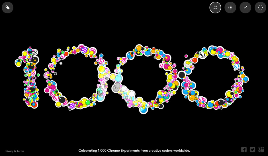 Source: 1000: Chrome Experiments
There are actually a lot of elements on the above page: navigation tabs, social media links, even legal information. However, the most prominent is clearly the interactive "1000" graphic that's dead center. By shrinking and pushing the other elements to the corners, the designers at Chrome Experiments actively maximize the space around the element they want the users to interact with most.
Likewise, minimizing the amount of space between a smaller line and the one proceeding may be a good way to "hide" it, as is often seen with legal requirements or copyright information. See how, below, the line "FiberSensing is an HBM Brand" is displayed without drawing too much attention.
 Source: HBM FiberSensing
Macro white space is often used actively to draw attention to the page's single main focus, or to separate more important elements from the pack.
However, it can also be used with micro white space. Mark Boulton explains in an A List Apart piece that he sometimes applies active spacing around a particular quote or paragraph within a block of text in order to draw attention to it. This is great way to emphasize the most useful points of your content to users who are just scanning.
At this point, we're getting into the strategic use of varying amounts of white space. This could be thought of as different degrees of minimalism, which we'll explain below.
Minimalism
The more white space you use, the more minimalistic your page becomes since you'll need to remove elements to prevent clutter.
Minimalism is a design philosophy that's neither good nor bad - it simply states that you remove any noise so users can focus on the content. As you trim away the bells and whistles, the remaining content stands proud amidst the elegance of space.
Like we described in The Zen of White Space in Web Design, minimalism affects your site in a couple ways: the amount of elements present, and the perception of luxury.
1. Amount of Elements
The less elements you have on your page, the more powerful each individual element becomes.
If you have only one thing on your page, even tucked away in the corner, it will become the sole focus of your user. If you have a hundred tiny things, your users will either begrudgingly sift through them for their point of interest, or more realistically, just give up from choice paralysis.
This is relevant because the easiest way to increase the white space at your disposal is reducing the number of elements on the page. But we know that's much easier said than done. Minimalism as a philosophy applies to any site - you never want to fill the screen with anything the user doesn't need. Minimalism as an aesthetic, however, is not appropriate for every site since content-heavy sites won't be able to support the bare look.
When it comes to minimalism, remember that the aesthetic is the byproduct and not the goal. The only way you'll achieve the right level of minimalism is to subtract just enough interface objects until the design almost fails, then test the design with users, stopping when you hit the tipping point.
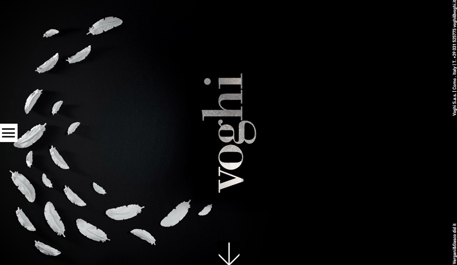 Source:Voghi
The site for the Italian fashion brand voghi keeps it simple and beautiful. There are only two clickable elements on the screen: the hamburger menu at the side and the arrow at the bottom. With the contact information minimized at the right, the lack of competing visuals focus the attention on the gorgeous graphic, which then leads attention to the arrow.
How you balance the significance of your items is up to you. Some pages have only one clickable link to ensure the user goes where the designer wants. Other sites have many menus of pulldown submenus to ensure that the user chooses exactly the option they want. As Kayla Knight suggests, you could consider removing taglines, "Featured Content", and simplifying your navigation. Of course, that all depends on your brand and product.
2. Perception of Luxury
Minimalism has become synonymous with luxury, and its use immediately conjures an atmosphere of sophistication, fashion, and elegance. Fashion websites are notorious users of minimalism in their digital designs – but it's rare to find those same designs for bargain or mass-market firms.
The perception of luxury has a direct correlation to the amount of white space:
- Heavy white space is seen as luxurious, high-end, or sophisticated, and as such expensive.
- Balanced white space is seen as, well, balanced – affordable but still quality.
- Little white space is seen as cheap, low-quality, and the clutter is also displeasing to look at.
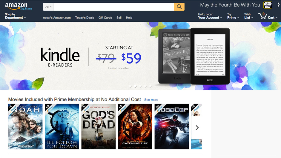 Source:Amazon
Compare the fashion website voghi we first examined to this screenshot from Amazon. Amazon is more cluttered and includes more navigation options and promotions. Both sites sell high-end fashion products, but which do you think a typical fashionable user would prefer? What about a reasonable, price-saver type of shopper?
This applies to macro and micro space, but also – and most importantly – to the images used within the site itself. Browsing the photography from fashion websites, you'll notice more artistry applied than the average photography from, say, an electronics website.
Ultimately, you'll always want to start first and foremost with the needs of your users. Research your users, create useful personas, then consider how white space can frame content so they can best accomplish their goals.
Conclusion
As a visual art, design can't neglect one of its most fundamental artistic principles. Nor should it – the power of white space goes far beyond aesthetics and can be used strategically to further the more business-related goals of interaction design.
At the bare minimum level, its use facilitates the basic functions of a site or app like readability and navigation. But in the hands of an expert, the smart use of white space transforms otherwise plain interfaces into designs that users want to interact with.
For more real-world advice on the effective use of white space in web design, check out the free e-book The Zen of White Space in Web UI Design. 23 examples are analyzed from some of today's hottest companies including Apple, Square, Lever, Wunderlist, and more.