

More than being creative, a good artist must also consider subtleties like composition, colors, size, what to include, and — perhaps more importantly — what to leave out. That’s no easy feat, which is why we hold the masters like da Vinci and Van Gogh in such high regard.
 Source: Achieving Visual Hierarchy
Web UI designers must do the same. As discussed in Web UI Best Practices, a website is a form of visual art in its own right, and follows many of the same rules as more traditional artforms. It is the science of aesthetics, mixed with the principles of business, and an extraordinary website interface must feel effortless yet enticing.
Creating Visual Organization
In his paper Communicating with Visual Hierarchy, Luke Wroblewski, author and Senior Principal of Product Design at Yahoo!, explains that the visual presentation of a web interface is essential for:
- Informing users — Like an invisible hand, the interface should guide users from one action to the next without feeling overbearing. For example, payment processor Square leads you through its value propositions as you scroll down, with relevant calls to action each step of the way.
- Communicating content relationships — The interface should present content in a way that matches how users prioritize information. For example, popular design website Abduzeedo includes broad categories at the top, featured content in the middle, and detailed categories in the footer.
- Creating emotional impact — People visit restaurants for more than just an edible meal. They want taste, texture, presentation, and a memorable ambiance. Interface design is no different, and people may actually be more prone to forgive your site’s shortcomings if you produce a positive emotional response. For example, Wufoo is a perfect example of a site with an interface that’s usable and pleasurable.
The end goal of your UI design is to answer three questions:
- 1. What is this? (Usefulness)
- 2. How do I use it? (Usability)
- 3. Why should I care? (Desirability)
1. Scanning Patterns: The Predictability of the Human Eye
Just as with a scurrying movement in the corner of your eye or a sexy walk from someone across the street, the human eye is drawn automatically to certain points of interest. While some of this depends on the person, the majority of people tend to follow definite trends — including how they view a web page.
In an article on visual principles, Alex Bigman, Design Writer for 99Designs, talks about the two predominant reading patterns for cultures who read left to right.
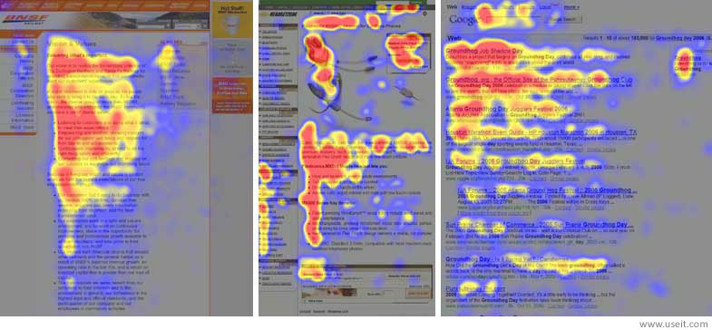 Source: Nielsen Norman Group
I. F-Pattern
Typically for text-heavy websites like blogs, the F-Pattern comes from the reader first scanning a vertical line down the left side of the text looking for keywords or points of interest in the paragraph's initial sentences. When the reader finds something they like, they begin reading normally, forming horizontal lines. The end result is something that looks like the letters F or E. As shown in Web UI Patterns 2014, CNN and NYTimes both use the F Pattern.
Jakob Nielsen of the Nielsen Norman Group conducted a readability study based on 232 users scanning thousands of websites and elaborates on the practical implications of the F-Pattern:
- Users will rarely read every word of your text.
- The first two paragraphs are the most important and should contain your hook.
- Start paragraphs, subheads, and bullet points with enticing keywords.
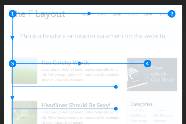 Source: Understanding the F Layout
You can see in the above image that the most important content can be seen in a few seconds, with more detailed content (and a call to action) presented immediately below for quick scanning. The F-pattern can be very helpful for sites that want to embed advertising or calls to action in a way that doesn’t overwhelm the content. Just remember that content is always king, and the sidebar exists to get users involved in a deeper level.
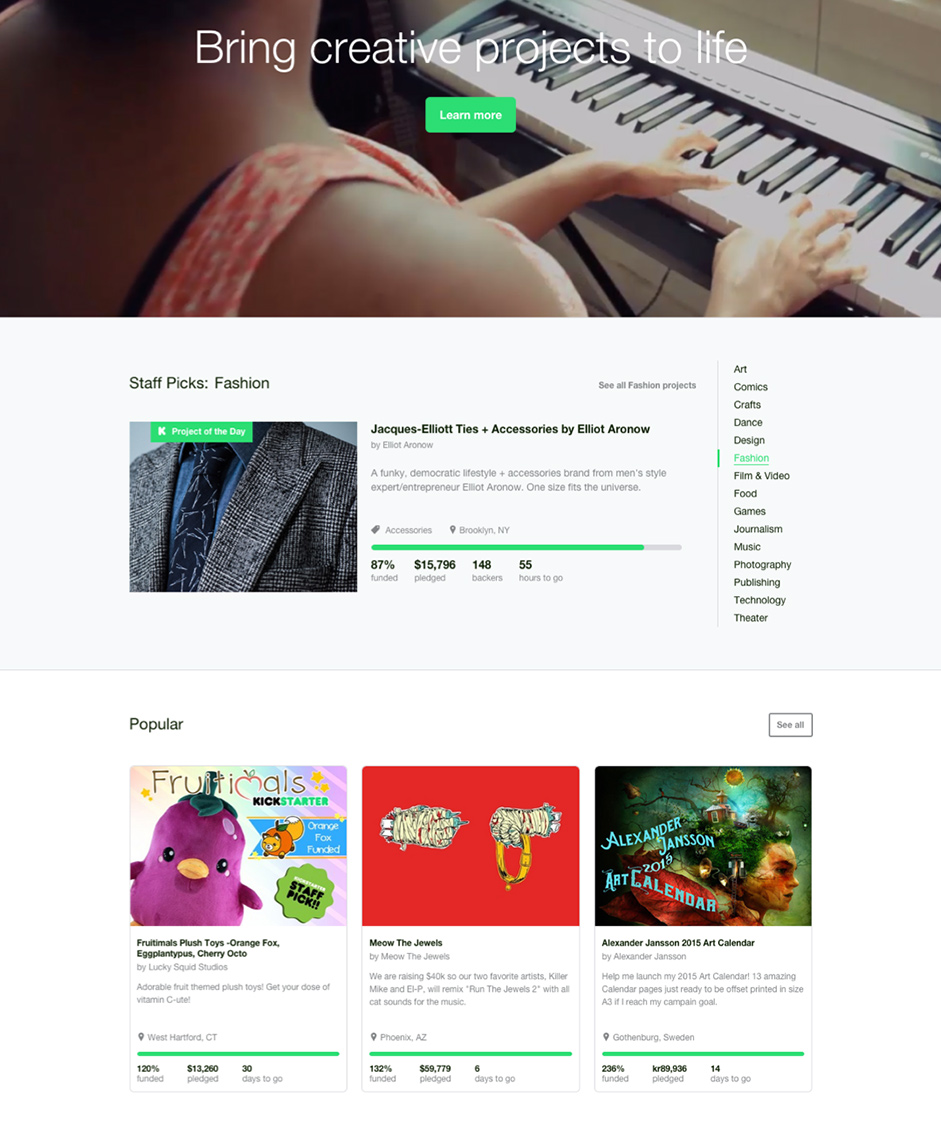
As with all patterns, the F-Pattern is a guideline — rather than a template — because the F-pattern can feel boring after the top rows of the “F”. As you’ll see below, Kickstarter adds in some widgets (laid out horizontally) to keep the design visually interesting beyond the first 1000 pixels.
 Source: Understanding the F-Layout
II. Z-Pattern
Z-Pattern scanning occurs on pages that are not centered on the text. The reader first scans a horizontal line across the top of the page, whether because of the menu bar, or simply out of a habit of reading left-to-right from the top. When the eye reaches the end, it shoots down and left (again based on the reading habit), and repeats a horizontal search on the lower part of the page.
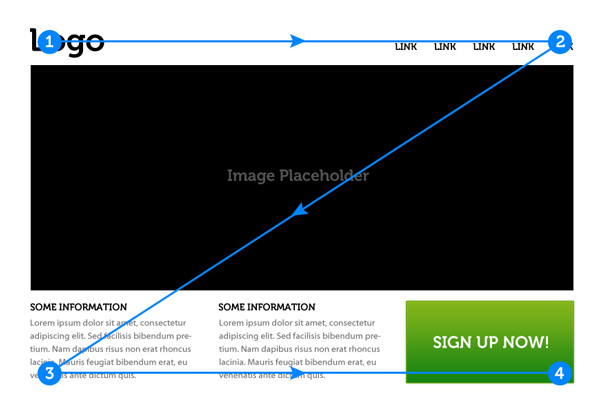 Source: Understanding the Z Layout
The Z-Pattern is applicable to almost any web interface since it addresses the core website requirements such as hierarchy, branding, and calls to action. The Z-pattern is perfect for interfaces where simplicity is a priority and the call to action is the main takeaway. Forcing a Z-pattern for a website with complex content may not work as well as the F-pattern, but a Z-pattern can help bring a sense of order to simpler layouts (and increase conversion rates). Here’s a few best practices to keep in mind:
- Background — Separate the background to keep the user’s sight within your framework.
- Point #1 — This is a prime location for your logo.
- Point #2 — Adding a colorful secondary call to action can help guide users along the Z-pattern.
- Center of Page — A Featured Image Slider in the center of the page will separate the top and bottom sections and guide the eyes along the Z path.
- Point #3 — Adding icons that start here and move along the bottom axis can guide the users to the final call to action at Point #4.
- Point #4 — This is the finish line, and an ideal place for your primary Call to Action.
Predicting where the user’s eye will go can be a huge advantage. Before arranging the elements on your page, prioritize the most and least important ones. Once you know what you want your users to see, it’s just a simple matter of placing them in the pattern’s “hot spots” for the right interactions.
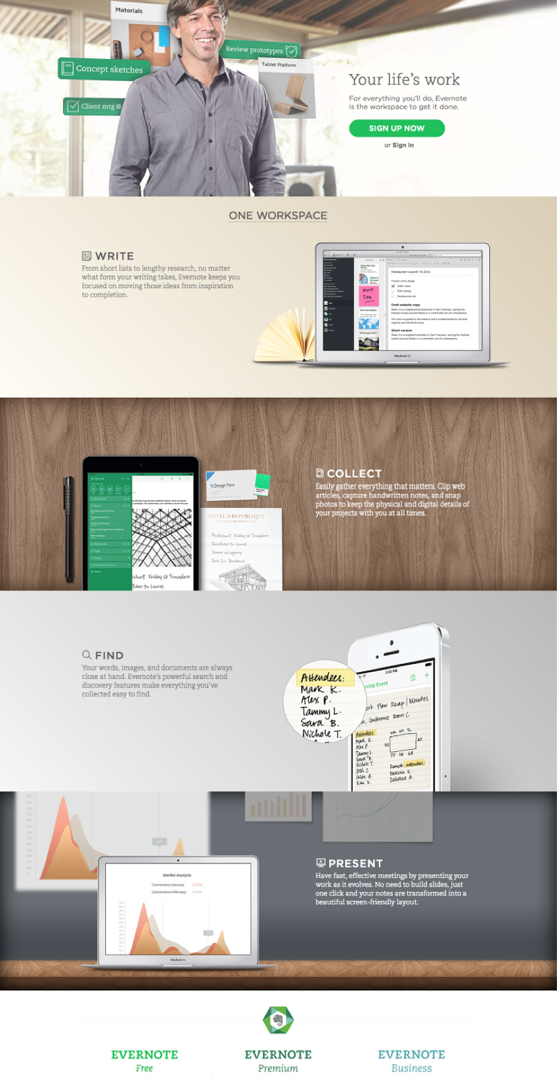
According to Web UI Best Practices, you can even extend the Z Pattern throughout the entirety of the page, repeating Points 1-4 if you feel that more value propositions are needed before the call-to-action. As you’ll see below, this is exactly what Evernote does by starting with a “Sign Up Now” call-to-action, guiding users through a few selling points, and finishing their “repeated Z pattern” with payment option calls-to-action.
 Source: Understanding the Z Layout
2. Contrast: Generating Interest
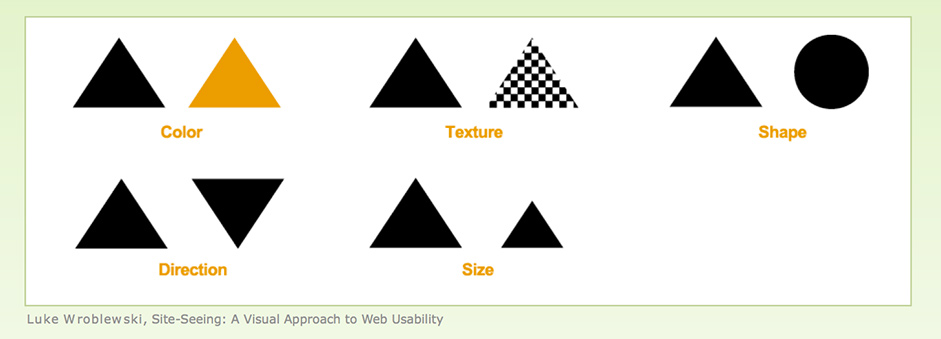
To best explain the use of contrast, let’s go back to Luke Wroblewski. Plainly put, contrast is the occurrence of two different elements positioned close together. In web UI design, these elements can be colors (more in Chapter 5), textures, shapes, direction, or size, to name the important ones.
 Source:
 Alternating between different sized fonts and colors creates an instant hierarchy to your interface. For instance, as you can see below for Constant Contact, changing from a light background to dark background immediately separates the primary call to action of “Try it FREE” from the navigation menu and secondary “Call Us” call to action. Combined with the Z-pattern of the site, the treatment provides a clear visual hierarchy that highlights the email submission form followed by the mid-page navigation menu.
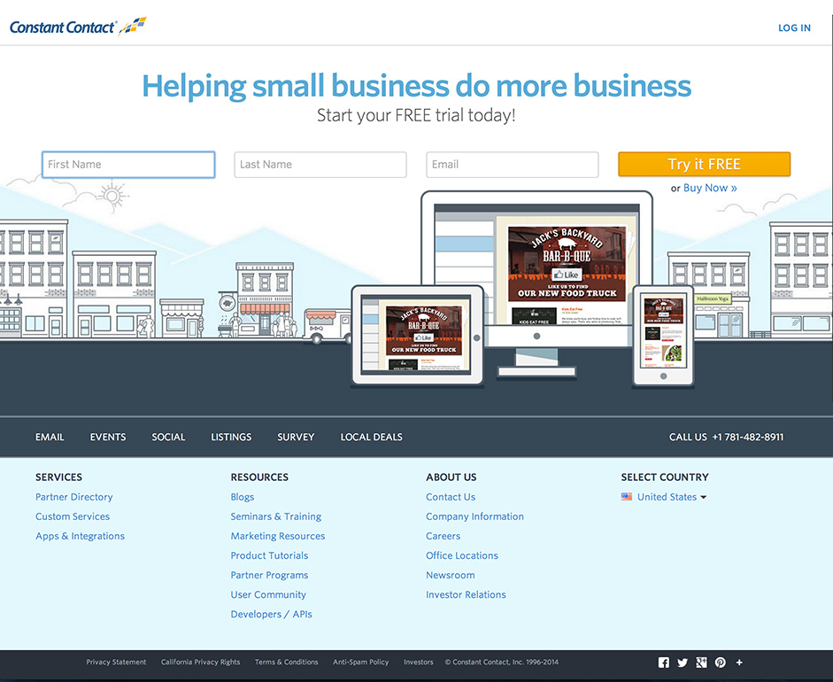 Source: ConstantContact
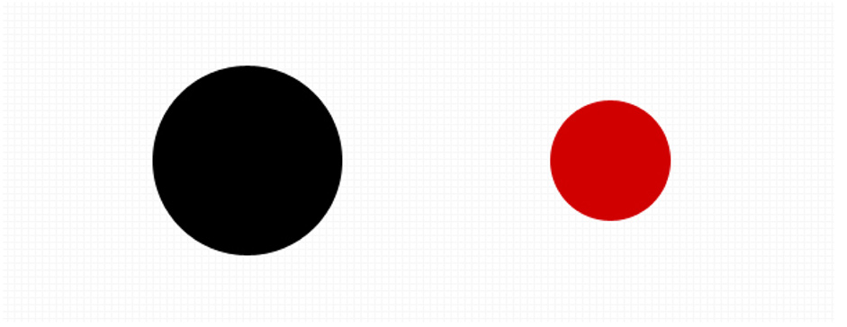
Brandon Jones, looks at how the use of color and size affect first impressions of objects in an interface. Using the below image as an example, most people won’t just see two circles on first glance — instead, they’ll likely see “a black circle and a smaller red circle”. In this sense, contrast in interface items is very powerful since differentiation is the default human response.
 Source:
 3. Tools of the Trade: Color, Size, and Space
When “painting” the web interface, don’t forget to use your most powerful visual tools: color, size, and space. Alex Bigman believes that colors and size manage attention, while spacing helps manage visual relationships.
I. Color
In a nutshell, bright colors stand out from muted colors. This may seem obvious, but the important takeaway is its application: you can exploit this to draw your user’s attention where you want. Additionally, certain colors can help set the mood of the entire site (blues are tranquil, reds are aggressive, etc.).
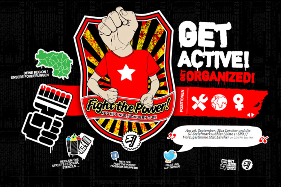
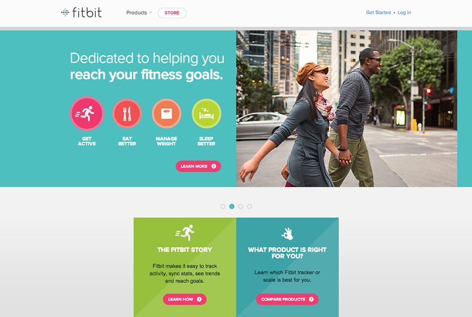 Source: Fitbit
Fitbit’s use of color in their Z-pattern interface above is especially clever. The bright use of magenta immediately places the calls to action near the top of the visual hierarchy, but also matches the color of the “Get Active” button — subconsciously signaling that the two concepts are related. Similar shades of blue are also used in the fitness goals and product sections, which cleverly creates an association between the two (and draws clicks to the most valuable parts of the interface).
II. Size
Size, particularly for text, is a powerful tool in that it circumvents the traditional rules of left-to-right and up-to-down reading. That means a large word or phrase in the bottom right-hand corner might be the first thing a person reads. Moreover, size can add emphasis to the actual message or content, making it more significant.
When it comes to the size of text, a typography study conducted by Smashing Magazine on 50 popular website interfaces found that headings usually stay between 18 and 29 pixels with body copy ranging between 12 and 14 pixels. Of course, this is just a guideline (and will apply more to content-heavy sites), but shows that you still want to maintain a sense of proportion.
III. Space
As discussed in Web UI Best Practices, one of the most important tricks in making something pretty is the absolute absence of something pretty. Cluttering too many attractive images together is a quick way to ruin them all. It’s important that your web interface has breathing room and that you space everything out. Reducing the amount of “visual noise” will make the points you want to keep even stronger.
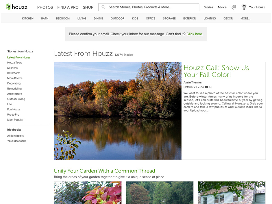 Source: Web UI Patterns 2014
In fact, Dmitry Fadeyev, founder of Usaura, advises that white space actually improves comprehension. A 2004 study found that strategic use of white space improved comprehension by almost 20%. While spacing didn’t affect how people performed on the website, it did affect user satisfaction and experience (which is equally, if not more, important). As you can see above, the large content margin, padding, and paragraph spacing used by Houzz makes the content easier to read (and encourages interaction with links and sidebars).
4. Test Your Visual Hierarchy: Blur Technique
Now that we’ve discussed how different interface elements affect visual prioritization, let’s look at a simple way to test your hierarchy. Designer at Rackspace Lee Munroe offers a great method we’ll call the Blurring Technique.
Basically, look at a blurred version of your site and see what elements stand out. If it’s not what you want to stand out, it’s time to go back and make some revisions. The blurred version will present a bare bones representation of your visual hierarchy, allowing you to evaluate your interface fresh without any distractions. To spare your eyesight (or a trip to the bar), take a screenshot of your site and add a 5-10 px Gaussian blur in Photoshop.
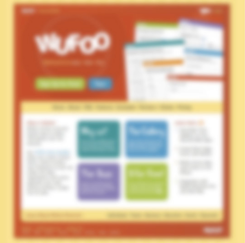 Source: Visual Hierarchy
Wufoo’s homepage passes the blur test because the prominent items are the sign up and product feature buttons, both of which should be priorities on any homepage. The shape of the sign up bar makes it stand out, while the white space around the features buttons draws the eye by creating “breathing room”.
Takeaway
Understanding visual hierarchy and applying design patterns are two of the most important skills in good web UI design. They are fundamental and interconnected: once you know how to visually prioritize information, you’ll have a better grasp of how to apply existing design patterns.
Prioritize your interface based on how people scan for information. Then, apply color, contrast, color, size, and spacing for further accentuation. To help shorten the learning curve, you can also turn to UI pattern resources like UI Patterns and PatternTap.
For practical advice on building web interfaces based on examples from top companies like AirBnB, Wufoo, Linkedin, and more, check out Web UI Best Practices.