

What makes a great landing page has always been a topic of discussion for many designers and webmasters. In order to design a winning landing page, you have to do plenty of research about your target audience’s needs, the web-page-design techniques used and heaps of other information on the science and psychology involved. It’s not the same as making an attractive website that is beautiful and functional. Clearly, a landing page has to have much more to make sure your viewers LAND on it safely and take action, just like an astronaut would.
So, your client has asked you make a marvelous landing page, your deadline is nearing, and you have no idea how to encourage users to make the intended action. Wait a minute, you can’t force users to make the intended action, right? True, but… *long pause*… you certainly can motivate them.
Motivating your customers to make the intended action, just like any other marketing technique, involves plenty of science and psychology. So, let’s get into that brain of typical online visitors and find out what actually motivates them to take action and thus increase conversion on your landing page.
Kill-er the Filler:
Online visitors typically don’t like to spend hours reading paragraphs upon paragraphs of information. Leave that for books or novels. They have a habit of being “on the go” while they are simply scanning text on a page through their small devices (usually) and probably doing something else, as well. That’s just your typical online visitors and so you have deal with it accordingly. So the point is GET TO THE POINT.
The best way to do that is by writing very short paragraphs, removing the distractions (ads, navigation, etc.) and stating the purpose right in the beginning. Keep their need, interests, and problems in mind and present a solution right away.
The Art and Science of Contrast:
Ever noticed how the Call-To-Action button is always the odd one out? While the rest of the page is a light color, the CTA button with a bright, sharp color. Or it could be the other way around (while the rest of the page is black, the CTA button will be a light color). This follows the Contrast Principle in psychology, which states that you can make an event/object seem different based on the context that surrounds it.
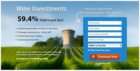
You may not have noticed the white arrow, but the red button must have caught your eye right away.
The Power of Formatting:
Your visitor has safely landed, the page has caught his attention, and you’ve got him reading the first few lines of the copy after he has scanned the headline, images, and the logo. Will he keep reading and make the intended action? Or get bored and exit the page?
Once they are interested in the first few lines of text stating the purpose, they should go on reading more. The best way to ensure that they read scan the remaining information is by inserting subheadings or pointers highlighting the benefits. Evidently, they are much easier to scan. To emphasize a point, make clever use of formatting such a Bold, italics, CAPITALIZATION, and underline. Those four words really got your attention didn’t they?
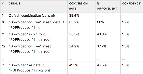
Paras Chopra tested 12 different Call-To-Action links using different formatting.
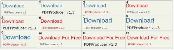
Here’s what he found.
Color:
If you’re a real designer, you must have heard this one a million times: Color has immense power in arousing certain emotions in the viewer. There is plenty of psychology involved in this department. Let’s look at how we can use this knowledge to our benefit and use it in conversion.
- Yellow: is the color of optimism. It arouses clarity, warmth, and happiness.
- Red: is the color of excitement. It arouses enthusiasm or urgency and could be linked to youth and attraction.
- Green: is the color of peace. It is arouses serenity and is often linked with health and growth.
- Blue: is the color of trust. It often linked to strength and dependability.
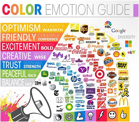
For more information: Psychology of Color in Branding.
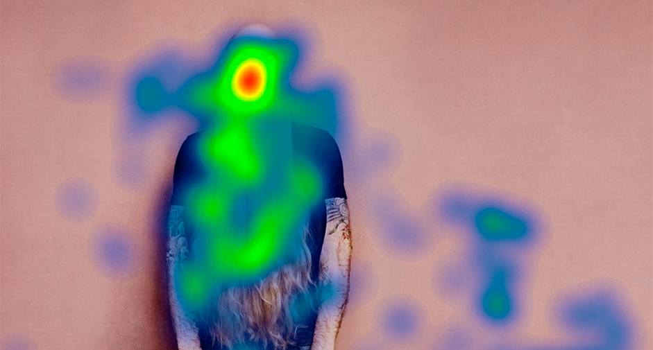
The Smiling Human Being:
There’s a reason why most of the web forms over the Internet has an eye-catching picture beside them, especially pictures that have a pretty smile. The same psychology behind it applies to marketing.
So the average human being tends to respond to other human being’s images (or even animals) far more emotionally than other images which do not include people. This is why a testimonial with a person’s picture is highly effective.
The science also goes on to further explain how we subconsciously focus on people’s face. Eye tracking software proves that the hottest points are the face and the eyes.
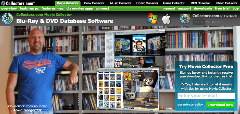
A recent A/B Split test, initiated by a software developer, proves how image of him smiling improved his profits by 10.7% as compared to when there was image of him not smiling.
Now you know why just a functional and beautiful website is not enough? The mishmash of science, psychology, and art is meant to transform that landing page into something more than just a page where they land and leave without completing their mission. The time and efforts spend on making them should not go to waste! A landing page must fulfill its purpose.
Author Bio
Preston Pierce is a professional blogger and designer at UK-based logo design company, Logo Ping. He is a marketing graduate with certification in graphic designing. He mainly writes on topics related to designing and marketing areas. Follow him on Twitter.