Any discussion of UI design will always return to UI patterns.
As described in the free e-book Web Design for the Human Eye, UI patterns originate as solutions to common usability problems, and their effectiveness correlates directly with their popularity and adoption. That means the more a certain pattern is used, the more powerful it becomes… which means more sites will start using it.
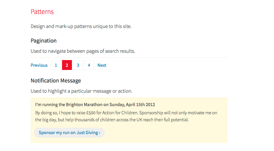
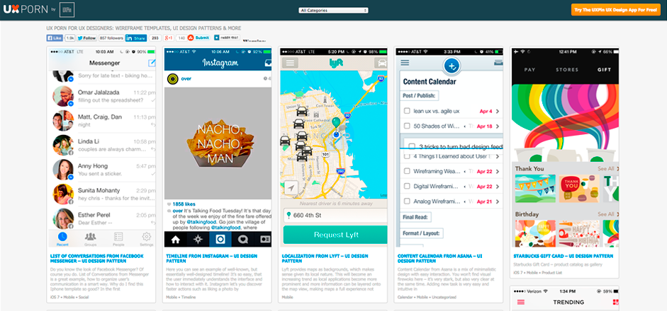
 Source: Web UI Kit
In this piece, we’ll dive into the anatomy of UI patterns and how to select them as shortcuts to meeting user explanations.
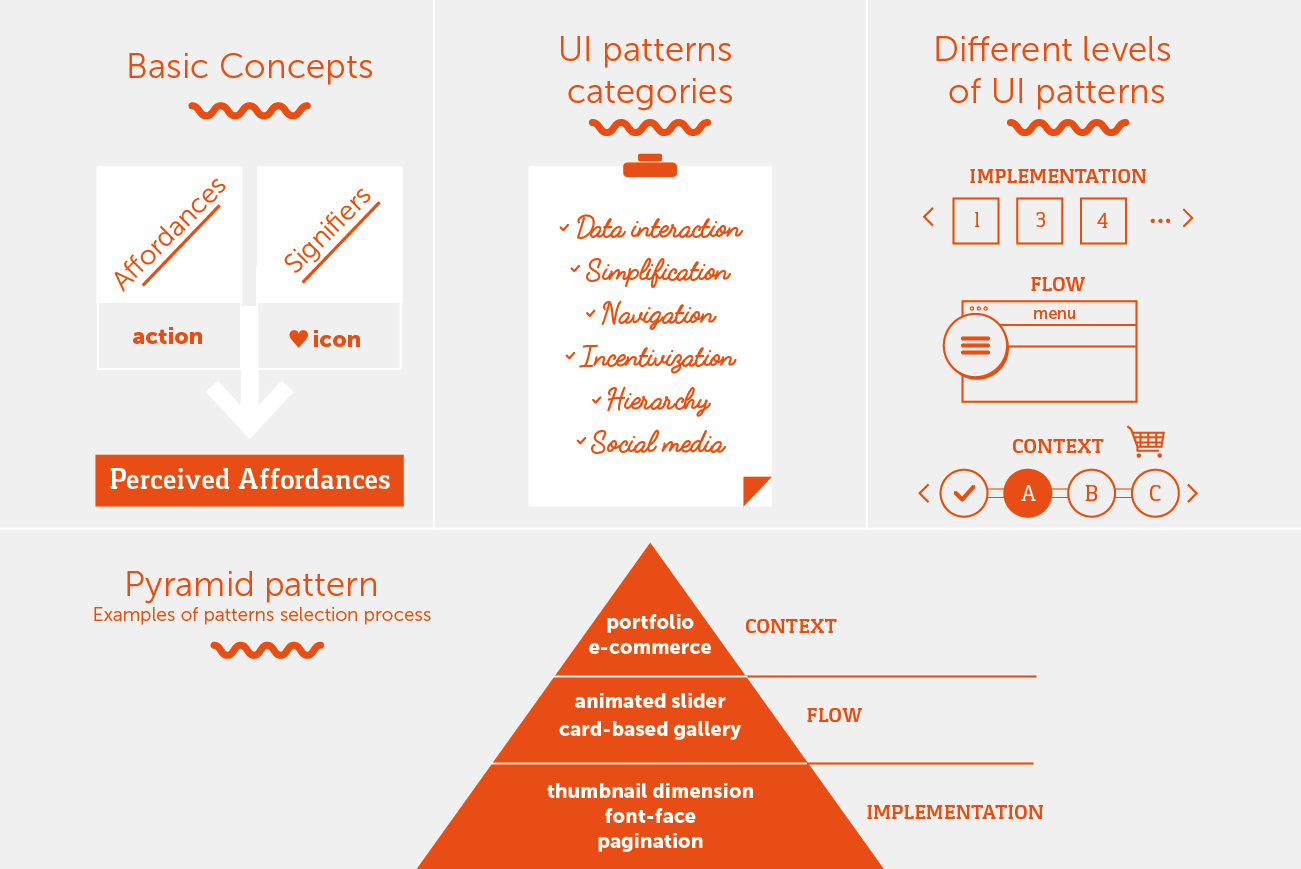
Affordances & Signifiers: The Foundation of UI Patterns
Affordances are what a product can do. Signifiers are the visual cues that tell users what it can do. At an atomic level, all UI patterns are composed of signifiers that hint at the interface’s affordances.
For a simple example, let’s say a page can be saved to favorites on Dribbble.
The page affords being favorited. However, if there are no signifiers, the user will have no idea. Now, if the page does have a signifier – in this case, a heart icon – then the user visually understands the page can be favorited. The perceived affordance, therefore, is what users interpret based on the signifier. Of course, a perceived affordance should always sync with the actual affordance.
 Source: Dribbble.
The process for signifiers and affordances usually runs the same way. The user sees a signifier (heart icon) and gets an impression what the site can do, a perceived affordance (“I can favorite people’s work on Dribbble”).
Used well, signifiers save time in explaining functions by playing on the user’s pre-existing knowledge. They give the site an intuitive and familiar feel, as if the user has used it before – because in a way they have, or at least some of it.
The important benefit about signifiers that we’d like to shine some light on here is that <consistently used signifiers from other sites and apps will cut down on your own explaining. Using signifiers that are consistent with other sites will streamline your own design.
To learn more about the categories of affordances and signifiers, we recommend this article on Smashing Magazine as one of the most comprehensive pieces we’ve read.
Different UI Pattern Categories
With thousands of patterns to choose from, selecting the right ones can become overwhelming. A good first step is to categorize them into different groups depending on their functions. Patterns all have different effects on a design, so dividing them into a few groups (based on the classification used by UI Patterns, one of the best resources on the web) lets you know which ones can help, and which ones you can ignore.
- Data Interaction This type aids in giving and receiving data, and enables deeper interactions. These cover not only how the user sends data to the site, but also how the site responds via feedback.
- Simplification These patterns provide shortcuts around typical problems, to reduce both friction and cognitive load. In essence, they streamline the entire UX.
- Navigation As a site is no good if everyone gets lost, these patterns help the user orient themselves and find their destination effortlessly.
- Incentivization Sometimes your users need a little push to interact with certain features. These patterns incentivize your user to perform certain actions (or at least don’t give up), sometimes with a small reward-system to explore the brain’s habit loop.
- Hierarchy These patterns establish a visual hierarchy, so your users understand logically, which elements are more important than others. For example, do you section out your site or lay everything out on an equal plane with a cards layout?
- Social Media These patterns not only facilitate users sharing content from your site, but also provide a feeling of trust.
These six options are just some of the many ways to organize patterns. Below, we’ll explain a classification system that applies to each of these categories.
Different Levels of UI Patterns
Anders Toxboe, founder of the exhaustively thorough UI Patterns.com, explains that patterns can be used on different levels, in different ways. Extending beyond the classifications based on what they do, patterns can be further classified by how they’re used. For example, some patterns are flexible and change depending on the type of site, while others are stagnant no matter where they appear.
We’ll describe these patterns based on Toxboe’s UI Pattern Pyramid.
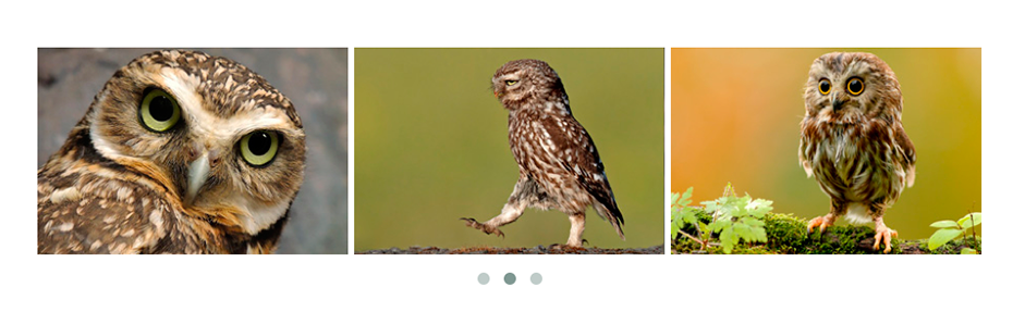
1. Implementation
Patterns of implementation are concerned purely with consistency across your pages.
For example, while you might get a bit creative with how you design a photo carousel on your site, implementation patterns ensure that the treatment is consistent across every page.
 Source: OWL Carousel.
It’s worth noting that there is some room for customization – the location of the dots varies, sometimes outside the pictures, sometimes superimposed over them.
As we described in the free eBook Consistency in UI Design, you first want to design the UI pattern in a way that feels familiar to users based on their existing knowledge (external consistency). When it comes time to then build those patterns on your site, implementation patterns then help to ensure internal consistency.
 Source: Paul Robert Lloyd
It’s hard to track how to balance personalization with consistency, so we recommend creating a front-end style guide. This is a global, quick-reference guide so all team members know the guidelines for each pattern. In the style guide for his website, Paul Robert Lloyd (above) lists all the patterns choices unique to his site. For more examples of style guides, check out the free pocket guide An Overview of Style Guides for Modern Designers.
2. Flow
If implementation patterns are tactical, then patterns of flow are strategic.
As the name suggests, these patterns help users flow through your site. For example, both the sidebar and controversial hamburger menu are patterns of flow – they are both different ways of helping users navigate through a site.
Aside from choosing between different patterns of flow, you’ll also find different approaches to the same pattern.
Let’s take, for example, the controversial hamburger icon. Love it or hate it, the fact is that it’s a popular pattern today. It’s also fairly versatile. Let’s compare the different treatments on the awwward-winning sites Vangarde Music and ThinkBlink.
Once you click the menu on both sites, the differences are quite apparent.
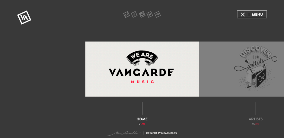 Source: Vangarde Music
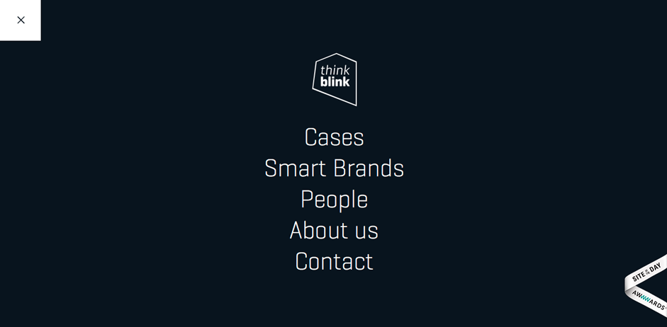 Source: ThinkBlink
As before, Vangarde chooses a more stylistic, flashy approach, opening an unconventional side-scrolling menu with grab-and-scroll functionality, and featuring more of its artistic flair, at the cost of presenting all menu options at once. ThinkBlink keeps it simpler, opening up a standard, five-item menu of text-only labels, set against a monochrome background. Navigation is more traditional on ThinkBlink (which makes sense for an audience of potential clients), and more unconventional for Vangarde (which might suit their artistic audience).
However, both sites keep the essentials the same. The look of the icon – a signifier – is nearly identical, and once clicked the icon turns to a X for cancelling on both sites. The heart of the flow pattern is the same, but sites are able to customize the look or interactivity to suit their users.
3. Context
Last are patterns only applicable to specific types of sites. These are appropriate only for certain situations, and so fit the narrow margin at the top of the pyramid. Further, while they’re application is very precise, their functions tend to be broad – think of the pattern for step-by-step checkout, which is only applicable to ecommerce sites, but is open to a broad range of variations.
For this reason, context patterns are often chosen early in the design process since it’s immediately obvious that ecommerce sites need a checkout pattern and portfolio sites need a gallery pattern.
 Source: Amazon
 Amazon did not invent the step-by-step checkout process, but they utilize it because it’s practical. The pattern breaks up the otherwise complicated checkout process into individual steps, so as not to overwhelm the shopper and scare them off at the crucial moment. As a pattern, the step-by-step checkout is used often… however only with ecommerce sites. Sites like Facebook or Google have no use for such a pattern.
4. Putting It All Together: Building the Pattern Pyramid
Toxboe’s Pattern Pyramid was not simply a creative choice. It realistically reflects the pattern selection process.
You start at the top, selecting only a few contextual patterns depending on your site. These often shape the layout and/or information architecture.
For example, if you’re building a portfolio site, you know you’ll need a page for samples of your work, which will affect the navigation of the entire site. That’s why these are selected early on, generally in the wireframing phase (you can learn more about making structural design decisions in our free Guide to Wireframing).
 Source: Dunckelfeld
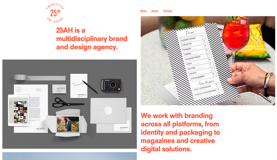 Source: 25AH
You then move to the middle phase, where you choose more patterns that you personalize to help users move through your site. For example, if you’re building a portfolio site, do you select a cards-based design pattern or an animated slider? The bulk of design work usually focuses on wireframing, prototyping, and then testing decisions made during this middle stage of UI design.
Last are the implementation patterns. These are the most granular, but also the easiest to incorporate, since there’s little room for variation. If you dictate that each card on your portfolio site is 400x400 pixels, then you need to build every card to that spec. You can specify these patterns during later stages of design, whether as the result of usability testing insights, or as you start increasing fidelity.
The UI Pattern Selection Process
Now that you know the waters, it’s time to dive in. The effectiveness of a pattern depends on the site – the perfect pattern for one might do more harm than good on another.
 Source: UXPin
Our preferred method of pattern selection involves four distinct steps to help you identify which patterns will work best, and how to implement them:
- 1. Isolate the problem.
- 2. Examine which patterns other sites used to solve the problem.
- 3. Analyze how these sites used the patterns.
- 4. Customize the pattern in the way it’s right for you.
Let’s explain how this process works with an example: site testing has revealed that users find your interface too cluttered.
1. Isolate the problem.
You take a critical look at your interface and realize that, yes, it is too cluttered. After analyzing the qualitative and quantitative user feedback, you realize the controls are the issue. There’s too many options available, but at the same time, users value these options and use each at different times (so none are expandable). Your problem is clear: how do you save screen space without sacrificing user options?
2. Examine how other sites solve the problem.
You visit sites similar to your own, and see how they solved the problem. You go to sites like Pinterest and Quora.
 Source: Pinterest
On Pinterest, you notice they use the pattern of Discoverable Controls. By hovering the mouse over the relevant card, the controls appear, but when you don’t interact with the card, the controls disappear. This allows the user to focus mostly on content, and only see controls when they’re needed.
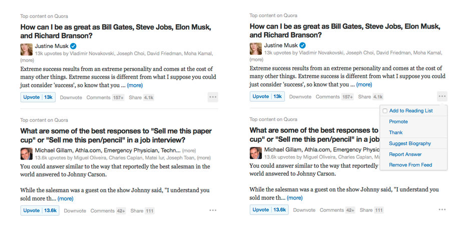 Source: Quora
Quora takes a similar approach, but with notable exceptions. Instead of hovering over the relevant car, the user must click the icon to open the collapsible menu. These present their interaction options, with word links instead of Pinterest’s icons.
3. Analyze how these sites used the patterns.
After taking good looks at each, you realize the major differences. First, Pinterest has the controls appear by hovering, while Quora involves a click. Second, the Pinterest controls are icons, while the Quora controls are words.
4. Customize the pattern for your site.
You decide to mix-and-match the elements to get the best of both worlds. Because their are only a few relevant cards per screen, you decide on the clickable icon to reveal more options, as opposed to the hover controls. However, your options are simple and fun, so you decide to represent them with icons, rather than labels.
This process gives you a familiar and recognizable pattern that requires no explanation when your user sees it, but is still personalized enough that it feels unique to you.
Takeaway
By taking advantage of generally understood knowledge, patterns save your users time in learning new interface systems, while also solving any number of problems for you at the designing end.
In fact, patterns are just creative design solutions that were so effective, more and more sites started using them until they became commonplace. That’s what makes patterns such a valuable design tool… as long as you know enough about them to choose the right one for the right job.
To learn more about creating the strongest first impressions with users, download the free e-book Web Design for the Human Eye. Written for real-world applications, the book teaches through analysis of visual examples from companies like Squarespace, Jukely, Wunderlist, and others.