

Web design is all about movement. There’s plenty to be said for a static picture: you can read into it, ponder its intricacies, and reflect upon the artists intentions at your leisure. However, this is not an art gallery. It’s a webpage. Most site owners don’t care one lick whether or not their online presence can make a visitor thoughtful.
The idea is to keep them engaged. That, of course, means to keep them moving.
There are all sorts of methods designers use to accomplish an acceptable degree of user engagement, but the topic du jour concerns animated CSS and JS transitions. These clever animations offer instant feedback to a user, an aesthetic reward for a desired action. The classic call and response that creates a musical harmony to a page’s design.
Collected below you’ll see several stunning examples of what’s possible in today’s dynamic web. The options for animations are truly astounding, and you’ll learn how to apply all of your favorite effects as well.
Let’s get started.
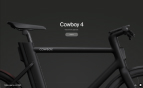
Menus
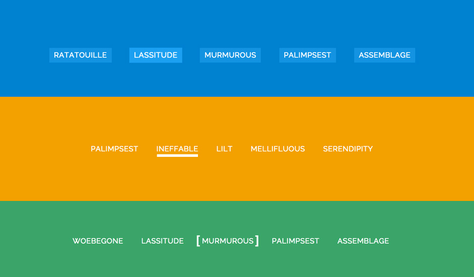
In terms of providing users with feedback, it’s of paramount importance that menu animations be included in any modern design. Your menus provide users with a glimpse into the overall architecture of your website, and more importantly, they serve as a means to quickly and easily navigate toward their desired content.
Menus are the go-to method for navigation, that’s why they're often sticky these days. Seeing as they are so pivotal to UX, it makes plenty of sense to make them attractive and inspiring. Moreover, it’s smart to show users exactly where they’ll be navigating by providing that bit of animated feedback. The animations highlight and confirm the destination as the user hovers.
Take a gander at some of the outstanding examples that are available around the web:
Once again, to get your menu animations going, just follow the simple process outlined above. Link to the appropriate style sheet, add the relevant effect to the menu element in question, and then enjoy the fruits of your minimal labor.
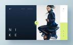
Full-Screen Pushing Navigation
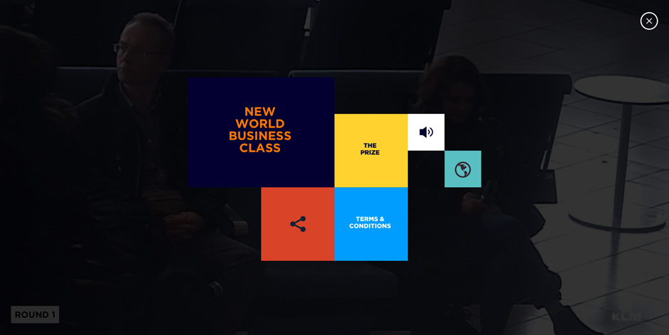
Going back to menus for just a moment, there is a particular web design trend that we’re seeing more and more of lately. And we like what we see.
Full screen push menus are a fantastic way to increase user focus on the task at hand: finding their next destination on the website. Once they’ve made the decision to navigate away from the current page, everything except the navigation menu becomes superfluous. It would be really great if, at that point, everything else would just disappear.
That’s what makes these push screens so laudable. All users have to do is click the menu icon then any and all unnecessary elements are snuffed out, replaced by the navigation screen. This allows the user to interact with the one thing they’re currently concerned with, navigation. And as aforementioned, they’re becoming pretty popular:
Now a full menu change is slightly more complicated than the animations we’ve gone through up until this point, so you’re probably better off reading through the tutorial that Codyhouse.co has written on the subject.
There you’ll find the structural requirements for the HTML, an exhaustive explanation for the CSS3, and a handy link to download the CSS and JS files you’ll need to implement the menu on your site.
Hover
The most common transition effect (likely because it’s easy to undertake but still extremely attractive) is the hover reaction. With mobile devices, the mouse hover is usually replaced with a little tactile contact. Regardless, the animation still serves the purpose of instantaneous feedback.
Take a look at a few examples of what this effect looks like, and learn at least one easy method to implement it.
Buttons
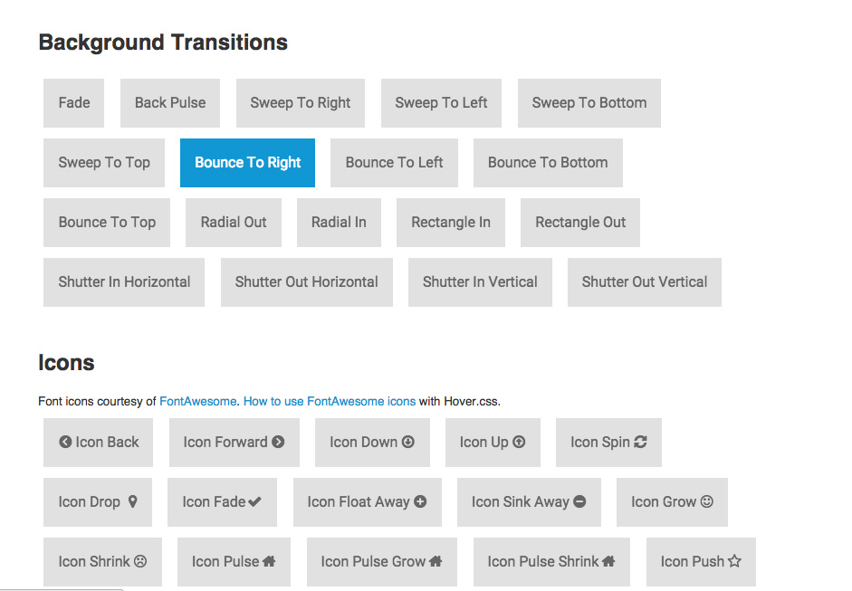
The options for animating your buttons are nigh endless. The most common effects you’ll see across the web are background transitions. As you can see from the example above, colors slide across the buttons as the mouse hovers. You’ve probably seen this effect in action all over design portfolio websites, often in conjunction with ghost buttons, as a means of achieving greater contrast.
There are, of course, many more button hover animations. You can have your buttons pulsing, shifting, slanting, skewing, wobbling, floating, sinking, or bobbing up and down.
The methods of realizing each effect, however, are fairly similar.
In this particular case, you can use the Hover.css style sheet to easily copy and paste the effect directly into your HTML. Simply download the hover pack style sheet (available here) and add the effects to your webpage through the HTML in the Head tags. Like so:
<link href="css/hover.css" rel="stylesheet" media="all">Next you’ll add the hover effect to your button element. Just find the effect that you’d like to add within the CSS file, and see how it’s written. That way you can apply it directly into the HTML.
You’ll start out with something that looks like this:
<a href="#" class="button">Checkout</a>
And after you’ve added the secondary .hvr-float class, the HTML will look like this:
<a href="#" class="button hvr-float">Checkout</a>
Easy peasy, right? What’s more, this is exactly the same method you’ll use to apply hover effects to any other element on your webpage. Many of the other examples in this gallery can be implemented using this exact formula.
- 1. Link the CSS sheet to the page
- 2. Choose an element in the HTML
- 3. Find your preferred effect in the CSS file
- 4. Enter the class to modify the existing element.
- 5. Sip cappuccino in satisfied manner.
For more information on this particular stylesheet, I recommend you check out the highly informative tutorial by Ian Lunn. Or if you’d like to see more cool things you can do with your buttons and CSS transitions, take a look at any of the following resources:
Of course, there’s always more than one way to skin a cat, or animate an element, for that matter.
Let’s take a look at some of the other stuff that you can animate on your web pages.
Images
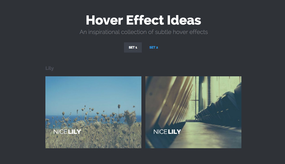
Animating smaller images can call extra attention to an element that may be lower in your hierarchy, but still deserves attention.
You can also use these as alternate user navigation patterns, to add written content (clarifying the image’s purpose), or just to add a little extra style to your designs. Whatever your purpose, adding a CSS transition to an image can take an already engaging element and boost its overall immersive qualities.
To implement these particular ihover effects, you just need to follow the process described in the “Buttons” section of this article. Although predictably, you’ll just be linking a different stylesheet to your page. Rather than Hover.css, you’ll link ihover into your HTML.
Just in case you’ve forgotten, here’s how that end result should turn out:
<link href="styles/ihover.css" rel="stylesheet">
Once that’s finished, you’ll be free to add effects to your images as you see fit. And of course, always be on the lookout for other nifty collections to add to your repertoire.
Text input
Moving on from mouse hovers, it’s fitting that we give our keyboards some love. Text input transitions are another fantastic measure for providing user feedback. Animating the fields where you need your users to input text informs them that the site is ready to receive the information they’re trying to give. Not only that, but it does so in a much more obvious manner than the blinking cursor which they’re so used to seeing.
This can be extremely helpful for users working with slower devices. That caveat goes double for when they’re trying to type on a smartphone or tablet:
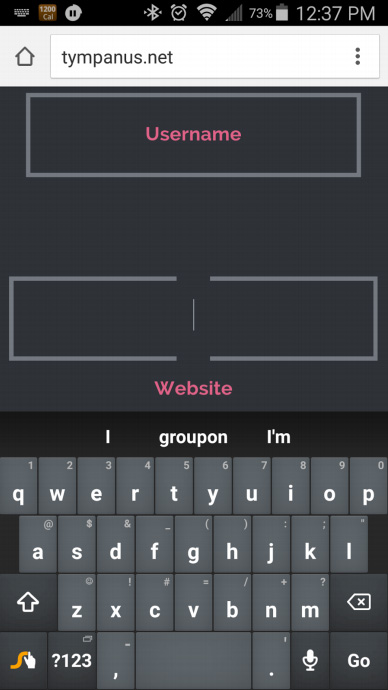
Note how there’s a clear change from the inactive (Username) field to the one that’s animated (Website). By implementing a CSS transition in your text fields, you’re eliminating possible confusion for the user. Obviously, decreasing frustration with your design’s usability is an important goal.
Slider Transitions
Animated slider transitions have been around a long while. These days if your site doesn't’ have a hero image, it’s bound to have a slider. Even so, being ubiquitous, they can get boring. Let’s take a look at how they can be jazzed up a bit, shall we?
JS Image Sliders
First up is your traditional slider transition animations. These are very useful. You can cram several pieces of content into a high priority piece of web real estate at once, conserving space and highlighting important information.
Follow this link for the source code and directions on implementation.
Image Comparison Sliders
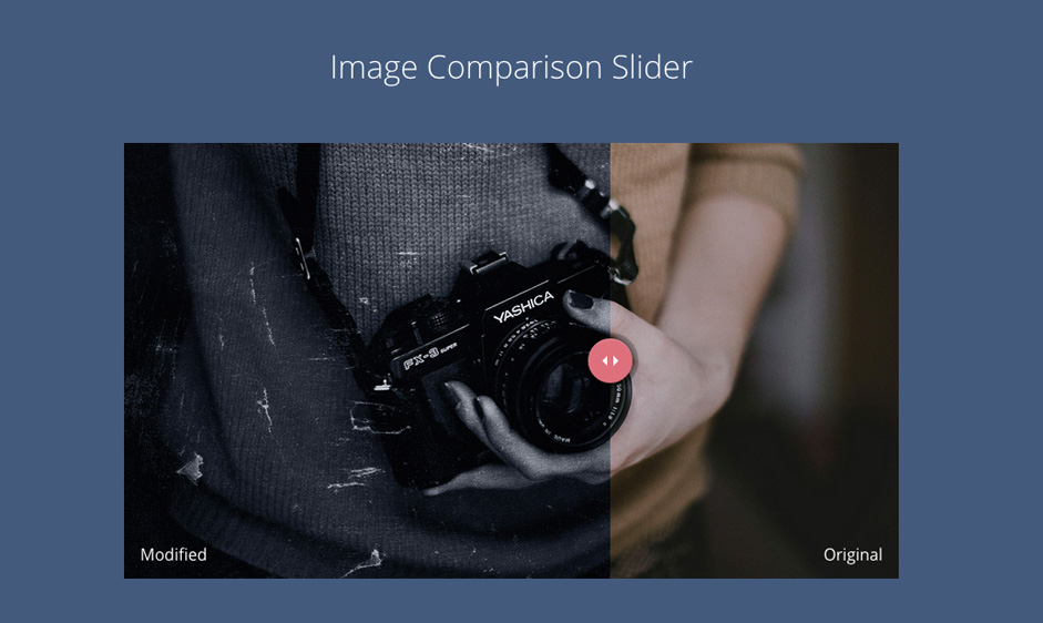
The “before and after” effect is basically two different images superimposed upon one another. The user can drag and drop the slider icon at the bottom of the image to decide which image they want to see.
This can be a very handy effect if you want to compare two items. It’s ideal for showing contrast between two products, and can thus be particularly effective when used on a product page.
To learn how it’s done, click here.
Draggable Slideshows
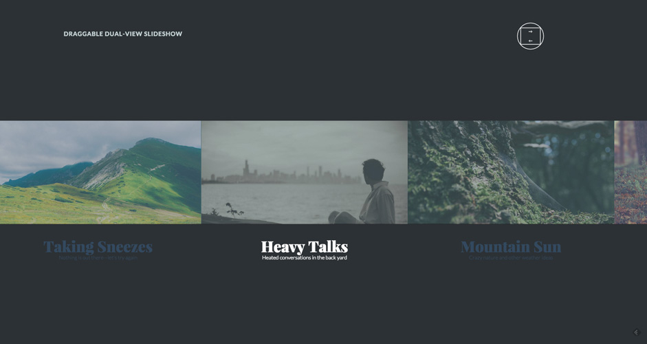
This one is the newest of the bunch. A slide-show style slider that has multiple full screen views, and doubles as a carousel where you can view multiple slides at once. This transitional effect can be used to present multiple items in a fun and engaging way.
The novelty of this effect makes it really special. when implemented properly, it can really be an immersive experience.
Further Reading
If you’d like to learn more about CSS/JS transitions and other animated effects, then take a look at a few of the following tutorials we’ve curated for your reading pleasure:
- CSS Transitions, Transforms and Animation Tutorial
- W3schools - CSS3 Transitions
- W3schools - Transition Property
- CSS-Tricks - Transition
As you can see, the options and implementations for dynamic transitions in web design are many and varied. Furthermore, these CSS and JS animations serve an invaluable purpose. They increase user attention, while decreasing user frustration.
Effective design is all about an emotional pull towards an end result, i.e. the conversion. Animated transitions facilitate this aim in ways that few other design trends are able. It would be incalculably wise to find the time to insert a little motion into your designs as well.
How have you utilized animated transitions in your work? Share some examples in the comments.