


As a complement to our prior post "30 Grid-Based Websites", we've made a selection of indispensable resources like layout frameworks, tutorials, books, templates and useful tools that can help you understand and implement grid based design in your projects.
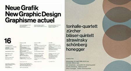
Let's start with a little history. Many of you know who Massimo Vignelli is, a known designer with a solid modernist influence who developed his career in numerous areas of design. In 1977, he designed the Unigrid System for the National Park Service. The module grid system allowed the creation of brochures in ten basic formats keeping a consistent, recognizable structure. Who knew that 30 years later his work would be the inspiration of a discipline that he couldn't even dream of at that time. In 2009, Vignelli himself published a free e-book called "The Vignelli Canon" with the sole purpose of sharing his knowledge with the new generations of designers.
Tools & Online Layouts Generators
- The 892 unique ways to partition a 3 x 4 grid
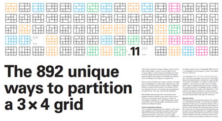 The 3 × 4 grid poster is a computation-based design. It reveals the 892 unique ways to partition a 3 x 4 grid into unit rectangles using an algorithm designed to generate all possible variations. http://www.3x4grid.com/poster.html
 - 3x4 Grid Builder
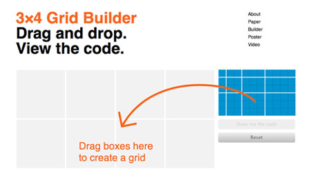 Drag& drop. View the code. http://www.3x4grid.com
 - Tiny Fluid Grid Generator
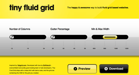 The happy& awesome way to build fluid grid based websites. http://www.tinyfluidgrid.com/
 - The 1kb Css Grid
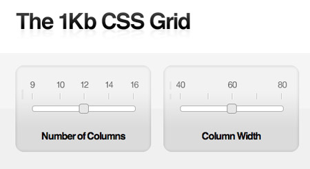 Looking for a simple, lightweight approach? Meet The 1KB CSS Grid. http://www.1kbgrid.com/
 - Grid calculator and Generator
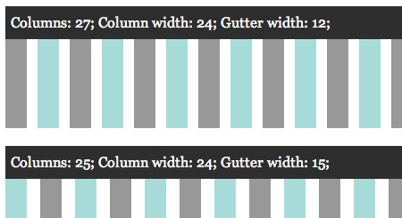 GridCalc is a easy to use grid calculator that gives you all the possible combinations within the limits you entered. http://www.problem.se/labs/gridcalc/
 - Grid Pak
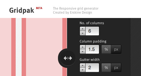 Gridpak is an interactive tool for creating responsive grid layouts. http://gridpak.com/
Photoshop Grids and Plugins
- Modular Grid Pattern
 Application for web designers, which helps you quickly and easily to create a modular grid in Adobe Photoshop. Download
 - Guide Guide
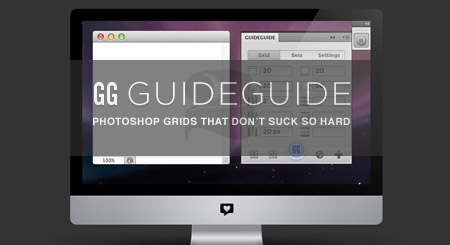 Plugin for Photoshops to create guide sets. Download
 - Responsive Photoshop Template
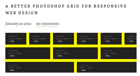 A better photoshop grid for responsive web design. Download
 - 960px Grid Templates
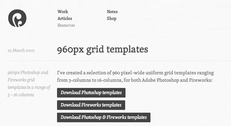 960 pixel-wide uniform grid templates ranging from 3-columns to 16-columns, for Adobe Photoshop and Fireworks. Download
 - Frameless Template
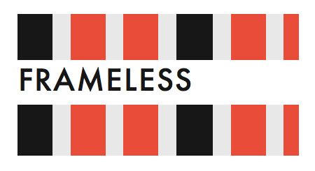 A basic template for a Frameless grid with 48 px columns and 24 px gutters. http://framelessgrid.com/
 - Responsive Grid PSD
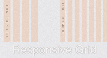 Joel Beukelman photoshop template for responsive design. http://dribbble.com/shots/410635-Responsive-Grid-PSD
Frameworks
- 960grid
 The 960 grid is a classic among CSS frameworks, a very useful tool based on a width of 960px with a large number of resources to integrate the design in the layout. http://960.gs/
 - YAML
 This is not just another multicolum layout. Yaml is a fluid and responsive grid system framework that gathers the best characteristics of the most well-known grid based systems together with new techniques applied to responsive design. http://www.yaml.de/
 - The Golden Grid
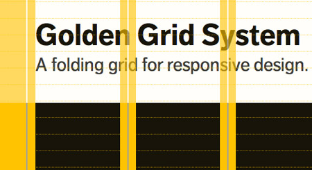 A grid system for responsive web design. Includes folding columns, elastic gutters, a zoomable baseline grid, and a delightful grid overlay script. http://goldengridsystem.com/
 - SimpleGrid
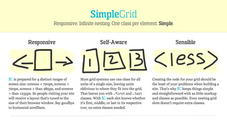 Responsive. Infinite nesting. One class per element. Simple. http://simplegrid.info/
 - Frameless
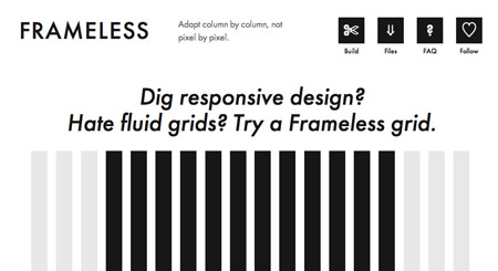 This is not a Framework this is a non-fluid grid for adaptive web design; adapts column by column, not pixel by pixel.Use media queries to adapt your design as more columns become available. http://framelessgrid.com/
 - Columnal
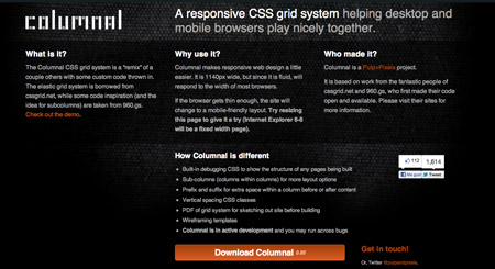 A responsive CSS grid system helping desktop and mobile browsers play nicely together.Columnal supports mobile layout through the use of media queries. http://www.columnal.com/
 - 1140 CSS Grid
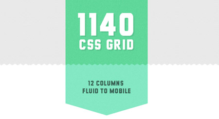 The 1140 grid fits perfectly into a 1280 monitor. On smaller monitors it becomes fluid and uses media queries to serve up a mobile version. http://cssgrid.net/
 - Skeleton
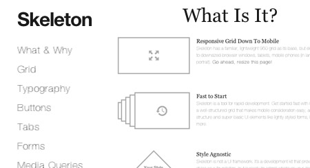 Another Responsive Grid System is the best choice to quickly create a website for multiple devices. http://www.getskeleton.com/
Books & Geekeries
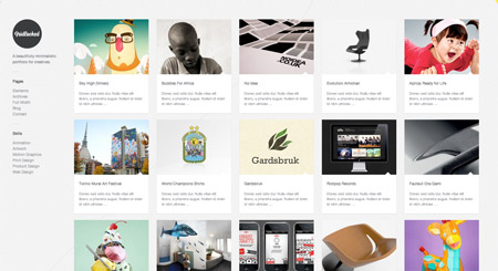
- Ordering Disorder: Grid Principles for Web Design
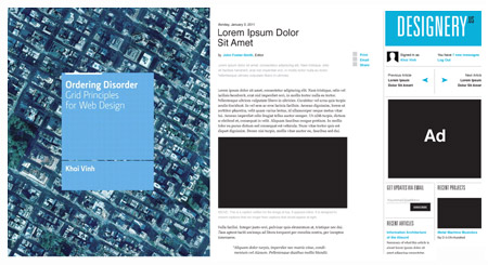 WordPress themes adapted from typographical posters of modernist designs. Buy it!
 - Layout Essentials: 100 Design Principles for Using Grids
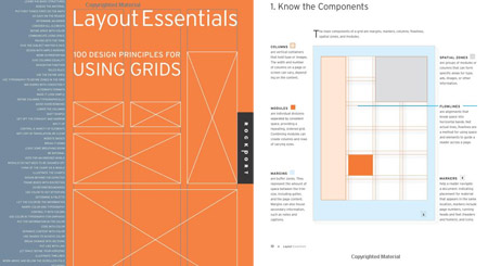 This book will outline and demonstrate basic layout/grid guidelines and rules through 100 entries. Buy it!
 - Web Book
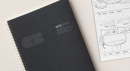 This notebook is designed for digital designers. It features a 15-point dot grid that divides vertically into two, three, four, five or six columns. Buy it!
Wordpress Themes
- Vertical Rhythm
 WordPress themes adapted from typographical posters of modernist designs. http://verticalrhythm.org/
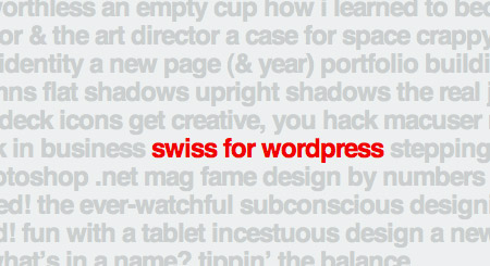
 - Swiss Theme
- Ultra Grid Theme

- GridLocked Theme
- Grid-A-Licious Theme
Related Articles
- Rethinking CSS Grids
- Rolling Your Own Grid Layouts without a Framework
- Grid Based Web Design Simplified
- Web Culture: Grid-based Layout Design