


One of the most difficult tasks as a designer is choosing the appropriate font pairing. It is never an easy undertaking, whether you face many limitations or none, your decision will define the tone and voice of your product. This is why selecting font pairings is such an important element of the process.
When working for an agency, it is not uncommon to receive an established brand guide from the client. Depending on the client, they may already have a corporate typeface picked, in which case there is no room for deviation- you have to work with it.
This does not mean that your creative input is over. On the contrary, it presents an exciting challenge. You now must configure a pairing that is balanced in the sense that it does not create typographic conflict and allows for a beautiful and perfectly legible experience. Game on!
Larger companies usually choose typefaces that serve as a platform to express all of the values the brand encompasses. They tend to have a very strong personality and will affect your design in one way or another.
On the other hand, you will always find licensing issues. As a designer, it’s very easy to justify a design decision when we don’t have to account for the cost of them. When you work for a corporation that has millions of visits, it’s not that easy. Decisions like these require budget planning, legal consultations and scaling up. We have to be wiser when it comes to making our clients lives much easier as well.
So what can you do when you face this? There are a number of tips to follow when picking your font pairing.
1. Find a neutral font.
This may seem very obvious, but it’s not the case. Whenever picking a typeface that has to work with the brand’s, the more neutral it is the better. This is because you won’t have two very opposite styles and there won’t be any visual clashes.
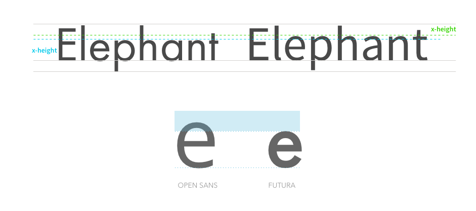
2. Find a font with an appropriate x-height
A balanced x-height will ensure good legibility. This is an aspect that many designers tend to overlook. Using a neutral typeface with a good x-height allows you to use it as the main body copy font. It’s a simple trick that helps you to have more control of the larger pieces of text.
Let’s look at this with an example. Imagine you have a client that uses Futura as part of their brand. Futura is gorgeous, but it may not be the best choice when it comes to large pieces of legal copy on a screen. The rule is simple: a font with a better x-height will provide room for more information, making text easier to read on smaller sizes. The contrast between the letters is much higher, making it easier for the reader to go through a text without hiccups or excessive attention.
3. Think of licensing and hosting issues
Nowadays, thanks to many online services, there are plenty of ways of serving a font to your site. Also, many of them are free to use for commercial projects. This is a tool that you have to use in your favor. But handle with care, font families are expensive for a reason. There’s a lot of work and testing behind them. Not saying it’s the opposite with free fonts, but if your project is for an international firm that has sites in different languages, you have to make sure your pairing has complete character sets, thus narrowing the options in the free font universe.
If you can’t source the fonts directly, but your client has the capability to host them on their servers, free fonts are a great resource to alleviate those endless budget discussions. Always check the usage and license limitations first, and then make an informed decision. Don’t forget that you probably don’t need all the weights, and loading just what you need improves page load times.
4. Find a font that works for your purpose
It may seem pretty obvious, but not every font pairing works for what you’re trying to achieve. Remember, big companies have a very widespread presence. They want their presence to remain consistent and convey the same message. Try different combinations and make sure everybody feels confident about the brand’s consistency. Keeping your client onboard with this decision will positively impact the outcome of your project.
Typography is a crucial player nowadays. It’s not taken for granted and it’s now another aspect of the user’s experience with that brand. It is probably impossible to find a streamlined process to pick a perfect font pairing, but that’s another beautiful aspect of being a designer.