


Colors add appeal to websites—the more vibrant and stunning, the better. Even so, web design done correctly should consider the utility of adding any colors, to the overall user experience. After all, when you’re designing, your number one goal has to be the user experience, so always think how your clients’ users can be helped by your color selections.
The best sites can combine gorgeous colors and usability to create a user experience that’s smart, considerate and increases the quality of navigating the site. All designers can get to this level of proficiency; it’s just a matter of understanding the basis of good color design.
We’re talking about fundamental color theory and schemes. Once you master these basics, you’ll know how to add color to sites not just for aesthetics’ sake, but for usability.
Here’s what you need to know.
Better Navigation: Easily Finding Categories You Want
One of the most challenging aspects of the user experience on any site is finding the content you want quickly and efficiently. This is particularly true of news sites, where the content is updated fast and furiously and there are many pages on the site. If designers use colors that fail to make obvious categorizations stand out, readers won’t be pleased, they’ll leave the site, and the bounce rate will increase.
That’s not the result you want to provide to your valued clients!
USA Today, a highly trafficked American site dedicated to breaking news and news of all sorts, understands this need to let readers understand site categorizations quickly and easily. Therefore, it has used the complementary color scheme to highlight the different news categories on featured stories, right on its homepage. The outcome is a very navigable site where users enjoy quickly finding categories of interest to them.
On its homepage, there are two examples of the complementary color scheme at work.

The first example is noticeable on the big picture with the headline about the Trump nomination: See the category “Elections” in blue, placed over a yellowish-brownish background color? Note how the blue stands out a lot from the background because blue and yellow/brown are on opposite sides of the color wheel—thereby making them complementary.
The second example is seen on the picture of Ronda Rousey: Note how the red “UFC” category label is over a greenish image background? Again, red and green sit on opposite sides of the color wheel, making them complementary.
Complementary colors are always used to make the elements that you want noticed stand out.
Material Design’s Color Palette Ensures Visual Hierarchy
Visual hierarchy is a vital concept in design that, done correctly, can lead to a great user experience because the site becomes so much more usable when the priorities of where to look are clear. Since there are many elements competing for your clients’ users’ attention on any given page, hierarchy ensures that they’re able to view and absorb the most important parts first. This results in interacting with the site more easily.
How designers use color in their page layouts can massively help or hinder this hierarchy, thereby impacting the usability, too. If designers are thoughtful about how selecting color can aid a user in finding something they’re looking for, then they’ve made smart decisions with regard to hierarchy!
Look at Trippeo’s site, which is very modern because is uses Google’s Material Design in its color choices. Material Design has a color scheme all of its own, created by Google with the aim of helping site usability. One of the big principles of Material Design color palettes is the focus on primary colors (blue, yellow and red), which should be used the most widely in the website design. Secondary and accent colors should be for symbolizing related actions and interactive elements like buttons.
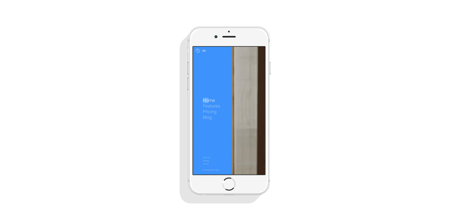
Trippeo’s site features blue predominantly in the navigation: When you hover on its hamburger menu, you see blue come in from the left of the screen, thereby drawing your eye to that section and telling you that it’s the most important aspect of the screen because you can find your way around the site there.
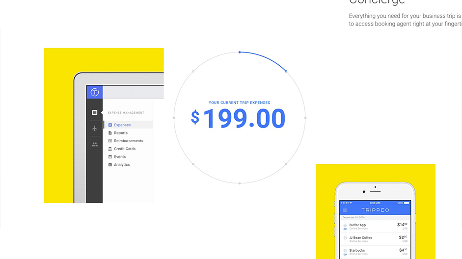
Next, when you scroll down the homepage’s long-scrolling screen, you see primary colors being used in the same way: to signify the visual hierarchy of more important page elements. For instance, the current trip expenses are in blue (primary color), and the icons on the center circle that tell you what you’re spending on are also primary colors or variations thereof.

Finally, the interactive element of this long-scrolling homepage is the scrolling bar on the right side, which is also consistent with Material Design’s color theory: It is either orange or purple (secondary colors) for most of the scroll down. According to Material Design’s rules, the accent colors for these interactive elements are secondary.
Amazing Clarity so Search Results are Legible
Even if people can immediately find what they’re looking for on your site, a well-organized and well-designed search feature can drastically help their navigation and user experience. After all, one of the key areas of importance is the search results page, if your users can’t readily make sense of the results your site shows them, then the search feature is meaningless.
Part of the problem with search results pages is a scenario where there are many results. This can sometimes create chaos and confusion for the user since they feel overwhelmed by all the data they have to interpret. The solution should be color design that empowers them to quickly process what results they’re being shown.
Trip Advisor does a remarkably great job of using color to make search results vibrant and stand out, thus enabling users to efficiently pick out and sort the most important pieces of data shown to them.
When you’re looking for hotels in any given location, Trip Advisor not only finds the best matches and displays them, but they go one better by using the triadic color scheme in the results presentation to significantly boost the user experience. This color scheme is based on using colors together that are evenly spaced on the color wheel.
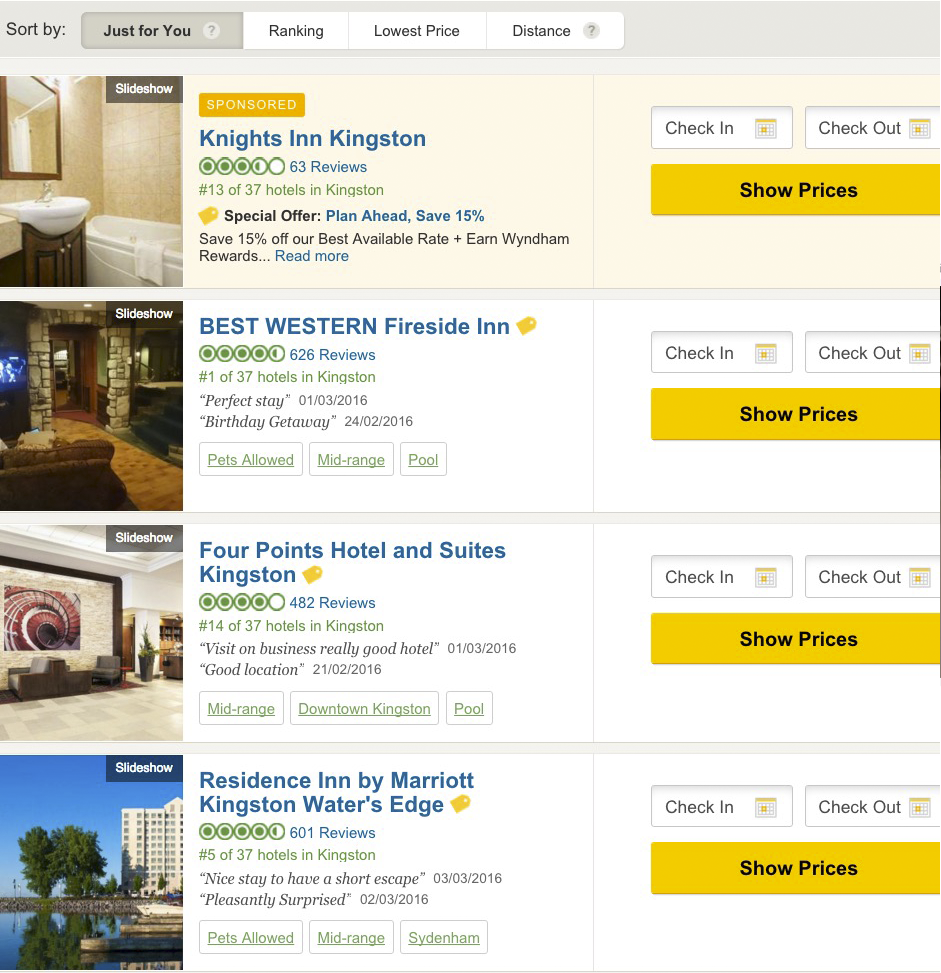
Note how Trip Advisor’s search results are defined by blue, green and orange, with orange by far being the dominant color. Blue draws your eye to the name of the hotel, green to the user ratings, and orange to the most important element, the call to action.
This triadic color scheme highlights, through its bright colors, the info that’s of greatest interest to the user. This enables people to quickly make sense of this info, so that they can make a booking decision, which is the ultimate page goal of every page on Trip Advisor!
Don’t Add Colors Just for Appearance
While colors definitely spruce up any site, especially when used in color-theory best practices, they must serve a greater purpose when you design for your clients and their customers. They have to serve a specific usability and user experience function, just as the examples above show! Failure to do so means you’re not giving your clients’ users the best, possible experience, which they deserve.
Think of how a color combination elevates site usability. Does this color make the other color and its page element stand out more? Does this color combination serve some user-experience function that makes site use more enjoyable, perhaps? When you finally start asking these questions, you’re on the way to using color theory for stellar design.