


The corporate workplace as we know it has devolved into a ruthless environment, where working round-the-clock, unrealistic expectations, and overall bad treatment of humans are the norm. It’s unacceptable.
My intention was to bring awareness to these issues in an effort to induce change. It starts with reminding everyone that employees are human beings who deserve to be treated with respect and kindness, both inside and outside of the workplace.
But how could I leverage my three core competencies—leadership, art, and technology—to turn people’s attention to these potential solutions? The answer was creating a flawless blend of all three, an unforgettable experience that stretched from print to digital, to reach everyone possible. Something that turned heads, elicited smiles, and seamlessly delivered these concepts to bring about change.
To pull that off, I partnered with a few leaders in the art and digital spaces to create a non-traditional business book filled with mind-bending art, which was then brought to life digitally through an online reading experience that is truly like no other. A connected reading experience made for everyone.
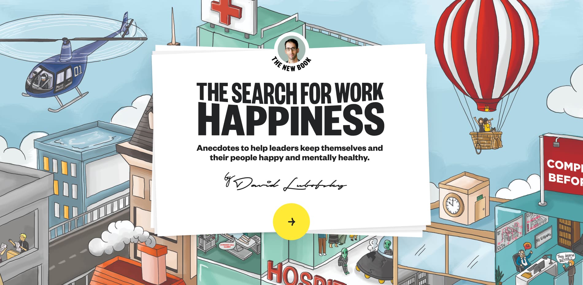
The digital manifestation of "The Search for Work Happiness," is a smile-filled, animated web experience that inspires readers to not only find happiness in their workplace but also to become catalysts for joy in the lives of those around them. Chapter by chapter, this interactive book-in-a-browser immerses the user in a vibrant Wimmelbilderbuch-style illustrative world, where every pixel brims with color and life.
1.The overall experience
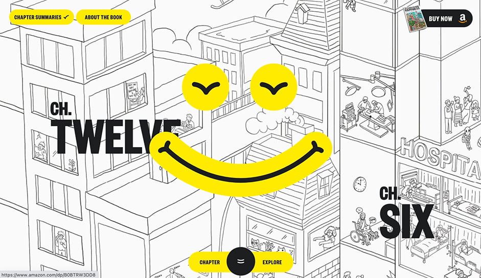
The physical book zooms into a large illustration that depicts a vast city full of hard-working characters in various work-filled scenes for each chapter.
Original concepts
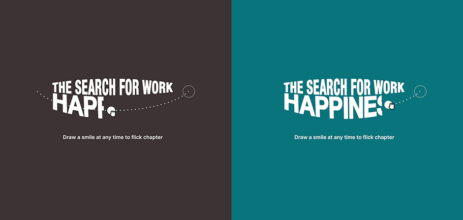
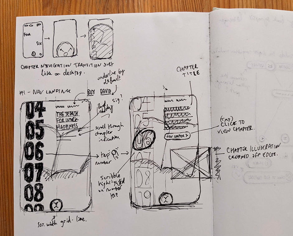
During initial creative and wireframing, we had various core interaction ideas. One of the earlier contemplations was to ‘draw a smile’ using a drag interaction which would take users forwards and backwards between synopses.
Chosen concept
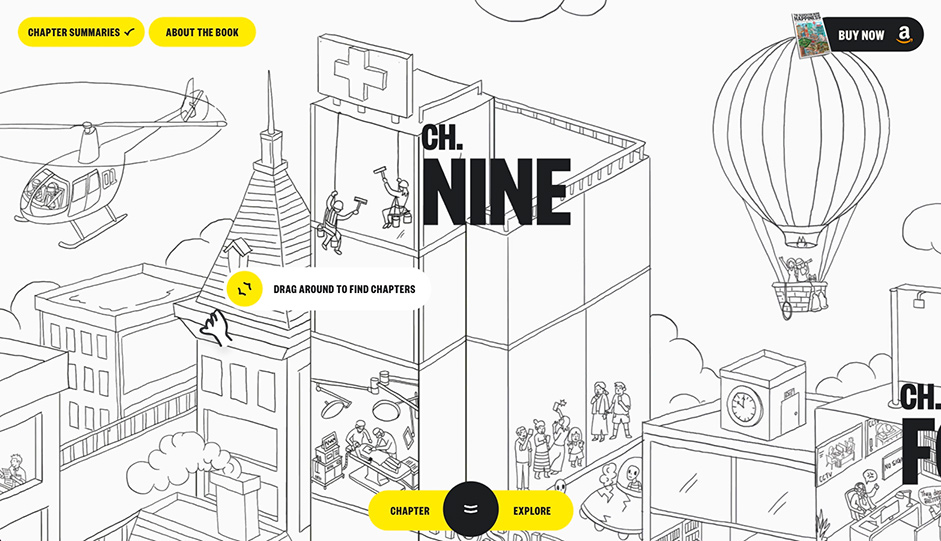
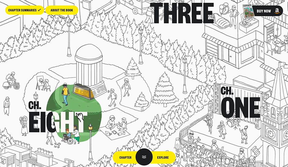
The large art piece was broken up throughout the print book, so it made sense to drop the user into this whole world digitally and let them navigate around freely versus forcing them down a linear chapter-by-chapter path.
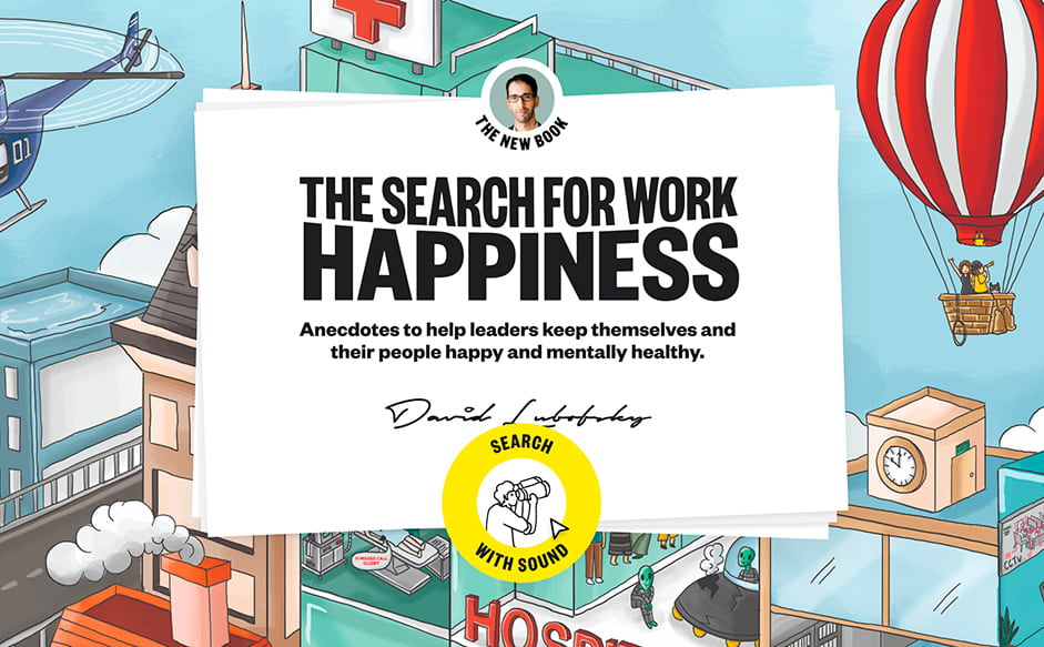
Once they are taken into the book art, a short introduction explains the book and site’s purpose. The user is then directed to click the central ‘search with sound’ button; for this first focal interaction, a circular button with an arrow transitions into a spinning ring around a ‘searching’ Rive animation. This is intended to evoke a vinyl record rotating, nodding to the nostalgic notes the Wimmelbilderbuch-style attempts to twang.
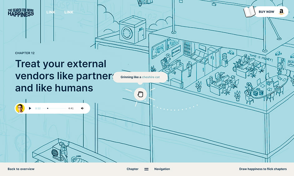
This way of interacting creates a key connection to the title of the book, in that the user is ‘searching’ around the canvas, thus, the ‘search’ for work happiness. Users navigate around this illustrated world freely at their own discretion, ‘finding’ pieces of work happiness in chapters depicted within the canvas via bold, punchy written numbers in the wonderful Founders Grotesk Xtra Condensed by Klim type foundry.
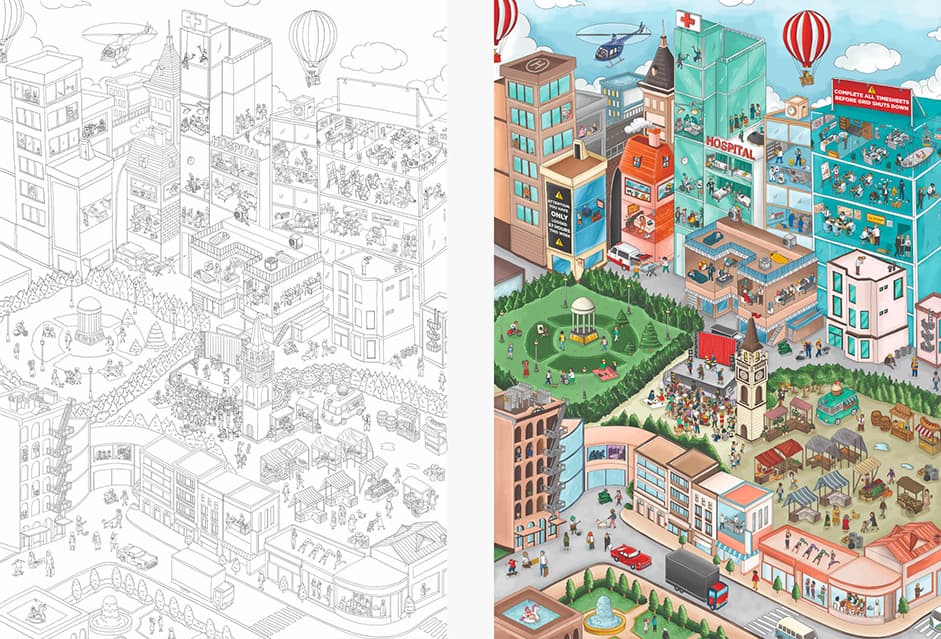
Another quirk to navigating this art was using both color-filled and line-only versions, giving the canvas an extra visual depth and playability with a hover interaction which opens up a portal to the color-filled world, further displayed when the user clicks to view a particular chapter.
2.The content
The purpose behind this entire initiative was to soften the way we deliver solutions to serious problems in the workplace, so we had to make sure a fun, engaging web experience didn’t forget to seamlessly deliver the story and solutions to those who are interested.
Understanding that some people like to read while others prefer to listen, we architected the site in a manner that would be a harmonious blend of both. For the reader, smile-inducing music quietly plays in the background as snippets of every chapter are available to navigate through. Users who choose to listen to snippets of the chapters are rewarded by seeing the audio timeline mirror joy with a warm smile.
Utilizing Rive animation with time-based progression, the audio timeline actually bends into a smile shape as it progresses. Combining these multiple methods of content delivery with the highly-detailed accompanying artwork, users really would be able to sit back and comfortably enjoy the experience, front to back—their way.
3.The navigation
The main intention was for users to drag their way around the canvas; however, it was a priority to provide multiple ways to explore to make the site accessible and easy to navigate. We added a fullscreen chapter navigation for ease of use while taking a few extra steps to evoke the real-world experience of flipping through a book’s physical pages.
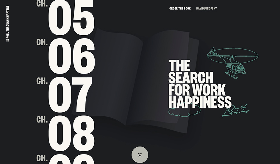
As you open the main chapter navigation, a subtle book in the backdrop comes to life using scroll to evoke the feeling of “flipping through the pages of a book” to help users move through the site. Utilizing Rive animation, we created a looping timeline of pages being flipped and connected it to a variable input generated by the scroll in JS.
This interactive element is complemented by an infinite scroll, illustrations, and a scribbled hover to give this part of the experience some depth.
The book analogies are pulled through the entire journey with tons of micro-interactions where icons and UI are often brought to life in book-shaped arrows, with turning pages upon hover.
4.The features
Navigating around a densely populated piece of art is one thing, but we wanted to ensure there were other visual surprises to uncover. Every drag of the canvas, from the chapter title hover to the page transitions, helped bring the book to life. Every interaction either makes you smile or smiles back at you.
In keeping with the theme of searching for happiness, many of these hidden surprises present themselves as a smile shape. It is impossible to not leave this experience grinning ear to ear, just like the fullscreen smile you receive if you interact with the “Buy the Book Now” button.
The combined level of art + animation necessitated a preloader on this site. While the user waits for the site to load, we wanted to provide both visual pleasure and book access while they had bandwidth patience. While a fun animation takes over the screen adjacent to the loading progress indicator, the user is presented with animations of illustrations from the book, a glimpse of the book cover, and the ability to listen to the book’s introduction.
Considering the vast size of this world we created, we had to be careful with how the experience translated to mobile—especially since there are no hover states in that setting. Most hover-based animations and interactions were triggered during scroll or transition so that no user was left without an unique experience, regardless of device or screen size.
5.The tech
Uniting art, animation, and content in such a manner requires creative technology that is nothing short of otherworldly. This was achieved through a handful of tools and technologies:
“Painting” the canvas with color
We leverage the magic of Three.js to let users breathe life into the draggable canvas, empowering them to interact with a world of mesmerizing line art. Through hover or chapter navigation, you are greeted with an enchanting masking effect, brought to life by a GLSL shader animated with GSAP, which transforms every interaction into a playful masterpiece.
Animation and bending
This unbelievably fun journey is enhanced by WebGL, GSAP, and tons of Rive animations that really push the user to want to search and find every micro-animation that exists on the site.
Build
At the core of the web experience is Nuxt.js, ensuring a seamless and dynamic frontend. Dato CMS was used to manage all of the content and it all packaged up and delivered with speed to users with Netlify.
6.Company info
My name is David Lubofsky and I am a freelance visual strategist and creative technologist. To build legendary work, one must partner with legendary talent. For this project, I partnered with Aaron Yeo to create the illustrations; Bryan James to help architect, design, and animate the entire experience; David Ellis for the 3D book used throughout; and Jesper Landberg to turn it all into creative-coded brilliance.