

Love for Iceland is a website that tries to promote many of the aspects of one of our favorite countries. From the first moment we were aware of all the many visual possibilities for a project of this topic, so the main challenge was to present the text content in a friendly way so the navigation wasn't too tedious.
Main challenge: make a visually attractive site with a lot of information
Generally websites with lots of information have classic blog structures so our goal was to make it less conventional. We wanted to make something creative where the usability wasn't penalized, so we focused all our attention on the navigation, making an interface where the user could access all the content easily.
We explored the way mobile apps work, showing the sections and its contents with lateral interactions keeping the user on the same page, not refreshing it, and having all the elements animate in a responsive and fluid manner.
We tried to make users navigate all the content in a responsive and fluid way, so the user experience isn't affected by all the content the website has.
Design Approach
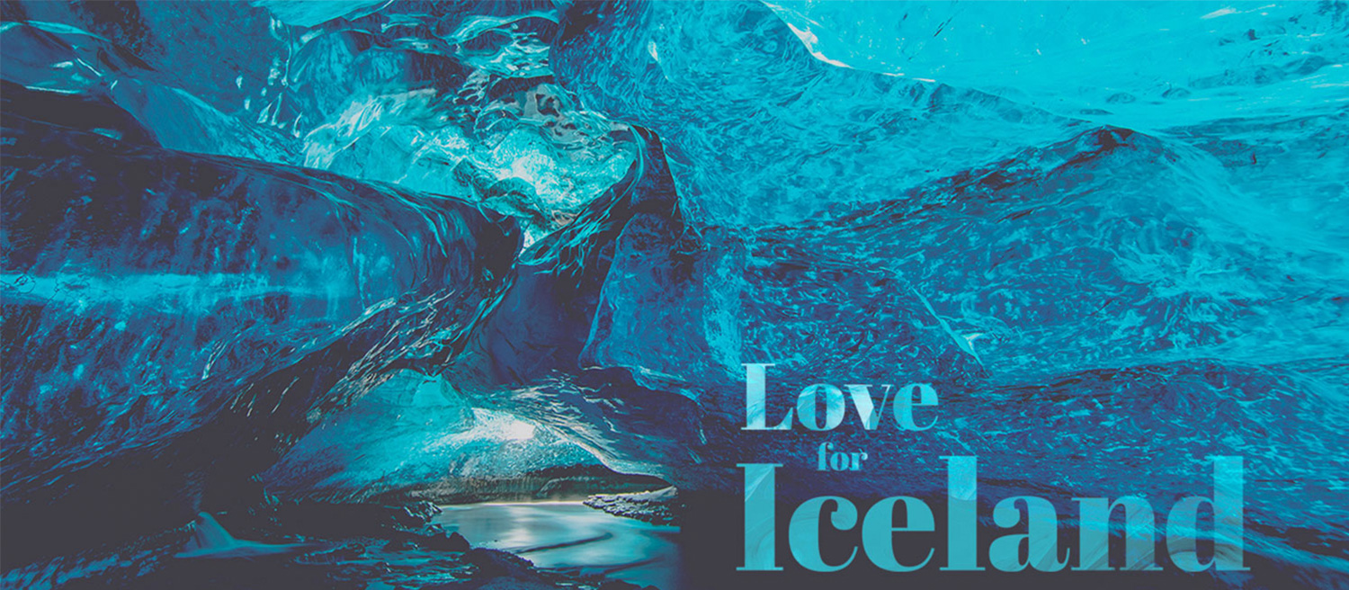
One of the biggest possibilities of this project was to show the amazing photography of the country so we decided from the first moment to make a design with full screen backgrounds and big headers.
Our designer had recently traveled to Iceland so we used some of the photos he took, but we mainly got the visual contents from Unsplash because there was so much to choose from. We also wanted to give an homogeneous look to the site so we applied a grey filter to the photos.
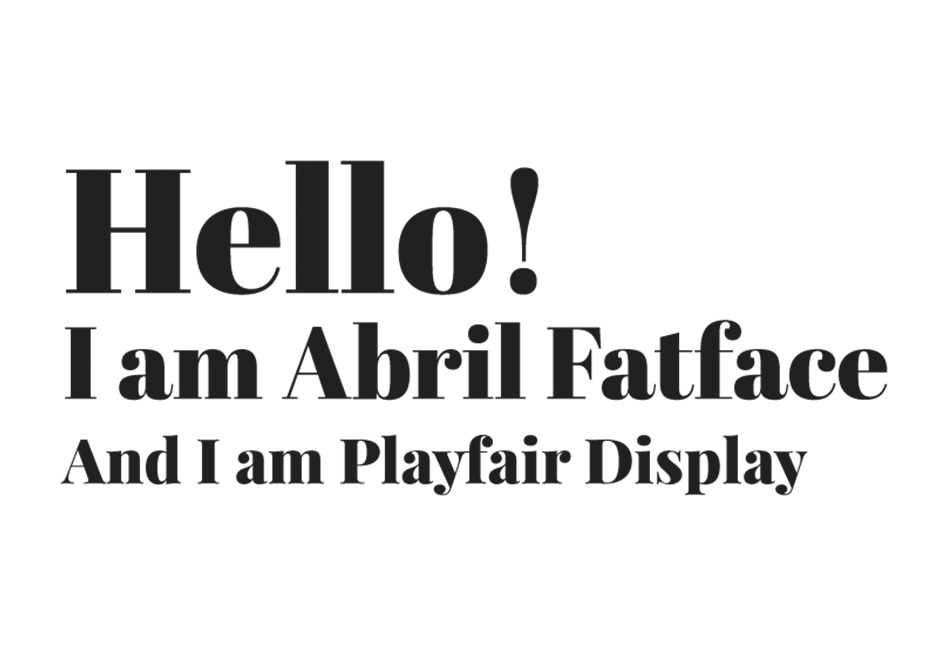
We decided to choose a typography with a lot of personality because it would make the big amount of content more friendly and readable. We liked Abril Fatface, a serif font that looks elegant on big sizes, but the legibility would have been bad on smaller texts, so for those small paragraphs we chose PlayFair, an elegant font that works well in smaller formats.
Our initial final design followed current minimalist trends and had flat backgrounds, but when we had the website developed we decided to change them. Using different and subtle textures instead of flat colors as backgrounds the website had more personality, and it was a minor change that wouldn't have a noticeable effect on other important parts like the preloads or the smooth animations so we decided to do it.
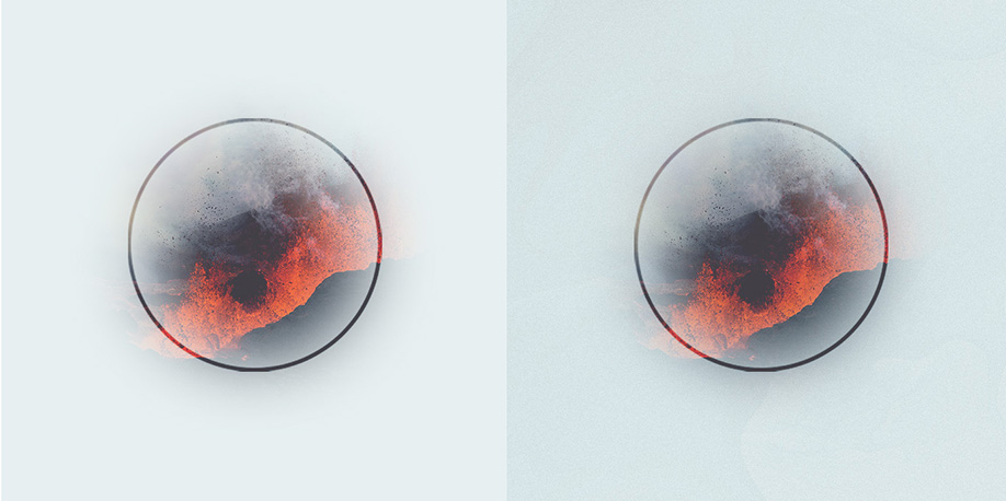
Initial and final backgrounds.
We decided to use a texture that looked like ice from the glaciers and even lava from the volcanos.
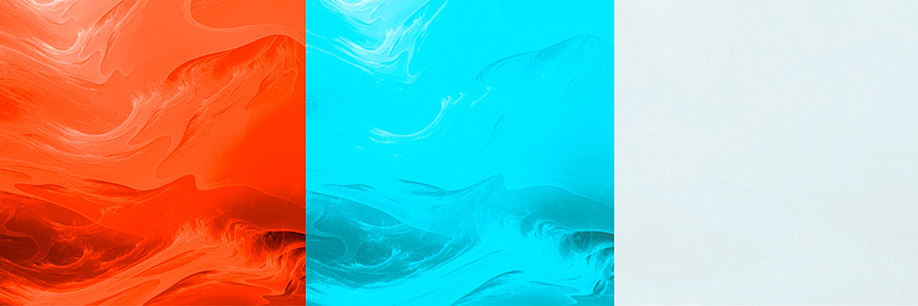
Lava / Ice / Texture with 5% opacity.
Technical Approach
To get an experience similar to an app we made the content appear as soon as the user clicks on a link, avoiding in-between preloads and reducing the wait time. To make that possible we developed a preload system in the background that anticipates where the user could access and has all the content preloaded and ready to show it.
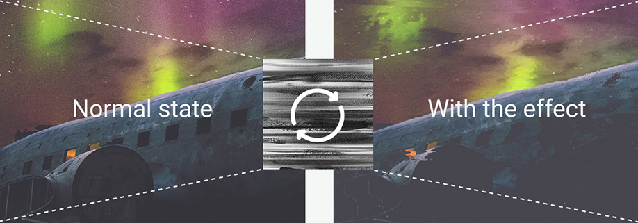
Up to this point the technological part wasn't really special so we thought about adding some small details that would enrich the experience. We added some small ice/dust particles to the backgrounds that the user could interact with. Also we applied a displacement map to the backgrounds when a section is accessed that conceptually simulates the movement of lava.
With these organic effects the website seemed more alive and closer to the atmosphere of the country we were talking about.
One of the problems we detected with the app-like way of showing content was FPS drops when a new image was decoded and shown on the viewport. To prevent this from happening we had to come up with some pretty weird techniques.
For example when the user clicks on a link, before anything animates, we insert the images on the DOM with 0.0001 opacity so they are invisible to the user, then we move them to the viewport to force the image decode, then after some milliseconds we place them on their initial positions and finally show them with the rest of the content. All of this happens very quickly so the user cannot perceive it.
Tools used
Wordpress REST API, Node, Webpack, Javascript with Babel, SASS, PIXI, GLSL.
Company Info
Twenty Two Degrees (22º) is a web design and creativity studio based in Madrid. We focus on new ways to create and develop innovative projects. Even though our main focus is digital projects we also offer other design services like branding.