MUELLER is a modular grid system for responsive/adaptive and non–responsive layouts, based on Compass. You have full control over column width, gutter width, baseline grid and media queries.
This post is a brief step–by–step tutorial on how to work with MUELLER. I assume that you're comfortable using Sass and Compass. Moreover, a decent knowledge of Grid Theory is an advantage.
“The grid system is an aid, not a guarantee. It permits a number of possible uses and each designer can look for a solution appropiate to his personal style. But one must learn how to use the grid; it is an art that requires practice. (Josef Müller–Brockmann)
Why another Grid System?
Mainly because no other grid system met our requirements: Full control, clean code, maximum flexibility. We use MUELLER for either standard (non–responsive) layouts or for building complex adaptive layouts with media queries. Although you can do fluid designs with MUELLER, I personally don't recommend it since you lose control over your typography (that being said, you might need to go fluid with targeting small handhelds).
Preface/Coding
MUELLER does not help you decide on the number of columns (per media query), the width of your columns or the width of the margin between columns. To put it another way, MUELLER doesn't help you with your layout, because that's your decision and a grid system shouldn't force or restrict you in any way. Before starting, you should have an idea about which devices you would like to target and what kind of grid you want to use (e.g. 24 cols for large desktops, 12 cols for tablets, 6 cols for handhelds and so on). Moreover, you shouldn't be scared of coding. MUELLER is not an out–of–the–box-drag–and–drop–on–the–fly grid system. It does require coding. Once you understand it, you're able to define a grid which perfectly adapts to all devices.
Download & Install
First, you obviously need to download the MUELLER source code. The repository is hosted on GitHub, so you have several options (clone git–repo, download zip/tar) to choose from.
I assume you already have a working version of Compass, so you just need to place the two folders (grid, partials) and the file screen.scss in your Sass folder. If you're struggling at this point, it's probably a good idea to consult the Sass documentation. You can also use Codekit to automatically compile Sass/Compass files.
First off, we're going to define columns for each device resp. media query. Then we'll build layouts (and templates) on top of the media classes and I'll explain some helpers for fine–tuning your layouts. Finally, I'll touch on the topic of baseline grids.
Basic Grid Structure
Inside the folder media there are different files for media queries (e.g._handheld_landscape.scss). You can rename these files, delete the files you won't use or even choose to combine all files. The file layout is completely up to you. For the sake of simplicity, I'm going to explain things based on the given structure.
If you target tablets in portrait mode and you want to define 12 columns with a width of 40px for each column and a 20px margin, you should open the file _media-tablet-portrait.scss and change the variables according to your needs:
$gc: 12;  /* grid columns */
$gw: 40px;  /* grid width */
$gm: 20px;  /* grid margin */
// container
.g-tp-c {
  @extend .g-base-c;
  width: $gw*$gc+$gm*($gc - 1);  /* 700px */
}
// creating the grid-columns
@include grids(tp,
  0 1 2 3 4 6 12 16 24,  /* columns */
  $gc,
  $gw,
  $gm,
  0 2 4 8 12 16);  /* append/prepend/push/pull */
That's basically it. You're now able to use media classes like .g-tp-6 (6 columns for desktop) or .g-tp-12 (12 columns for desktop) within your templates, though you're not able to use .g- tp-5 (because you didn't specify that column). You also just defined classes to append, prepend, push and pull. You should repeat this for every media query you want to use (e.g. large desktop, handheld landscape, handheld). And don't forget to add a file with default values (e.g. _media-desktop.scss) for browsers that can't interpret media queries as well as your default target.
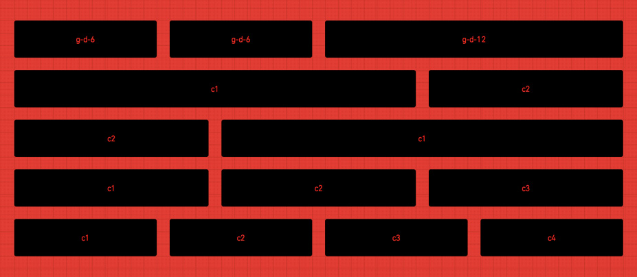
If you think this concept through, you'll end up with templates looking like this:
...
While this is fine for prototyping, it's not clean code and not maintainable at all. That's where layouts come into play...
Layouts & Templates
A Layout is an abstraction on top of several media definitions. For example, you could define a two–column asymmetrical layout by extending the media classes like this (note that I choose to override the columns with small handhelds):
.l-2c {
  @extend .g-d-24;
  @extend .g-tp-12;
  @extend .g-hl-12;
  @extend .g-h-6;
}
.c-1 {
  @extend .g-d-16;
  @extend .g-d-f;
  @extend .g-tp-8;
  @extend .g-tp-f;
  @extend .g-hl-8;
  @extend .g-hl-f;
  @extend .g-h-6;
}
.c-2 {
  @extend .g-d-8;
  @extend .g-d-l;
  @extend .g-tp-4;
  @extend .g-tp-l;
  @extend .g-hl-4;
  @extend .g-hl-l;
  @extend .g-h-6;
}
So, instead of using the media-classes...
... ...
you can now use the layout-classes...
... ...
This makes your templates much more redable and maintainable. But we're still using presentational markup here.
Going on step further, you are also able to define so–called templates in order to remove the presentational markup:
.tpl-1 {
section { @extend .l-2c; }
article { @extend .c-1; }
aside { @extend .c-2; }
}
Your template now looks like this ...
...... ...
Please note that while using templates may seem tempting at first, it'll bloat your code and you'll end up with a huge stylesheet. For now, you're better off using layouts until browsers natively support the @extend directive.
Helpers
MUELLER includes helpers in order to append/prepend resp. push/pull certain columns and to show/hide elements per media query.
To append or prepend columns, you just have to extend the classes you defined with your grid setup:
.l-2c {
...
.c-1 {
@extend .g-d-12;
@extend .g-d-prepend6;
@extend .g-tp-8;
@extend .g-tp-prepend4;
...
}
}
The same applies to push and pull. Here´s an example to switch columns:
.l-2c {
...
.c-1 {
@extend .g-d-16;
@extend .g-d-push8;
@extend .g-d-f;
...
}
.c-2 {
@extend .g-d-8;
@extend .g-d-pull16;
@extend .g-tp-l;
...
}
}
Moreover, there are classes to show/hide certain elements, e.g. the class .hl-hide in order to hide an element with handheld landscape or .tp-show in order to show an element with tablets in portrait mode:
... ... ... ...
Vertical Rhythm
So far, we've only been talking about a horizontal grid: splitting the screen into columns and adapting the width of these columns based on different devices (resp. screens). But what about a vertical/baseline grid? Changing font size and line height is obvisously as important in order to preserve the overall harmony.
With Compass, that's quite easy to achieve. First, you need to define a default font-size/line-height
@import "compass/typography/vertical_rhythm";
$base-font-size: 16px;
$base-line-height: 24px;
Second, you can change the font size/line height within your media-query:
@include establish-baseline(14px);
With this command, you end up with a font-size of 14px and a line-height of 21px (14*1.5). If you now use 1.5em (or 3em, 4.5em ...) throughout (e.g. for margins/paddings), you'll end up with a very strict vertical rhythm.
Alternatives
As already mentioned, there are a lot of different grid systems out there and you need to find the one that fits your needs (or write your own). I can personally recommend Susy and you might want to give Gridsetapp a try as well.
Conclusion & Credits
I hope this (slightly superficial) article gives you an idea about how to achieve an adaptive website using MUELLER. Note that the only file you actually need is _grid_system.scss. All other parts that come with MUELLER are just examples of how to use the grid system, so you're free the change the file structure, use templates (or not use them), define your custom layouts etc.
MUELLER is largely a copy of the ideas outlined by Chris Eppstein in his article Building Responsive Layouts with Sass. The name MUELLER refers to Josef Müller-Brockmann. It's also part of my last name.
If you need help with using MUELLER, feel free to ask me via Twitter or GitHub. If you have ideas on how to improve MUELLER, please share your thoughts (or fork and send a pull request).
About the Author
Patrick Kranzlmueller (*1972 in Vorarlberg/Austria) studied Media Science in Vienna & Liverpool. He has worked in the fields of Webdesign and Webdevelopment since 1996, mostly doing websites based on Django/Python. Lead developer of Grappelli and MUELLER. Occasionally gives lectures and writes articles.
http://www.vonautomatisch.at, http://www.twitter.com/sehmaschine