


Web design is like any other art form, it’s largely at the mercy of the zeitgeist possessing the industry experts of any given era. In other words, the trends, techniques, styles, and syntax surrounding web design are all products of the influences within the industry. Thus we begin to see commonalities emerging, sites emulating one another in a quasi-herd mentality sort of situation.
Oftentimes, the popular trends of the day end up overstaying their welcome. In point of fact, 2014 has been a slower year in terms of innovation, relatively speaking. Therefore we’ve seen an abundance of web design trends proliferating across the web in great numbers, moving toward widespread uniformity, with lessening degrees of variation.
This is not to say that all web designs are cookie cutter style. Rather, there are certain trends that have gotten staler than a package of Mrs. Fields—sans the preservatives. Imitation may be the sincerest form of flattery, but it’s also the godfather of stagnation, the arch-nemesis of progression. To be blunt, seeing the same stuff too many times gets really old really fast.
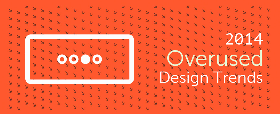
1. Thinking inside the box: sliders
5 years ago, when these sliders yet retained some novelty, gigantic boxes scrolling through various content bits adorned the tops of webpages everywhere. There was much in the way of rejoicing, and many self-bestowed back-pats. And deservedly so.
Box sliders are great space savers, they can display multiple pieces of content at once without wasting an exuberant amount of valuable web real estate. The problem is everyone jumped on that band wagon like it was the last train out of Dodge before the big gun fight.
Nowadays the novelty is gone, the sheen dulled, and the glamour worn thin. Giant box sliders are now so ubiquitous they quickly identify any website with a slider as an obvious industry follower rather than an influencer. Fate is indeed a fickle mistress, and the fate of all trends is that they fall out of style. Such is the burden of boxes.
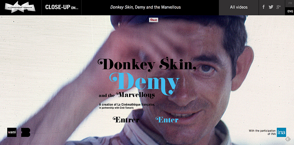
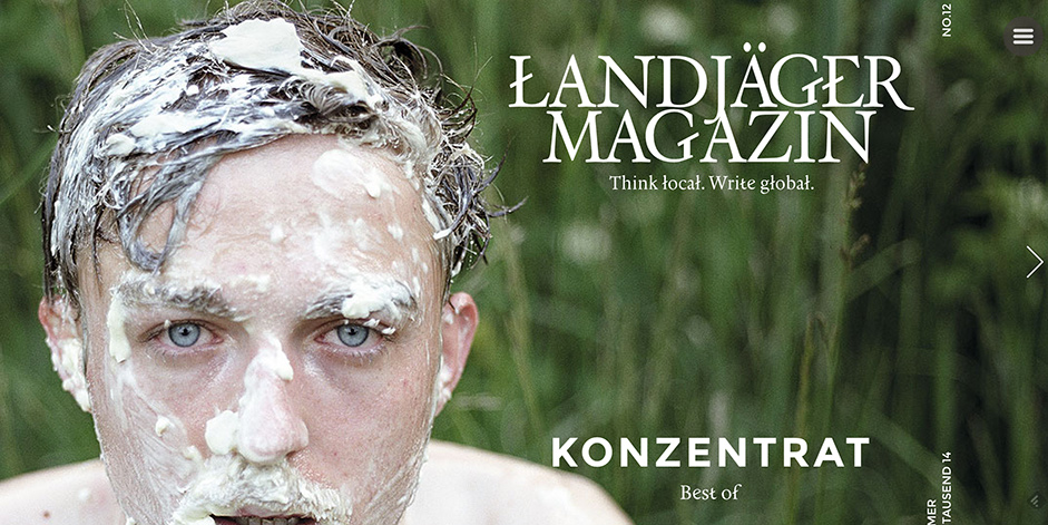
2. Full Screen photography
Splashy, flashy, and full screen. There’s no denying the visual appeal of full screen photographic websites. And since there’s no denying it, designers the world over have found the suggestion to add it onto their home pages… well, undeniable. So again, we’re confronted with the problem of ubiquity.
Observe:
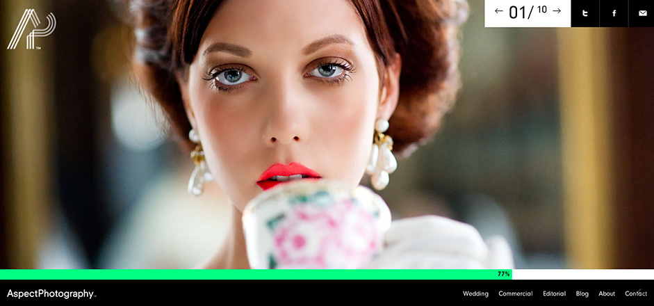 http://www.aspectphotography.net/
Because showing your entire face is just passé, amirite?
Now perhaps you’re under the impression that I’m being nitpicky—that there’s nothing wrong with a few sites of similar size, stature, and subject matter.
You’re not wrong.
These pages are beautiful. More than that, they’re dazzling. But only in isolation. Taken together, they’re ubiquitous. There’s that word again. We’re circling the same drain over and over, going back to the well to pull out beauty and the only thing attached to the end of the fishing pole is a big boot full of stuff we’ve seen before.
Again, I love these sites individually. They’re fantastically designed, brilliantly executed, but just a little bit overdone. They’ve been in heavy circulation and it’s bound to result in a little bit of burn out.
3. Boring Typography
There’s a reason coding is always written in Courier New. The developers want to dull everything down so that you’ll be too bored to read all the whacky stuff they’re actually writing in your HTML.
Keep the Courier delivering digital packages on the back end of your web pages. Boring typography isn’t a prevalent problem among the premiere designers, but it’s still a problem that’s far too common. It’s caused such a backlash that it’s spawned its own anti-trend. One that’s poised to become the defining trend of the year.
Non-boring typography has a much better ring to it, I think.
4. Bad Parallax Scrolling
This one might come as a surprise, because it’s still so popular. Even so, not too many parallax sites are properly implemented. Most have the effect plastered on as an extra bell/whistle/pogo-stick that’s supposed to shock and amaze. Done right, that’s exactly what it does: impress and engage. Done wrong, however, and its effect is more confusing and overwhelming.
It’s a little like adding salt before you taste the soup. You’re being a little rude to the chef. Insulting your visitor’s intelligence and taste in aesthetics by delivering more to them than they want or need, and expecting them to eat it up like good little piggies.
Bad form. Bad form all around.
5. Universal compatibility (at all costs)
If I had a nickel for every time I read the phrase “responsive across all devices and browsers” well, I’d have about tree-fiddy, at least. RWD is important. It’s great to be assured your webpage will display nicely no matter who’s viewing it, where, or on what. But it certainly isn’t everything.
Moreover, cross compatibility on older browsers isn’t always even necessary, depending on your website’s average visitor. If you run a web design blog, chances are your readers know enough about the internet to where they aren’t using IE7.
This is one of those trends that actually makes sense from a ubiquity standpoint. After all, this year we’ve reached a point where mobile usage is outstripping desktops for the first time. But with mobile redirects, dynamic serving, and mobile applications still existing as extremely valid and usable options, it’s a little odd that every single designer out there seems so anxious to throw all their eggs into the RWD basket.
6. Stock photos
Ah yes, stock imagery. You’ve got to love it. Overly expressive, out of work models emphatically posing their way to internet immortality. If you want to talk about web trends that overstay to the point of overpopulation, you couldn’t pick a more perfect example. Hundreds if not thousands of sites use the same stock photography to illustrate the same ideas, over and over again.

Hurray for diversity! Now let’s see how many times Google can find this image on the web. Go ahead. I’ll wait.
…
Finished? My search only came up with 817 identical results. Don’t get me started on the visually similar stuff. The point I’m trying to make here is that there’s plenty of room for custom photography, specified illustrations, flat-themed vectors, anything but the same tired stock photography that everybody and their mother has up at the top of their initial “Hello World” blog post on their WordPress theme.
7. Loading screens
We are not playing on a PlayStation 1, and this isn’t the late nineties, so it’s difficult to justify waiting for a screen to load. In this day and age, when Google recommends a load time of no more than 4 seconds, what in the name of all that’s holy is there to gain by constructing a page so unwieldy with superfluous functions that I’m forced to sit and stare at my monitor for a solid 15 seconds before I begin twitching uncontrollably in my ergonomic chair?
Just kidding, I could never make it past 10 seconds. Also, my chair isn’t ergonomic. I’m too poor for that mess. *Cue world’s tiniest violin.
If your page requires a loading screen, it’s probably too heavy.
I’m not here for pretty animations, or clever graphics. I’m here for content, and if I don’t get it fast, I’m going elsewhere. Note that this is NOT because your site is poorly designed (if anything, it’s overdesigned), but because I’ve been borne into an entire generation that lacks an attention span.
Unfortunately, the design heavy corners of the web I browse through can often get a little overzealous with their CSS and that makes for slow loading. A load screen mitigates the annoying wait, but it also emphasizes the fact that a website is going to require more patience from me than I’m willing to give.
I wouldn’t put loading screens under the “ubiquitous” label I’ve been bandying about so liberally, but I would definitely say that in this case, even a little is too much.
Well, I’m done with the soapbox for today. Anybody else want to step up and complain about the trends they see too often? Sound off in the comment section and we’ll compare criticisms.