

Who can forget the GIFs of the ‘90s, or the more up-to-date focus on flat design?
Recently, we’ve seen a surge in popularity of responsive web design, as more and more sites join the drive to become ‘mobile ready’ which is now even more important in the wake of Google’s Mobile Friendly update.
Let’s examine some of the most popular for this and the coming year.
1. The Proliferation of UI Patterns
One of the side effects of responsive design has meant that a lot of sites look similar. However, responsive design isn’t solely to blame. The rise of WordPress sites and the booming theme market also have a hand in it.
And some folks, such as Matthew Monbre, have copped to being guilty of following everyone else’s look with his company’s site.
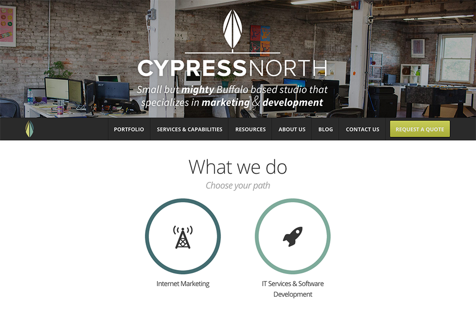
Photo credit: Cypress North
But having a similar look isn’t necessarily a bad thing. That’s because we’ve changed the way we consume the web, which has resulted in a lot of common UI design patterns. Design patterns have matured and as such, there’s little in the way of innovation when it comes to UI patterns.
In other words, a checkout will still be a checkout and should function as such. Same with a login model. There’s no real reason to reinvent the wheel. UI patterns must guide users through a smooth experience.
Here’s a few patterns you should be familiar with:
- The hamburger menu: While some criticize this pattern’s use, there’s no doubt that it’s widespread use makes the function easily recognizable for users.
- Account registration: You’ll find this pattern whenever you try to register for a site. There might be a form to fill out or a button that’ll allow you to use a social account to sign up. Multi-step form wizards are also effective since they “chunk out” the required fields, reducing friction and encouraging users to flow through the process.
- Long scroll: Placing all your important elements above the fold is now a well-known myth. Furthermore, almost everyone is accustomed to long scrolls thanks to mobile devices. The technique works especially well for sites that want to lure users through storytelling, and you can still mimic a multi-page site by breaking the scroll into clear sections.
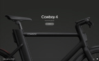
- Card Layouts: Pioneered by Pinterest, cards are everywhere on the web because they present information in bite-sized chunks perfect for scanning. Each card represents one unified concept. Since they act as “content containers”, their rectangular shape makes them easier to re-arrange for different device breakpoints.
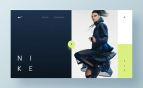
- Hero images: Since vision is the strongest human sense, HD hero images are one of the fastest ways to grab a user’s attention. Thanks to advances in bandwidth and data compression, users won’t suffer from slow load times either. One common layout you’ll find is a hero image above the scroll, followed by either zig-zagging sections or a cards-based arrangement.
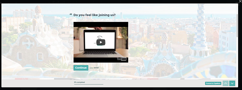
Photo credit Typeform
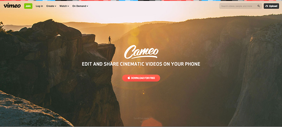
Photo credit: Vimeo
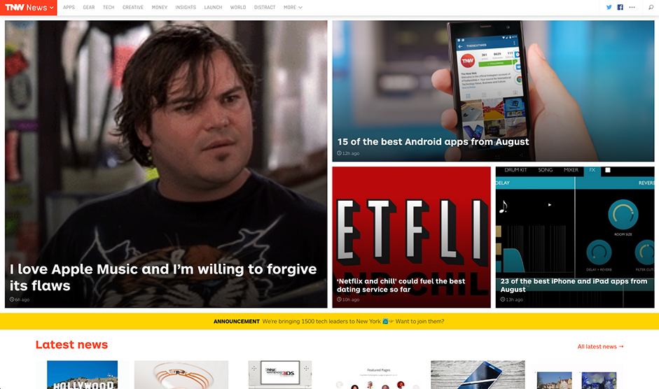
Photo credit: TheNextWeb
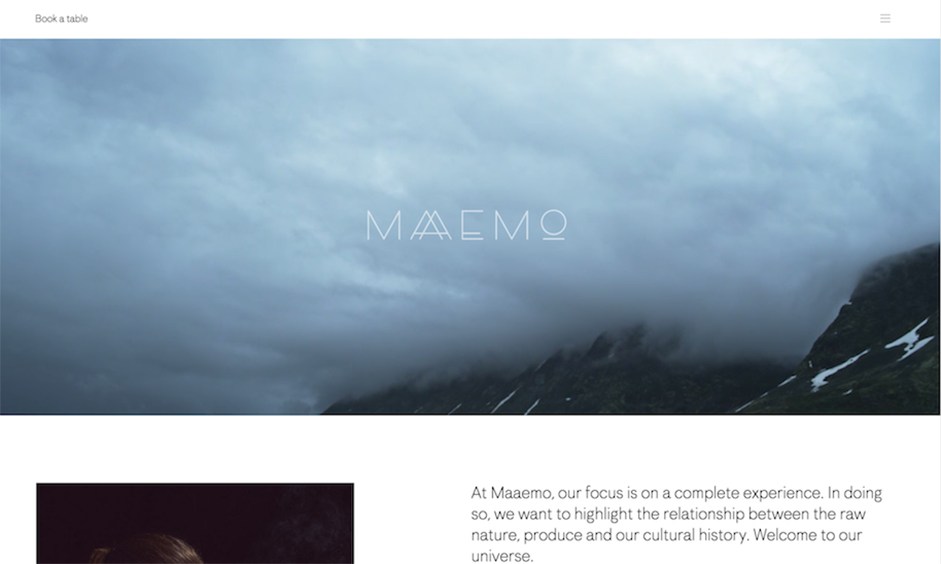
Photo credit: Maaemo
For more UI patterns and techniques, check out the free e-book Web Design Trends 2015 and 2016.
2. Rich Animations
Animations are being used more and more to enhance a site’s storytelling, making the experience more interactive and entertaining.
However, you can’t just stick animation in anywhere. Consider carefully whether it adds to your site’s story elements and personality. Animations can be thought of in terms of two groups:- Large scale animations. These are used as a primary interaction tool have more impact on users and include effects like parallax scrolling and pop-up notifications.
- Small scale animations. These include spinners, hover tools and loading bars, and don’t require any user input.
We’ll describe 7 of the most popular animation techniques:
- Loading animations
- Navigation and menus (nonscrolling)
- Hover animations
- Galleries and slideshows
- Motion animation
- Scrolling
- Background animations/ videos
These are used to entertain users and delight users during an otherwise tedious experience. Loading animations tend to be popular for flat design, minimalism, portfolios and one-page sites.

Slack via Lauren Tan
Keep them simple and avoid adding sound. They should however match your site’s personality and color palette.
Hidden navigation menus have become increasingly popular, especially as they can be used to save screen space. As you can see in the example below created in the collaborative prototyping tool UXPin, these use animations to reveal a menu when clicking on a specific button and prevent a jarring transition (like a navigation drawer hidden behind a hamburger icon).
Hover effects give a more intuitive feel to a site as users mouse over content. Users unsure about a feature’s function tend to hover over them automatically for instant visual feedback.
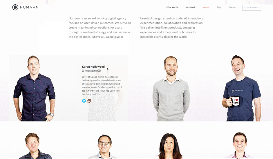
Photo credit: Humaan
Galleries and slideshows are an effective way to showcase multiple images without overburdening the users. These are great for photography sites, product showcases, and portfolios.
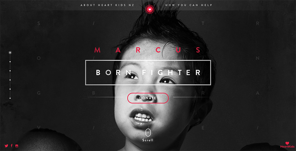
Photo credit: Born Fighter via awwwards
Our eyes are naturally drawn to motion, which makes it the perfect tool for drawing a user’s attention. Motion can also help with visual hierarchy. This can help to add interest and intrigue to forms, CTAs and menu items.
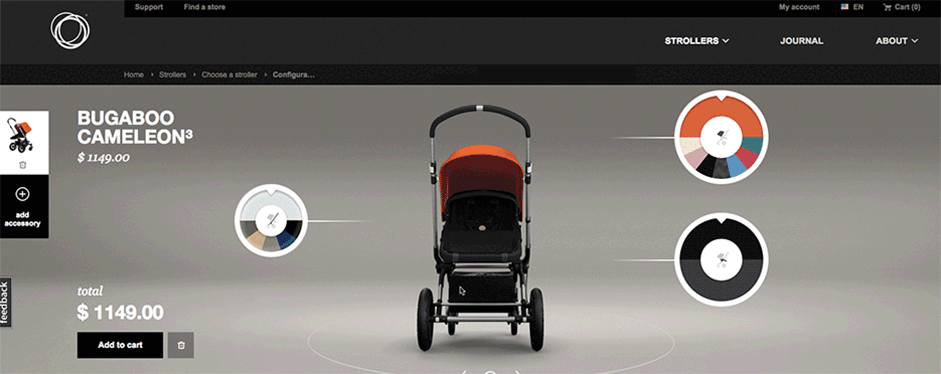
Photo credit: Bugaboo via awwwards
Smooth scrolling relies on animation and gives further control to the user, who can determine the pace of how the animation unfolds.
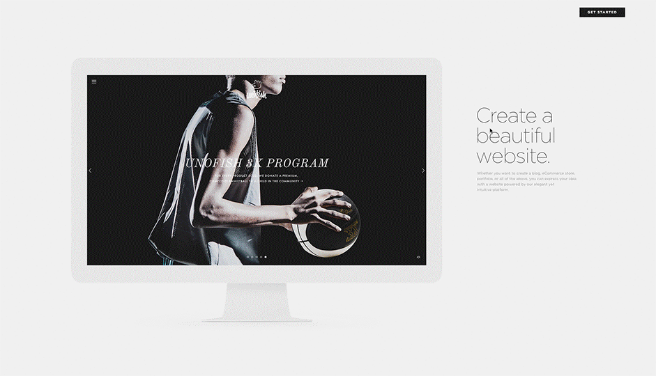
Photo credit: Squarespace
A simple animated background can add visibility to a site, but should be used in moderation or it can be very distracting to the user. The key is to work on individual sections or create a gentle movement of an entire image.
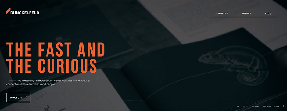
Photo credit: Dunckelfeld
3. Microinteractions
Microinteractions happen all around us, from turning off the alarm on your mobile phone to liking that cat picture on Facebook.
Each one done without a second thought. It’s likely that you started your day with a micro-interaction. By turning off the alarm on your mobile phone, you engaged with a user interface in a single moment. And more and more of these are baked into the apps and devices we use.
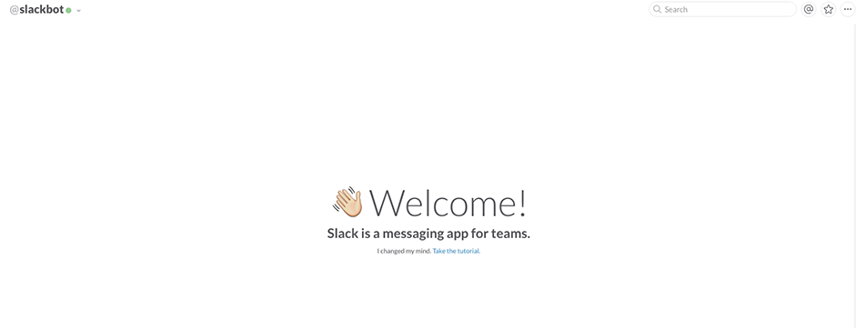
Photo credit: Slack
Micro-interactions tend to do, or help you do, several different things:
- Communicate a status or bit of feedback
- See the result of an action
- Help the user manipulate something
Micro-interactions are a vital part of any app.
As recommended in Web Design Trends 2015 and 2016, you’ll want to ensure that these interactions happen almost invisibly. Don’t go overboard and keep it simple. Consider each detail with care, and make each interaction feel human. That is make text conversational and not robotic.
Micro-interactions are an important part of almost every digital design project. You’ll be hard-pressed to design a website or mobile app that does not include some element, or moment, that a user needs to interact with.
Each of these interaction types lead users to a path of more human-centered design. This concept of making devices more human-like in their moments is a key to adoption and usability.
4. Material Design: A Richer Alternative to Flat Design
Last year, Google launched its new style language, Material Design. It uses shadow effects and the concepts of movement and depth in order to create designs that appear more realistic to the user.
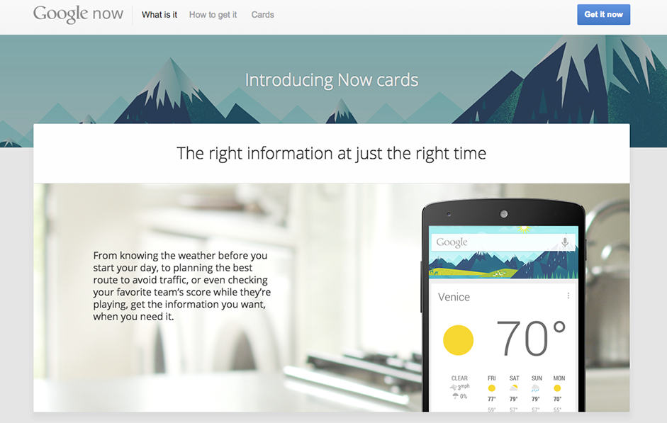
Photo Credit: Google Now
The goal of Material Design is to create clean, modernistic design that focus on UX. While Google’s design aesthetic has detractors, it’s been mostly praised as a game-changer.
With its minimalistic look, Material Design has a lot in common with another growing trend — flat design. Material Design, however, makes use of depth and shadow, which allows for more depth than pure flat design.
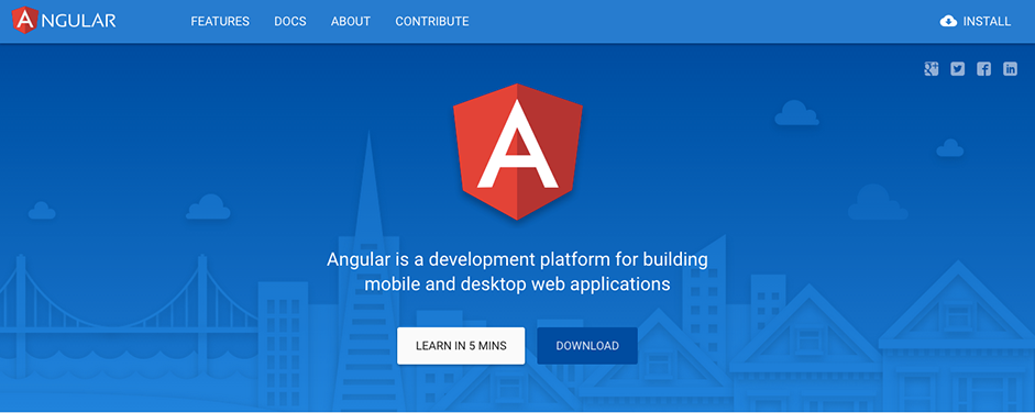
Photo credit: Angular
Before now, we’ve seen the majority of Material Design projects limited to app design. Google however announced Material Design Lite in July, which is more suited to websites. Nevertheless, Material Design was intended to provide great UI and UX across devices. Lite uses vanilla CSS, HTML and JavaScript and is intended to make it simple to add the look and feel of Material Design to websites.
Material Design Lite doesn’t rely on any particular framework, so designers can use a wide variety of front-end tools to create their sites. It’s also lightweight when it comes to the code.
5. Responsive Design
Responsive web design has become incredibly popular in recent years thanks to the rise of mobile internet usage.
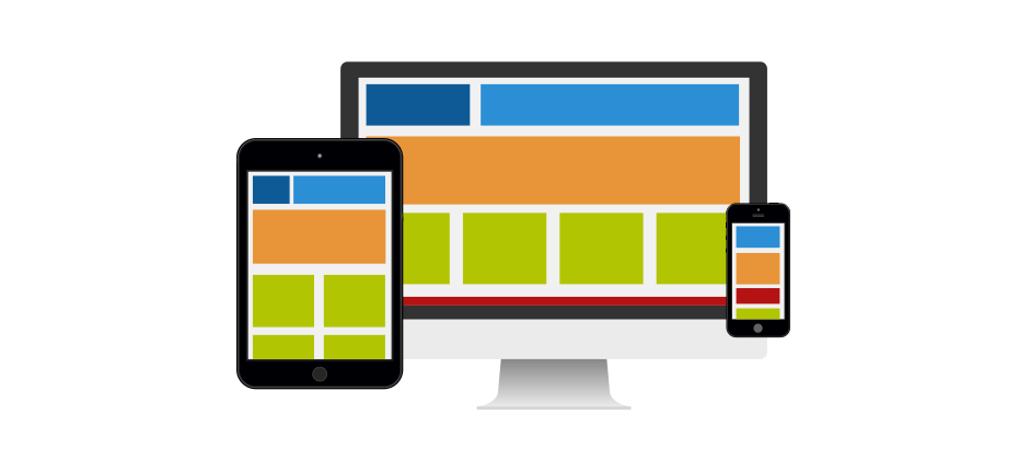
Photo credit: UXPin
It’s safe to say responsive design isn’t going anywhere soon, as it represents a relatively simple and cheap way for businesses to build a fully-functional mobile-friendly site. But responsive web design does come with some issues if not carried out properly, the most important being performance.
To ensure that a responsive performs at the peak of its ability, according to Guy’s Pod, designers should:
- Avoid using JavaScript and CSS image loading using the display:none tag. This still downloads the image to the device and adds unnecessary weight to a page.
- Use responsive images which are defined using a percentage.
- Use conditional loading for JavaScript as many of the JavaScript components used on a desktop site will not be used on smaller devices. Pay particular attention to third-party scripts such as those used for social sharing as these often impact negatively and reduce performance.
- Use RESS – Responsive and Server Side
- Apply performance testing into the process in order to effectively measure and optimize each site.
Performance is important not only to UX, but also to Google in the wake of the Mobile Friendly update which released in April 2015. Responsive web design is also highly compatible with minimalism, thanks to the necessity to keep page weight down. It’s also great to work with cards and responsive design as they can easily restructure in order to fit any breakpoint or screen size (like rearranging rectangular containers of content).
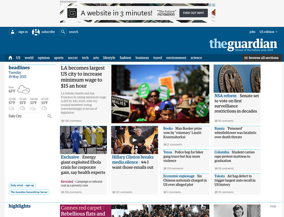
Photo credit: The Guardian
Responsive web design is becoming less of a trend and more of a best practice. And designers have come up with clever ways to get around any speed issues.
There’s no doubt that responsive design is highly useful and versatile, but it also should be lightning fast in order to deliver a great UX.
6. Flat Isn’t Going Away Anytime Soon
Flat design has been around for a while and is compatible with other trends such as minimalism, responsive web design and Material Design.
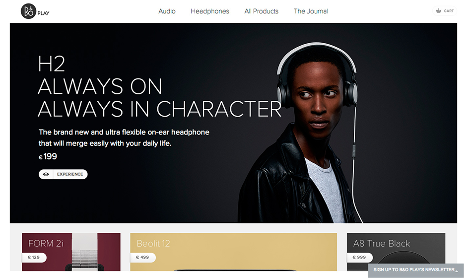
Photo credit: Beoplay via awwwards
Going forward, it’s likely that we’ll see the following further trends in flat design come to the forefront.
- Long shadows. These bring more depth to flat designs.
- Vibrant color schemes. Popular UI frameworks and templates have prompted many to begin using more vibrant colors in their designs.
- Simple typography. Simple typefaces help to ensure that text remains legible and readable in flat design.
- Ghost buttons. These allow for functionality without distracting from the UX and are often represented as outlined, clickable links that change when the user hovers over them.
- Minimalism. Looks to cut down on the number of elements in order to create a fresh, uncluttered UI.
Additional Advice on Web Design Trends
Don’t follow trends just because they’re the “hip” thing to do at the moment. Trends represent popular techniques for good reason, but make sure it’s best for your users. For example, an e-commerce site certainly wouldn’t do well as a single-page infinite scrolling site.
Trends are nothing more than additional tools in your designer toolbox. Always pick the right ones for the job.
For more advice on the 10 most important web design trends, check out the free e-book Web Design Trends 2015 and 2016. You’ll learn from the best with analysis of 166 examples from companies like Google, Apple, Reebok, BMW, Intercom, Adidas, Dropbox, and many more.