Creating a home for the great 3D work of digital artist Ross Mason.
When Ross came to me with the question if I was up to design his new website it felt like a full circle moment. I've personally worked with Ross before on another project where he did the 3D visuals and it was obvious we worked together very well.
I've seen all of his work before and getting to design an online experience for it was a lot of fun. In this case study I’ll go over some of the challenges, solutions and favourite parts of the website.
Challenge/solution
The main challenge for Ross’ website was bringing together 3 purposes: His services and work, his Patreon offerings, and a home for his experiments and personal works. The most important thing here is that there are 2 different groups of target audience and we want it to be clear on the website which group should go where without it being confusing.
The first thing that needed to be done was to create a hierarchy between these 3 purposes. By simply asking what brings in the most revenue for him and also considering what he wants to become a bigger part of the revenue we could establish a clear hierarchy for the site: The clear number 1 was client work (work and services), Patreon/educational content came in 2nd, and 3rd we had his experiments and personal work.
This hierarchy helps to make decisions when it comes to the information architecture. The homepage or main page you land on showcases an index of projects Ross has completed over the years, this is targeted at potential clients. Then looking in the main navigation we first see Patreon for his educational content and lastly Lab where he can put his personal work and experiments.
It’s important to not only differentiate the pages in what order they show up but also have them visually and structurally different so it’s clear there will be different content for different target audiences. Let’s go over these 3 in depth.
“It’s important to not only differentiate the pages in what order they show up but also have them visually and structurally different so it’s clear there will be different content for different target audiences”
Work index and detail page
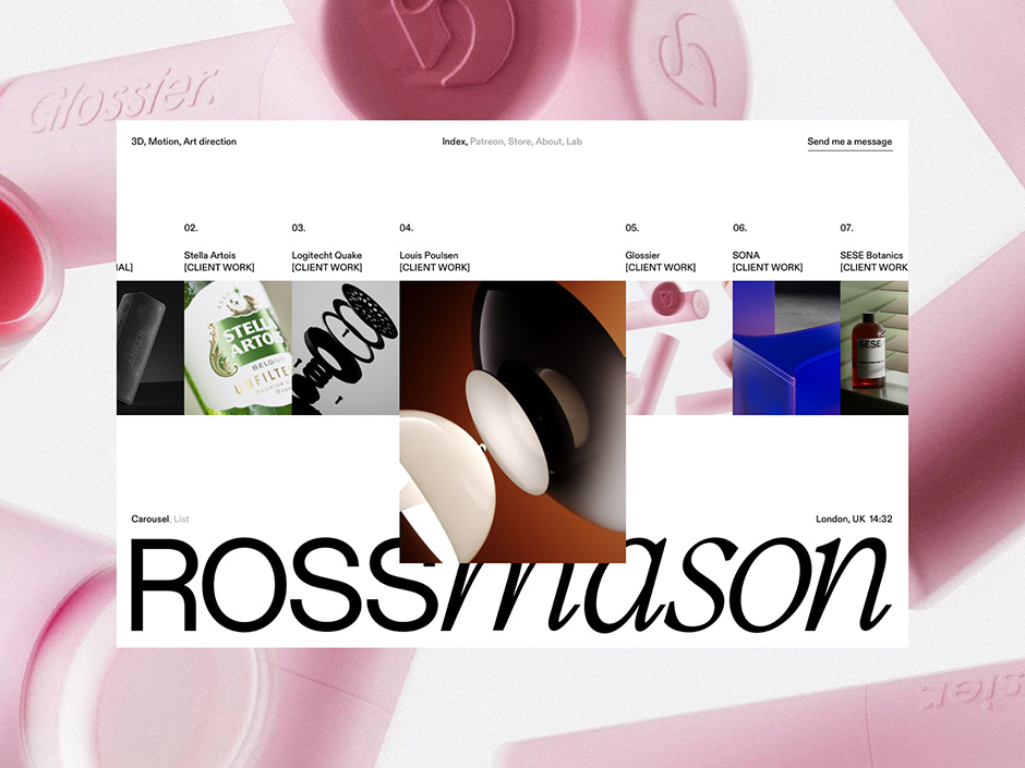
The main landing page for Ross’ site is the work index page. To differentiate this from the other pages on the site we intentionally chose to have no distractions on this page and create an infinite carousel of projects with the middle one highlighted by being bigger. This also created a more interesting composition with the middle project overlaying over the big logo at the bottom, which helps with creating some depth.
The first thing a user usually does on a page is scroll, so we decided that a normal scroll is what triggers the carousel. This way all the focus is on the work, visually but also interaction-wise because the first scroll will trigger the carousel and bring extra attention to it.
Not all people like navigating an infinite carousel because there is no clear start or end to it so we created an alternate way of viewing the projects in a list format. This also helps in the long term when there would be a lot more projects on the site to navigate the projects all in one view.
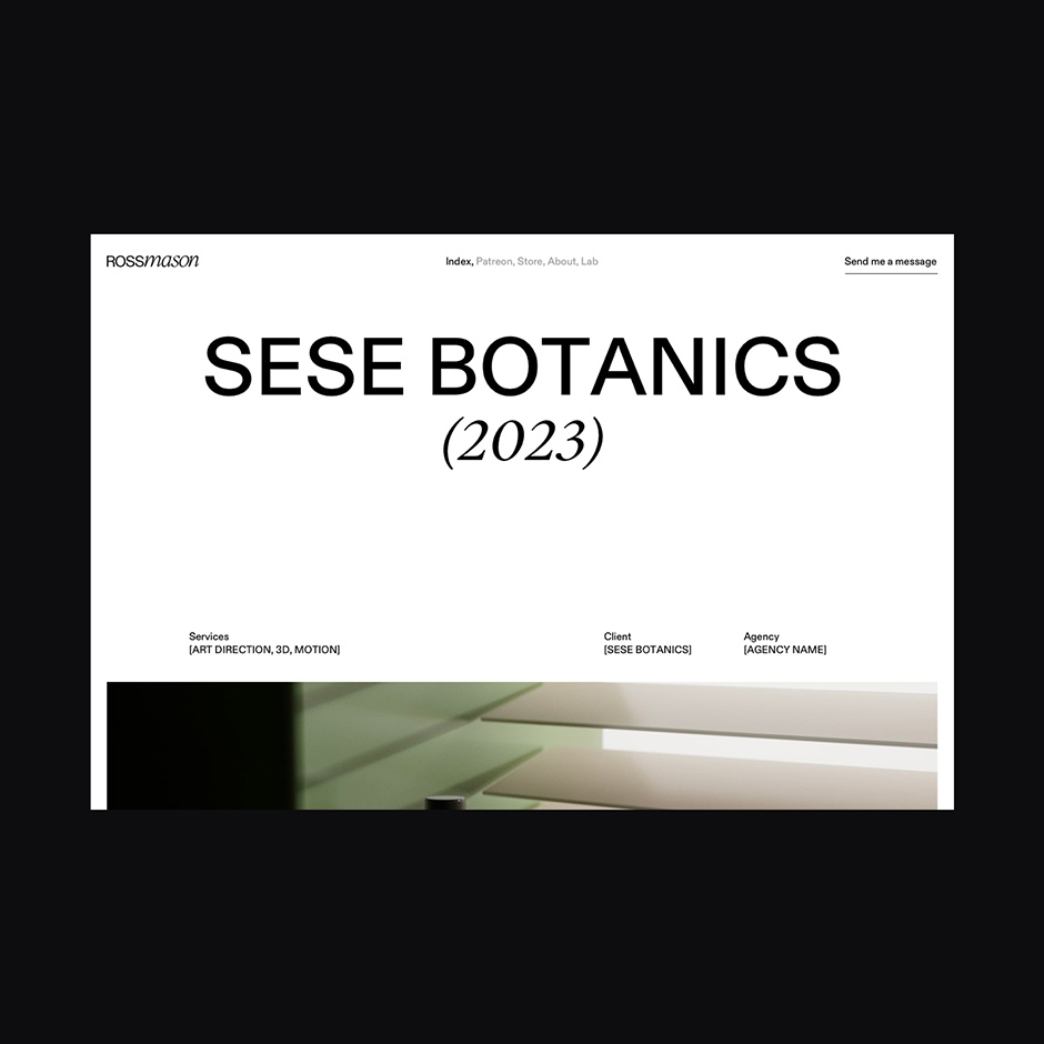
For the project detail page we wanted to have a strong focus on the work so we chose to have basic information in the hero section and a small title+paragraph in the 2nd section. After that, it’s all about the work.
At the bottom of each case study, we made it easy to continue with the next case study so you wouldn’t have to navigate back to the index.
Patreon page
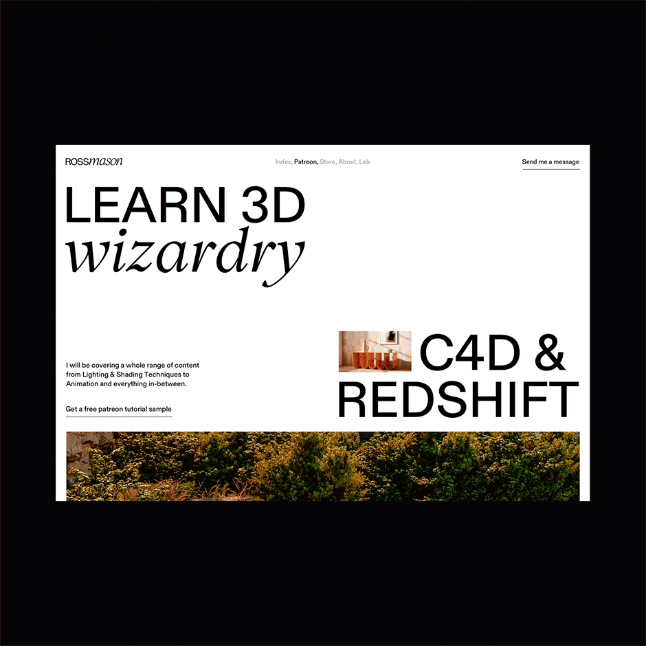
The second part of the site is the Patreon page. This page has one sole purpose and that is selling the Patreon. Structure-wise this means the page needs a couple of sections to be an effective sales page, let’s have a look at those.
When we start at the top in the hero section we need a value proposition and a small introduction, when scrolling down we highlight the latest tutorial to give a taste of what’s on Patreon. We then go into 3 main benefits followed by a listing of the most recent tutorials. This way the audience can already have a look at some tutorials and judge if they are relevant for them.
Since not all people are immediately going to buy a subscription we added a section to download a sample tutorial for free. This way the people can already get a taste of the content and get updates by email to maybe sign up later for the Patreon subscription.
No sales page is complete without social proof. Instead of going with testimonials, like you would see on other sites, we decided to show the results of people that are subscribed to the Patreon to show what is possible when you subscribe.
We close off the page with a list of features that are included and a section talking about Ross, the instructor. This last section also links to the About page.
Lab page
The last of the 3 purposes of the site was the page for personal projects and experiments. Structurally the biggest difference with the work index is that on the lab page, Ross can post one-off images/videos. No need to build a case study or have multiple images. Visually we wanted this page to feel like a separate experience to emphasize on the lab name. We did this by using a big gothic font to give a different vibe together with a black background. The animation also helps with this but we'll discuss that later on.
We wanted it to be easy for a guest to go through the images and videos, for this reason we used small thumbnails at the bottom of the page so you already see a lot of the work. This is also triggered by a scroll like on the homepage.
When interested in an image a simple click enlarges the image or video, any click on the image or video makes it go back to its original state. when having an image or video in the larger mode you can easily navigate with the arrows on your keyboard as well. This all together offers a fun and seamless experience.
Store, about, and contact page
Now that we have covered the main pages of the site, it’s time to go over the 3 other pages of the site that are left.
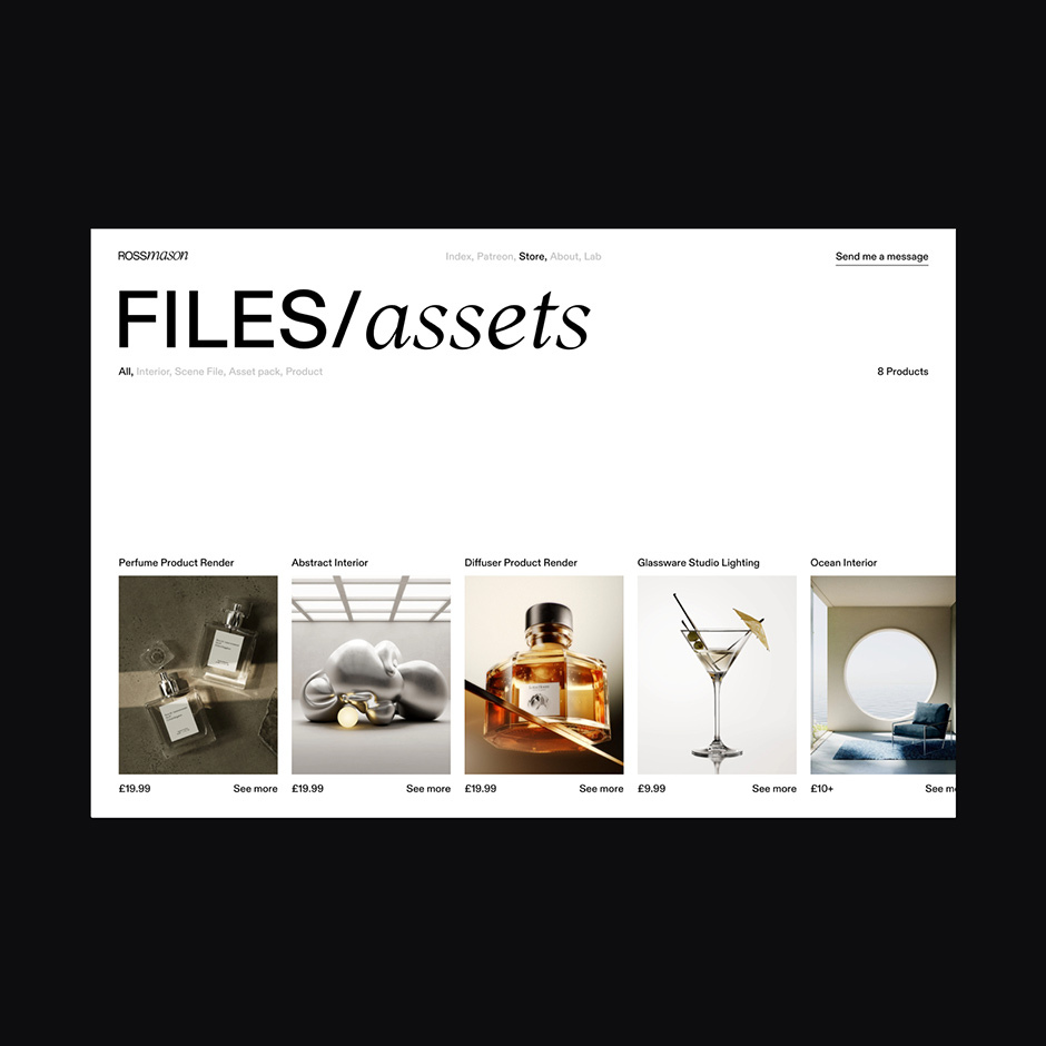
Store
Besides making educational content on Patreon, Ross was also selling digital products on Gumroad. This being one of his offerings it made sense to give it a place on the website. This way a visitor gets the full ‘Ross’ experience. For this page, we also used a horizontal scroll layout where the title and filters are fixed but the products scroll horizontally. Going with this instead of doing cards that are stacked vertically we created a more cohesive experience since we use the same scroll behavior on the home and lab. Since this is a secondary page for the website we chose to use a Gumroad popup so we didn’t have to build a checkout flow from scratch.
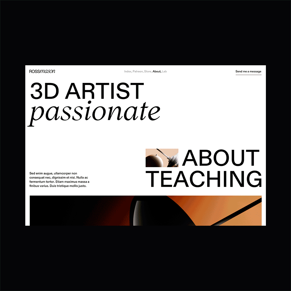
About
The About page is another secondary or supporting page on the website. On this page, Ross talks about how he got into design and 3D, gives some more info on his services with a fun interactive section, and shows what clients and agencies he has worked with, this also serves as social proof for potential clients. At the bottom of the page, we added a CTA section so a visitor can easily navigate to the contact page.
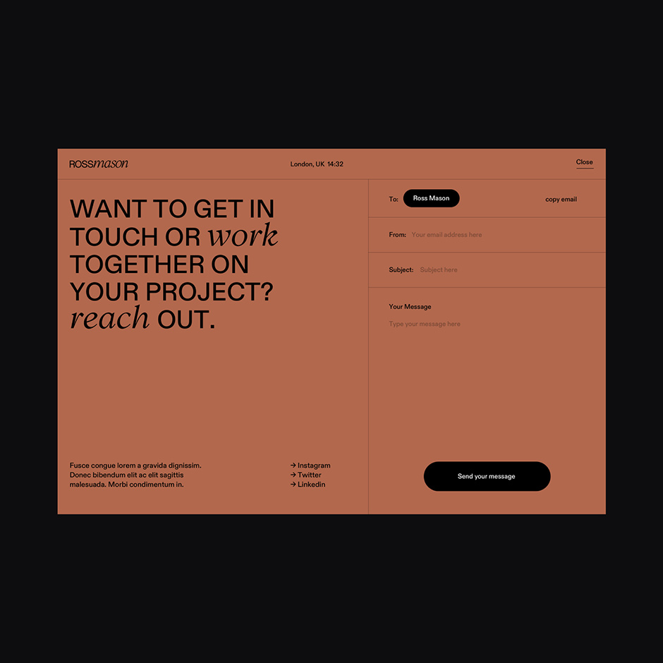
Contact page
For the contact page on Ross’ site, we wanted to do something that’s a bit more fun than a normal contact page. Structurally we chose to build it as an overlay. Because we have a fixed navigation on the site, visitors can always click on the contact page, so by it being an overlay you can easily go back to browsing on the website where you were.
Because it’s an overlay we wanted it to be another color than white or black (most of the website is already white and the lab page is black). In the 3D space, there is a term called ‘clay’ which refers to a model before textures, lighting, etc. The color we chose for the contact overlay is a clay color, so it fits the site perfectly with the tie-in to 3D design.
For the form, we chose to create an email-like UI so users can easily use the form. It is however not needed, by simply clicking the name in the ’To’ field you can copy the email address.
Animations
We used a lot of subtle and not so subtle animations on the website. There’s an overall motion language on the website with things implemented site-wide like parallax on images and a very subtle smooth scroll. But there are also some stand-alone animations, let’s cover 3 of my favorites.
Intro
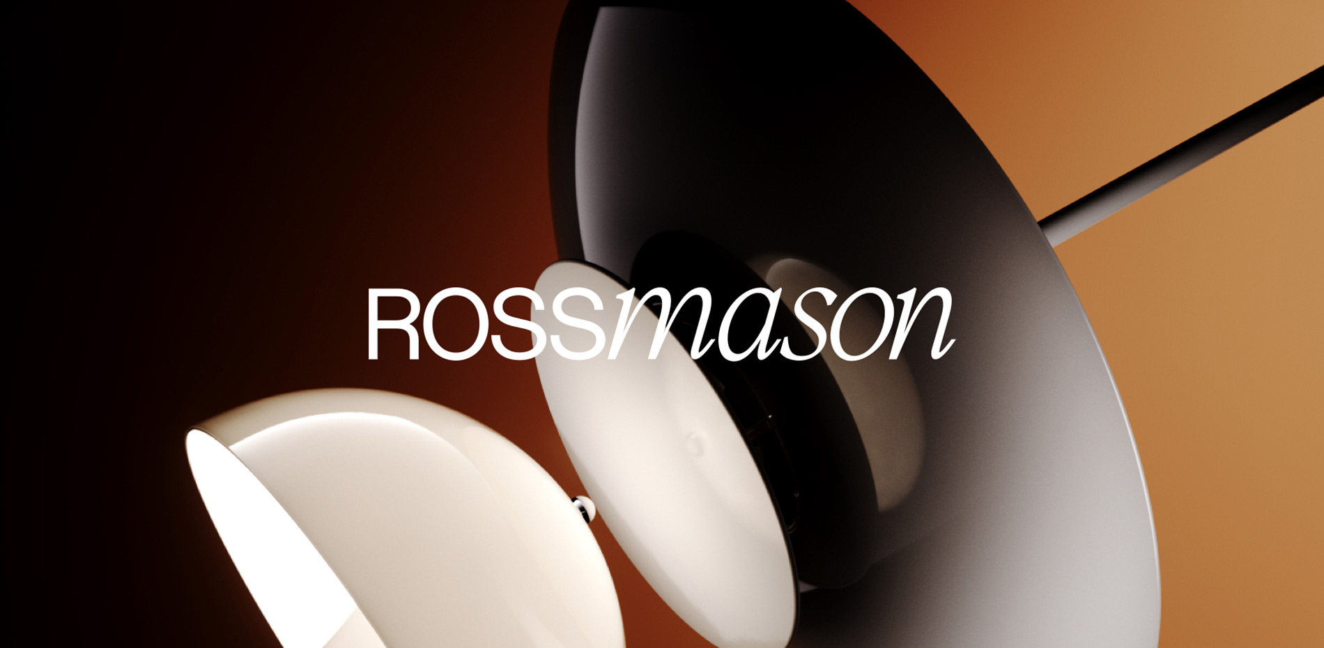
The intro animation has been splitter into 3 parts, first, we get the logo that animates in. Ross already had a brand identity where he uses the 2 different typefaces, having the logo split by the first case study and in the second step, it emphasizes this even more. It also sets the stage for the homepage carousel since the image will be the middle project.
Carousel to list
One of my favourite animations on the site is when you are on the homepage carousel and click on the list viewing option. All the projects stack on top of each other which creates this seamless experience of going to the list view.
Lab page transition
If you navigate from one page to another on the site you see that all page transitions are the same with a simple fade. There is one page transition we intentionally did differently. When going into the lab page we wanted it not only to be visually different like mentioned before but to emphasize this with motion. With the animation, we wanted to create the feeling that you would be going into a more ‘underground’ feeling page of the site.
That’s been a behind the scenes look at the process of designing the website for Ross. Massive credits to Jesper Landberg for building this as smooth as butter. And of course also to Ross Mason for the great content and conversations on what we wanted to do with the site.
Technologies
Front-end: Nuxt, GSAP
Backend: Dato CMS
Server: Netlify
Tools: Sketch, Figma, Principle app
Company Info
My name is Gil Huybrecht, freelance designer and skateboarder from Belgium. Through strategic art direction and web design I help companies around the world grow their business.