


Prime Development
PRIME DEVELOPMENT - Specialising in finding properties for retailers and partner for investors.
For their new corporate identity, they came knocking on Studio Boiler's door. Their brand needed to exude class, experience and sustainability.
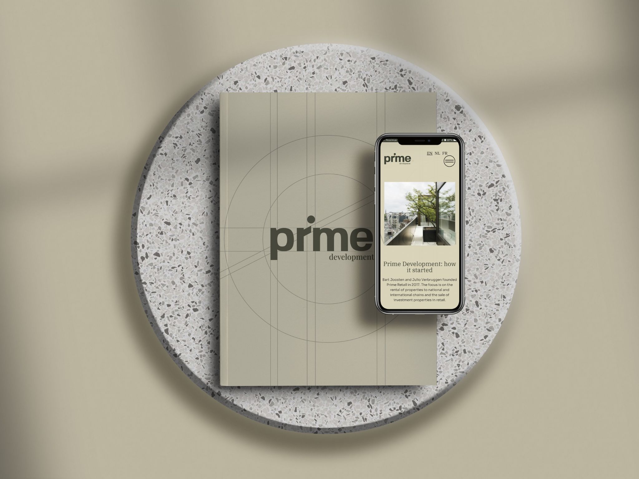
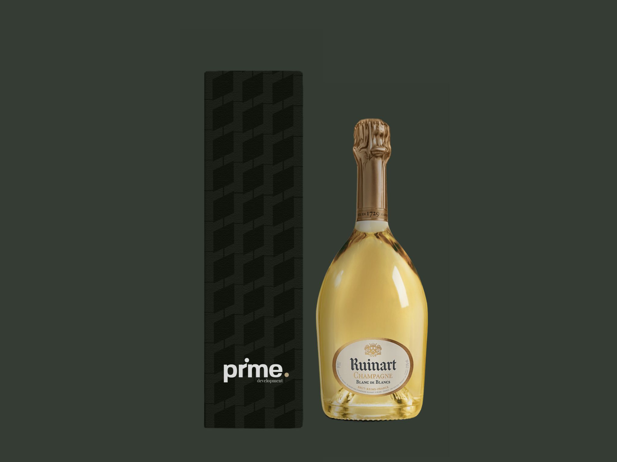
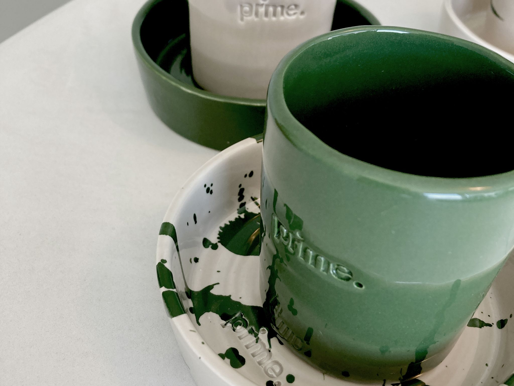
A branding with a warm colour palette of green and beige tones. The combination of the large titles in serif font and the body in sans serif creates a nice balance between class and professionalism. For the website, Prime Development wanted an eye-catching entry. For this, we turned to UnCanny. They made a floor plan flow seamlessly into the logo. The sketch lines of the logo are continued in the background of the website.
Project Details