

Verhelder
Verhelder is all about the structure of organisations. How you organise, structure the work in your company and how that directly contributes to the work happiness, personal wellbeing and health of yourself and your employees.
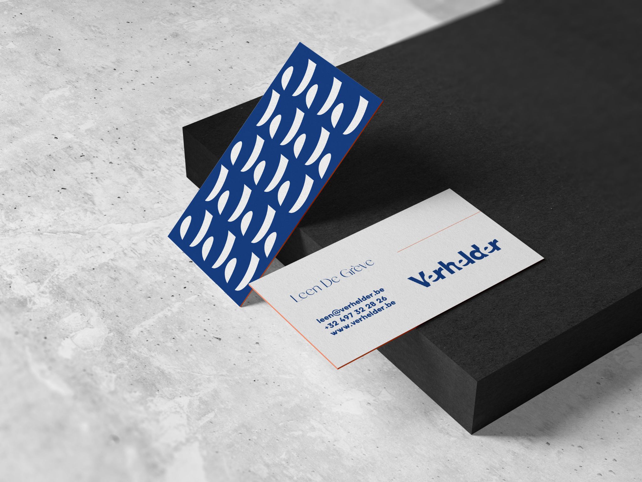
Above all, Leen wanted a clear branding in Studio Boiler style. In Leen's own words, "I fell for you guys. Fonts, colours, symmetry and simplicity. The way you integrate images and the less-is-more create calmness and compactness. I am a fan". And Sudio Boiler knew what to do.
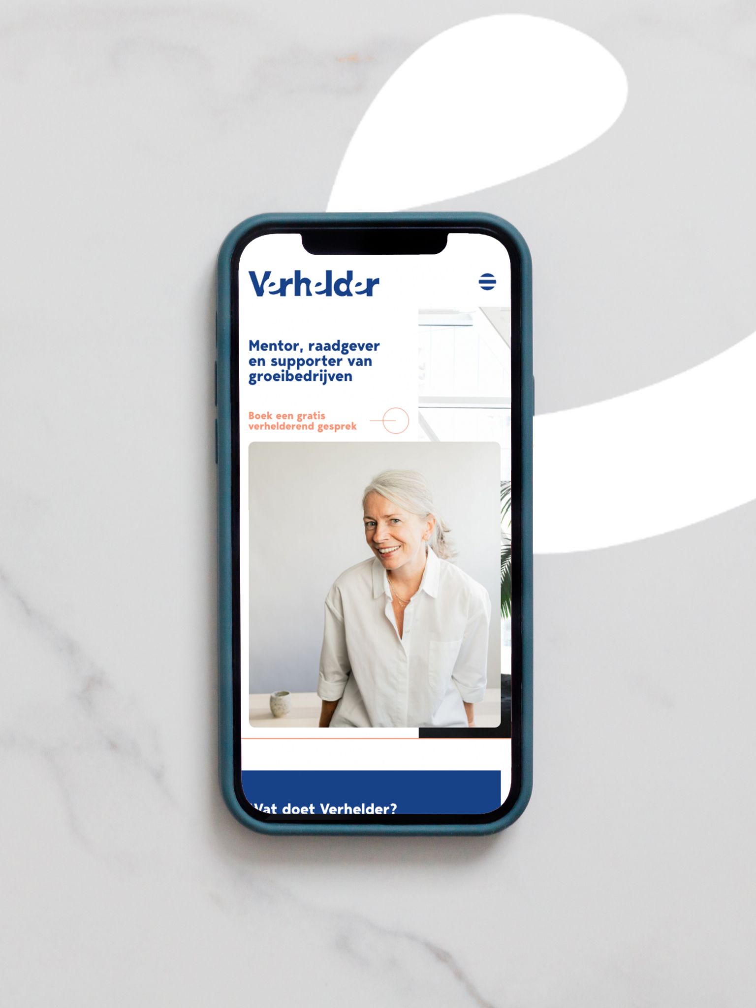
A branding with corporate colours and a feminine accent. Professional yet playful at the same time. That became the look for Verhelder's new site. A combination of fine font and bold font. Discrete CTA buttons and moving titles.
Always looking for the perfect balance. Not too much but not too little either. The white space doesn't make the whole thing too heavy. Enlightening branding to further assist all growth companies.
Project Details