


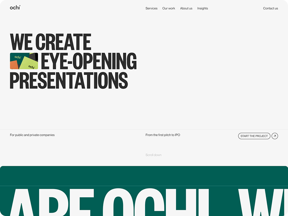
This spring we presented a new website for Ochi Design. Ochi is a presentation design agency from Lviv, Ukraine working with international businesses. The main feature of the site is the eyes that you can move with your cursor.
Why did we choose eyes? Because Ochi means eyes in Ukrainian. The company creates presentations to clients, presentations are watched by thousands of people, the visual style is perceived by the eyes. Therefore, it was one of the main ideas in the design.
Main and secondary design idea
As we wrote before, the main idea of this website is using a client’s brand name – Ochi. We play with the eyes from the beginning of the site, all the way to its footer and make the users do the same. Presentations are made up of slides. This is the second feature for design ideas. Therefore, many elements on the site have rounded forms, and are made in the form of cards that interact with each other, turn over, overlap, increase, and so on.
The preloader is also made in the style of cards with information, and the user is immersed in one of them and then gets to the main page.
“The client’s team are open to any bold suggestions that will make their site stand out from the competitors’.”
On the same page as the client
The client already had their own color style, illustrations and logotype. We have just changed the fonts to more modern ones so that we can make and use good typography on the website. Since the client is a modern, young company, the colors are also very bright and stylish. The client’s team are open to any bold suggestions that will make their site stand out from the competitors’. The topic of this project we fell in love with from the first email from the client. Thus, the creation of the site did not take us much time. We created the website quickly, the client completely trusted us in terms of visual style, we worked out the ideas well and finished the site with almost no edits.

The content: from the site to the Instagram account
Since we were on the same page with our client, we showed them examples of how cases can be designed, how minimalistic photos and graphics should be, and made several cover options for projects. It so happened that now the client is actively using many of the techniques from the website in their branding on Instagram. So this case is a bright example that a wow site could not only be achieved in the case of close cooperation and trust on the part of the client - but the design, development team must also take into account the wishes of the client and the quality of the brief stage.
Technologies
Since we have our own developer in the team, and we have been working together for a long time, there were no particular difficulties in implementing all our ideas. There are no secret technologies in front-end or back-end development: Wordpress, WebGL, GSAP Animation, Three.js. and Locomotive Scroll.

And one more thing
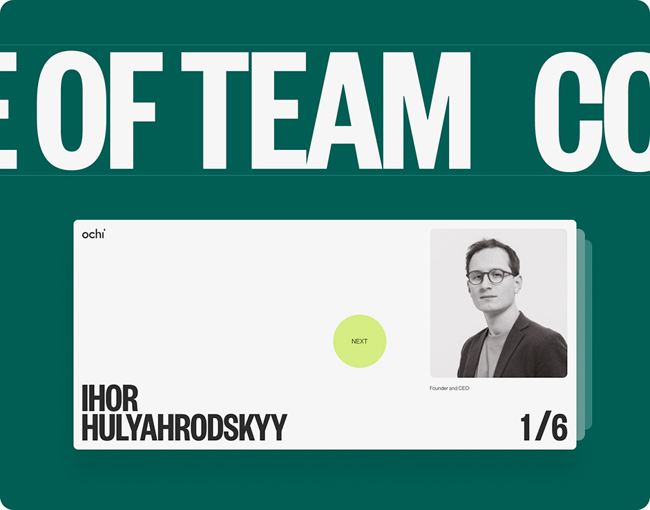
We are most proud of the following blocks on this site: Hover on projects, CTA with eyes on a green background, block with a team on About, contact form, preloader, block with clients in the form of a table. And what is your memorable part on Ochi website? Don’t hesitate to share your preferences with us :)
Company Info
Obys is an Ukraine-based design agency that creates unique graphic and web experiences all around the world.