🎤- Is this thing on? One, two, check, check, chECK, CHECK. Okay, here we go... My name’s Henry, and today we’re going to speak about the KIKK, because it’s that time of the year at Dogstudio: we get to entirely redesign the KIKK Festival’s identity.
- Again.
- First things first : yes friend, there’s an « i » between all those K’s. Sit down.Thanks.
- So, what the hell is this KIKK Festival?
- KIKK Festival started 7 years ago, and has grown from a cool local event to become a major worldwide digital culture event. Now over 15,000 attendees come from over 40 countries to Belgium for a few days of conferences, workshops, masterclasses, exhibits, concerts, contests and more. If you’re considering starting a design-related festival, you’ll realize there are a few things you can do to turn it from an average event to an unmissable one. Those things include memorable branding and an awesome website.
*suspenseful music*
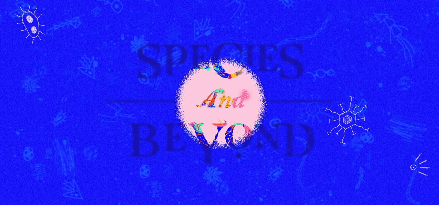
Species, the infinite, and beyond
Every edition of the KIKK Festival has its own theme. It is then partly guiding the curation of content, but it’s also the main inspiration for the branding.
This year, the KIKK team came up with “Species and Beyond”.
Wait, what?
In order to avoid the lengthy and somehow philosophical explanation on the matter, let’s just say it’s all about looking at the world under a non-anthropocentric angle ( it-means-it-is-not-from-a-human-perspective-if-you-prefer). What do we do when we have something that broad and we have to get started on delivering design? Yeeeeeees moodboardiiiiiiing. You got it.
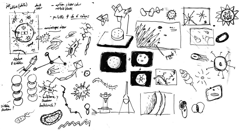
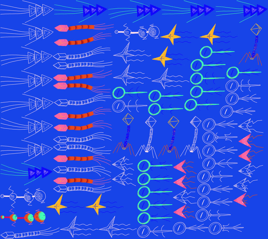
Now, this is a crucial phase for us as it’s laying ground for months of work and evolutions based on the chosen direction. This year we were quite prolific and came back with five different tracks, including more arty stuff, different kinds of illustrations, macro photography, 3D environments and what not. Among them all, the one which instantly stood out from the rest, was actually a simple and nearly childish illustration of microbial 2D organisms.
Let’s be honest, it’s not exactly the kind of aesthetics we’re used to manipulating but….CHALLENGE ACCEPTED.
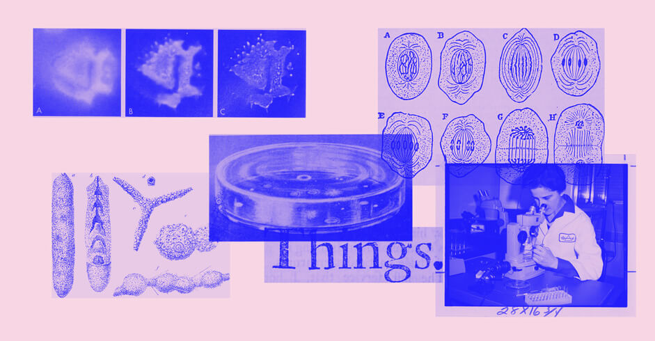
We should have listened better in chemistry classes
In this slightly messed up happy place that is our minds, we came up with an unstoppable logic: who says microbes, says microscope, and from our painful years of chemistry classes, it also definitely means petri dish.
So...why not create a website where you can see living organisms being observed through the lens of a microscope? You know, having that circular limit between the visible and the invisible? Texture everywhere, gross creatures, weird colors, and the whole shebang.
Now...YES, we definitely know it can be annoying to hijack your pointer for something else than pointing at things, but you know what? After months of seeing pointless uses of modified pointers everywhere (HA!), we came up with a decent storytelling to justify it all. And well...at least we didn’t go for another liquid distortion of our images (because we did it last year already. Hush!)
Art Direction
Globally, the first step towards building the yearly rebranding of the KIKK is establishing the right look and feel. Part of that work comes down to crafting a decent, usable, and appropriate logo, in a decent amount of time, as with the KIKK Festival redesign being mostly self-financed, we have to think fast, and we have to move quickly as well.
We felt that there was definitely something interesting to play with in opposing those hand drawn creatures with design codes directly inspired from the 19th century science books: small thin lines organizing space and pointing at things, grids, small captions, etc…The code idea was to create a funny tension between an almost childish style of illustration, with the rigor of those grids and organized spaces. Normally we don’t really like tension, but here it kinda makes sense, right?
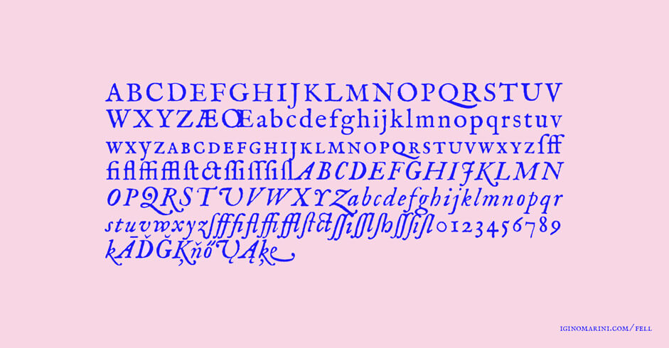
Now, font-wise, it came as pretty befitting to stumble on the quirky IM Fell, a modern revival of a 17th century font designed by John Fell (If you’re a typography freak, it’s still an interesting read). Reworking on that base, roughening edges, changing shapes, creating a composition and *poof* you have the start of your branding. Well, we may have skipped a few steps but trust us, it’s better that way.
Call me maybe
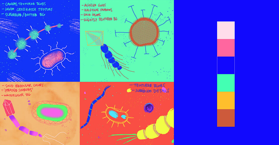
What’s fun about getting out of your comfort zone, is that fresh opportunity to call back your ol’ friends and get them to collaborate with you. This is how we got in touch with Christian Villacañas: friend, Spanish, moustached, and talented illustrator and animator. The brief was simple and the task a bit less so: we needed to create a family of simple and friendly microbial organisms, based on a restricted color palette, which would then be animated frame-by-frame and displayed on the website through fancy WebGL / canvas and stuff.
We needed to create a family of simple and friendly microbial organisms, based on a restricted color palette, which would then be animated frame-by-frame and displayed on the website through fancy WebGL, canvas and stuff.
Christian, the floor is yours
Animation + Illustration
So yeah, friendly microbial organisms. Cool. Should they have eyes and mouths? Should we make them cartoony and lovable? Childish like drawings or something more scientifically accurate? After some documentation through our friend big G and the first palette and shapes test, we decided to get childish but not too much, (vibrant colors, funny textures, but no facial or character treats at all) as well as scientifically accurate, but just a little (just taking reference from shapes and movement behaviours).
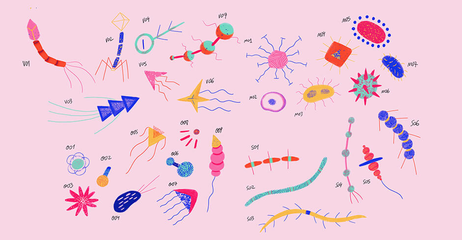
The result: 29 different organisms, which I divided into four groups to have a clearer organization (molecules, serpents, viruses and others); and why 29? Because in science, the number 29 represents the knowledge of... just joking... I don't like even numbers, so it just felt right to me!
Anyway once we had the colored organisms we felt that we needed a contrast somehow, and took advantage of the "microscope view" concept we had to accomplish that.
What if instead of seeing organisms through the microscope lens we could also see them outside it, but differently? What if the ones in the lens are colorful, textured and handmade-ish; and the ones outside are just cold outline, with subtle dotted textures? That way, what we "see" feels organic and lively, while what we "don't see" feels artificial and aseptic, like a scientific scheme or study? Oh look, a new species there! (Moves the pointer to it and Bam! it comes to life!)
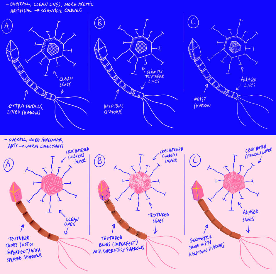
Guess what? It worked. That was the missing piece to wrap up the concept; though it meant double the work and double the animations!
Animation-wise, no mysteries there. Just being playful and imagining how could this or that organism move is the main secret. I animated all of them in Photoshop (call me crazy; I know it has an awful timeline but I feel comfortable with it) in twos. Each organism has a slightly different duration so when put together you can't see them looping equally. And that's pretty much about it. The rest of the magic concerns the devs.
Now Anthony, Lead Front-end at Dogstudio
The technical side of the force
The main concept of the website was about having organic elements in some liquid you can discover through a microscope lens. The main objective for us was to make users feel that animations and rollovers were organic and fluid all around the website.
The main concept of the website was about having organic elements in some liquid you could discover through a microscope lens. The main objective for us was to make users feel that animations and rollovers were organic and fluid all around the website.
I’m sick of microbes
The concept was based on a liquid containing a bunch of animated organisms the user would discover through a microscope lens. We worked hand in hand with Yi-Wen Li to create this part of the overall concept using WebGL and Canvas technologies. It allowed us to fill the screen with all those 2D microbes moving all over the page, and enabled the microscope lens to follow the user’s mouse pointer.
Animations of the microbes are made using a PNG sequence called spritesheets ( Houuuu big reveal ). We therefore asked Christian, to split his animations into multiple steps, each one of them being a different PNG. Since there are various types of microbes and therefore a bunch of animations exported into multiples PNGs we had to pack them together by creating textures with a script in Javascript.
However the final textures were still quite heavy, and we had to run them all through ImageOptim in order to reduce their weight and keep a decent quality of details. Once these textures were generated and optimized, we were able to use them in our script to animate the microbes we placed randomly in the Canvas.
The animation itself, is a fundamental trick used for decades in 2D animations. Exactly like old Disney movies we binge watched during our childhood, animations are made by displaying each steps of a movement quickly enough to make your eyes believe in a continuous and fluid animation. Did we just invent cinema? Did we? Well….*sad face*
Lens, lens, lens
For microbes and some UI elements like the “Species and Beyond” logo or speakers pictures, we thought about different states for each one of them. Well, there’s of course a default one, but also an alternative one, so every time the lens hovers above them we display their alternative state inside the lens, letting you discover the hidden part of these elements. Shiny! For actual DOM elements, like the logo and the pictures, we had to draw those into the Canvas as well, so that the lens would be able to reveal their alternative versions.
Morph me baby!
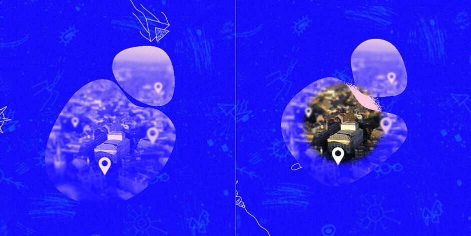
On all the pages, users can find pictures inside organic shapes.
Using SVG clipPath we were able to give those pictures the shape our awfully complicated and demanding designers wanted *wink wink*. The duotone color applied to them has been made possible using the now well supported SVG filters. Now we had those clipped images, we wanted to add a layer of organic animations to them and we got inspired by a demo posted on Codrops a few months ago. Using 2 different shapes for each picture and using some Javascript, we were able to tween between the 2 shapes when the users hover over them to get the organic animation we wanted.
Transitions
Last but not least, we wanted the experience to stay immersive so we added some transitions between pages during the navigation. A few weeks ago we developed and released a custom library called Highway to simplify the transition management on our projects. The KIKK 2018 website was a good case study to try and improve it. So we created a hand-made and fluid video which would then be converted to a png sequence. Same as for the microbes animations, we extracted three animations (because having the exact same transition every time is boring...right?) from the video and converted them into sprite sheets we then animated using CSS to create those cool and fluid transitions with Highway.
Company Info
Dogstudio is a multidisciplinary creative studio at the intersection of art, design and technology. They are on a mission to explore, create meaning and provoke emotions through design and storytelling.
Their strong focus on producing high quality and emotional branding, digital products and experiences became their signature. They’re passionate about moving people and solving problems for the likes of Microsoft, The Museum of Science And Industry Of Chicago, The Kennedy Center of Washington, The Navy Pier, Dragone, Quanta Magazine, and many more.