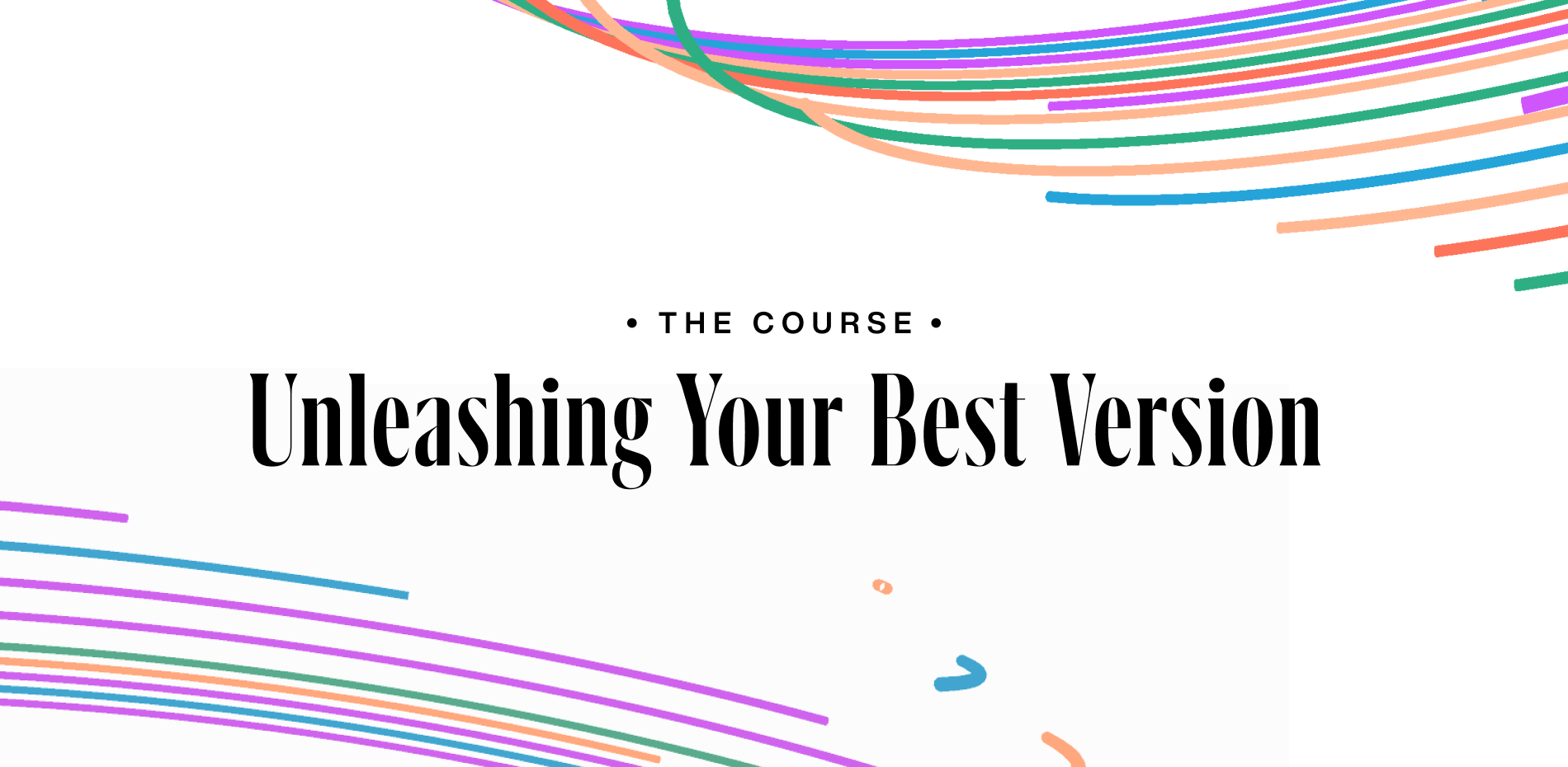
Massive congratulations to the talented Victor Work for winning Site of the Month July for his website Unleashing Your Best Version. Thanks to everyone who voted, find out who won the free Pro Plan at the end of the article.
My course's website was created to help people understand what they will be purchasing, the benefits, and how to get the best of it. After months of preparing a course to answer some questions that I have been constantly asked: “How can I create animations, be recognized, and build websites as you do?” The website helps users, professionals, and potential students to consume the main message behind the course purpose in a very illustrative and interactive way.
Chapter Interactions
Capturing users’ attention
I always have in mind that my projects should deliver content in an easy, interactive, and memorable way so users don't have to struggle to find what they are looking for and have a pleasant moment while navigating through the website.
I knew since the beginning that my course's audience would be professionals and creatives who want to be inspired, motivated, and be part of something really breathtaking; all these factors added extra pressure in a very healthy and exciting way.
As a very challenge-driven person who always pushes boundaries, especially when I have complete freedom to explore ideas and go beyond the trivial, I decided to try something I've never seen on websites.
The idea of adding an interactive video teaser playing with words and displaying why the course would be an excellent investment for their personal growth came from this mentality. But what and how?
A Kinetic Typograph as Website Introduction (using handwritten code)
Kinetic Typograph Animation
I have to confess, I was really caught up by the idea of coding from scratch a kinetic composition and synching it with some immersive background. Still, I didn't consider how time demanding it would be, especially to synch all elements with the audio and make it responsive to users on all devices, who would be able to have the same experience. It turned out this composition became the primary key on the website, receiving a ton of positive feedback from creatives in our digital industry.
A progressive navigation
The website is an extension/connection with the course, and the course has a very pragmatic schedule and narrative. Therefore, the website must deliver the content in a matching way, so the users have a better knowledge of where and how they should start their navigation to understand the content the course is about to offer.
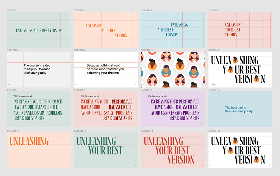
After analyzing many possibilities (vertical scroll, horizontal scroll, carousel), I've decided to use a mouse-wheel and keys-pressed system to provide the user with a dynamic and agile way to navigate through the course's chapter. Initially, I thought of using an infinity carousel. Still, thinking of bringing the users a more progressive and straightforward way to consume the course content, I decided to provide numbered slides with an end, so users would not get lost, believing they would interact with more chapters than the course offers.
Slider home page
Considering user experience and better navigation, the website also offers a faster way to navigate through all chapters, so the users can easily interact with the information they are looking for without having to scroll multiple times on the home page.
Chapters modal navigation
It’s for everybody
The course is for everybody: designers, developers, photographers, copywriters, art directors, freelancers, employees - for EVERYBODY.
This statement made me think about how I would be able to illustrate this message in a memorable, interactive, and easy way. And one day, I went to a mall close to my place, and I saw a poster from the Government of Canada using a cartoon-drawn silhouette of different races. It inspired me to incorporate something similar on my website.
I certainly would like people to identify with those characters and bring them to life, but I didn't want to use videos, and using 3D would require extra loading time and maybe jeopardize the website's performance.
After the decision to use different looking types of people to illustrate the idea of "THIS IS FOR EVERYBODY," I was conflicted between using 3D characters or Illustration. So I thought to myself, why not use animated SVGs? There! I found the perfect solution, animated characters in SVG.
That's what the result looks like:
Animated Characters
The massive chunk of texts issue.
Everybody knows that nowadays, with these media-driven platforms like Instagram, TikTok, and YouTube, many people have become more accepting of non-readable content. Making it very challenging to deliver content that should be written, and to solve this problem, I decided to provide the content of the website in a way people don't need to read to be aware of what I had to provide them.
The Solution: Transcription. I've decided to transcribe and synch the texts and audios and trigger everything when the user reaches certain vital points inside the website. It was a very time-demanding and thorough process to transcribe those audios, implement them using code, and animate them according to user control.
Marking up transcription to synch with code and text
Animations and Interactions
Everyone who follows my work knows I'm enthusiastic about using animations, interactions, and interactive components on my projects. This one being a personal project designed to inspire and engage people, I tried to go above and beyond my usual. I tried to rely on the most modern approach in the digital industry today to provide a breathtaking experience.
I can easily say that I invested a decent amount of time creating, experimenting, implementing, testing and tweaking animations and interactions in the project. Two of the most demanding interactions were the colorful intro tornado and the line-shaping animations on the homepage slider.
Debugging Tornandos
Debugging Tornandos
Technologies
Front End Tools
VueJS: Progressive JavaScript Framework
NuxtJs: VueJs framework
ThreeJs: 3D JavaScript Library
Greensock: Animations Javascript Library
Lottie: SVG and Canvas Animations Library
Back End Tools
Prismic: Headless CMS Platform
Netlify: Server Service
Visual Compositions Tools
Figma: UI and Design application
Photoshop: Image Editing software
After Effects: Graphic and Video software
Company Info
Victor Work is a design and developer who has achieved a place in the international market in less than two years of his career, becoming a world-renowned professional. Focused on emphasizing the statics model into a memorable and interactive experience, perfectly aligning the sense between effects and animations, I usually rely on advancing and improving browsers to break barriers and make the web a better place.
Thanks again to everyone who voted, the winner of the year’s Professional Plan in our Directory is @Jonascalvo, please DM us to collect your prize!