The Project
The-Artery is a full-service creative studio specializing in content creation for feature films, television and consumer brands. Spurred by recent growth in the scale and scope of our business, we began work on a fresh in-house site to promote The-Artery's diverse portfolio and showcase our design capabilities. The redesign process was a two-month internal collaboration between the design team, lead by designer Liron Ashkenazi Eldar, lead creative technologist Gal Eldar, and The-Artery's founder Vico Sharabani.
The Challenge
At The-Artery, we believe creative practice requires both dedication to your craft and rigorous curiosity about what lies beyond it. Honing creative discipline and stoking the intensity required to invent each day is vital to our work and the relationships we form. As we see it, collaboration depends on willingness to explore, blended with a shared sense of enthusiasm for building new things. So, we approached the redesign with the intention that our site should serve as both an archive and a living experiment. A gallery to celebrate the past and inspire curiosity about the future. Ultimately, we hoped to invite people into a private space to share a virtual collaboration with us, to learn who we are and what we do.
The Design
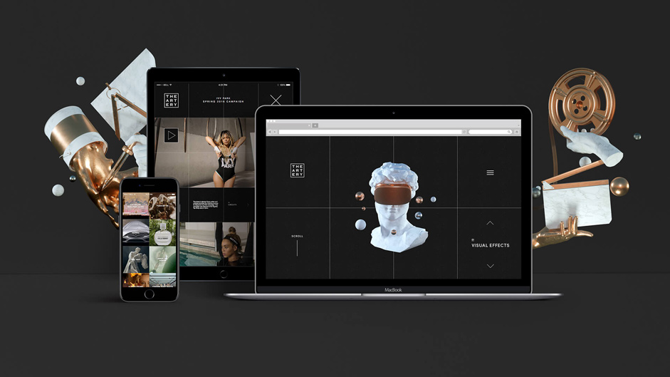
Our first priority was clarity. As we searched for visual systems to organize the site, conversation centered on creating a natural user experience and interface without sacrificing scalability. We wanted to avoid unnecessary visual noise and let the design speak for itself, keep the user focused and in control, and creative a narrative language with assets. So navigation and layouts needed to be simple and intuitive for users across platforms - this was a tactical concern. We felt strongly that the site should retain its visual identity across all platforms. No Frankenstein mobile or tablet sites built with withered components or views folded in half. The site had to be uniquely itself, regardless of how weird a screen you're looking at. This required a elastic design built to handle odd breakpoints, subtle but directive user interactions, and a changing spectrum of projects and content. We drew our final inspiration from our logo's existing design - the studio's name inscribed within a framed square - extracting the grid from the image's negative space and laying it over the website as a raw layout.
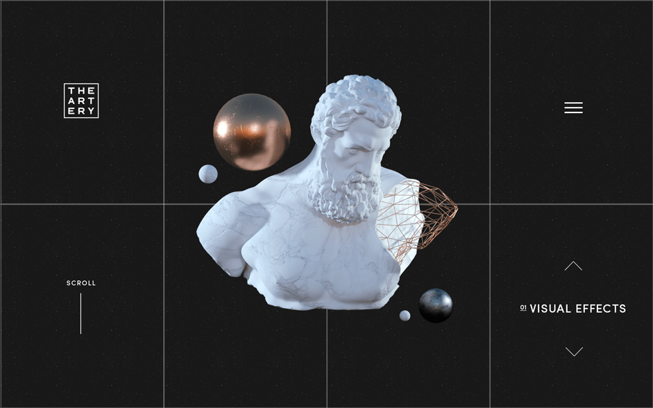
This reference evolved into our dynamically-animated grid, which provides a natural visual system for the user and continued flexibility for the developer. Composed of two layers, a CSS layer to template and hold assets and a visible Javascript grid mapped on top of it, the grid is generated and modified live with data from listeners monitoring changes in screen size and orientation. With an artful touch, we can also use the grid as a medium - as a trophy-case or a podium, or break it, overlay it, suspend objects over and behind its gutters. And while the grid forms the site's physical architecture, it reveals a subtle metaphor about our work: it separates and connects, giving substance to a latticework linking each node of the studio's past. It creates oscillations between the micro and the macro, bringing each axiom into singular focus and pushing it away into the broader view of the whole once more. Each project is an encapsulated unit in the grid that informs our future work and process. In the end, it acts like a tide pool, washing new and intriguing things into view.
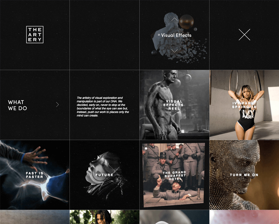
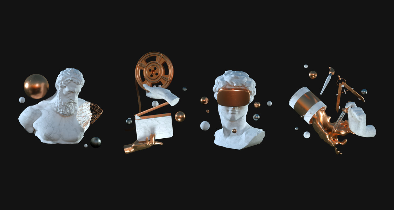
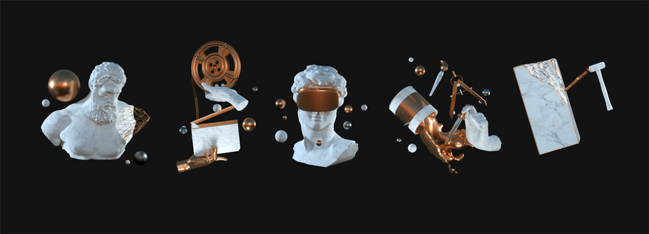
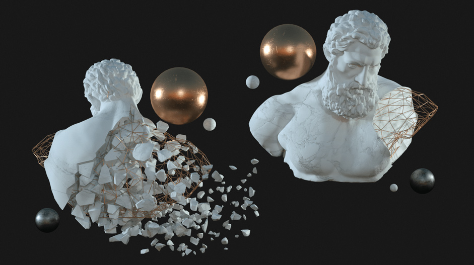
From the start, we prioritized arranging and exhibiting our portfolio content in unique and beautiful ways. We wanted to display who we are - and we are what we make. But we wanted to show our design capabilities rather than talk about them - the less words the better. This was the intention behind the creation and usage of our sculptural 3D models. Drawing on elements of classical sculpture and timeless correlative materials like marble and gold, each model serves to represent a pragmatic concern about creating a visual language throughout the site while highlighting the design team's capabilities to build and incorporate cutting edge material. Rendered in Octane, each is designed to represent one of the studio's creative departments and signpost while navigating through department and project pages. They greet users on the landing page and reappear to prompt and give context. But the importance of these works lie in their representation of our abilities and our desire to experiment and extend the boundaries of what is possible. In the end, each acquires its own reverent quality - artifacts that come to behave like elegant delegates, taking on lives of their own.
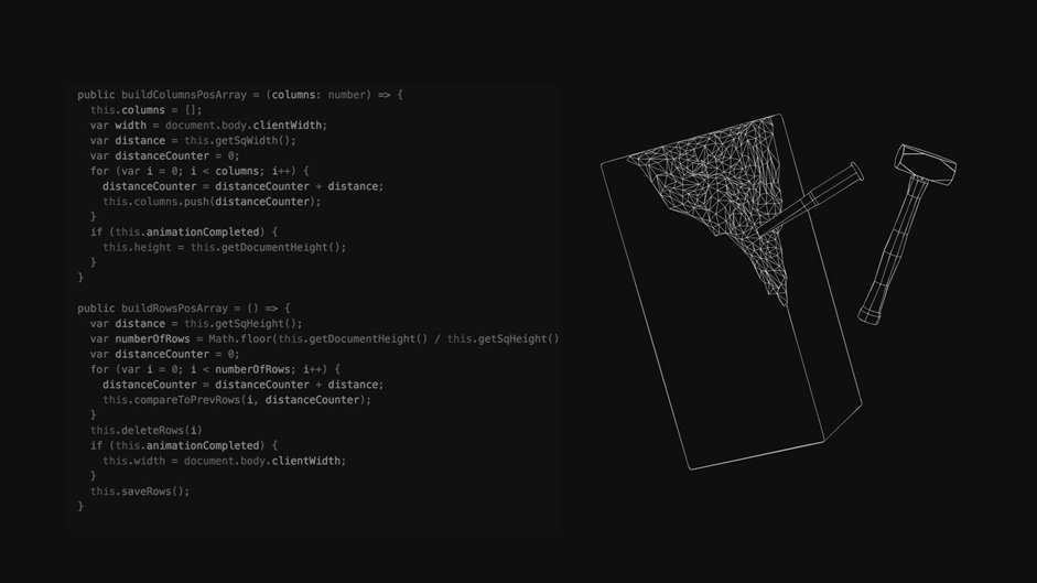
The Tech
The site is written with Angular4 and compiled with Gulp. The bulk of user interactions and animations are handled through Anime.js accompanied by smaller libraries, such as Wow.js and Tilt.js, to add an additional layer of motion and interactivity. We were careful to keep interactions logical and avoid unwieldy or confusing transitions - this consideration was born out of our desire to keep users happily engaged throughout the experience.