Oct 16, 2019
Statement on the web made without coding: Go behind the scenes with Readymag on their new feminist project
➭ Born to promote a fair discussion
Designing Women was conceived by Readymag CEO and co-founder Diana Kasay: “It all began with a Facebook post announcing yet another design conference. Almost all of the invited speakers were men, and that triggered a huge discussion in the comments about the current status of women in the industry.” The thread continued for several days, yet it all was just milling in the wind.
“So, we decided to view the issue from a variety of angles. We looked into the topic, interviewed designers, structured the gathered information, and finally presented it together as Designing Women,” says Diana. “I believe information based on facts, statistics, and the perspectives of design theorists and practitioners is the best basis for constructive discussion and positive change.”
➭ Equal & wholesome
Structurally, Designing Women consists of three independent sections—an essay exploring the current status of women in design, a timeline telling the stories of trail-blazing female designers of the past, and a list of feminist resources for self-study—plus a tessellated index page, uniting them all. “I challenged myself to present each section with equal prominence, and make them easy to view, read, and navigate,” says Tatiana Egoshina, the designer who was responsible for the look of Designing Women.
My goal was to make this compleх study look wholesome, so that the visitor could switch from one section to another without losing the thread. I also had to emphasize visually that Designing Women is the brain-child of Readymag, but without overdoing the corporate identity.”
All sections are based on a four-column grid, creating a common structure and anchoring each layout element in the same rhythm. Designing Women uses Haas Unica—a simple, time-tested font. Black, red, and grey are the only color accents in the project, drawn from Readymag’s traditional palette.
➭ Scrolling as an artistic vehicle
The project’s central essay was written by Madeleine Morley—an art and design writer whose work has appeared in Dazed and Confused, AnOther, 032c, and many other publications. Her text is spread out across six web pages stacked in a vertical column, one for each chapter. The text fills the right half of the screen, with a static navigation menu on the left that stays in view while readers scroll down.
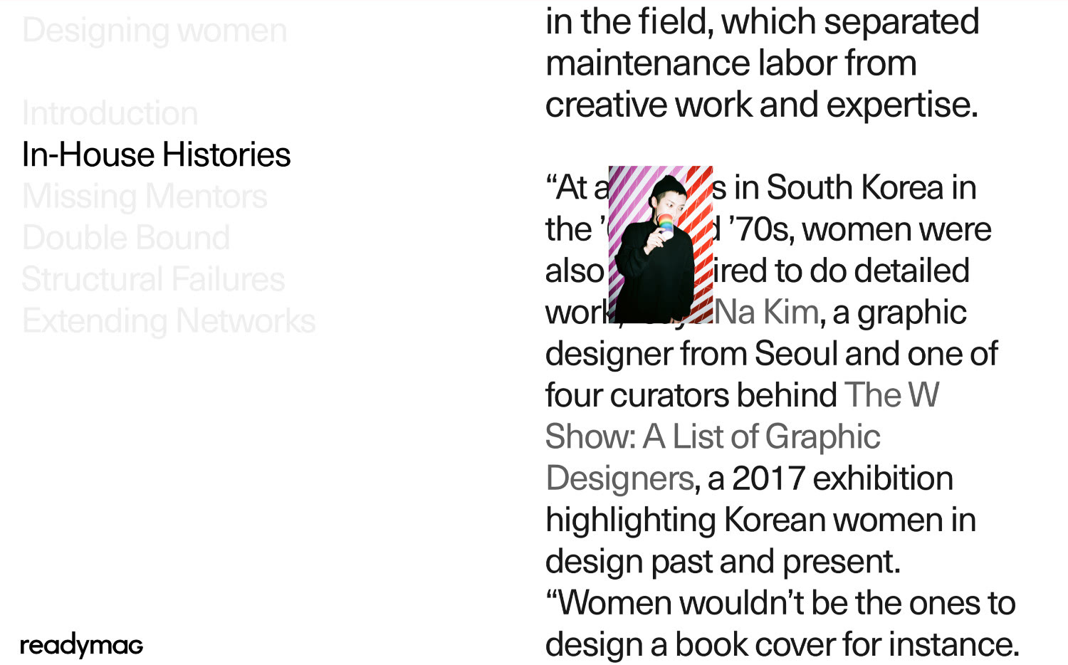
When a new chapter comes into view, its name in the menu changes color from grey to black. When you place your cursor over the name of a chapter in the menu, its color changes from grey to red. “To do this, I used Readymag link style options and set three possible styles for the names in the menu—active, inactive, and on-hover. The idea was to ease navigation through the essay—readers can see which chapter they’re reading at all times,” Tatiana explains.
When scrolling down, images of the speakers quoted in the essay also appear over the text. “I wanted to avoid monotony when reading. What you see is an on-scroll animation implemented in one step,” Tatiana adds.
➭ Color blocking & dynamic layout
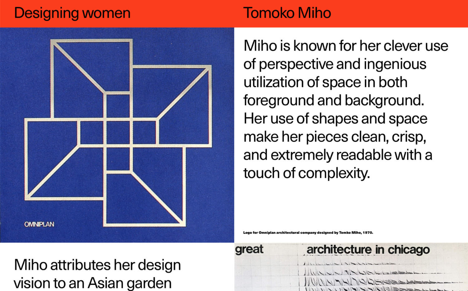
In the second section, profiles of each designer are split into rectangular blocks that act as content-holders and colored backgrounds. This section has a dynamic layout: some blocks change size while scrolling. “Our aim is to ‘refine’ the content—text sizes and the number of images vary in each profile, so I had to downplay this visual inconsistency,” eхplains Tatiana. Technically, that’s been implemented with Readymag’s on-scroll animation option—it was applied to the content-holding rectangles with all parameters set manually.
The four-column grid allows you to fit content blocks of multiple sizes easily: on different pages, pictures and texts can span the entire screen, half, or a quarter, but never just a third, since the layout doesn’t allow for it. In this way, the overall look of the pages always seems different, but preserves visual integrity. To make images stick to the edges of the browser window, Tatiana switched on Readymag’s Scalable Layout feature.
I loved the work process: conveying a big idea is always more exciting than just making beautiful images. The web has still a lot of room for statements—and Readymag gives you the freedom to make whatever you want without coding, see the results instantly and achieve a high level of precision in visual language, which is crucial for any designer,” Tatiana sums up.