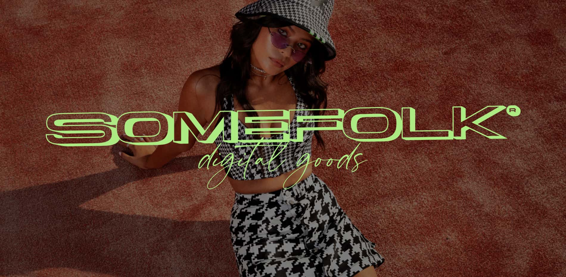
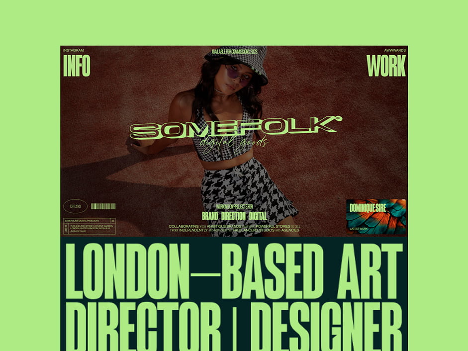
Somefolk Digital Goods is the 2023 portfolio site of Designer, Art Director and Creative Developer Jason Harvey.
Anyone who’s ever designed their own portfolio or agency site will know that it’s one of the hardest projects to work on, and it never stops evolving.
The limitless possibilities for creative outputs, lack of strict deadlines and the fact you are your own client is at the same time liberating and restricting. With client projects, I love listening to their story and finding visual cues that help to communicate that with their audience in an identity that the client can own. Experimentation is of course still essential in the discovery phase, but ultimately the client plays an inevitable role in funnelling multiple creative directions down to a single cohesive route that they feel represents them and their business. When you are both the creative and client on the other hand, it can be difficult to settle on a single concept or identity.
It can be easy to feel like you’re drowning in a sea of similar portfolios, all offering the same services and promising the same results. It’s difficult to stand out, and that’s why I think it’s so important to be authentic. With this edition of my portfolio, not only did I want to put everything I’d learned over the past few years into practice, but I wanted to strip it back to the core of why I became a designer in the first place.
Early Inspirations
Portfolio sites, especially personal portfolios, are the perfect excuse to give yourself creative freedom. They should be an authentic representation of yourself. They should show personality. So whilst it was of course still essential that potential clients could digest the information on the site and easily navigate the projects, I gave myself the licence to have complete creative freedom from a design-perspective. More importantly, I wanted to use it as a way of showing my journey as a designer, so that the story was more unique to me. This came from two particular places:
- Childhood Inspiration
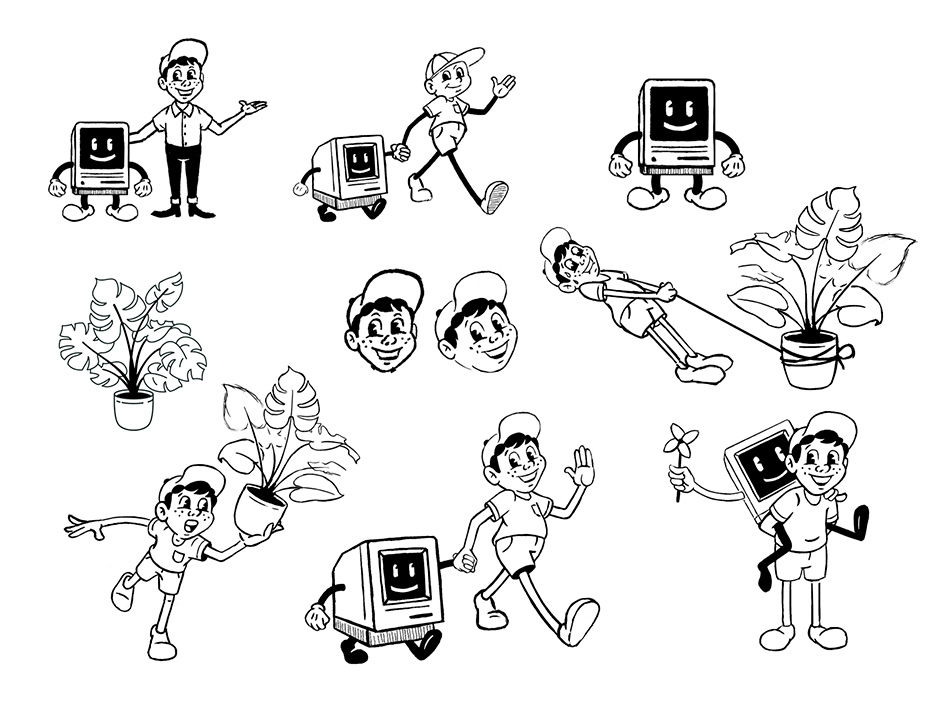
As a child, I used to spend days drawing my favourite cartoons and characters from animated movies. A pencil and a piece of paper were enough to sustain hours of creativity, and I wanted to throw back to those ideals of designing and creating for fun … not for profit. This inspired the illustrated character that ended up becoming a central part of the identity - even flowing offline into proposals and cred docs. - Early Career
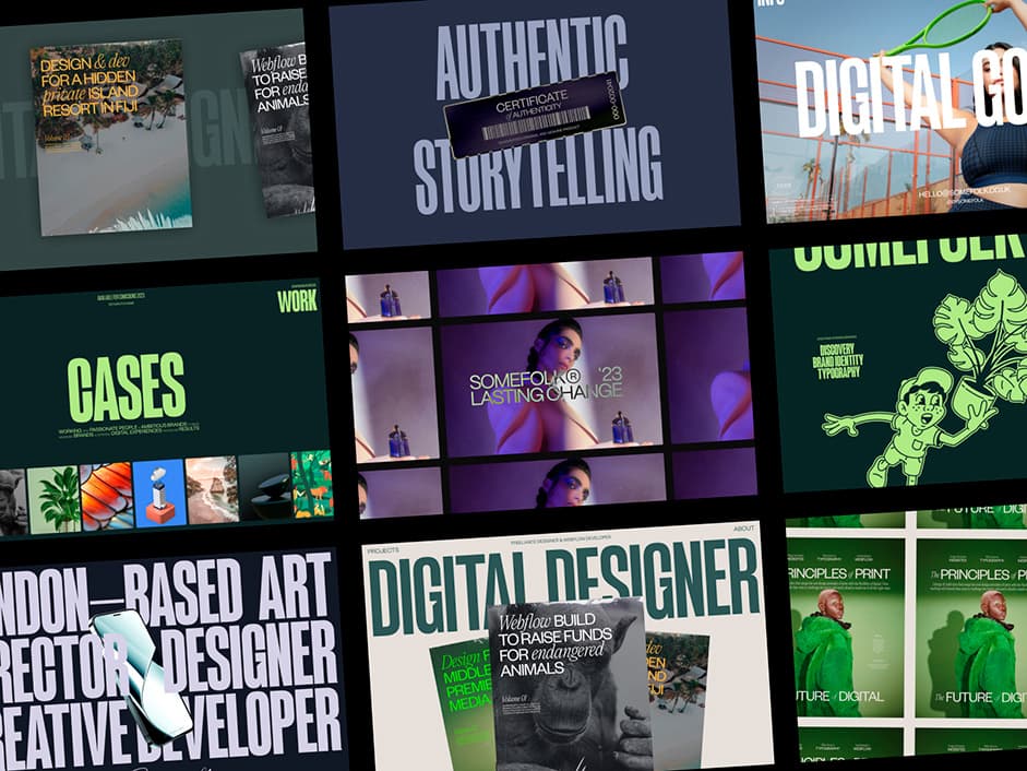
My entire education in design and my early career was heavily focused on print design. Creating something that not only used the design principles of print, but that also had visual cues and references to print design was a primary goal from the outset. This inspired several aspects of the site, including the loading sequence that resembles a magazine/newspaper printing press, the powerful typography reminiscent of letterpress printing techniques, through to the use of symbols and graphic assets associated with print such as stamps and barcodes.
Adding Character
Since I work with a lot of clients in luxury/high-end spaces, I wanted to use bespoke, light-hearted illustrations as a complete contradiction to that line of work; to help convey my personality and attitude beyond my work, and to reference and credit my earliest inspirations.
As an independent, it can be easy to try to take on all aspects of a project, but I’m a big believer in collaboration when trying to create something of high quality. I worked with illustrator Jared Schofner to create the original static illustrations that were inspired by vintage Disney cartoons. We came up with fun, comical scenarios where a cartoon version of me walked hand-in-hand with an old computer and struggled to balance an oversized Monstera plant to create a sense of humour that contrasted with the high-end fashion photography. Motion designer Filippo Marchetti helped emphasise this level of humour by bringing the characters to life with realistic but exaggerated mannerisms. I also wanted to use these as a way of bringing a level of approachability to our industry, a sense of character and self-parody to an otherwise (at times) mysterious and jargon-filled world.
Playing with Dimensions
“Since my childhood creative inspirations came from 2D spaces, and today’s digital industry is increasingly 3D, I wanted this site to exist in the blur between the two"
This concept is introduced to the user in their first interaction with the site, the loading animation. As I already touched upon, I wanted to create a loading experience reminiscent of a magazine printing press. I achieved this by simply duplicating one of the shots from a high-end fashion shoot to form a grid, and using simple transform animations to give the impression of a flat industrial printing press. The staggered letter rotations on the WebGL logo combined with the scaling and parallax effects on the imagery then helps create a sense that the user is absorbed into the hero of the site, turning a 2 dimensional space into something more immersive.
The illustrations across the site were created as static assets, but during the animation phase we imitated a sense of 3D through perspective and depth. For example, with the plant scene, I knew that I wanted a single linear timeline animation that I could animate on scroll, to create an imitation of 3D that made the user feel like they were descending past the scene, as if in an elevator. The WebGL logo on the other hand takes the reverse approach - existing in origin as a 3D object but evoking a sense of flat 2D design reminiscent of graffiti and WordArt.

Development
With a small sitemap and a simple CMS, it was the perfect project to build within Webflow; offering a streamlined experience for the main front-end build and leaving more time to focus on tweaking and perfecting the details and micro-interactions.
One of the biggest technical challenges was forming a style for the 3D logo that inherited this concept of merging dimensions, and became a central part of the digital identity. Working in collaboration with Kujira, we spent some time figuring out possible design directions that suited the styling of the UI. We wanted a logo treatment that retained a graphic single colour style and a strong connection to the rest of the brand even when animating and interacting in 3 dimensions. We experimented with several treatments, including outlining the mesh as a post process, but the best results came from using a separate mesh as a masking material - allowing the user to peer through a solid object in a style often visualised for print and animation but rarely experienced in full 3D interactivity. We also came up with a mobile-specific adaptation that helped the visual impact of the hero section to carry across responsively.
The illustrations were animated externally in AfterEffects, but exported as Lotties animations, allowing control over the animation within the scroll experience of the site. The smooth scroll experience was achieved with Lenis (by Studio Freight), and helps to enhance the level of luxury within the case study assets and emphasise the layering/parallax and sense of depth.
Company Info
Somefolk Digital Goods is the alias of designer, art director and creative developer Jason Harvey. I work with startups and SMEs across all industries to create memorable brands and digital experiences. I strive to create unique, design-led products that authentically tell the stories of ambitious brands.
Instagram: @bysomefolk