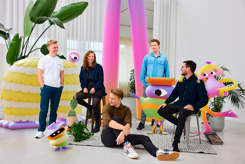
Ribbit is a Copenhagen-based motion design studio founded by five longtime friends and animators who, after years freelancing for top-tier studios, decided to join forces.
They asked me to create a brand and a tailor-made digital home that would let them show off animation at both the micro and macro level, while standing apart from the crowded creative studio landscape. Their main target audience are producers and marketing departments of companies, who are on the lookout for a top-tier motion agency.
The challenge was to build a memorable identity that communicates curiosity and craft, and translate it into a flexible system and website that celebrates motion as the primary medium.
From naming sessions and early sketches to the final animation renders, I worked hand-in-hand with the Ribbit team - iterating concepts, swapping ideas, and refining motion until the identity felt like theirs.
Approach
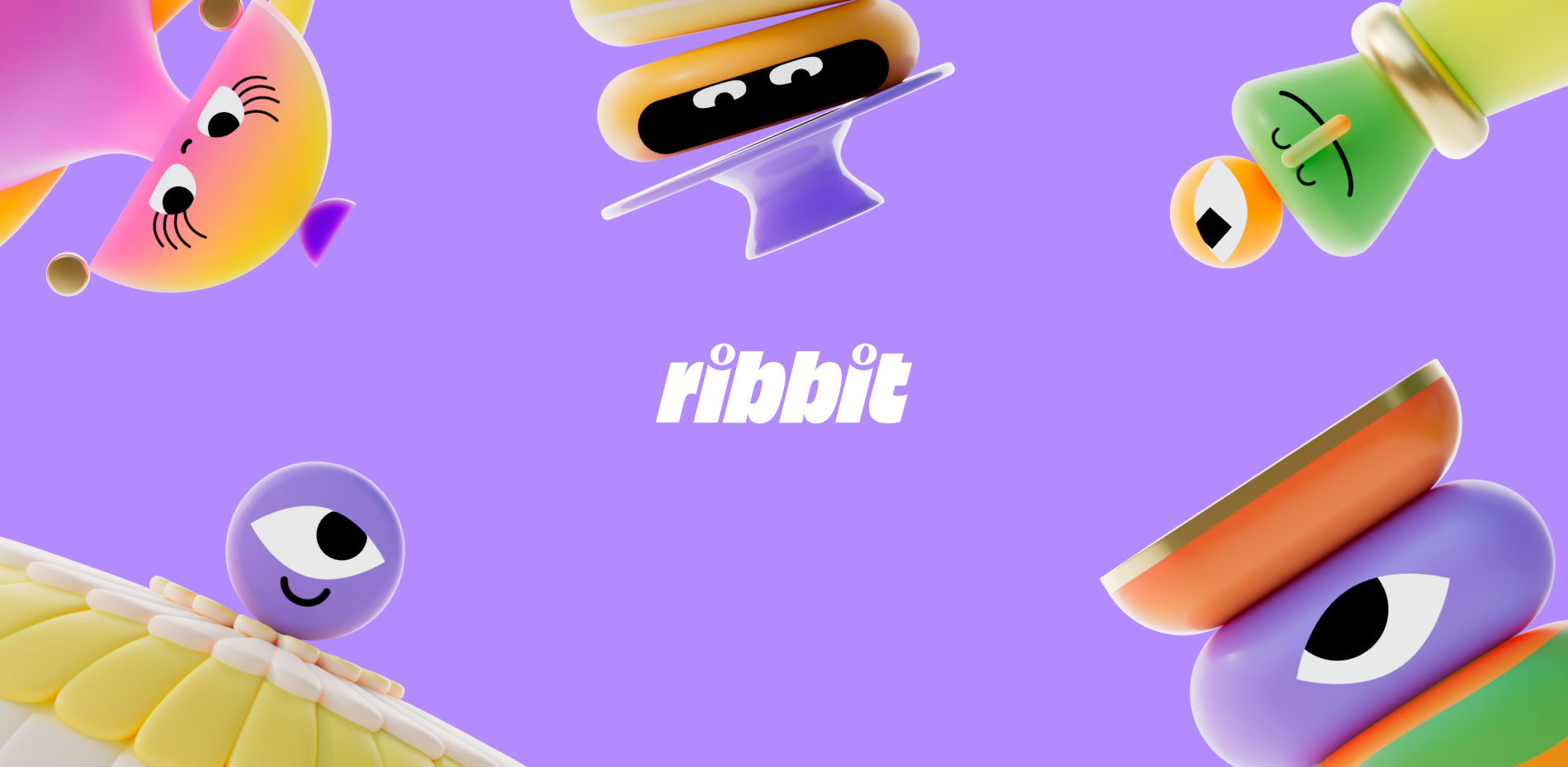
During the brand discovery sessions with Ribbit, we identified curiosity as the studio’s core emotional brand value. This comes from its approach to creativity, which is deeply driven by curiosity and exploration. That insight inspired several design choices, including the two eyes in the logo’s is. Curiosity ended up being the main keyword driver, that inspired many visual choices, from a “eyes” logomark to five distinct character archetypes that read individually but work as a system.
“How do you stand out as a new studio trying to compete in a highly competitive space and try to be remembered? The motion space is already filled to the brim with insane good looking work from all over the world. We decided to double down on Ribbit’s branding, to make their visual universe very specific to them and created these characters for their website to differentiate them.”
Strategy
Through our research, we discovered that few to almost no competitors were trying to build brands that risked overshadowing the client work they showcased—especially not through brand characters. So, we decided to do exactly that. Zig when others zag. Most competitors design their sites as clean black-and-white canvases, allowing the work to stand out. We wanted everything to stand out, to pop, to exude playfulness and curiosity, and to express Ribbit’s unique creative spirit.
Character collaboration with Ribbit
We knew from the start that we wanted five characters to represent the brand—not as digital substitutes for each founder, but as an extension of the brand itself. Three felt like too few, five felt right.
How do you define a direction and breathe life into five characters? I identified five cohesive archetypes, inspired by those created by psychotherapist Carl Jung (learn more in The Hero and the Outlaw by Margaret Mark). The five archetypes that aligned with Ribbit’s emotional brand value—Curiosity—were: Jester, Explorer, Sage, Outlaw, and Creator. I then used these archetypes as the core creative direction for Ribbit to develop, illustrate, and animate each character.
Once Ribbit had created them, I used sketches and lo-fi prototypes to demonstrate how each character should animate and interact within specific sections of the website.
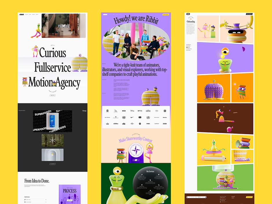
Website Creation
From my workshops with Ribbit I locked down two main business objectives for their website:
- Showcase their work in a unique and memorable way.
- Make it easy for potential clients to reach out. Also for the ones that need good motion work, but don't know about a standard motion process or the terms and measures that are used.
“In designing the site, I focused on making it a true home for all five characters. Instead of confining them to one or two static square JPGs on the homepage or about page, I let them take up space — owning sections, shaping layouts, and driving the experience.”
Frontpage push/pull scroll interaction
As the first touchpoint for potential clients, the homepage had to grab attention instantly and explain what we do. I solved this by creating a small “stage” for each character, a nod to early platform games, and asked Ribbit to produce walking-cycle animations for push, pull, and an idle loop. Characters physically push and pull UI elements into view, then settle into an idle loop when a reveal finishes.
The motion becomes our messaging: playful figures animate the showreel and reveal headline brand statements, making the site’s personality and purpose literal, immediate, and impossible to miss.
Process page
As a newborn agency, credibility matters. You need to look established — and prove you know exactly what you’re doing the moment someone considers reaching out. Instead of hiding that story inside a pitch deck, I turned it into a dedicated page.
Borrowing again from the world of illustration and character design, I asked: what if this felt like a real magazine? Something tactile and dimensional, adding depth and presence to the site. When you “open” it, you’re met with a slanted cartoon-strip layout and a side menu that functions like a table of contents — guiding visitors smoothly through each chapter of Ribbit’s process.
Booking flow
Reaching out to a motion agency can feel intimidating — especially if you’ve never commissioned motion work before. What do you ask for? What information matters? To meet potential clients at eye level, we needed to remove that uncertainty.
The solution was a guided questionnaire followed by a clear “book a meeting” step. I worked closely with Ribbit to identify the exact inputs they need to define scope and budget, then structured those into five concise categories. This simplified the process and allowed us to bring the characters back into play.
Since launch, the flow has proven to be a tangible advantage — qualifying leads more effectively and helping Ribbit convert new clients with greater confidence and clarity.
Footer
Where should five characters go to sleep after a long day on the website? In their respective custom-cut mouse holes, found at the bottom of each page. The main driver of this interaction was to nudge visitors to book a meeting by only making all the characters appear when you hover over the only coloured button down there.
Technologies
The website is static generated using a headless CMS. We are using our own minimal framework for routing, templating etc. GSAP handles many of the animations, including the text reveals. We are also using Mux for HLS videos and Lottie for icon animations.
The push and pull animations on the homepage required us to think creatively with code. Our immediate approach was to use a WebGL renderer and spritesheets. But we couldn't get the smooth feeling out of it in some browsers (Apple we are looking at you). So after some experimentation with custom renderers and spritesheets, we ended up with a simple solution of loading each frame as a png and toggling the visibility of it. The animations are handled by scroll listeners, checking direction and progress, it’s probably simpler than it sounds. The same png sequence renderer was used on About and Contact, though without scroll control.
For the Process page, the opening of the book progressively on scroll required some extra attention too. We really wanted the feeling of moving seamlessly into the video sections, but we also wanted the user to feel in control. The solution was to use CSS transforms handled with GSAP and locked to scroll position.
About Frederik
Frederik Hansen runs the freelance design practice Nyance. A Copenhagen based digital design partner collaborating with creative studios and agencies around the world, specialising in crafting tailored websites through design, interaction, and motion.
Credits
Strategy, Visual Identity, Web Design, UX: Frederik Hansen – Website, IG Web development: Michael Vestergaard – Website, IG Character illustration, character animation: Ribbit – Website, IG