
Introduction
In the world of architecture websites, standing out has become increasingly difficult. Minimal layouts, large imagery, refined typography, many portfolios now share the same visual language, often resulting in experiences that feel generic. The challenge is no longer about adding more, but about knowing what to leave out and what to focus on.
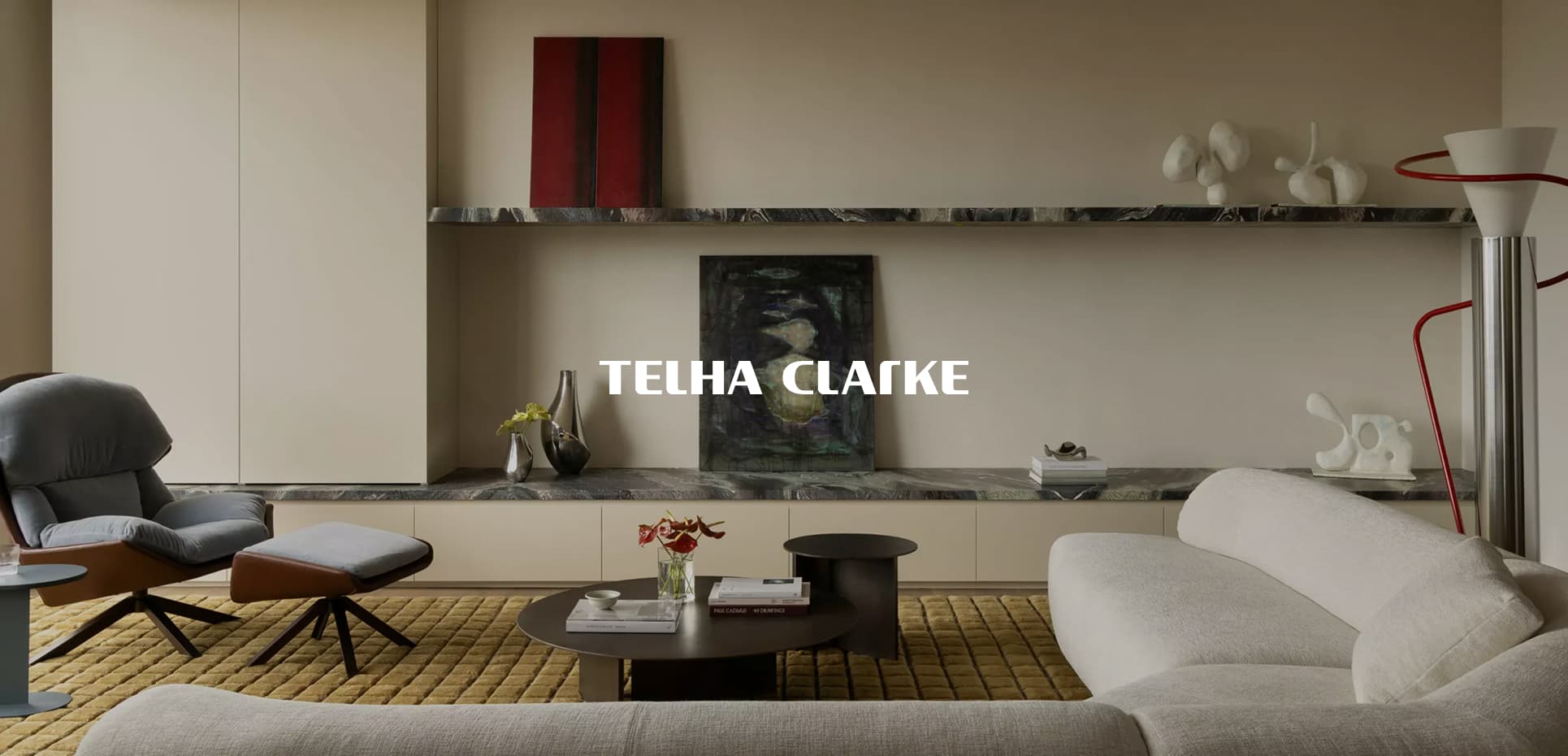
For Telha Clarke, simplicity became our answer. Instead of relying on visual excess or complex interactions, we focused on creating a digital experience that feels intelligent, precise, and purposeful. Every design and development decision was guided by a simple objective: to build a website that reflects the studio’s architectural thinking while allowing the work itself to remain at the center of the experience.
Layouts shaped by content
Architecture websites often share the same visual language: neutral color palettes, oversized imagery, minimal typography, and rigid grids. While these conventions create elegant experiences, they can also make studios feel remarkably similar online.
For Telha Clarke, we believed the real differentiator wasn't the interface itself, but the quality of the work being presented. Rather than designing a website that competes with the projects for attention, we built an experience that allows the projects to become the primary narrative.
This principle guided both the design and development process. We developed a scroll-driven storytelling experience where layouts, transitions, and animations respond to the content instead of dictating it. Every interaction was designed to reveal, frame, and elevate the architectural work, creating a rhythm that encourages exploration while keeping the focus exactly where it belongs: on Telha Clarke's work.
The result is an experience where motion serves meaning, and where the interface quietly steps back to let the architecture speak for itself.
Reducing interaction to a single system
It quickly became clear to us that creating an original experience while preserving the sense of simplicity that defines our client’s identity would require smart, purposeful interactions rather than additional visual complexity.
After exploring several directions, we concluded that the most effective approach was to combine storytelling with adaptive, evolving interactions throughout the scrolling experience. This led us to design a single interactive entry point: an animated widget that acts as the primary CTA across the entire website.
By intentionally contrasting with the site's layouts, this widget provides users with contextual guidance while maintaining a single, consistent point of interaction. Through this element, we can redirect users, switch between different views, reveal information, and challenge the traditional role of a button within a web experience.
This element also became the foundation of the project's entire motion system. Its transitions between states inspired a series of smooth, cohesive animations that ultimately shaped the overall motion language of the website.
More than just a functional component, this small widget acts as the connective thread between pages, helping create a navigation experience that feels both relaxed and satisfying from beginning to end.
Meaningful motion, seamless experience
The motion system was crafted to feel refined, yet always intentional. The animations had to reflect the precision and calm inherent in Telha Clarke’s architectural work, never flashy, always considered. Every interaction, every hover, every scroll effect was calibrated to be smooth, elegant, and intentional.
The site opens with a loader that reveals the new wordmark in two steps, subtly referencing the duality of the two founders, Tim Clarke and Stuart Telha. The loader’s deliberate pace reflects the care and craftsmanship behind the studio’s work, creating an immediate link between the digital experience and their architectural approach.
We introduced subtle scrollytelling sections throughout the site, particularly on the homepage and About page. The goal was to connect sections smoothly, almost imperceptibly, creating a narrative flow that enhances both storytelling and the overall scroll experience.
This approach also solved a key challenge: how to showcase Telha Clarke’s work without overwhelming the user, highlighting only the three or four projects the studio wanted to feature. On the homepage, for example, the “highlighted works” section flows into a deeper exploration of their vision through a contextual grid of images.
The grid provides additional glimpses of the studio’s broader work, using subtle parallax and depth to enrich the visual experience.
Final thoughts
This project reaffirmed a belief that is often overlooked in digital design: less interface does not mean less experience. In a landscape where many websites compete through visual complexity, we chose to focus on clarity, intention, and rhythm.
Motion played a fundamental role in achieving this balance. Rather than using animation as decoration, we treated it as a navigational tool, guiding users, providing context, and creating continuity throughout the experience. Every transition was designed to reinforce understanding and make interactions feel natural and rewarding.
Ultimately, the goal was never to make the interface more complex, but more intelligent. By carefully considering how content, motion, and interaction could work together, we were able to create an experience that feels both effortless and engaging.
Tech stacks
- Frontend: Templating handled with Blade (PHP), complemented by Tailwind CSS for styling.
- GSAP: Our go-to for complex and high-performance animations, combined with ScrollTrigger for scroll-based effects.
- Lenis: For smooth scroll, by Darkroom Engineering.
- Taxi: For powerful JavaScript page transitions, by Unseen.
- piecesjs: JavaScript framework built on native web components, by Quentin Hocdé.
- Back-end: WordPress as a CMS, enabling flexible and custom content editing for the client, powered by ACF.
- Figma: Our main design tool for web layouts.
- Jitter / After Effect: For our motion exploration.
About Gregory & Thomas
For nearly three years now, we have been crafting digital experiences as a duo: Grégory leading development and Thomas shaping design. As with the Telha Clarke website, our ambition is to create web experiences that feel both original and immersive.
We believe there is always room to push things further, to find new ways of interpreting conventions, challenging expectations, and transforming familiar patterns into memorable moments.
Thank you to Nicolas Garcia (Studio Paack) for his support on the brand identity, and to Emeric Desgranges for crafting a fully custom 3D scene for the website’s social media communication.
A special thanks to Tim and Stuart for trusting us throughout the process and giving us the freedom to refresh the studio’s identity while staying true to the essence of their work.