
A Blueprint for a New Kind of Fintech Web
There is an unspoken rule in B2B product websites. Keep it clean. Keep it safe. Keep the product in the hero. Lead with trust signals. Lead with a pricing table. Lead with the product dashboard.
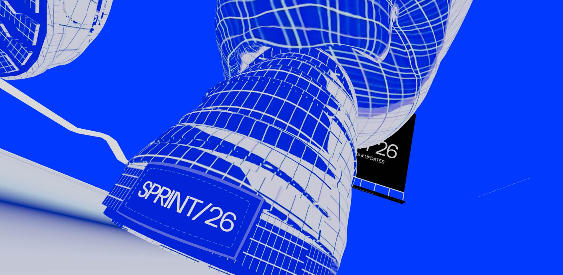
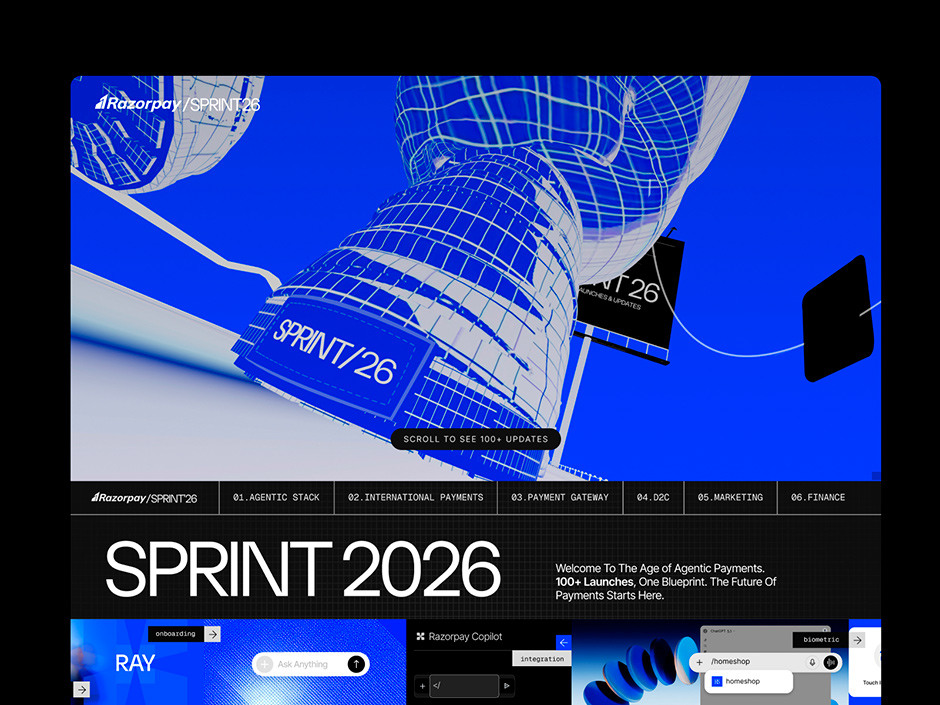
We broke all of it. Razorpay Sprint26 opens with a giant shoe.
Not a product demo. Not a headline about payments. A single oversized sneaker, hanging in space, waiting for you to scroll. That's the first frame of a fintech website announcing 100+ product launches to the world.
It's not a mistake. It's the whole idea.
What Sprint26 Actually Is
Sprint is Razorpay's annual product launch. The year's biggest innovation releases, compressed into a single digital experience. Think Apple's WWDC, but for Indian fintech. The 2026 edition had over 100 product updates across six verticals: Agentic Stack, International Payments, Payment Gateway, D2C, Marketing, and Business Banking.
The brief, distilled: make 100+ updates feel like one cohesive, unmissable story.
A grid of product cards was never going to do it. We didn't try.
The Idea: A Shopper's Journey into the Age of Agentic Payments
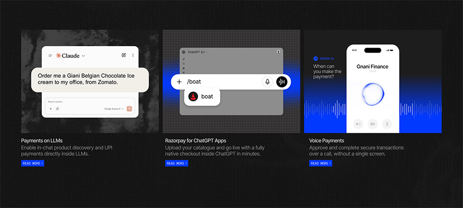
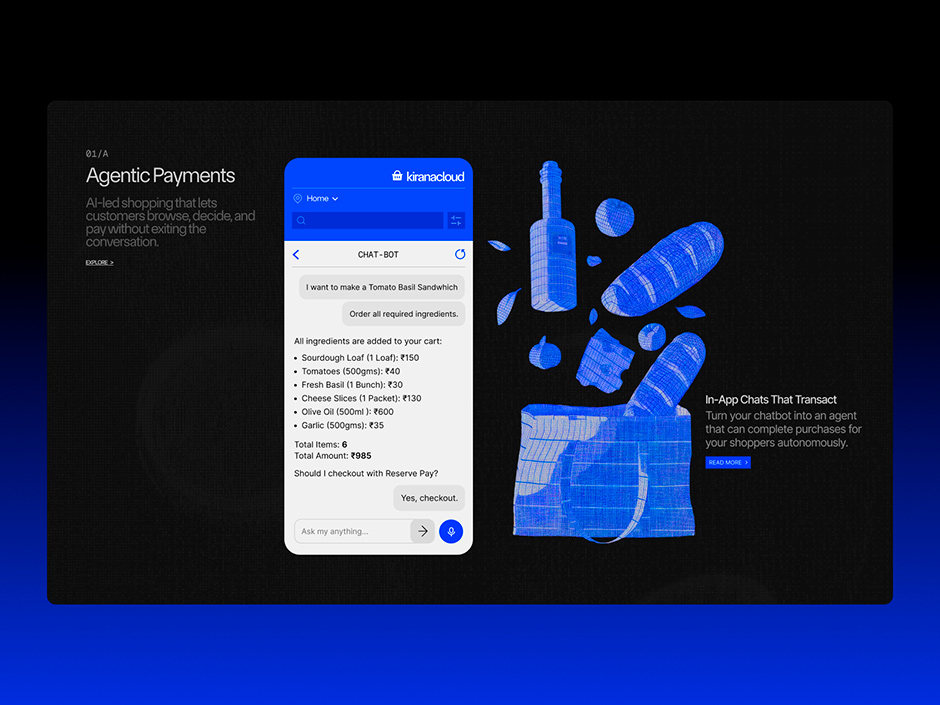
The central metaphor emerged from what the products themselves were about. Sprint26's biggest announcement was agentic payments, AI-led commerce where customers browse, decide, and complete purchases without leaving a conversation. The future Razorpay was announcing was one where shopping happens inside LLMs, voice calls, and chat interfaces. The checkout isn't a page anymore. It's a moment inside a flow.
So we asked: what if the website itself felt like that future?
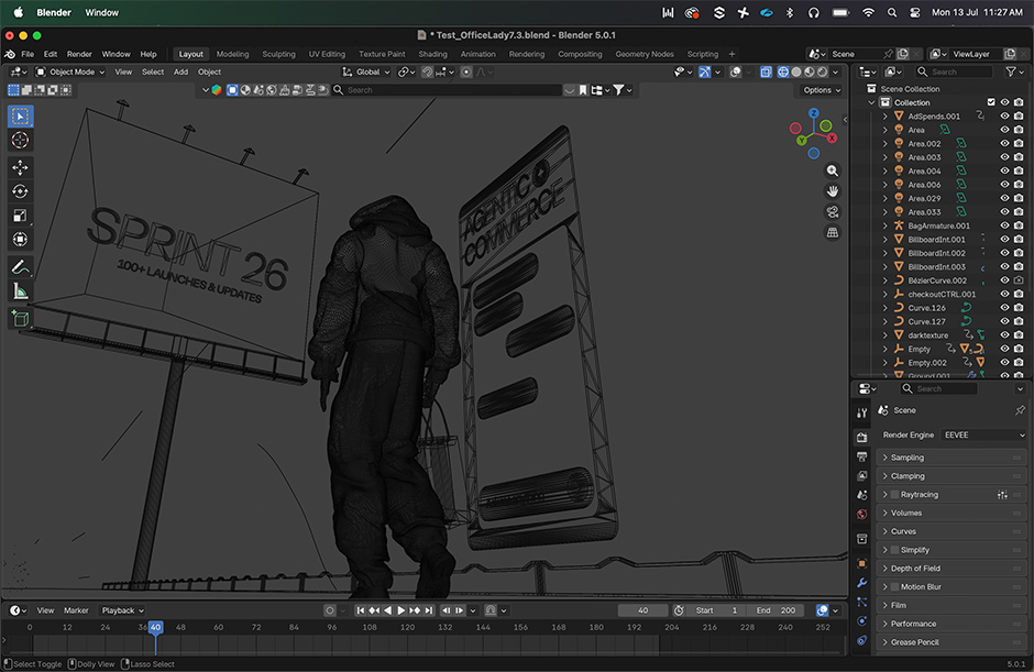
What if scrolling through Sprint26 felt like walking through a store? A real shopper's journey, beginning with the shoe you just picked up, carrying a bag as you walk, and with every step, more of the world Razorpay is building begins to appear around you?
That became the spine of the experience.
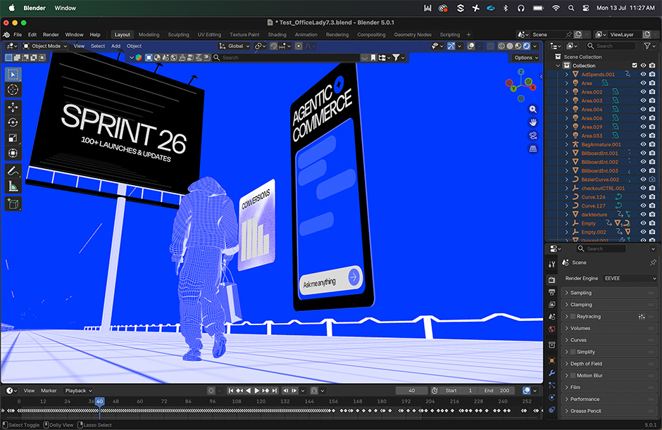
A giant shoe on load. Scroll down, and a figure appears: a shopper, walking. The bag in their hand fills with product. The street around them is filled with Razorpay's new infrastructure. Every section of the site is one more step in this walk. Six product verticals, six beats in the journey, 100+ launches revealed as a single continuous narrative.
“Not a list. A story you move through.”
Boldest Design Decision: Unexpected, Deliberate, and Inevitable
The shoe was always going to be controversial internally. A fintech company, known for trust and scale, opens its most important product moment with a fashion object. No product in sight. No headline about security or API uptime or settlement speed.
That's exactly why it works.
Sprint26's thesis is that the future of commerce is agentic, autonomous, AI-led, ambient. The days of the sterile payment gateway website are over. The product Razorpay was announcing was built for the age where Nike sells inside ChatGPT and D2C brands complete purchases through a chatbot. Opening with a shoe wasn't a non-sequitur. It was the thesis.
It was also a signal: this website is not going to behave like other fintech websites.
The Design Language:
Once the metaphor was locked, we needed a visual system that could carry it.
We built around what we called the modern blueprint aesthetic. Technical precision, architectural line work, and a monochromatic base. Blueprint is the vocabulary of builders. It felt right for a product launch site announcing infrastructure for the next era of commerce. Clean enough to let 100 products breathe. Detailed enough to signal craft.
The entire site runs on two colors. Electric blue #0039FF and near-black #151515. That's it. Two colors powering an experience with 100+ animated interactions, six product verticals, 3D spatial transitions, and a walking narrative metaphor. The restraint isn't a limitation. It's the discipline that makes everything else land.
Typography is spare and structured. Hierarchy is clear. Color is intentional, not decorative.
When everything around a moment is calm, motion becomes meaningful. Every Rive animation on this site pulls focus because the surrounding space earns it.
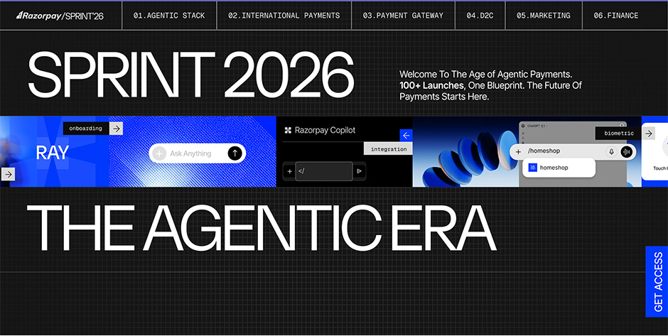
100+ Triggers. All of Them Earned.
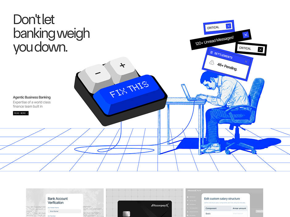
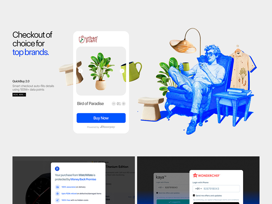
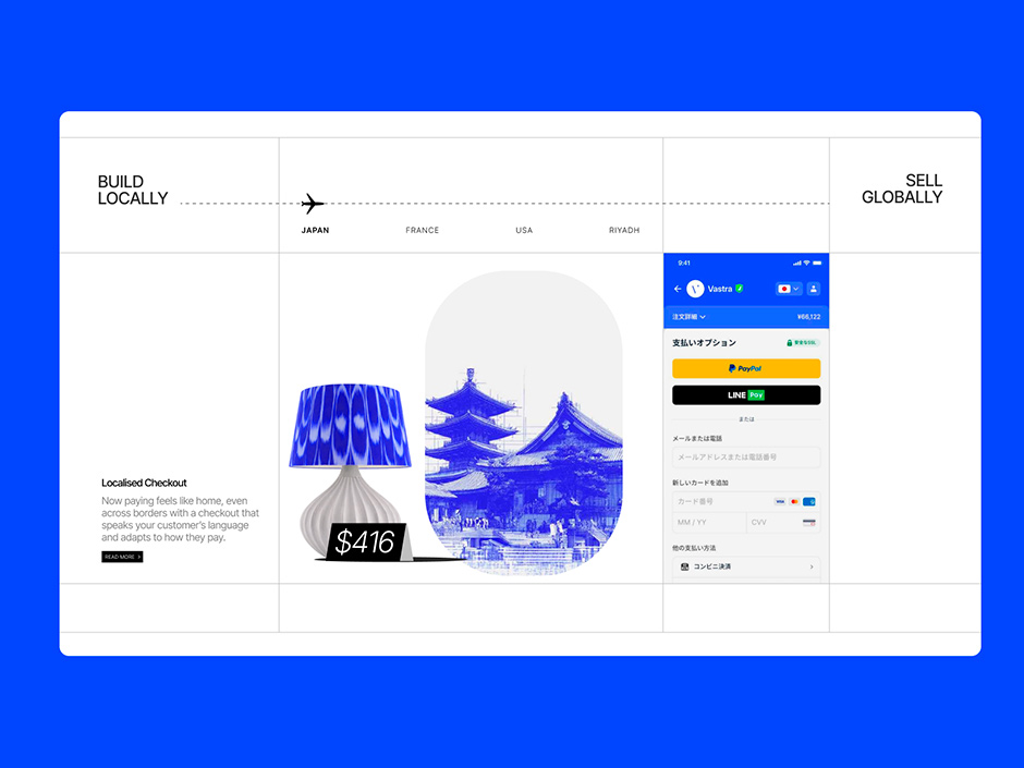
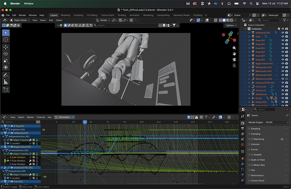
The number that gets cited most: 100+ scroll and click triggers, all built in Rive.
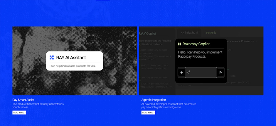
This wasn't cosmetic interaction design. Every trigger served the narrative. A product card that unfolds as you scroll into it. A pipeline diagram that assembles itself as the section enters view. An agent flow that runs on click, mimicking the live product behavior.
Rive was the right call for this kind of interactivity. It's a runtime animation tool that compiles to WebAssembly, which meant the interactions stayed fast even as we loaded 100+ of them across the page. The animations aren't looping GIFs or CSS transitions. They're state machines. They respond to user behavior, not just scroll position.
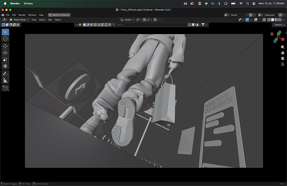
That distinction matters. The interaction is alive, not decorating. Three.js and WebGL powered the spatial layer, the walking figure, the shoe, the dimensional transitions between sections. Blender Studio was used to build and iterate the 3D assets before they were ported into the browser environment.
Full tech stack: Webflow / Rive / WebGL / Three.js / Blender Studio / Figma / Claude / ChatGPT
Designers Who Became Builders
This is the part of the project that matters most, and it's the part that no award category captures.
Sprint26 was designed and built entirely in-house, by the Communication Design team at Razorpay. The team used Webflow for the build layer not handed off to a dev team, not outsourced to an agency. The designers became the builders. That erased the gap between intent and execution.
In most organizations, the thing that gets built is a compromise of what was designed, filtered through developer interpretations, sprint constraints, and technical debt. On Sprint26, the person who decided the shoe should be that size was the person who placed it in the DOM. The scroll curve was tuned by the person who originally imagined it.
This is the real unlock of the AI-first, tool-native design team. When your designers have the range to execute at this level, the work stays exact. Two months, zero to ship, no agency, no compromise.
The AI tools in the stack, Claude for content architecture and interaction logic thinking, ChatGPT for research and iteration, weren't novelties. They were production tools embedded into the workflow at every step.
What It Changed
Sprint26 set a new creative and technical benchmark for B2B product storytelling in India.
Before this site, the accepted format for a B2B product launch page was a grid of feature cards, a hero headline, and a CTA. Readable. Functional. Forgettable.
Sprint26 proved that 100+ product updates can be told as a narrative you walk through. That fintech can open with a shoe. That scroll can feel like physical movement. That an in-house design team can build something that competes on a global stage.
Every design decision on this site was a deliberate rejection of the safe choice. Not because safety is wrong, but because the products being announced deserved an introduction that was as forward-looking as they were.
The Team
Design, Marketing and Build: Priyank Hegde / Divya Lohia / Aman O S / Rajat Bire / Monika Maharana / Rashi Mishra / Anushka Braganza
Communication Design Leadership: Sourajit Sengupta Avantika Swarup
Product and Marketing Leadership: Saurabh Soni / Apuarv Sethi / Dushyant Panda
One Line
A fintech site that opens with a giant shoe reveals everything about the team that built it. They didn't settle for good.