About a year ago Constantinos Haritos approached me in order to help him materialise his personal portfolio. He needed a modern solution that would reflect his aesthetics and would help him work with clients all around the globe.
The final website got some really nice feedback and we’re both quite happy with the result, so we're happy to share some insights from the process.
Own voice
Initially, Constantinos had gathered many references, examples of sites he loved and interactions he wanted to include on the project. We started by toning down these references and agreed to lay back from any future ones. The plan was to jam our way through.
The most difficult part of our job is to find your own voice. It’s always a challenge to filter out all influences and focus on your own gut. At some point you just have to stop seeing others' works and focus on your own craft. More doing, less referencing.
The first goal was to identify Constantinos’s original intentions in between these references. To create a unique tone and feel, not only for the website, but for his brand voice in general. Something that could then be applied to his whole digital presence.
And this is how we started. We focused on the overall concept, the aesthetics we were trying to communicate and all the elements, apart from the design, that would be used in order to form the complete visual language of the project.
We knew that interactions and animations would play a vital role, so the sooner we started playing with motion, the better. It was a long shot, but we decided to try out concepts directly in the browser, with code.
Mood-board in Figma, Design in browser
I’ve found that on small websites like this, it’s better to start by establishing the core concept, then design a rough prototype/mood-board in Figma and jump into the browser for the final design. Of course, it all depends on the project, but we felt this one would fit that workflow.
We went like this and ended up testing different variations on most of the website’s Components. When we had enough to play with, we started dropping things out, until we only had the bare minimum. That bare minimum was our core concept.
We only wanted to have 1 Key Component. One thing that the user could take away from this website and we worked our way to finding it.
I'm a big fan of this mantra:
First do it, then do it right, then do it better.
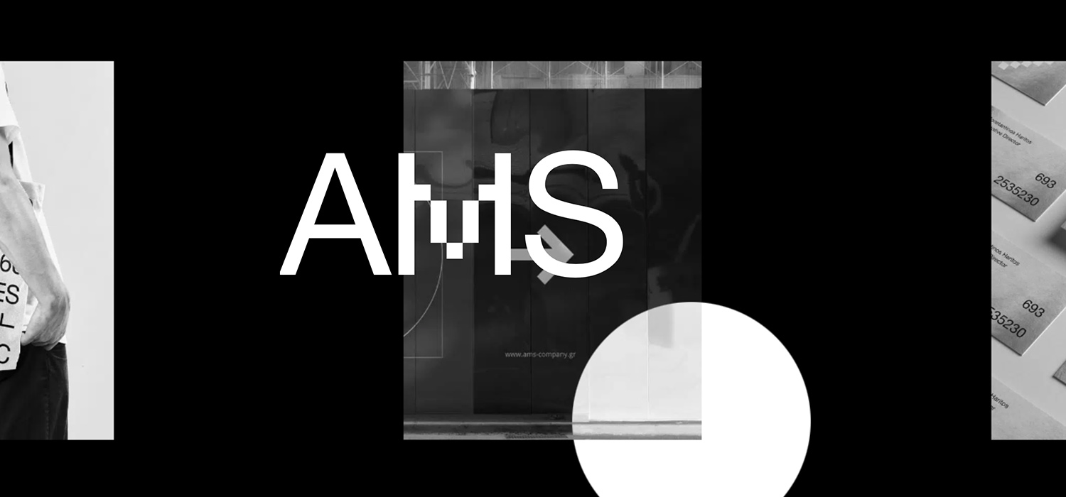
Text → Image Hover Effect
We started experimenting with the first Component of the website, the Hero. Initially we thought we would try out a commonly used effect, in order to show images behind highlighted texts.
This worked nice but felt a bit flat, so we tried an RGB distortion:
This was much better, but we still wanted to take it a step further and bound the effect to Constantinos’s own branding.
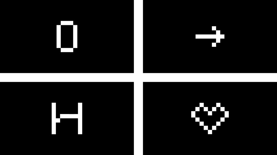
His brand symbols were made out of pixel art, so we thought about bringing that concept to the effect, resulting in a velocity-aware, pixelated distortion, which we hadn’t seen elsewhere, and fitted the context quite nicely:
Infinite Slider
Constantinos wanted to showcase his works in an infinite horizontal slider. Having our Key Component set, felt natural to give it a try on the slider as well.
Even though this is an early version, you get the idea. We did some further iterations, but overall we felt that the pixelated effect was too distracting, so decided to go with the plain version for this one.
The cursor mask was practically decided on the fly, but we believe it triggers you just a bit more, to discover each work.
On the slider itself, we tried some other ideas as well, mostly on the animation of text, but concluded that the inline transition for the active text was the way to go for this one. The simpler, the better.
Page Transition
Building up on our initial Key Element, we decided to use the same vertex distortion for a standard, page cover type of style.
Nothing special here, apart from 2 small details to note, about the implementation.
- One being the blend that the overlay does on the header menu (as it passes over it), so you don’t lose any white-on-white content at any point.
- And two, if you trigger a transition from a “dark” component of the website, the transition layer gets inverted to white, to highlight the transition.
A good example of a thing going unnoticed, only because it’s there.
About / Case Study
For the about page, we wanted something quite minimal, that would leave room for the actual content. A basic, clean layout with some subtle animations as the elements enter the viewport.
The same concept for the case study page. Nothing to distract the user from actually seeing the content. A pretty basic grid of images, to showcase Cosntantinos’s works. Again with some subtle animations that elevate the actual content.
404 is meant to be found
Which brings us to the 404 page, one of the most fun pages to build.
404 pages are always the playground, the place for free improvisation and actual experimentation.
So on this one, we decided to play with the pixel concept and simply overdo it. Try things out just for the fun of the game. This is the live version, where the mouse is also controlling the RGB distortion of the noise background:
However, we did try a few other (extreme) alternatives, mostly playing with background noise:
Ok, maybe not that good for your eyes, but still quite fun to play with 😄
Technologies / Development Stack
As with every project that needs a Content Management System, we used Wordpress as our building block, for a tailor made solution. Code wise, everything is mostly handled by my own small WP stack, based on Roots.
Under the hood:
- Vagrant is used to create the development environment.
- Ansible is handling all configurations.
- Composer is managing all dependencies (including Wordpress itself).
- WP-CLI is saving hours and headaches.
- Laravel's Blade is used as the templating engine.
- Webpack pulls all the strings on the frontend.
- Digital Ocean hosts the project on a dedicated droplet.
Backend
Everything was built in a Component based manner, which practically means, that every module of every page can be used in combination with every other module, resulting in a flexible page builder for the backend, that can be used to extend this website with new pages & layouts, at any given point.
In Constantinos’s words:
I received a fully functional (backend) environment, which I can reshape or simply edit at any time.
Frontend
On the front end, everything is set up & bundled with Webpack.
All stylesheets were written with Sass, following a vague BEM approach, and every Component is built as a standalone entity that can be easily ported or handled independently.
For the WebGL part, I chose curtains.js as a more lightweight Three.js alternative, smooth scroll with asscroll, AJAX is powered by highway.js and of course all animations are built with GSAP.
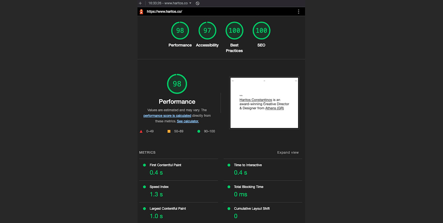
Performance / Accessibility
As with every project, a lot of work has been put on the things behind the scenes. Performance, best practices, accessibility is always a challenge, that you’re eager to implement as close to perfection as possible.
Dealing with projects that mix DOM & WebGL, can often be challenging, however the browser’s dev tools provide many useful insights that can point you to the right direction for optimising your code.
In our case here, one major performance issue we faced was the use of blend-mode.
Turns out (and of course makes sense) that if you have different layers, where everything blends together in a different way and at the same time the canvas also blends with the rest of the content, performance can have a major drawback.
However, blending only where/when necessary, pausing & restarting your render, along with some thoughtful markup layering, can actually save the day!
Of course there is always room for improvement, but the website performs almost perfectly on Lighthouse:
Outcome
This pretty much wraps everything up, the project was very well received and has already given Constantinos many leads for new collaborations. In Constantinos’s own words:
My goal for this project was fulfilled, as I acquired a fully functional and modern website which reflects exactly who I am and what kind of services I provide, while at the same time I managed to raise the level of my clients.
Company Info
Yannis Yannakopoulos is a freelance Developer collaborating with studios & individuals around the globe to bring life into unique concepts & designs.
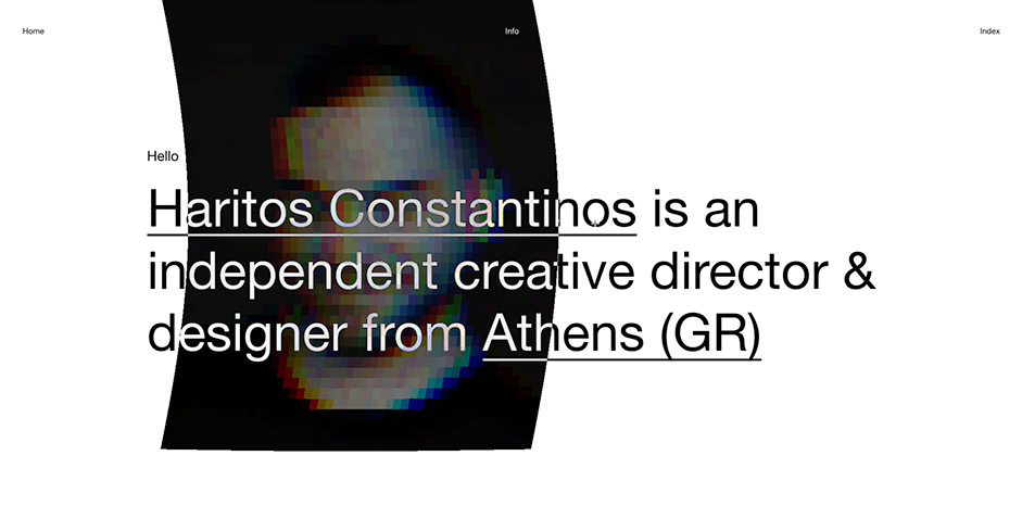
Haritos Constantinos is an independent creative director & designer from Athens (GR).