At Obys, we believe that the right book can change the way you see the world. Obys' Design Books is our curated digital library of the most impactful titles that have shaped our thinking, our work, and our teaching.
Many of these recommendations come straight from our Design Education Series, where students often ask us for reading lists on typography, layout, or just for inspiration. We wanted to bring these books together in one place — a collection that grows with us. This site is for every designer and creative who wants to dive deeper into their craft or simply find a moment of peace and inspiration. For us, a book is more than information; its texture and feeling provide a sense of calm that we wanted to translate into a digital format.
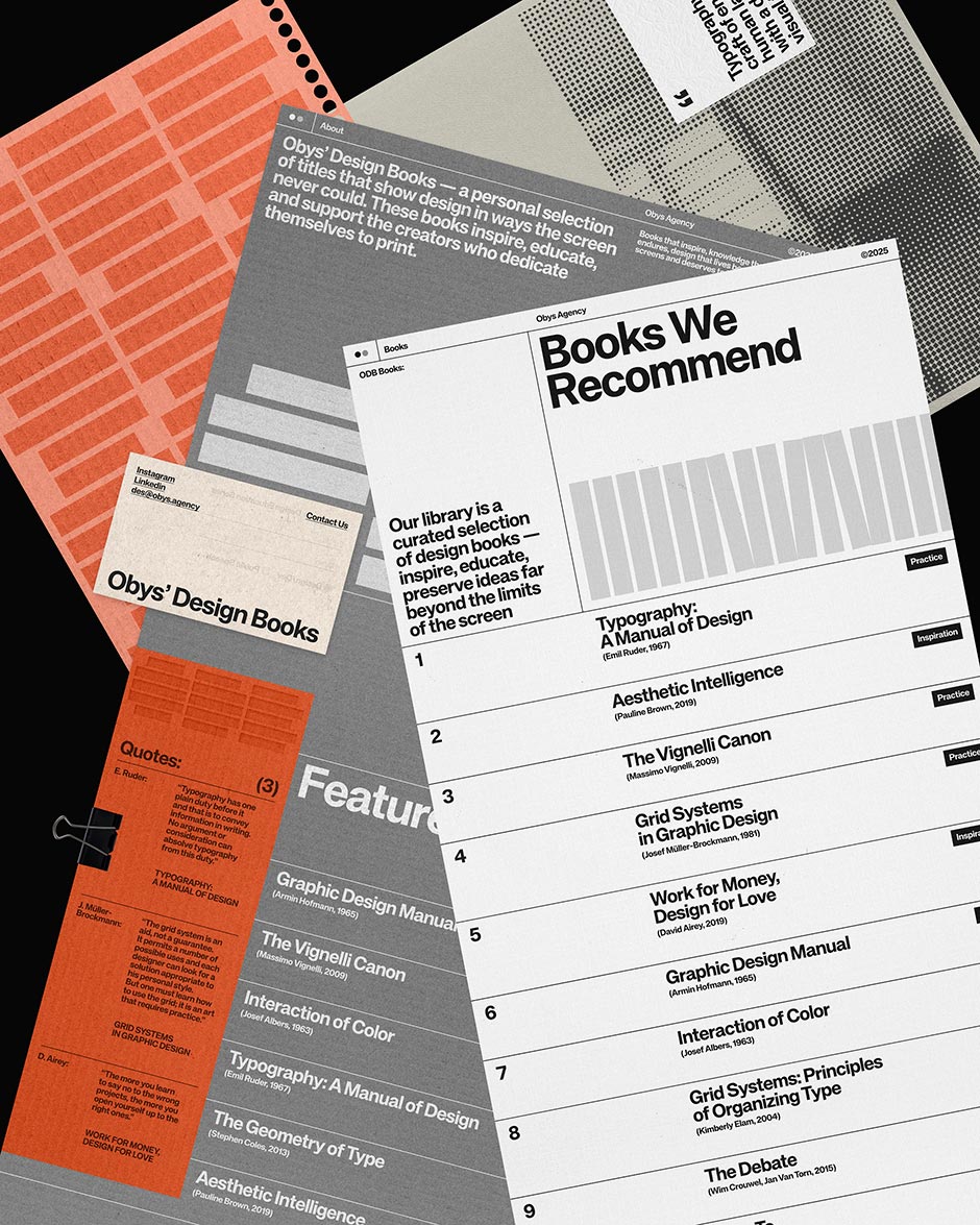
A Digital Experience You Can Almost Touch
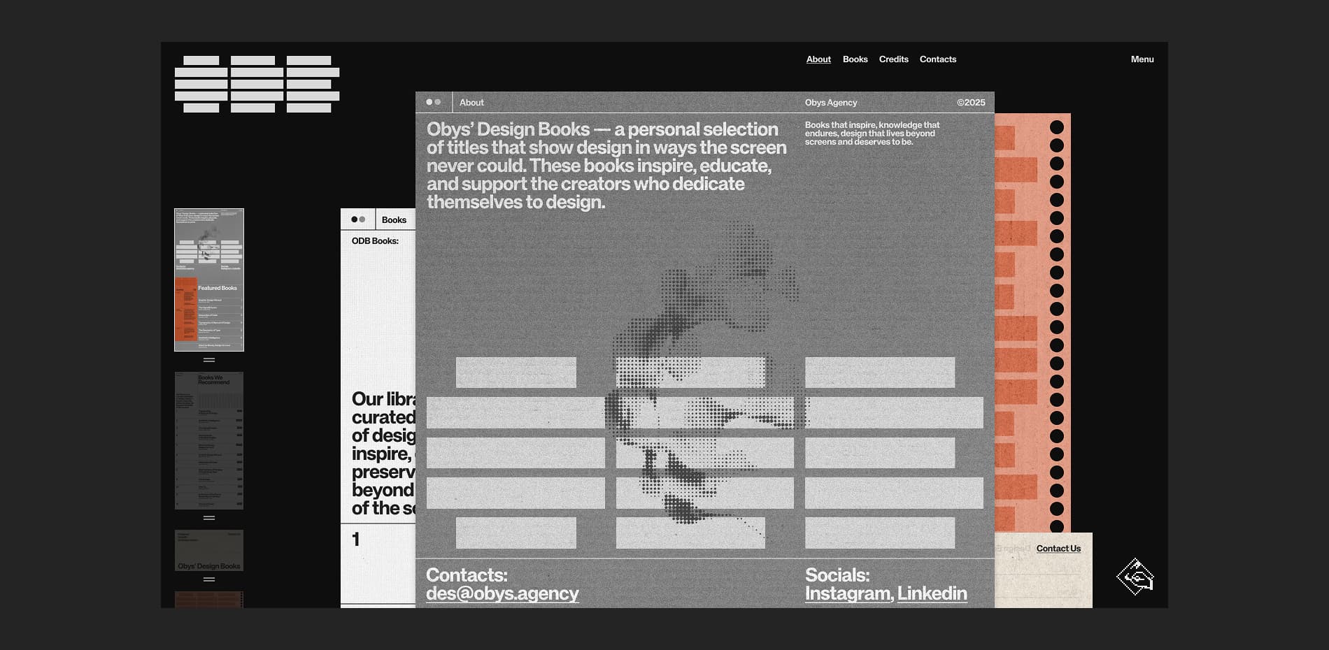
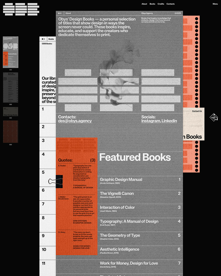
The core idea behind the site is the interaction itself. We wanted to move away from the standard "grid of items" and create something that feels tactile and rooted in the physical world. Instead of browsing a typical website, it feels like you are handling printed materials.
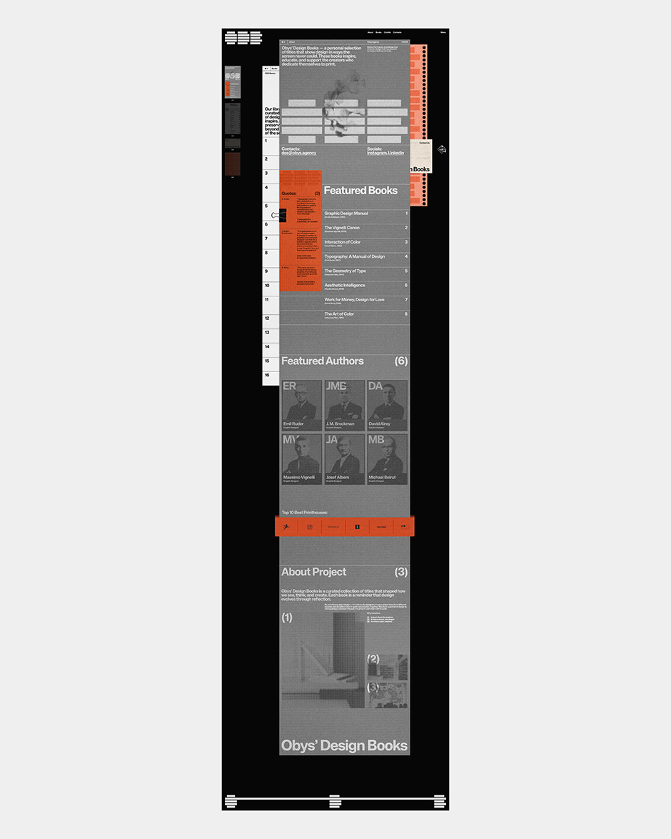
Every book lives on its own "paper-like" page. The most unique part? All the pages are visible at once. This creates a layered look that invites you to play and switch between books instantly, just like having a real desk full of open books in front of you. To make this feel even more real, we gave each page its own texture and visual style, referencing different types of paper stocks.
““Every decision had to be tested in context. There was no template for this. We had to build, test, and tweak until the balance between "chaos" and "order" felt just right.””
Rethinking How We Navigate
Traditional navigation usually follows a strict path: Home > Category > Item. We decided to break those rules. Because every page is always on the screen, the navigation defines the entire structure of the project.
We created a system that encourages exploration:
- Direct Interaction: You can simply click on any visible page in the stack.
- The Full-Page Menu: For a birds-eye view of everything.
- Quick Menu: A condensed version for fast switching.
- Stack Reordering: Users can physically change how pages are layered.
The goal wasn't just to help people "consume" content, but to let them "explore" the library in a way that feels natural and intuitive.
The Challenge: Balance and Visual Noise
Rethinking navigation from the ground up was our biggest hurdle. When you decide to show everything at once, classic layout rules stop working. You can’t design each screen in isolation; you have to design a living system.
The main challenge was simplicity. If we used our usual level of detail on every page, the whole site would look like a mess. We had to intentionally reduce visual noise. We asked ourselves:
- How do we create enough contrast between pages so they don't blend together?
- How do we keep the flow consistent without repeating the same colors or rhythms?
- Should we use heavy animations or keep it still like print?
Every decision had to be tested in context. There was no template for this. We had to build, test, and tweak until the balance between "chaos" and "order" felt just right.
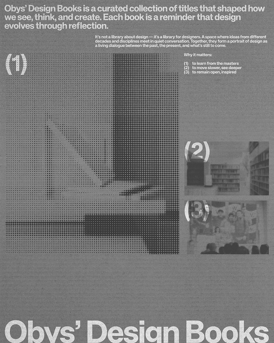
A Timeless Reference for Us and for the Creative Community
Books are a source of inspiration that never gets old, and that’s exactly the feeling we wanted to capture through our design. By experimenting with the UX and making the site more tactile, our goal was to create a site that becomes a "desktop" resource for designers.
We’ve seen this happen before with our projects like Grids and Typography Principles, which became go-to references for the community. With the ODB, we wanted to do the same – create a digital space that feels as permanent and reliable as a physical book on your shelf. It’s our way of celebrating the balance between digital progress and the timeless calm of printed wisdom.
Technologies
We kept the front-end clean and fast using HTML, CSS, and Vanilla JavaScript. We avoid heavy frameworks for these types of projects because we need total control over how every element moves and renders.
- GSAP (GreenSock): This was essential for the "paper physics." It allowed us to animate the z-index, position, and rotation of the pages smoothly.
- Smooth Scroll: We used a custom smooth scroll to make sure the movement felt weighted and tactile, not floaty or "too digital."
Back-end Technologies
For content management, we used Strapi (Headless CMS). It gives us the flexibility to update book details, textures, and categories without being locked into a specific layout. It’s a great bridge between a robust database and a custom front-end.
Company Info
Obys is a creative design and development agency working worldwide, specializing in concept-driven websites and digital experiences with a strong focus on storytelling, interaction, and motion.
More about us is here and here.
X: @obys_agency IG: @obys_agency