Hot off the press, Niccolò Miranda's – Paper Portfolio wins Site of the Month November 2021! We often see absolute stunners of websites appearing at the end of the year and this was no exception. Thanks to everyone who took the time to vote and tweet, the winner of the free Pro Plan is at the end of the article.
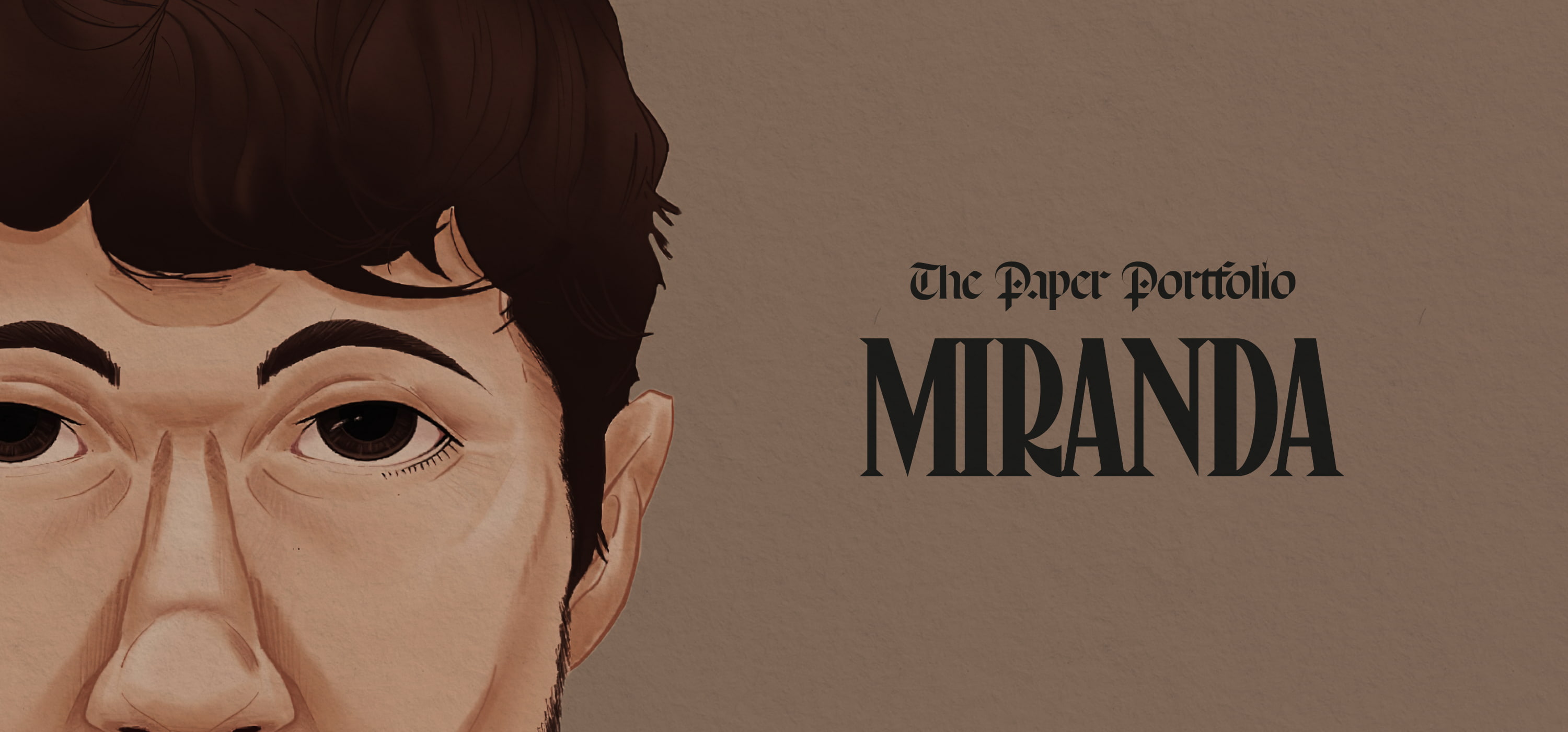
The "Miranda – Paper Portfolio" is a creative showcase site featuring the work of the Amsterdam-based interactive designer and developer. An immersive and playful experience, narrated through a visual language of illustrations and paper effect.
1. Behind the scenes
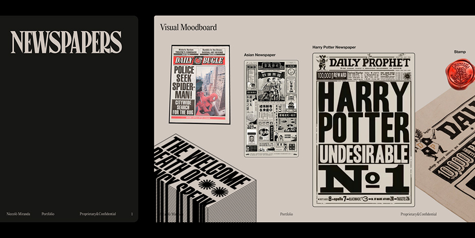
My father showed me “The Shining” by Stanley Kubrick when I was 6 years old, it's one of the first visual memories I have. The irrepressible beauty of Cinema is something I carry with me in everything I draw. Specifically, the idea is from which the Paper Portfolio was born is the Harry Potter saga. I've always found the Daily Prophet animation fascinating. So I asked myself, "Why not make a Portfolio out of it?"
The irrepressible beauty of Cinema is something I carry with me in everything I draw.
From the beginning, I started to collect some ideas in a Visual Moodboard in Figma to translate all the hidden spots of those newspapers into UI Elements.
2. The Grid
During the initial prototype phase, I wanted the digital experience to match both aesthetically and functionally in order to create a creative portfolio scalable over time. The scroll and grid blocks have been set up to make navigation straightforward, catchy, but most importantly accessible.
The bones of the website came from a deep research on typical newspaper blocks, specifically from the Guardian’s terminology. Therefore, I began the grid division in Figma by trying different types of iterations of the blocks by dividing them into:
- Headline, Sidebar, Masthead, Standfirst, Byline, Body Text, Package, Crosshead, Imprint
Being a complex type of structure for a website, I faced some design restrictions that challenged me to test out several design iterations in order to have a scalable HTML layout system across different breakpoints.
Grid Navigation structure
3. The Menu navigation
Time to make it "papery"! Navigating through The Paper Portfolio Menu feels like torn pages of a newspaper, landing somewhere that tastes like newsprint. Even before I started the project, I was aware that given the particularity and complexity of the structure (baked in Webflow), I would lose wiggle room in the animation.
Animation and code are usually UX decisions to be made during the first phase of Visual Strategy, as they could change all the rules of the game during design. So I envisaged a menu that could be the key link of the site with a torn paper effect made in #WebGL.
Navigating through The Paper Portfolio Menu feels like torn pages of a newspaper, landing somewhere that tastes like newsprint.
WebGL Torn Paper Effect
3. The Sidebars
In theory, there is no difference between theory and practice. But, in practice, there is. Thanks to the theoretical study that was done on the grid elements, the navigation sidebars were born.
These are primarily placed at the top and bottom, in order to have the project links always suggested in the viewport that change dynamically based on the page.
During the development process, one challenge was to create seamless WebApp-style transitions that could fetch the image in the WebGL shader and match it to the hero section illustration on the landing page.
4. The Books Shelf
The Work page was a never-ending challenge, with a very funny story behind it. After completing the Home build, I wondered how I could build something that would hold up to that design, without anything to detract from it. After several design attempts on a vertical orientation, I accidentally rotated the UI and that's how I was able to see the bookshelf.
The cover book front page template fetches the content from the Back-End to simulate the effect of pulling a book off the shelf, by twining it with GSAP to anchor the opened link when triggered.
Work page horizontal navigation
5. A visual narrative language
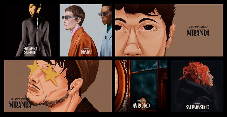
From the beginning I wanted to build a visual continuity between different project thumbnails to match thematically the newspaper-style with a catchy approach.
Therefore, teaming up closely with my big-time friend Michael Nardoni we carefully selected the best shot of my featured work spanning the last few years. A long journey of refinements and style transitions, which has allowed us to raise the level of design by creating an unprecedented visual experience.
From the beginning I wanted to build a visual continuity between different project thumbnails to match thematically the newspaper-style with a catchy approach.
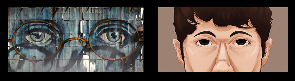
Fun fact: The close-up I used as Open Graph, is inspired by the eyes of Dr. TJ Eckleburg of "The Great Gatsby".
Technologies
Developing an editorial style is already complex, but building a site between global components and a dynamic back-office built to run on a whitespace-free layout is a unique challenge.
CMS / Hosting
Webflow in this case came to my aid once again, even if during the QA Testing phase it was slightly heavy due to the complexity of the HTML structure and the back-end.
JS Frameworks
WebGL was the supporting actor to GSAP in order to build the Torn Menu Paper effect. Locomotive instead, came to hand to create subtle parallax animation through the pre-built virtual scroll attributes.
The End
This award means the world to me. I want to congratulate all the great nominations this month, some incredible sites that make us all so proud. We are facing a golden age of digital, and this is proof that the industry is not only minimal grid-based and RGB effects, but we can do something more to make us one day be remembered as the era of the digital renaissance.
Credits
Niccoló Miranda: Art Direction, Design, Development
Micheal Nardoni: Illustration
Clèment Rochè, Micheal De Laborde: WebGL Support
Thank you for your support, the winner of the free Pro Plan in our Professional Directory is @albohol226, please DM us for us to upgrade your profile!